651%
INCREASE IN CLIENT INQUIRIES
934%
INCREASE IN ORGANIC TRAFFIC
500%
INCREASE IN CLIENT LIFETIME VALUE BY
Legal
Barr & Douds Attorneys

They say you never get a second chance to make a first impression, and when it comes to websites, your homepage is that critical first encounter. It’s the digital handshake that can either draw visitors in or send them clicking away. So, if you’re on a quest to create a homepage that wows, you’ve come to the right place!
In this article, we’ve scoured the web to bring you the 25 best website homepage design examples that exemplify excellence in web design. From sleek and minimalist layouts to visually stunning and interactive interfaces, these examples are a treasure trove of inspiration for designers, developers, and entrepreneurs alike. Dive in and discover the secrets to crafting a homepage that captivates and converts.

Apple’s homepage design excels in visual hierarchy and clarity. Bold visuals for products like the iPhone 15 Pro and Apple Watch Series 9 create a strong visual focus, while a minimalist aesthetic with ample white space enhances readability. The intuitive navigation and engaging product copy, such as “Titanium. So strong. So light. So Pro.,” encourage users to explore further.
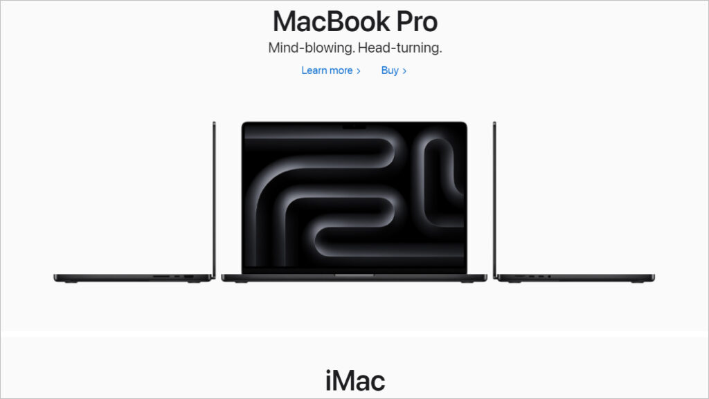
Source: Apple
The unified color scheme and effective CTAs like “Learn more” or “Buy” contribute to a visually pleasing and user-friendly experience. Additionally, the design is responsive, ensuring accessibility across devices. For a seamless shopping experience, Apple’s homepage is a prime example to follow.
Slack’s homepage design prioritizes user-centric messaging, conveying a human-first approach and boosting engagement. The site maintains visual consistency, using vibrant colors to highlight key elements, such as call-to-action (CTA) buttons. Its organized layout ensures easy navigation through various sections, from showcasing capabilities to presenting client testimonials.
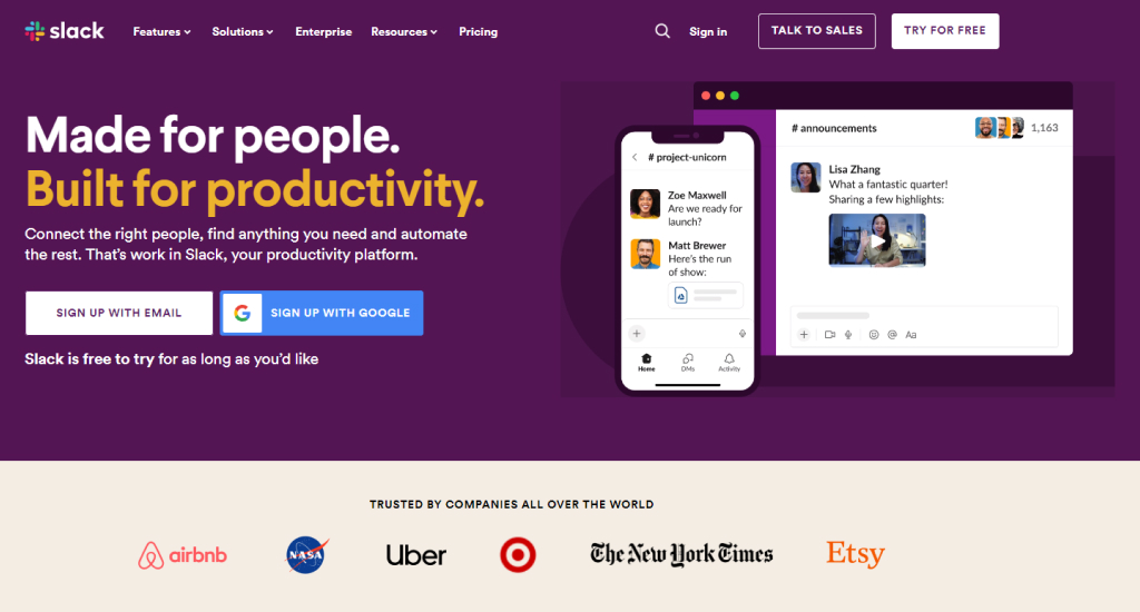
Source: Slack
Interactive elements like clickable CTAs and external links encourage exploration. Slack emphasizes trust with logos of reputable companies and usage statistics, offering social proof. The design promotes accessibility and inclusivity, and its responsiveness caters to users on all devices. With prominent CTAs like “TRY FOR FREE” and “TALK TO SALES,” the homepage effectively guides visitors to take action, making it a model for engaging potential clients.
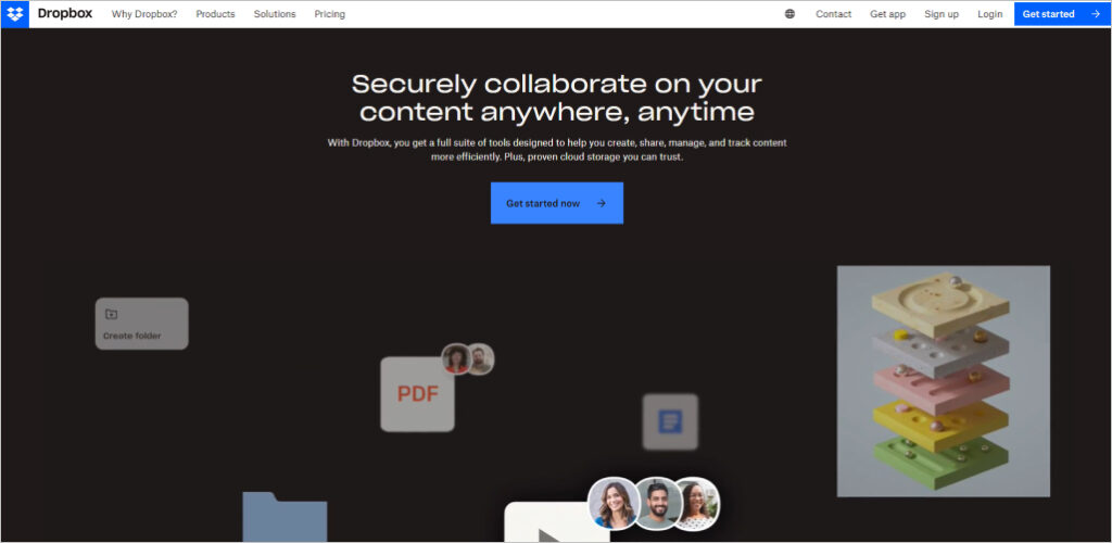
Dropbox’s homepage design excels in simplicity and clarity. With its clean layout and ample white space, the design minimizes cognitive overload and enhances content readability. The headline, “Securely collaborate on your content anywhere, anytime,” directly addresses user needs, offering a clear value proposition. Minimalistic icons and illustrations complement the text, adding aesthetic appeal without overwhelming visitors.
Source: Dropbox
The site’s intuitive navigation, bolstered by testimonials and case studies, builds trust among users. Strong CTAs, such as “Get started now,” guide visitors through the conversion funnel. Dropbox’s mobile responsiveness ensures a seamless browsing experience on all devices. Additionally, its focus on security, highlighting features like file recovery and password protection, positions the service as a reliable solution in an age of heightened data security concerns.
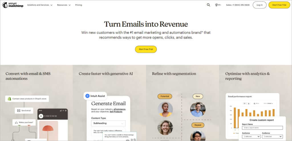
Mailchimp’s homepage design excels in several key areas. The use of vibrant colors and playful graphics, against a clean white background, instantly grabs attention and enhances engagement. Clear and impactful headlines, such as “Turn Emails into Revenue,” succinctly convey the platform’s value proposition.
Source: Mailchimp
The layout effectively employs white space, preventing clutter and allowing users to navigate seamlessly. Tailored user pathways ensure personalized experiences, building trust with visitors. Bold, strategically placed CTAs like “Start Free Trial” prompt immediate action. Testimonials provide social proof, reinforcing brand trust. Mobile responsiveness and data-driven content guarantee a consistent and compelling user experience across devices.
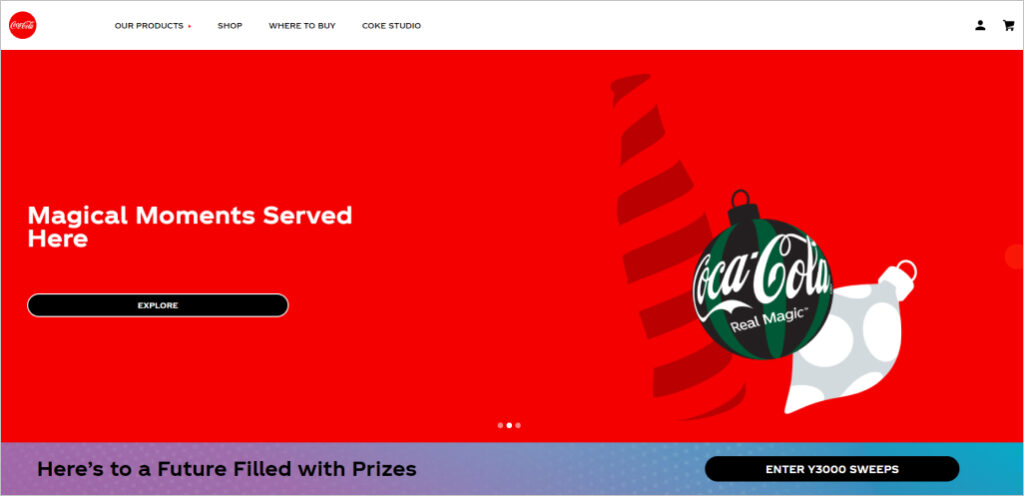
Coca-Cola’s homepage boasts a vibrant and modern design, prominently featuring its signature red color and high-quality images of its iconic products. The layout effectively guides visitors through various brand narratives, from new product launches to exclusive merchandise, creating an engaging user experience. Interactive elements, such as enticing call-to-action buttons like “TASTE THE FUTURE” and “JOIN NOW,” invite users to become part of the brand’s story.
Source: Coca-Cola
Furthermore, the homepage extends beyond product promotion, emphasizing the brand’s role in enhancing lifestyle and social experiences with sections dedicated to recipes and mealtime magic. Notably, the site also prioritizes accessibility, catering to visually impaired users and reflecting a commitment to inclusivity in web design. Coca-Cola’s homepage successfully combines captivating visuals, cohesive branding, interactive content, and user inclusivity, offering a memorable visitor experience.
Success Stories
Delivering Business Results: Our Digital Marketing Case Studies
651%
INCREASE IN CLIENT INQUIRIES
934%
INCREASE IN ORGANIC TRAFFIC
500%
INCREASE IN CLIENT LIFETIME VALUE BY
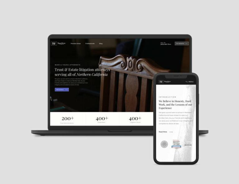
Legal
Barr & Douds Attorneys
 760%
Increase in qualified leads & sales
23X
Increase in targeted traffic from SEO
174%
Improvement in conversion rate
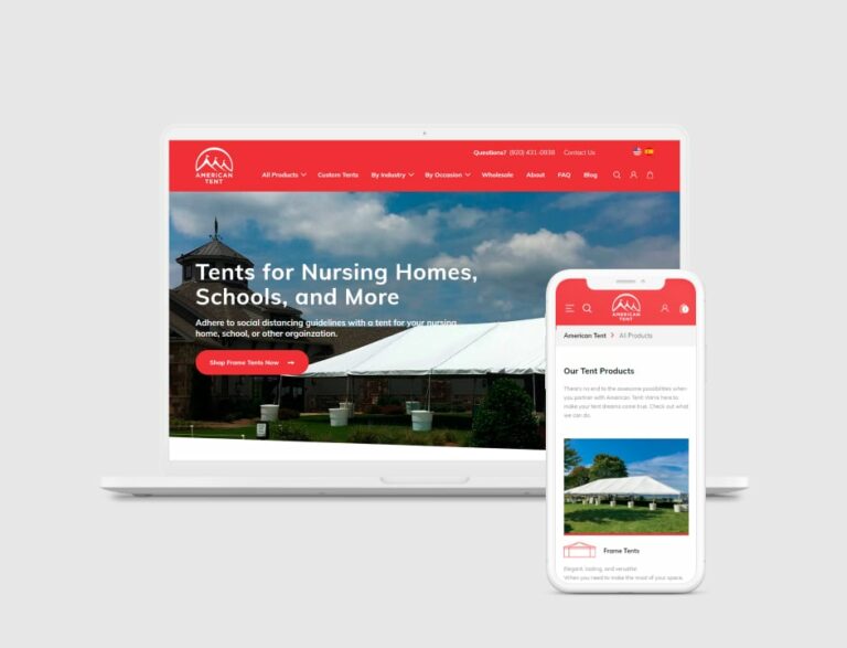
Ecommerce
American Tent
760%
Increase in qualified leads & sales
23X
Increase in targeted traffic from SEO
174%
Improvement in conversion rate
Ecommerce
American Tent
Adobe’s homepage design reflects its creative ethos through a clean, minimalist layout that prioritizes user experience. Dynamic visuals, multimedia, and interactive elements engage users and showcase Adobe’s products. The site maintains a strong, consistent brand identity with a recognizable logo and color scheme.
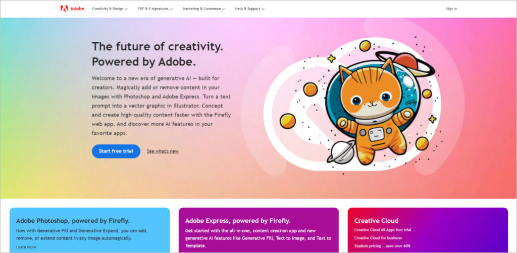
Source: Adobe
Intuitive navigation and clear, bold call-to-action buttons make it easy for users to explore Adobe’s offerings and access resources. The content strikes a balance between informative value and persuasive marketing language to cater to user needs while promoting Adobe’s products.
Trello’s homepage boasts a clean and clutter-free design that emphasizes clarity and simplicity. The effective use of whitespace ensures that users can easily focus on essential information, preventing overwhelming distractions. The intuitive navigation and engaging visuals further enhance the user experience, making it effortless to explore the platform’s features.
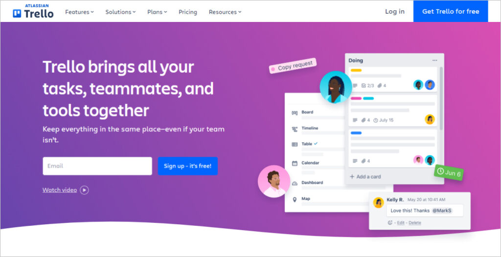
Source: Trello
Moreover, Trello’s homepage utilizes concise yet informative copy to communicate its value proposition effectively. The responsive design ensures a seamless experience across various devices, while consistent branding elements contribute to a predictable and harmonious user journey. Explore Trello’s user-friendly homepage today and discover the power of organized teamwork!
Squarespace’s homepage design is a prime example of aesthetic appeal and user-centricity. It employs high-quality visuals and a sophisticated color palette to attract users while reinforcing its premium brand image. Bold CTAs like “GET STARTED” guide visitors toward their next steps, whether it’s a free trial or exploring features.
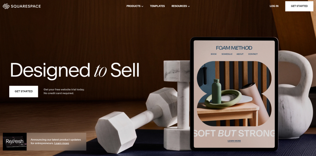
Source: Squarespace
The design’s simplicity and structured layout help users focus on core offerings without feeling overwhelmed. Real examples of websites in the “Made with Squarespace” section build credibility. The site’s responsiveness ensures a seamless experience on all devices. Squarespace’s educational content and consistent branding create a cohesive user journey, making it more than just a website builder—it’s a supportive partner in the web creation process.
Spotify’s homepage design embraces minimalism, offering users a clutter-free experience with ample white space and a simple color palette. The “GET SPOTIFY FREE” button serves as a clear call-to-action (CTA), guiding new users towards taking action, a crucial step for conversions.
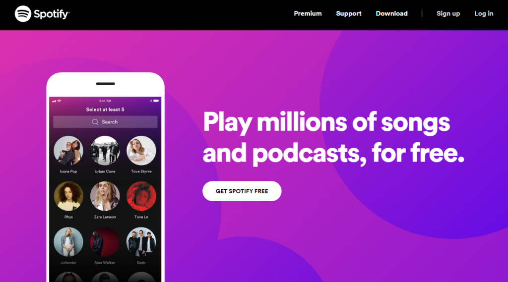
Source: Spotify
The visual hierarchy effectively directs visitors through the content, with engaging imagery adding visual appeal. Direct, user-centric copywriting highlights the benefits of Spotify Free without complex jargon. An integrated FAQ section preempts common questions, ensuring a seamless sign-up process. The consistent use of branding elements fosters trust and recognition among users.
Asana’s homepage design exudes professionalism and modernity through its clean visuals and bold color palette. The prominent “Try for free” and “Get Started” call-to-action buttons guide users effectively, while interactive elements enhance engagement. The use of imagery and icons isn’t just decorative; they aid in conveying information concisely. The content layout is well-organized, preventing information overload.
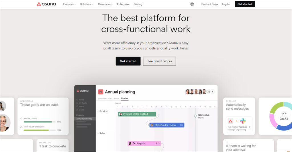
Source: Asana
Moreover, Asana’s inclusion of logos from reputable companies and its emphasis on seamless integrations build credibility. The presence of educational resources positions the brand as an industry authority, and the site’s responsiveness ensures a consistent experience on various devices. Visit Asana’s homepage to experience its effective design and explore its offerings.
GitHub’s homepage design excels in clarity and simplicity, with the prominent message “Let’s build from here” serving as a powerful call-to-action for both newcomers and seasoned developers. Visual elements, such as the image featuring “Mona looking at GitHub activity across the globe,” create an immediate connection with coding enthusiasts, adding depth to the message. The content is logically organized, guiding visitors through GitHub’s services, and emphasizing trustworthiness by highlighting their association with leading organizations and impressive statistics, like a “22% increase in developer productivity.”
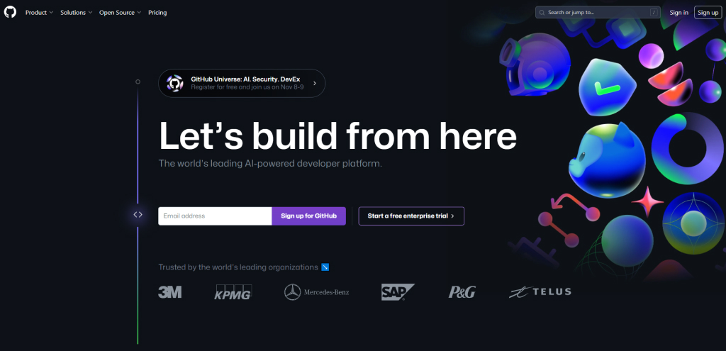
Source: GitHub
The site’s navigation is user-friendly, featuring clear calls-to-action such as “Check out GitHub Codespaces” or “Get GitHub Advanced Security,” encouraging further exploration. GitHub’s emphasis on community engagement, exemplified by “GitHub Sponsors,” underscores its role as not just a code repository but also a supportive development environment, making it particularly appealing to newcomers seeking a collaborative platform.
Airbnb’s homepage design strategically fosters an emotional connection with users by addressing the need for comfort during business travel. The clear call-to-action, “Add your work email to get started,” simplifies the user journey, ensuring a seamless experience. The page effectively highlights services, offers social proof through testimonials, and reassures users about safety. High-quality visuals and global customer support further enhance the user experience.
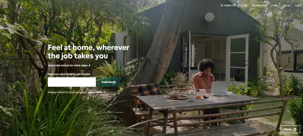
Source: Airbnb
By strategically placing a clear call-to-action and highlighting service offerings, Airbnb’s homepage design ensures an engaging and trustworthy experience for users. It appeals to the emotional needs of business travelers while addressing their concerns about safety and comfort. This approach not only attracts visitors but also guides them toward taking action, whether it’s booking accommodations or exploring team-building experiences.
HubSpot’s homepage design excels in simplicity and clarity, immediately conveying its value proposition – “Grow better with HubSpot.” The structured layout guides users seamlessly through various sections, with interactive CTAs enticing them to “Get a demo” or “Get started free.” HubSpot integrates social proof by showcasing its global customer base and offers educational content like blog posts and courses, positioning itself as an industry authority.
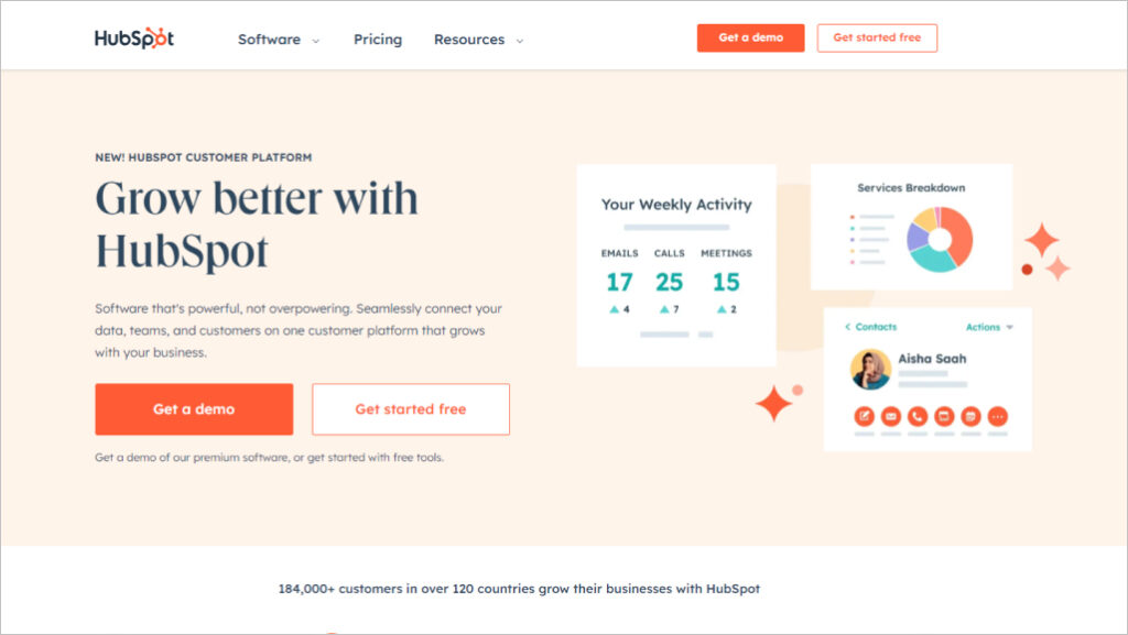
Source: HubSpot
The emphasis on support, community, and AI integration highlights HubSpot’s commitment to customer success and innovation. Whether users are seeking information or ready to convert, the homepage provides a cohesive and engaging experience, making it an exemplary model for effective website design.
Neil Patel’s homepage design excels in several key areas. Firstly, it features a clear Call-to-Action (CTA) that directly addresses visitors’ needs. For instance, the question, “Do you want more traffic?” encourages immediate engagement. The site’s simplicity and clarity are also notable, avoiding clutter and distractions while offering clear sections for different purposes, enhancing the overall user experience.
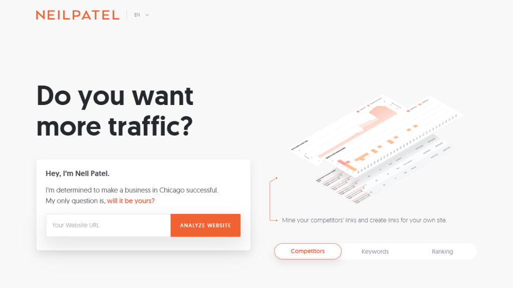
Source: Neil Patel
The navigation is intuitive, providing easy access to various sections, and accessibility options promote inclusivity. Interactive elements, like the free Ads Grader tool, keep users engaged and offer immediate value. Lastly, the content strategy is focused and tailored to users’ interests, ensuring a user-friendly experience. These design elements collectively make Neil Patel’s homepage an effective tool for engaging and guiding visitors.
Salesforce’s homepage design excels in conveying a compelling value proposition, emphasizing the fusion of Data, AI, CRM, and Trust for improved sales and customer satisfaction. The site maintains an impeccable visual hierarchy, guiding users’ attention to vital elements and multiple calls-to-action, such as “Start free trial” and “Watch demos,” enhancing user engagement.
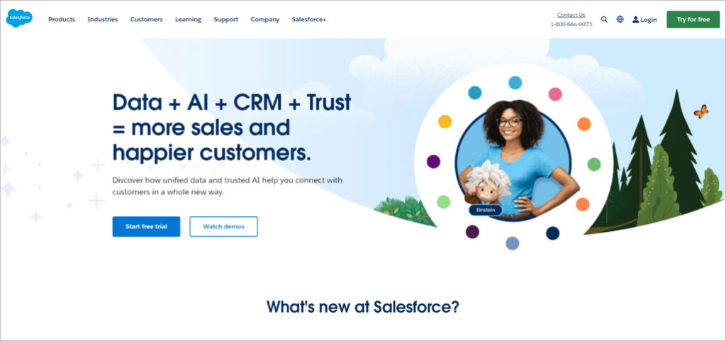
Source: Salesforce
Furthermore, Salesforce’s homepage segments information effectively, catering to diverse audience needs, and subtly incorporates social proof elements, enhancing credibility. Educational resources and consistent branding establish Salesforce as an industry thought leader while encouraging community engagement through events and the Trailblazer community. Explore these features to maximize your Salesforce experience and business growth.
Red Bull’s homepage design is characterized by dynamic visual content, capturing the essence of extreme sports and adventure, aligning with its “Gives You Wings” slogan. The design is minimalist, focusing on engaging visuals rather than direct marketing, allowing users to explore without feeling overwhelmed. Content variety caters to diverse interests, broadening its appeal beyond a beverage company.
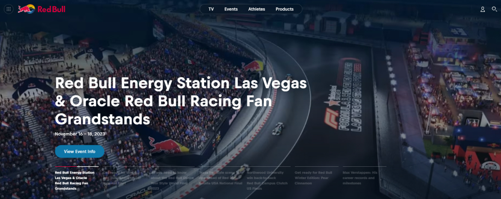
Source: Red Bull
Moreover, Red Bull prioritizes user privacy, offering customization options for cookies. The website fosters a sense of community and engagement through updates on events and news, building a dedicated fan base. With seamless navigation, visitors can easily explore various sections, enhancing the overall user experience.
Square’s homepage design effectively conveys its value proposition, showcasing its ability to power diverse business needs with clear and direct messaging. The clean and visually appealing layout, coupled with high-quality images and readable text, maintains functionality while preventing clutter. Square strategically employs call-to-action buttons such as “Contact sales” and “Get started” to guide visitors, potentially boosting conversion rates.
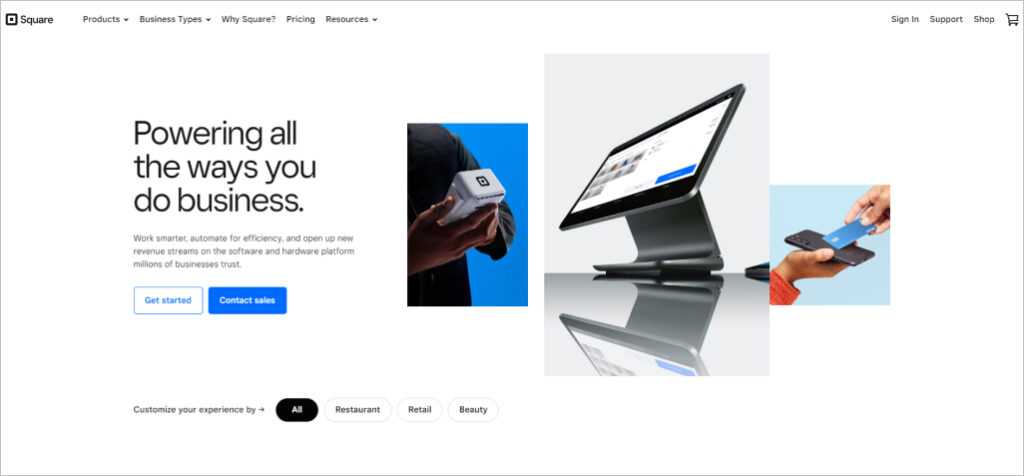
Source: Square
Moreover, Square leverages customer success stories and provides detailed product information, offering real-world examples and outlining the range of solutions it offers. Accessible resources and data points enhance credibility, while the emphasis on integration and customization appeals to businesses seeking flexibility. With Square’s homepage design, businesses can easily grasp the platform’s benefits and take the next step toward optimizing their operations.
IBM’s homepage design stands out with its innovative focus, emphasizing cutting-edge technology like AI, quantum computing, and cloud computing. This highlights IBM as a leader in technological innovation. Moreover, the site excels in providing clear Call-to-Action (CTA) buttons like “Explore watsonx,” “Try watsonx for free,” and “Book a live demo for watsonx.ai.” These CTAs guide visitors towards engaging with IBM’s products and services, promoting interaction.
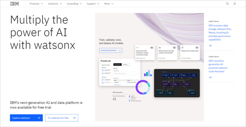
Source: IBM
Furthermore, IBM’s homepage offers educational content that informs visitors about various technological topics, positioning IBM as a thought leader in the industry. It also subtly showcases social proof through its innovations and contributions, establishing credibility. The site’s user-friendly navigation and clear categories make it easy for visitors to explore products, consulting services, and research, ensuring a seamless user experience. Don’t miss the chance to explore IBM’s latest advancements and engage with their offerings today.
Houzz’s homepage design is highly effective in several key ways. It prominently features clear call-to-action buttons like “Get Started,” “Join for Free,” and “Sign Up with Email,” guiding users towards engagement. Additionally, the professional directory offers users easy access to specific services they require, enhancing functionality.
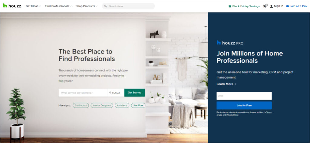
Source: Houzz
Visual elements, including high-quality images, create an appealing design, reflecting the industry’s emphasis on aesthetics. The organized layout with distinct sections streamlines navigation, while diverse content types, such as articles, photos, and videos, cater to various user preferences.
Airtable’s homepage boasts a clean and clutter-free design, directing users’ attention to prominent “Sign up for free” and “Contact Sales” call-to-action buttons, streamlining the user journey. The use of minimal yet powerful visuals and icons enhances engagement, simplifying complex information about the platform’s capabilities. Compelling CTAs like “Sign up for free” emphasize the cost-free entry point, enticing potential users.
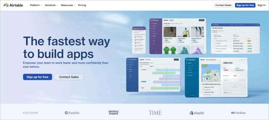
Source: Airtable
The homepage effectively highlights Airtable’s versatility across different workflows and departments, featuring real-world use cases for diverse sectors. Customer success stories provide social proof, while emphasizing AI integration positions the platform as cutting-edge. Easy access to various resources demonstrates a commitment to user education and community building.
Coursera’s homepage design excels in clarity and organization by prominently featuring courses from industry giants like Google and IBM, instantly conveying its purpose. The visual hierarchy smoothly guides users through various sections, from platform introduction to available courses and testimonials.
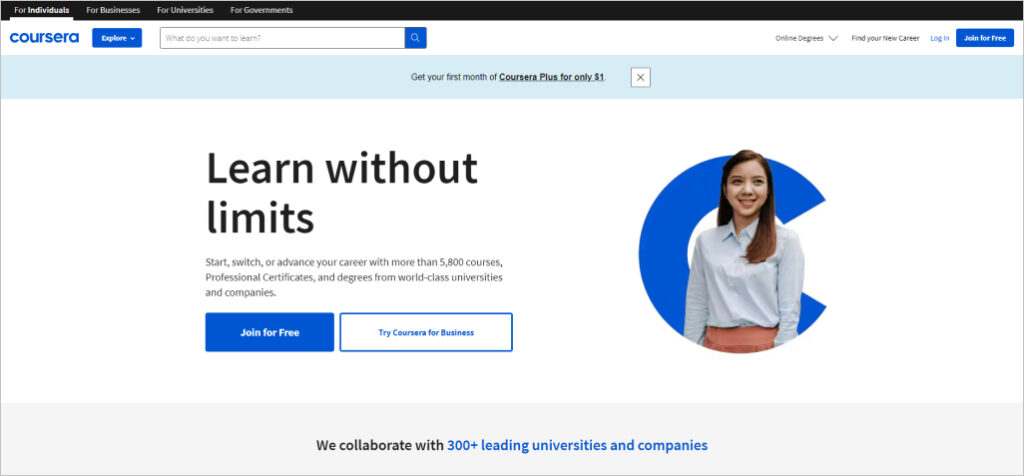
Source: Coursera
Strategic use of “Join for Free” CTA buttons encourages seamless user engagement, while partnerships with prestigious institutions enhance the site’s credibility. Furthermore, success stories and testimonials serve as compelling social proof, inspiring new users to enroll and embark on their educational journey.
Udemy’s homepage boasts a clean and straightforward design, emphasizing simplicity and directness. The prominent search bar takes center stage, urging visitors to explore the extensive course offerings, making it the primary call-to-action.
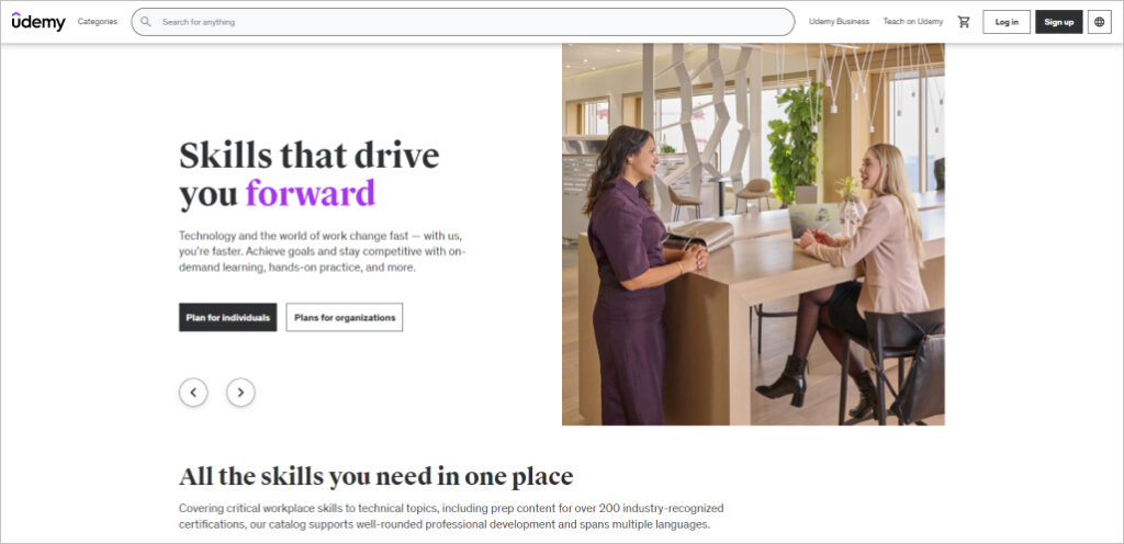
Source: Udemy
Moreover, Udemy leverages personalization by showcasing popular and trending courses while providing tailored recommendations based on user history, ensuring content relevancy for returning visitors. The homepage strategically features instructor profiles, ratings, and student reviews to build trust and credibility.
Additionally, Udemy’s mobile-responsive design, high-quality visuals, and cohesive color scheme enhance the user experience. The site frequently promotes discounts and free courses on the homepage, driving user engagement through incentives and limited-time offers.
Wix’s homepage design excels in several key areas. First, it features clear and compelling calls to action, such as “Get Started,” making it easy for visitors to engage. The site offers diverse options, allowing users to choose the type of website they want to create, providing a personalized experience.
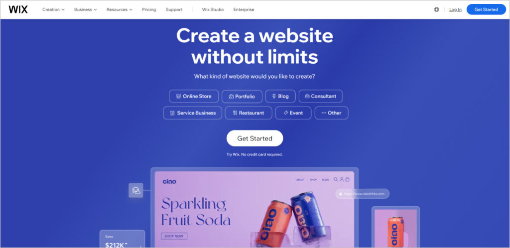
Source: Wix
Moreover, Wix’s visually appealing layout, high-quality images, and informative content contribute to a positive user experience. The inclusion of social proof, accessibility tools, and performance highlights instills trust in potential users. Additionally, the availability of educational resources and mobile responsiveness enhances Wix’s reputation as a user-friendly platform.
Duolingo’s homepage design excels in user engagement and clarity. With a prominently displayed and inviting “Get started” CTA, it ensures a straightforward path for users to begin their language-learning journey. The design’s simplicity, featuring a clean layout and minimal text, enhances user focus, while ample whitespace and legible fonts contribute to overall clarity.
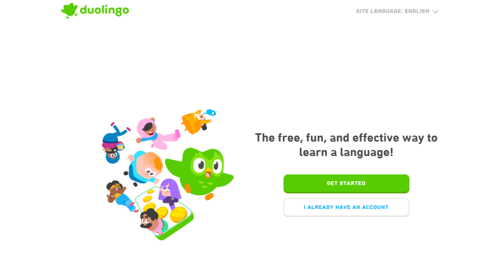
Source: Duolingo
Moreover, Duolingo employs vibrant colors and friendly characters, such as Duo the owl, to create an approachable learning environment suitable for users of all ages. This global platform offers multiple languages, fostering inclusivity, and prominently presents mobile accessibility options, catering to on-the-go learners with links to download the app from the App Store and Google Play.
Microsoft 365’s homepage design offers an intuitive, segmented layout that caters to various user needs, be it personal, business, enterprise, or education. Each section features clear and prominent Calls to Action (CTAs) like “Learn more” or “Get started,” guiding users toward their next steps. The dynamic content keeps users engaged by showcasing new features and emphasizing innovation and security through AI-powered experiences.
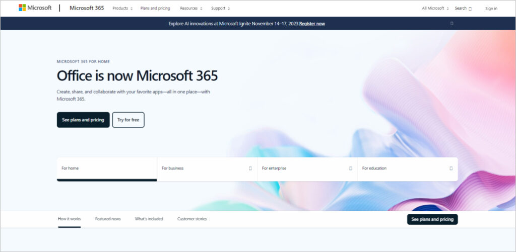
Source: Microsoft 365
High-quality visuals and social proof, such as customer stories, enhance the site’s credibility and accessibility. Microsoft 365’s comprehensive information and focus on collaboration and creativity make it a valuable choice for modern work scenarios. While not explicitly stated, the platform’s cross-platform accessibility ensures users can work from anywhere, solidifying its appeal.
These 25 website homepage design examples showcase the creativity and innovation that can be achieved in web design. As you embark on your own website design journey, remember that your homepage is your digital storefront, and its design should reflect your brand’s identity and engage your audience effectively.
If you’re looking for expert guidance in crafting a captivating homepage design that drives results, look no further than Comrade Digital Marketing. Our team of skilled professionals is here to transform your online presence and help you achieve your business goals. Contact us today to get started on creating a homepage that leaves a lasting impression. Your website’s success awaits!
The homepage of a website serves as the virtual front door of the site. It's often the first impression visitors have, and it plays a crucial role in retaining their interest. The best homepage, with interactive web design, can communicate a brand's identity, guide users to important content, and enhance user engagement. It's not just brochure wear but a strategic tool to captivate your target audience. Brilliant website homepage design ideas can transform a single-page site approach into something better, ensuring that site visitors are drawn in and engaged.
A brilliant website's homepage design frequently incorporates clear navigation menus, compelling visuals, and engaging copy. Additionally, it features prominent calls to action (CTAs) and ensures responsive design for mobile devices. If you're looking to design a custom wedding website, you'll discover a few key benefits of a good website homepage design.
When striving to make your website's homepage design brilliant, it's essential to consider the latest trends such as minimalism, bold typography, video backgrounds, and dark mode options. These elements can make your simple note-saving app or more blog-like homepage stand out and resonate with your target audience. Keep in mind that while trends are valuable, they should always align with your brand's identity to create a cohesive and appealing user experience.

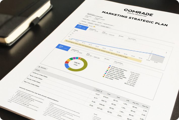
Do you want a marketing plan that fits your individual needs? Let us craft a strategy that drives results to your company based on your objectives.
Please fill out the form to the right, and we will contact you within one business day for a free initial consultation.
Unlock a full potential of your website. See which gaps in your marketing don’t allow your organization to scale. Get a complimentary, no obligation marketing performance review.