The best online beauty stores keep users interested with strategic content and streamlined navigation to engender an enjoyable buying experience. As professional beauty website builders, we’re accustomed to creating eCommerce stores primed for high conversion rates.
However, for many shop owners, it’s unclear what constitutes a conversion-optimized website because the truth is a beauty website can look aesthetically pleasing but fail to accomplish a rise in sales and organic web traffic.
At its core, beauty websites with bad designs make it challenging for customers to achieve what they need to. This can be for several reasons, ranging from poor website structure to a lack of clear calls to action, or just an off-putting typeface.


The gold standard of website design takes the following into account:
- UI and UX design
- Graphic design
- SEO
- Loading speed
- Unique selling proposition
These technical elements, along with an understanding of buyer psychology, are what distinguish most popular beauty websites from their competition. We’ll elaborate more on the details later. First, let’s take a look at these first-rate beauty sites to inspire your own!
Top 24 Most Popular Beauty Websites
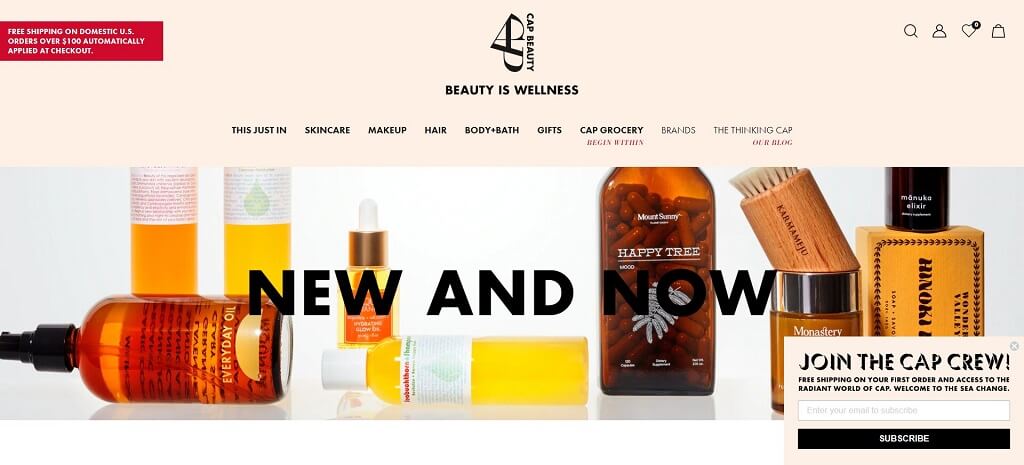
1. Cap Beauty
Cap Beauty sells skin care products made from 100% natural ingredients with no zero synthetics. The website’s top-of-the-line functionality is a reflection of the company’s transparency in using better products for people and the environment. Its purchase call-to-action buttons with the text “Yes, please” also convey enthusiasm, instead of just a generic “buy,” which provides a more personal touch. This is certainly one of the top skin care websites out there.
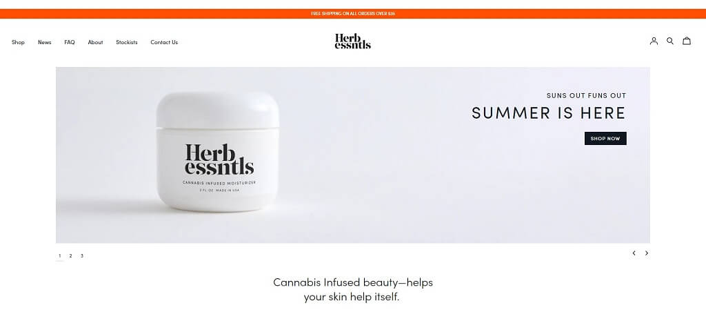
2. HERB ESSNTLS
As its name implies, Herb Essntls has a no-fuss, no-frills beauty website with minimalist appeal. It uses lots of white (negative space), creating a balance between text and image elements. Things are less cramped, uncluttered and easier to read. Additionally, a limited color palette helps establish greater design unity.
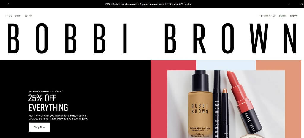
3. BOBBI BROWN COSMETICS
World-renowned cosmetic brand Bobbi Brown needs no introduction. Its website effortlessly showcases its most popular beauty products. The homepage advertisements do a good job at promoting new products, while its wealth of helpful tutorials is a great example of effective content marketing.
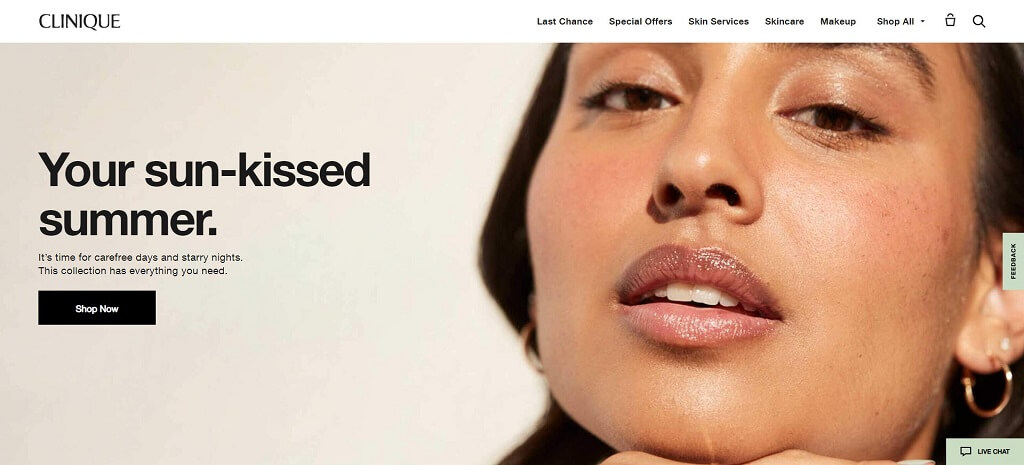
4. CLINIQUE
The most interesting feature on Clinique’s site is its virtual skincare diagnosis and foundation applicator. In a single scan, the software plots over 80 data points on the face against models built on 50+ years of dermatological research and 1+ million face scans. Moreover, its live chat functionality offers 24/7 beauty help.
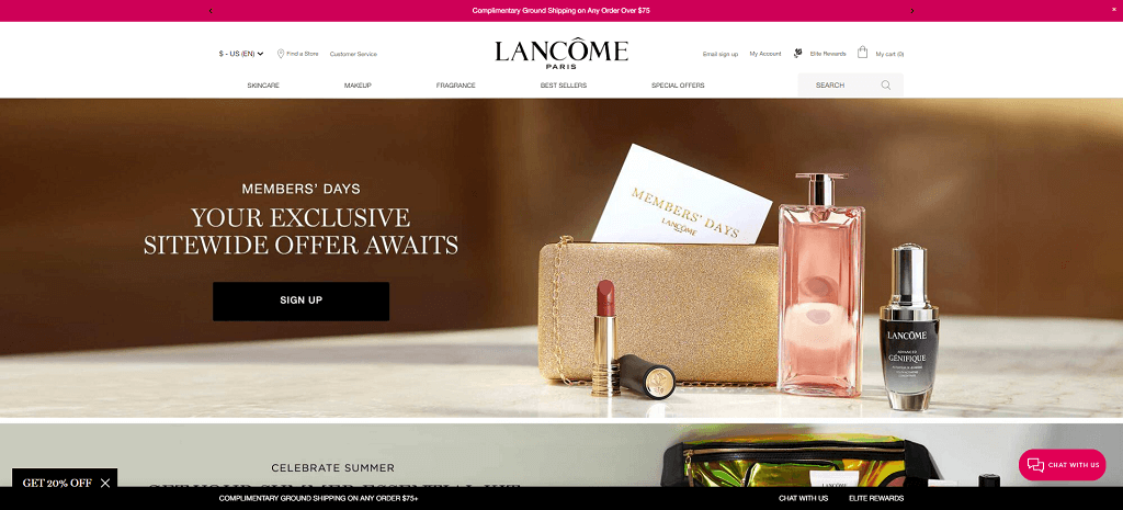
5. LANCOME
Like Clinique, Lancôme has a “virtual try-on” where customers can test new products on their skin type before buying. This function alleviates challenges connected with conventional eCommerce sales, such as reducing return costs. Lancome’s website also boasts a harmonious UX layout and easy checkout procedure.
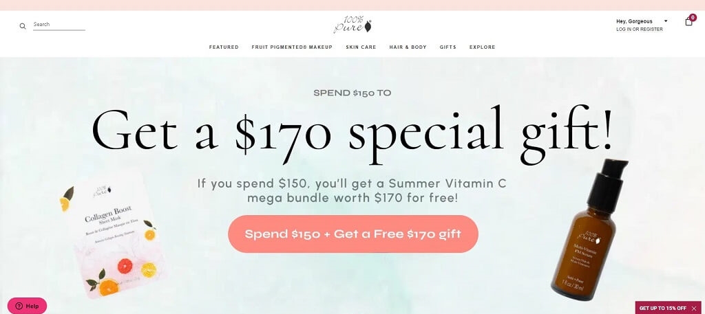
6. 100 PURE %
100% Pure sells hair, body and skincare products. This company uses social proof, i.e., reviews, to encourage buying. Below the header, it has a top-reviewed section, showcasing best-selling products. Nearly 90% of customers read online reviews before making a purchase, so including products with positive views is a useful tactic to increase sales.
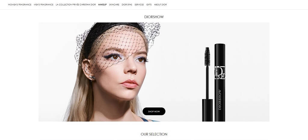
7. DIOR
Because Dior is a household luxury fashion and beauty brand, it focuses less on stock-standard product images, and more on meticulously curated images of models wearing makeup. This is the advantage iconic brand names have. It’s less about selling products and more about marketing an aspirational lifestyle.
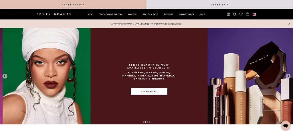
8. FENTY BEAUTY
Fenty Beauty is largely successful due to its founder, global superstar Rihanna. The young but fast-growing business makes cosmetics to suit over 50 skin shades, which is one of its unique selling points. This is one of the top websites on our list, featuring great product pages and high-production quality videos that demonstrate how to apply the company’s beauty and skincare products. One one the best cosmetics websites you can find.
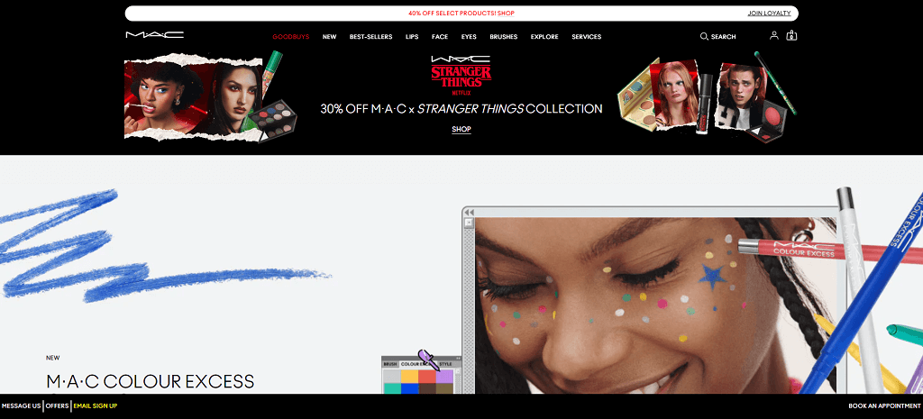
9. MAC COSMETICS
MAC Cosmetics is another beauty retailer titan. Known for its bold branding, the website does well to translate the company’s ethos into a color-filled online presence. Its well-organized product and trend catalogue offer an inspiring and stimulating shopping experience. Enabling customer account reaction also lets MAC send targeted advertising offers.
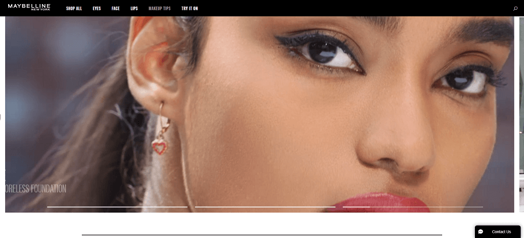
10. MAYBELLINE
This iconic beauty brand is well-known for its classics like “Great Lash” mascara. While it already has a loyal customer base, its hero video appeals to younger Millennials and Gen-Z. Despite its long history and extensive line of beauty products, the website is contemporary, dynamic, and fun.
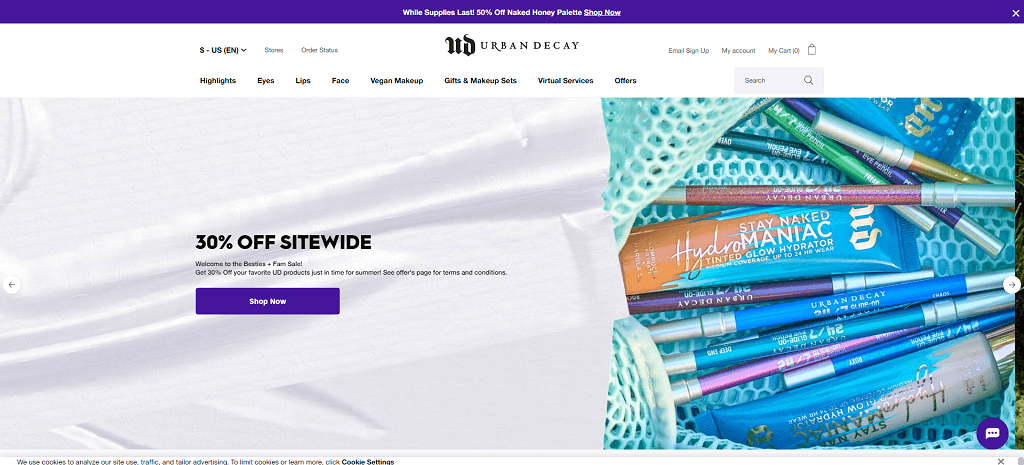
11. URBAN DECAY
Urban Decay is a cruelty-free makeup company. Its website’s horizontal menu offers easy navigation through its product pages, gift sets and virtual services. Like Herb Essntls, the limited color palette (white, black, and purple) ensures the products are the main focus, while the purple banner at the top of the homepage highlights current sales offers.
12. NYX COSMETICS
NYX Cosmetic’s beauty site has all the right design ingredients as well as a great selection of products, and strong branding. The UX is well-designed, and the interactive features enable customers to up their beauty game with fun tips and tutorials and help from a virtual makeup assistant.
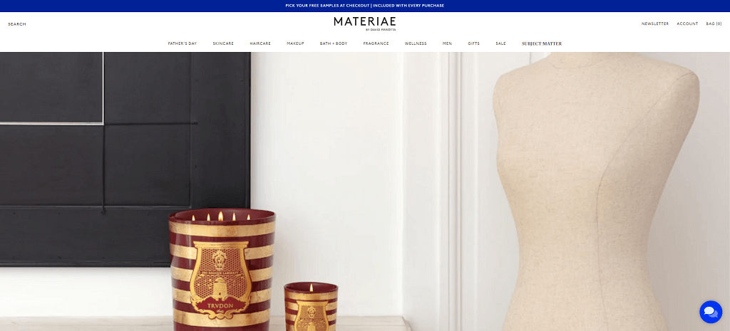
13. MATERIAE
Materiae calls itself the “ultimate online beauty destination for impeccable brands,” and its site embodies just that. As a purveyor of luxury and bespoke beauty products, its sleek menu exudes elegance, while its mega menu doesn’t detract from the beautifully styled images.
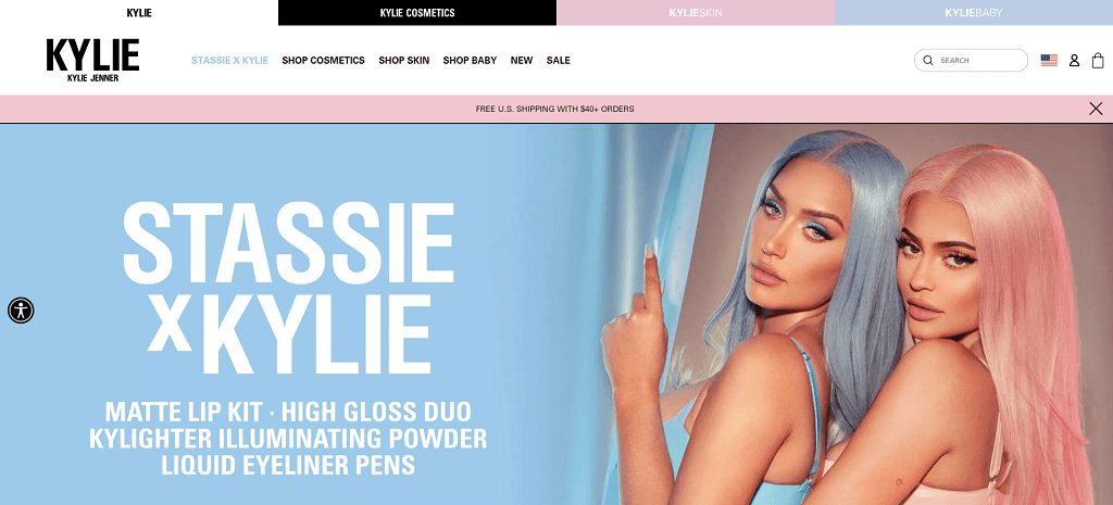
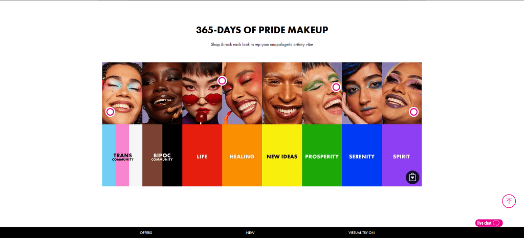
14. KYLIE COSMETICS
This is one of those best beauty websites that reflect the aesthetics of its founder, Kylie Jenner. Sexy and Gen-Z orientated, its skincare products are designed to appeal to Kylie Jenner fans. The one the site does really well is showcase lip colors on models, providing a clear idea of what they look when wearing them.
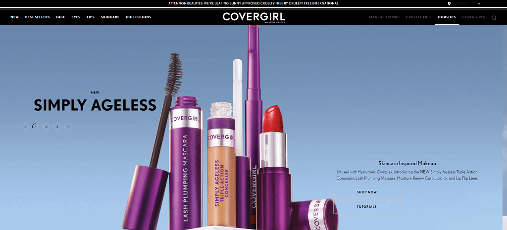
15. COVERGIRL
Covergirl showcases that even an established makeup brand can still provide an authentic impression with a well-designed, customer-centric site. Its updated design shines a greater light on authenticity, diversity, and self-expression. Lastly, this beauty brand’s simple interface facilitates easy shopping.
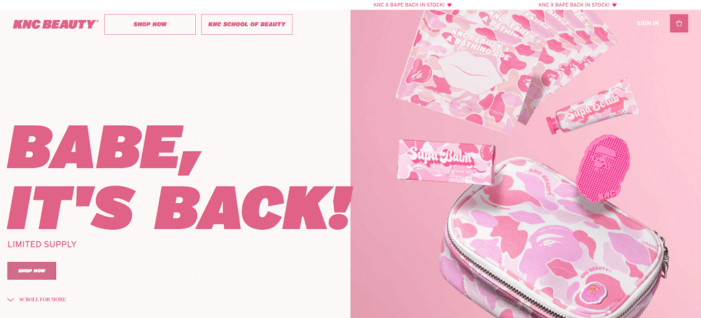
16. KNC BEAUTY
This is one of the most popular beauty websites and it screams Gen-Z. It’s bright, bold, and colorful, without detracting focus from the product pages. Unlike the other legacy brands, KNC Beauty is a great example of how a company should cater to its target market. The site allows customers to buy products in bundles, offering great value for money.
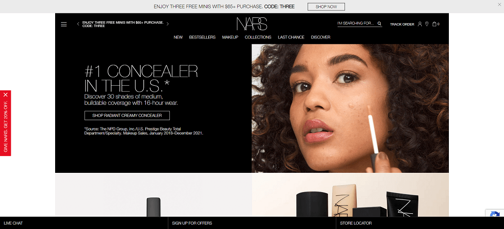
17. NARS COSMETICS
NARS symbolizes style, luxury, and elegance. Its stunning website also offers an AR-powered virtual “try-out” tool that eliminates possible barriers to purchase. The vibrant color contrast between red, back, and white immediately draws viewers in. Interestingly, NARS uses both a hamburger menu and a horizontal menu, so shoppers can find their products with greater ease.
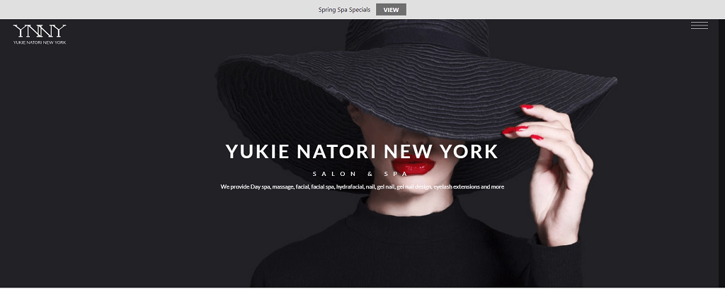
18. YUKIE NATORI NEW YORK
YNNY proves how minimalism needn’t be boring. Its interactive hero banner is one of the best on this list; it ripples like water as the user’s cursor moves over it. Unlike most websites that use a horizontal menu, YNNY utilizes a hamburger menu. It takes up less space and caters to a cleaner beauty website.
Men’s Cosmetic Websites
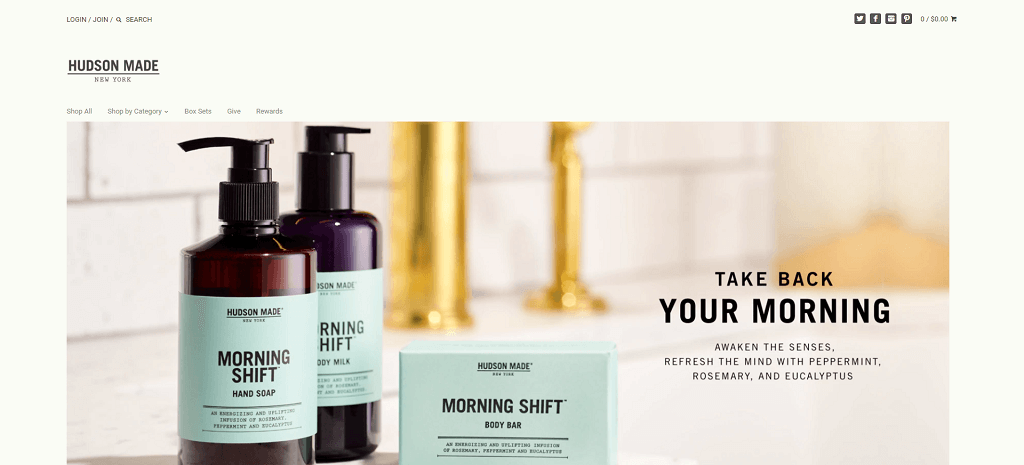
19. HUDSON MADE
Hudson Made believes our natural beauty is in harmony with nature. That’s why their products are 100% natural. The company is not only concerned about the benefits of its products for the body and the skin, but also concerned about being kinder to the environment. This builds an enduring brand image and a positive feeling when you browse through its product categories.
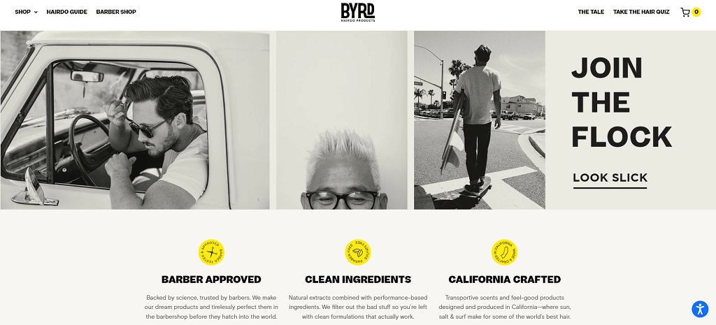
20. BYRD HAIRDO
What man doesn’t want to look attractive and cool? And most importantly, enjoy an effortless shopping experience. Let’s face it; we all know the majority of men would rather skip long, drawn-out shopping trips—whether in person or online! The company’s high-end bath and hair products attract those who enjoy an easy, smooth, and speedy online retail experience.
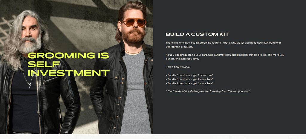
21. BEARDBRAND
Beardbrand does things a little atypically. Its homepage has a strong call to action. Instead of the usual hero image, its copy elicits a strong desire to explore the rest of the website. The “learn” tab is a classic case study of how content marketing can nudge prospects further down the sales funnel. Case in point: The first article that comes up is a quiz to determine beard type.
International Cosmetic Websites
22. JOE MALONE
This British lifestyle brand is known for its distinctive scent portfolio and luxurious bath, body and home products. Its website is appealing, beautiful, and elegant. Joe Malone’s gifting service web page is quirky and wonderfully conceptualized, and a reminder that attention to detail matters.
23. LUSH
This soap and cosmetic retailer has always placed a strong emphasis on ethical practices. Its humanitarian campaigns attract conscious consumers, who tend to become loyal customers. Lush’s hero banner video looks tactile, drawing attention to the products (not so much to models who usually market them) further underscoring the company’s commitment to sustainable beauty products.
24. Project VANITY
Project Vanity differs from the other best beauty websites on this list because it is also a beauty magazine. The clean layout allows customers to read a variety of skincare and makeup articles (all things beauty), as well as buy their favorite products. We think it’s an innovative way to conduct eCommerce for beauty brands.
What Makes a Good Website for Beauty and Skincare Products?
Functionality, a clean look, and high-quality graphics are some attributes that help create the best beauty websites that attract qualified leads and boost sales. Next, let’s discuss more website technicalities that help elevate skincare brands online.
UI & UX Design
UX and UI are related design disciplines, but they’re not the same thing. UI design is focused on visual design properties and the overall feel it conveys, whereas UI design is concerned with usability and navigation. You can have one of the best-designed makeup websites but without UX, it will create a bad user experience.
You don’t have to reinvent the wheel. Having a good understanding of how users shop online is a good starting point. For example, do they enjoy watching videos, and respond well to cross-selling? Are they interested in joining a loyalty program? Or are they teen shoppers who respond well to vibrant colors, self-care marketing, and free samples?
Here’s what it looks like when web designers keep things simple and effective:
- Each web page has a single purpose. For example, the nail products page contains only what is required to view the products and make a purchase—not tips on hair and skin care.
- The purpose of every page and each component on the site must be instantly understandable without explanation. For example, a customer should know immediately what types of makeup products are available on product pages.
- Additional information is located in less important areas. For example, social media icons are usually found on the top right or left-hand side by the footer.
Another important aspect of most popular beauty websites is maintaining user flow consistency throughout the buying journey. How your website encourages its target audience from arriving at the homepage to checking out products entails meticulous research and design.
Graphic Design
Our examples of some of the best beauty websites illustrate how persuasive graphic design is to get people to buy in the digital world (online). First impressions are made on homepages. Considering beauty products have to do with all things beauty AKA aesthetics, you will need to pay even more attention to design elements.
Poor graphic design choices can turn websites into a cumbersome maze of links, text, and images. Customers might be unsure where to click if they want to find out more about your loyalty program or skin products, for instance.
The following tips can help you create a cohesive and attractive website to showcase your high quality products:
- Use contrasting colors
- Avoid having too many fonts
- Don’t be afraid of negative space (this draws focus to specific elements)
- Implement visual hierarchy
SEO
Search engine optimization is the process of improving the quality and quantity of website traffic from search engines. Even if your UI and UX are excellent, you’ll still need SEO to get found by potential customers online.
93% of online experiences begin with a search engine. If your website’s pages aren’t popping up online when customers search for cosmetics, then your beauty business is just about invisible.
Even though businesses (many of them mentioned above) have brick-and-mortar stores, they still invest in a strong digital presence because 25% of shoppers buy online, and this percentage is only going to increase.
SEO combines many tactics and strategies, but we can divide them into four silos:
- On-page SEO
- Off-page SEO
- Technical SEO
- Local SEO
Optimizing these four aspects improves website performance, and generates more leads than most other marketing initiatives. Because organic search is the most popular way for customers to find your makeup products online, it makes sense to spend time developing a legitimate SEO strategy. How do the best beauty websites stand out online?
So, when someone searches for “non-toxic cosmetics,” “milk makeup,” “K beauty,” or “cruelty-free luxury products” they’re likely looking for beauty brands that stock these kinds of products. If yours fit the bill, you’ll want to pop up in their search.
Loading Speed
Imagine you’re using your phone to access the website of your favorite beauty store, and the site takes so long to load that you just give up. This is what happens when a website’s speed is too slow. For professional marketers, it’s a rookie error.
It is common knowledge among marketing professionals that all eCommerce websites should load in under two seconds. Loading speed is a Google ranking factor, so the faster your beauty site loads, the higher it’ll rank.
To quote Google:
Faster sites create happy users, and we’ve seen in our internal studies that when a site responds slowly, visitors spend less time there. But faster websites don’t just improve user experience; recent data show that improving site speed also reduces operating costs.
You can use the free tool Pingdom to find out how fast your beauty website is.
Unique Selling Proposition
A unique selling proposition (USP) is simply what makes your business better than the competition. For instance, beauty brands like Lush, consistently mention on their product pages how they’re an eco-friendly, sustainable brand. We can say their black product packaging makes them stand out, but it’s their business ethics that are a big part of their unique selling proposition.
The USP of beauty brand MAC, for example, is selling long-lasting products. Although it was initially aimed at professional makeup artists, its products became so popular they filtered into general consumer market.
Having a USP is what makes a business unique. It influences branding, identity, and last, but not least, website copy. As soon as customers arrive at your landing page, they should be made aware of your USP.
Many beauty websites suffer because owners don’t know how to determine their USP. Either that or they’re paying the consequences for not having one. Without a USP, you’ll get lost in the crowd of beauty websites and die a slow eCommerce death because you won’t attract enough interested customers to support your online shop.

3 Important Beauty Business Marketing Tips
How does the beauty industry get clients?
The beauty industry gets clients in a variety of ways, including through advertising and marketing, referrals, product sampling, word-of-mouth, influencer partnerships, collaborations with brands and celebrities, social media campaigns, and more.
Advertising is used to draw attention to certain products or services. Marketing helps the industry build relationships with existing customers and bring in new ones. Referrals from current clients can be an effective way to get new customers as satisfied clients are more likely to recommend a product or service to others.
Product sampling gives potential customers the chance to test out products before committing to them. Word-of-mouth has been shown to be one of the most powerful tools for garnering attention for a product or service. Influencers have become an especially popular way for beauty companies to reach their target audiences.
Collaborations with other brands and celebrities can also help bring attention and credibility to a company’s beauty products or services. Social media campaigns are highly effective when it comes to getting the word out about a product or service quickly and widely across multiple networks.
How can I grow my online beauty business?
Growing an online beauty business requires a mix of strategy, dedication, and creativity.
The first step is to create a website or online storefront that reflects your brand’s values and identity. A key part of this is having great visuals and product descriptions, as well as making sure the site is secure and user-friendly. Next, you’ll need to develop a marketing plan to drive traffic to your website. This might include SEO optimization, content marketing, influencer campaigns, targeted ads on social media platforms, email marketing, and more.
Additionally, consider offering loyalty programs or discounts to encourage customers to keep coming back. Once you have established a base of customers, reward them for their loyalty by offering exclusive content or rewards like discounts or early access to new products. Finally, use analytics tools to track customer behavior so you can fine-tune your strategies and focus on what works best for your business.
What is the target market for beauty products?
The target market for beauty products depends on the type of product you are selling and your overall brand focus. Generally speaking, the primary target market for beauty products is women and teens aged 18 to 35 who are interested in makeup, skincare, hair care, fragrances, and other cosmetics and beauty items.
However, depending on the specific product line of your store, you may also want to consider targeting men or older individuals as well. Additionally, it’s important to think about where your target customers shop online and how they use social media to influence their purchase decisions. By understanding their habits and preferences, you can tailor your marketing strategies to better reach them and increase sales.
We Know How to Market Beauty Products
Best beauty sites are here to stay. We’re doing more and more online, and shopping for beauty products is no exception. The bottom line: best beauty websites designed in a smart way are more likely to grow. The beauty world, like every industry, is competitive. That’s why most brands hire professional designers to create the best websites.
If you’re the owner of an established beauty business, and you have questions about how you can increase your beauty website’s revenue, reach out to us now. We’ve created many successful websites for a range of brands. We’d love to talk with you about your company and can even conduct a marketing audit free of charge.
Frequently Asked Questions
How to start an ecommerce beauty business?
Starting an ecommerce beauty business can be a rewarding and profitable venture, but it does require planning and commitment. The first step is to develop a comprehensive business plan that outlines your objectives, strategies, budgeting, marketing plans, customer service policies, and more. Next, decide on the products you want to sell and how you will acquire them. This could involve buying in bulk from suppliers or using drop shipping services. Once you have secured product sources, create an engaging website with easy-to-navigate pages that feature attractive visuals and detailed descriptions of your products. Additionally, you'll need to secure payment processing systems and shipping solutions for getting products to customers quickly and securely. After setting up those basics, you'll need to come up with a marketing plan to drive traffic to your site. This might include SEO optimization, content marketing strategies, influencer campaigns, targeted ads on social networks like Instagram or Facebook, email marketing strategies, and more. Finally, make sure you have comprehensive customer service policies in place so that customers feel supported throughout the purchase process.
Is an online beauty store profitable?
Yes, an online beauty store can be highly profitable. With the rise of online shopping, more and more people are turning to digital platforms for their beauty purchasing needs. This shift in consumer behavior has opened up a lucrative opportunity for entrepreneurs to capitalize on the increased demand and decrease overhead costs associated with having a physical storefront. The major benefit of owning an online beauty store is that it allows you to target a global audience – particularly those living in remote areas who may not have access to physical stores – thus increasing your potential customer base exponentially. Additionally, setting up shop on the Internet eliminates costly rent fees and allows you to reduce expenses related to staffing, inventory management, and other aspects of running a business. Depending on the type of product being offered, shipping fees may also be lower than traditional retail stores due to reduced weight or packaging requirements.
What is cosmetic example?
A cosmetic is any substance that cleans, improves or changes the complexion, the skin, the hair, the nails or the teeth. Makeup, perfume, skin creams, nail polish, soap, shampoos, shaving creams, and deodorants are all cosmetics.
What are the 5 main categories of cosmetic products?
A cosmetic product can be classified into seven categories: oral care, skin care, sun care, hair care, decorative cosmetics, body care or perfume.
In what cities do you work?
Comrade originates in Chicago, but we worked all around the United States. We can help your business grow and increase revenue whenever you are. We have offices across most major cities in the US. For example, we can offer digital marketing services in Cleveland or Washington D.C.. You can even find our internet marketing experts in Minneapolis! If you want to know more about our New Orleans digital marketing agency or find out how exactly we can help you, contact us via the phone or email.