Category pages are the bridge between your homepage and product pages. As a necessary part of the sales funnel, they don’t just make it easier for customers to shop at your store, but they also influence SEO rankings.
These pages use target keywords to organize content and assist search engine crawlers in detecting your eCommerce website’s purpose. A well-optimized category page with the right keywords drives more traffic to your website and ensures your customers have a smooth shopping experience.
Consider the following advice to improve your category page eCommerce SEO in 2025!
What Is an Ecommerce Category Page?
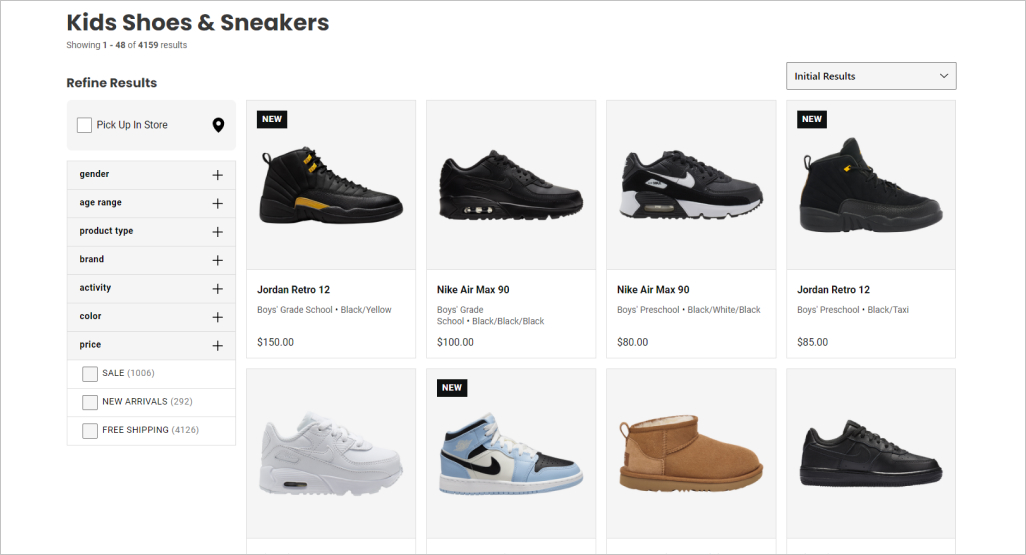
Category pages serve as an index of all the pages and posts that belong to a particular subject. They’re hierarchical; often the subject serves as a parent to a child page, several children pages, or even grandchildren pages.
For example, an online shoe store might have a category like “Men ‘s” with “Sneakers” as a subcategory, and under that page, there might be numerous children’s pages featuring different sneaker brands. As you can tell, categories group individual web pages together based on a similar subject or theme.
A category page is an essential part of an eCommerce website’s structure (taxonomy). After your homepage, it’s the next most important step in the marketing funnel, where you help customers narrow down their options and guide them toward their desired product page, so they can make a purchase.
Why Category Pages Are Important on Ecommerce Sites
Jon MacDonald, the founder of The Good, a conversion rate optimization firm made a salient point about shopping in physical stores vs. online. The best brick-and-mortar stores help customers get what they want, but provide browsers with the luxury of exploration.
We’ve all been to the supermarket to get essential items and walked out with items we had no intention of buying when we first entered. eCommerce is a little different. Category pages represent a “critical juncture” on the path to sales. They force the visitor to choose direction but without much detail.
Your job is to make that choice painless and simple for visitors. When it comes to product category pages, you must make sure every category page is optimized to carry out that purpose. Having a clear path to your store improves SEO efforts since you can use relevant keywords at each step of the journey.
Benefits of Optimized Category Pages
Product category pages need to be strong when it comes to UX and SEO. eCommerce category pages have the potential to become high authority pages when they strategically fit into a website’s hierarchical structure.
Together, a website’s effective internal linking and hierarchical structure present many search engine optimization opportunities, which are good for rankings and great for helping customers find your products:
- Boosts SEO and traffic
- Improves user experience
- Guides your marketing strategies
- Drives sales
- Offers prime merchandising space
So, what are the best practices for optimizing your product category pages, so they rank high, bring more traffic, and convert browsers into customers?
10 Ecommerce Category Page Best Practices
To achieve real gains in terms of rankings and traffic, you need to do some SEO work to optimize category pages. This ensures pages match user intent and helps shoppers and search engines better crawl and understand your eCommerce store’s structure.
1. Start With the Right Site Structure
The golden rule of SEO website structure is that no page should be more than three clicks away from the homepage. The idea is that if users can’t find what they’re looking for after three clicks, they’re likely to leave.
As such, an eCommerce website structure should be hierarchical. The homepage is at the top of the hierarchy, and below there are two or three levels before you reach the bottom of the hierarchy—the product pages.
The best type of website structure includes elements such as a clean navigation bar, internal links that follow logical paths, and the ability to filter information into additional subsets or pages. No matter where a visitor is on your website, it should always be easy for them to find the products they want.
2. Optimize Urls on Your Website
SEO-friendly URLs are short, keyword-rich, and meet the needs of users and searchers. The “slug,” which comes after the domain extension, should describe what the category page represents. If you’re selling women’s hats, then a slug that reads “womens-hats” is most appropriate. You want to keep URLs clean, so users can see at a glance where they are.
If your URLs expand to several pages, or if you use filters, you must set up your canonical URLs correctly. For instance, as the user moves from a homepage to a category page, the hierarchical structure should go from “www.hatshot.com/womens-hats” to “www.hatshop.com/womens-hats/fedoras.”
3. Write Metadata Using Relevant Keywords
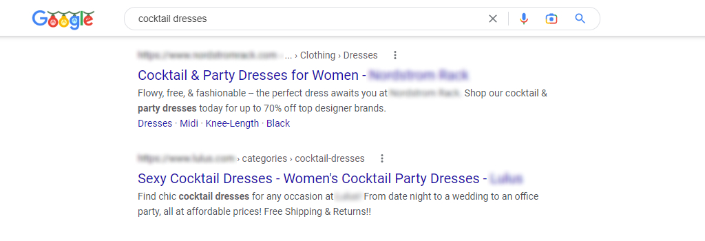
Title tags and meta descriptions should always be optimized. The title tag alone is an influential on-page element that sets up your product category page’s keyword and theme, and, combined with the meta description, influences the search terms your pages rank for.
Optimal title tags use the main category keyword alongside 1-2 most important features. While meta descriptions don’t directly impact search rankings, they let users know if a link to a category page is what they are searching for. Therefore, they need to be optimized because they influence click-through rates.
4. Make a Relevant Product List

Have you ever visited an eCommerce store only to find some products in a category that don’t belong there? A common one is “bedding and bath.” Clearly, companies want to hoodwink customers into seeing (and buying) different products. Yet, meshing categories creates a poor user experience and harms SEO rankings.
Trust us, there are other ways to upsell products—diluted product lists are not it. That’s because they weaken topical relevance. Once you’ve correctly grouped products together, you’ll want to showcase the most popular ones on the first product page to increase sales. Typically, categories are paginated at 12-20 items per page.
5. Highlight Your Product With Media Content

75% of shoppers rely on product photos when making a purchase. Images and videos help customers envision what products look like and how it addresses their pain points. Images are also great for SEO, so long as they’re optimized.
Image optimization involves creating high-quality images in the ideal format, size, and resolution to increase engagement. It also entails accurately labeling them with metadata, so search engine bots can read them and understand the page’s context.
You can’t just upload a file named “464748.jpg”—image names and alt names need to be connected to the overall theme of the page and include important keywords.
6. Add Relevant Text
Every category page should include keywords naturally through relevant text. This can be done in page titles, product titles, product descriptions, and so on. Always try to use text instead of images to display significant names, category page content, or links.
When it comes to content on product category pages aim for quality over quantity. Around 300 words per product is a suitable starting point. A good eCommerce store utilizes relevant, helpful, and descriptive text, making it easy for visitors to navigate the categories and products they want.
7. Improve Your UX Design
User experience (UX) design is the process of creating an eCommerce site that provides a meaningful and relevant experience to users.
So, how exactly does UX help with product category page optimization? It lets users do the following, among others:
- Browse products and see all product information in one place.
- Compare products and prices from multiple categories and explore other options.
- Add multiple products to their carts without having to open all individual product pages.
Let’s further discuss how UX can help with eCommerce optimization and sales:
The Right Layout
To optimize your category pages for sales, you should push top products and offers above the fold—the screen real estate visible when customers first land on your website. Why? Because this area accounts for 80% of all viewer attention on most sites.
Ideally, you should also mix horizontal and vertical layouts. Horizontal layouts work well when you want to show a few products from numerous categories, i.e., recently viewed products, whereas vertical layouts are best for showing products from the same categories.
Personalized Filters
Most eCommerce websites have filters because they break down categories into smaller more relevant niche product groups. Filtering is faster than scrolling through endless categories and improves user experience.
ConvertCart recommends starting with the most essential or basic product categories to provide a personalized product search for the largest segment of shoppers.
Recommendations & Variations
Every product category page has two goals: get the customer to buy the product or get them to view another product, or both. Data-driven product recommendations improve conversion rates and increase the average order value and the average number of items per order.
Including product variations also make it easier for shoppers to find exactly what they’re looking for and discover alternate options that they may prefer instead—or in addition—to what they originally wanted.
Wishlists
Oberlo defines wish lists as: “Collections of desired products saved by customers to their user account, signifying interest without immediate intent to purchase.” They reduce shopping cart abandonment and incentivize customers to return when they’re ready to purchase.
Moreover, they influence marketing decisions. For example, if you have products that have a low purchase rate but are on your customers’ wish lists, then you might offer them a discount. Digital marketing is all about data, and introducing wish lists in category pages is one way to gather info about customer purchase preferences.
Browsing History
Online shopping is fickle in the sense that customers look at thousands of online images every day. Providing access to browsing history offers a ready recall and an opportunity for a shopper to consider buying a product they’ve already browsed, without the hassle of having to relocate what they’ve already looked at.
UX is vital, and so is SEO. That’s because search engines evaluate web pages on more than 200 hundred ranking factors, including relevance, user intent, and user experience. Google is getting smarter day by day, and your eCommerce store’s UX design must live up to and exceed its expectations.
8. Improve Conversion Optimization

Category pages are funnel pages, meaning their main goal is to funnel visitors to the right product page to (hopefully) complete a purchase. According to research, category page recommendations can lead to a 1.3% boost in revenue. Moreover, displaying best-selling products on category pages can also increase customer lifetime value.
There are plenty of tactics you can use to boost conversion optimization, but if we had to distill them, it all comes down to; promoting popular categories, allowing shoppers to compare products quickly, having clear calls to action, and using sorting filters to show relevant products (from high to low price, etc.).
Furthermore, don’t forget to optimize category pages for mobile shoppers, as over 60% of people buy products via their smartphones.
9. Add Ratings to Build Trust
eCommerce websites often highlight the benefits of their products (as they should) but fail to provide adequate social proof. Consumers are well aware businesses want to make profits, so they’re less likely to trust a business touting how great their products are than other customers.
Your customers rely on ratings to get a sense of the performance, reliability, and customer service a company offers. 48% of customers won’t even look at a company twice if they have no reviews. Therefore, having legitimate 4-5 star reviews on your category pages can dramatically improve conversions.
10. Look at Your Competitors
Are there eCommerce brands you enjoy shopping at? Take a look at their category product pages. What works and what doesn’t? Competitive analysis isn’t only about understanding how your rivals are presenting themselves online. It’s also about identifying their weakness, so you can avoid the same pitfalls and setbacks.
Contrary to what people think, competitive analysis isn’t negative—it’s a positive process to help your business differentiate its category pages from everyone else’s. In fact, it’s the simplest way to determine how your business can fill the gaps and deliver better-optimized category pages.
Common Category Page Mistakes to Avoid
Optimizing category pages are a crucial part of UX and have a big impact on SEO. Although widely used, they’re often underutilized from a business perspective. Here are some common mistakes to avoid:
Duplicate Boilerplate Text
Inserting boilerplate text on category pages can hurt your rankings in search engine results pages. We typically see this with eCommerce terms and conditions, i.e., returns and shipping policies, which is highly problematic.
When Google bots scan category pages, they look for unique content. However, if every one of your eCommerce category pages has the same boilerplate text, the search engine won’t know which page is better to rank.
The best way to handle boilerplate text is to include a link on your category pages that take customers to a T&Cs page, rather than including lengthy text at the bottom of each page. It also makes your eCommerce site design much cleaner.
No Catalog Filter System
In human psychology, we have what we call the Paradox of Choice that suggests an abundance of options actually makes people feel overwhelmed and less satisfied with their final purchase or results in them making no choice at all.
Therefore, if you have a large product set, you must have more than one filter option in place that helps customers narrow down results. This is absolutely crucial if you want to convert traffic into sales at a higher rate.
Filters are an essential navigation element that creates a personalized shopping experience. Providing your customers with filter options to select desired colors, price ranges, materials, and other factors.
To quote eCommerce software company Searchspring: “Category filters are the unsung heroes of the merchandiser’s playbook because they help customers find what they want, faster.”
Forgetting About Internal Links
The basics of internal linking are linking pages of specific topics to other pages with relevant content on your eCommerce website. Many eCommerce stores don’t offer links to category pages and products related to the page a user is on and miss out on opportunities to increase sales.
This is one way to market subcategory pages or any other existing category pages that might slip through the cracks. Another popular way to encourage customers to view other pages is to incorporate a “customers also bought/ liked section.” This tells potential customers what other people are seeking and gives you insights into the popularity of your product mix.
Internal links also help search engines understand the most important pages on your eCommerce store. It is the best way to point to your significant content and make sure that search engine bots can rank and find it.
Some of the Best Ecommerce Category Pages
Exactly how your category pages look depends on your online store and what you sell. Nevertheless, here are some inspiring, high-converting category pages:
HP

Hp’s desktop computer’s category page is sleek with a minimalist design. Their three top categories, “Weekly Deals,” “OMEN Gaming,” and “Ready-to-ship desktops,” appear above the fold. Clearly, they know their customers are constantly looking for good deals and fast shipments. Moreover, notice how their images are a combination of product and lifestyle visuals.
Kohl’s
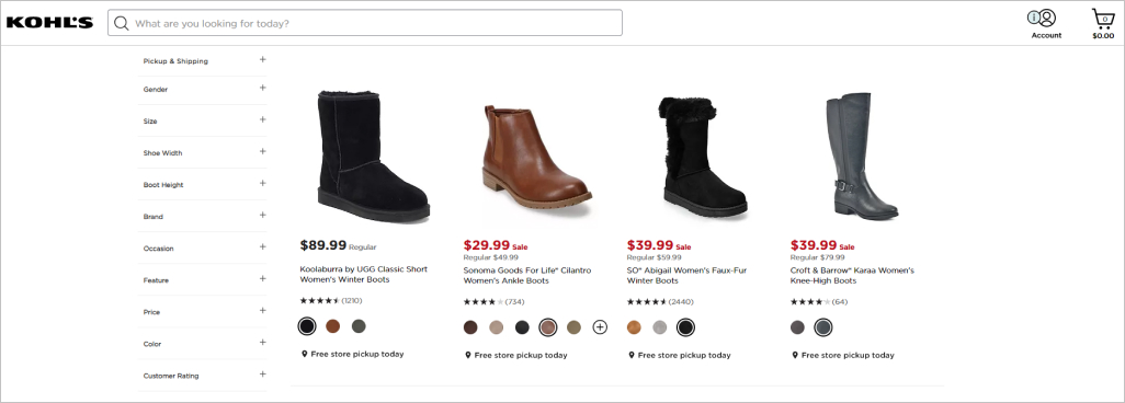
This product category page from Kohl’s adheres to SEO and UX best practices. Each product has a star rating along with clear prices and product variation viewing options when applicable. Instead of taking viewers to another page, they can just click on the colored dots to see the same product in different colors. There’s also a filter system on the left-hand side, allowing shoppers to select products according to price, gender, color, ratings, and more.
IKEA
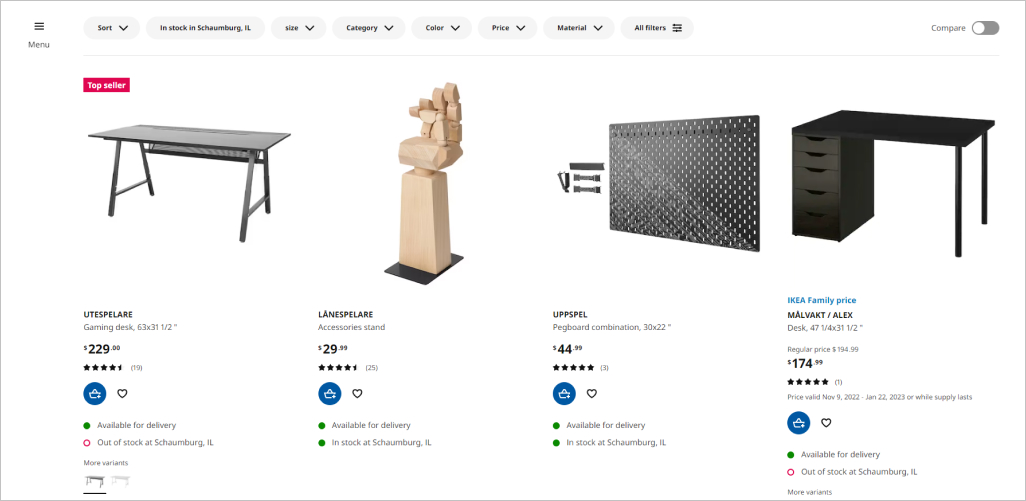
Ikea needs no introduction. In the context of product category pages, their UK and USA pages are slightly different. The US product images are interactive, whereas the UK ones are static.
Each has distinct advantages:
- Interactive: These images offer higher engagement and are great for lookbooks, especially to encourage shoppers to buy an entire outfit, or in this case, a furniture/decor collection.
- Static: These are more straightforward and work well when shoppers are past the discovery phase and already know exactly what they want.
Apple

Simple, clean, and to the point. Apple’s product category page has high-quality images and blue call-to-action buttons that contrast with the white background, providing a clear path to purchase. Because MacBooks look the same, they’ve made the shopping process easier by offering Shopping Guides and assistance from specialists. This smartly ensures those who aren’t tech-savvy aren’t dissuaded by their lack of technical knowledge from making a purchase.
Marks & Spencer

Marks & Spencer is a good example of how fashion brands can make their category and product pages more editorial and less like their products come from an Amazon shipping warehouse. You’ll also see how great their filter system is, allowing shoppers to view products according to brand, size, product type, and other categories. For fashion brands, it’s always a good idea to include full-body images of models wearing garments, so shoppers can see how the clothing fits and flows.
Conclusion
Category page optimization allows for an easy selling process and fluid design that’s simple to navigate. Of course, don’t forget that digital marketing can only go so far. Great products are important for attracting and keeping your customers. They’re also a key to high SEO rankings.
For help creating category and subcategory pages or a website that delivers results and ranks highly on search engines, contact our digital marketing experts. Comrade is a full-service digital marketing company that’s helped many eCommerce businesses. On average, our eCommerce clients achieve a 65% increase in sales year-on-year. We’d love to hear from you!


