Building a website is tricky.
According to a Stanford study, 75% of prospects will judge your credibility based on your website alone.
Your mission (if you choose to accept) is to build a beautiful, mobile-friendly site that deftly guides visitors toward calling, booking, or requesting a quote.
Personally, we’ve built over 300 websites since 2008. We’re super picky about what we consider “good” because we know how HARD it is to generate qualified leads.
So, with that said, what does a great website even look like? We got you! Let’s look at the top-ranking, highest converting contractor websites in 2026.
Best Construction Company Design in 2026
Pop open a Google doc. It’s time to take notes!
We’ll drop the top 30 contractor website examples that seriously impressed us. These were gathered carefully by our team from well over 100 options.
We picked the ones that rank well, have great messaging, and most likely generate a ton of customer inquiries. Keep scrolling.
- Absolute Home Services
- Apex Window Werks
- Quality Exteriors
- Fluid-Aire Dynamics
- Kitchen Cabinet Guys
- Forbel Commercial Security Systems
- Euro Maids
- Stone Center
- Granite Selection
- Safety Garage Door
- Cedar Rustic Fence
- HX Home Solutions
- Majestic Tiles
- Aurora Doors and Windows
- Zicklin Contracting
- Model Remodel
- West Village General Contracting
- Triond
- Bellweather Design-Build
- Harjo Construction
- Florida Palm
- Mission Home Remodeling
- Schmitt Company
- Oasis Builders
- DPR Construction
- DYNA
- Castle Homes
- Novo Construction
- Honest Renovators
- Continental
1. Absolute Home Services
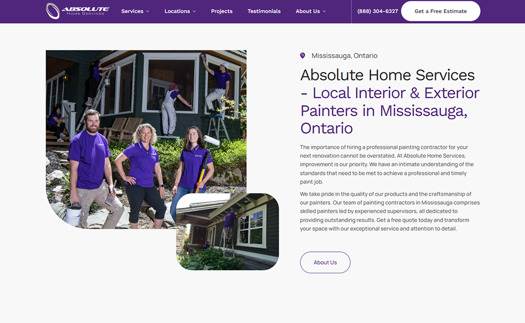
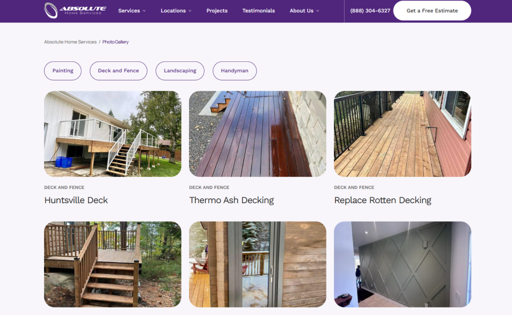
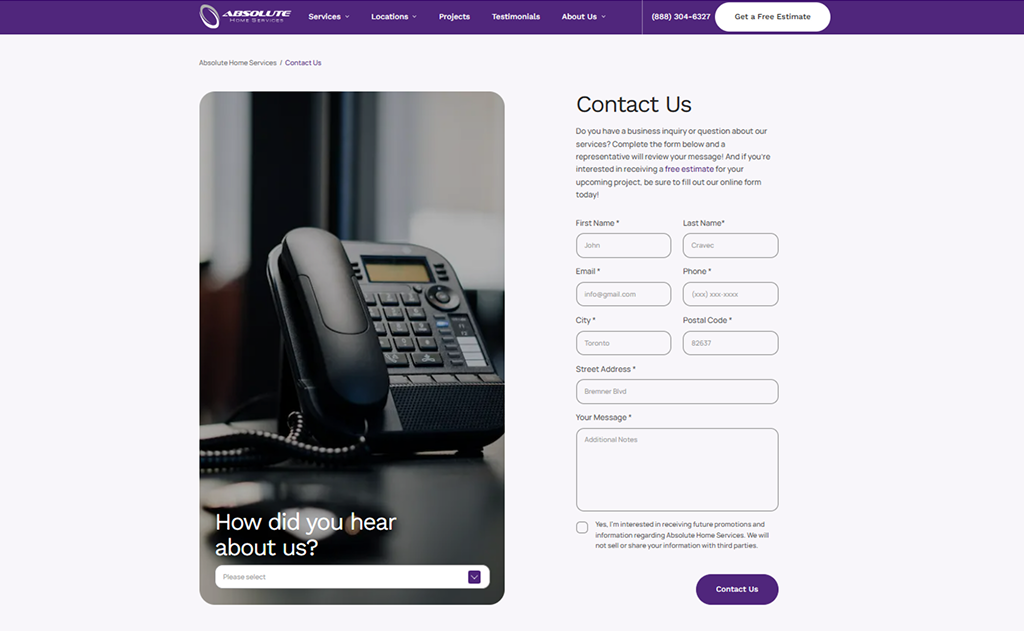
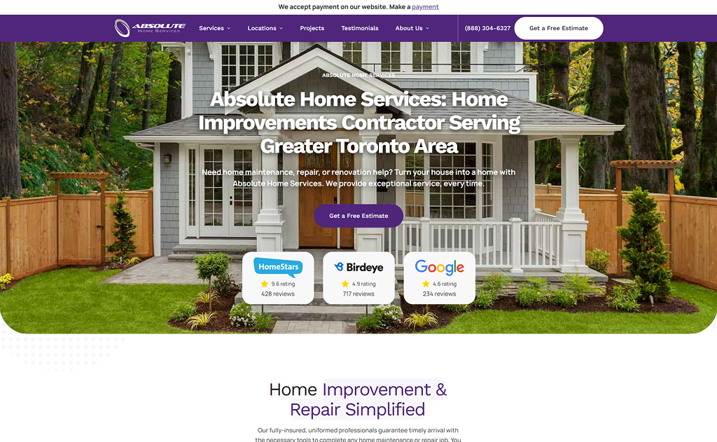
Absolute Home Services has one of the most user-friendly contractor websites in the game!
Their homepage oozes trust with high review ratings across Homestars, Birdeye, and Google, plus a bold “Get a Free Estimate” CTA that’s impossible to miss. Plus, they immediately confirm what they do and which location they serve.
And their website paid off big time: after partnering with Comrade, Absolute Home Services saw a 5,117% increase in organic traffic and a 922% jump in qualified leads. A perfect example of design and strategy working together.
Ready to improve your rankings? Find out how SEO for contractors can drive more traffic to your site.
2. Apex Window Werks
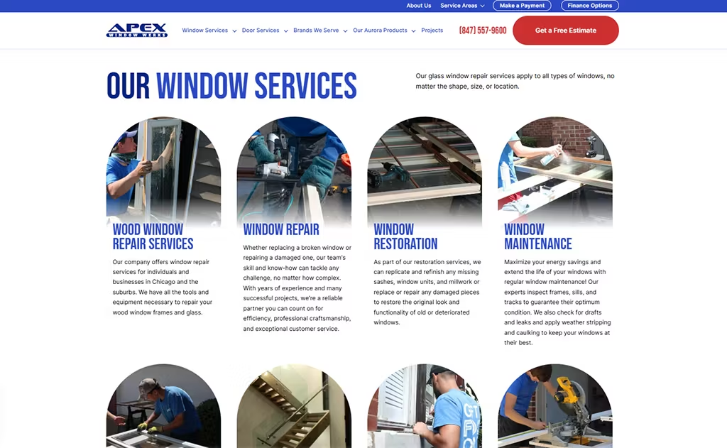
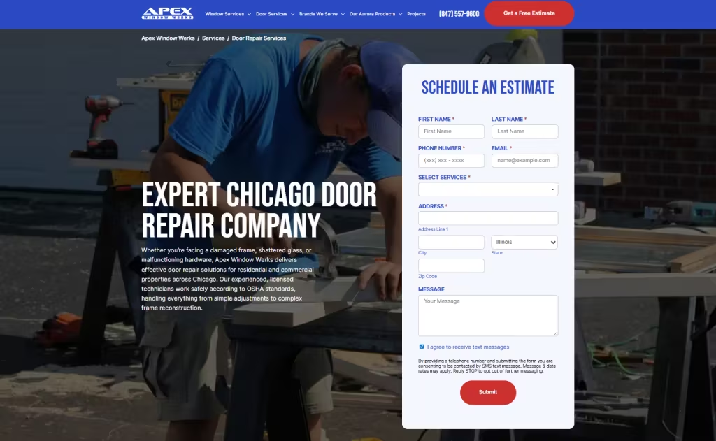
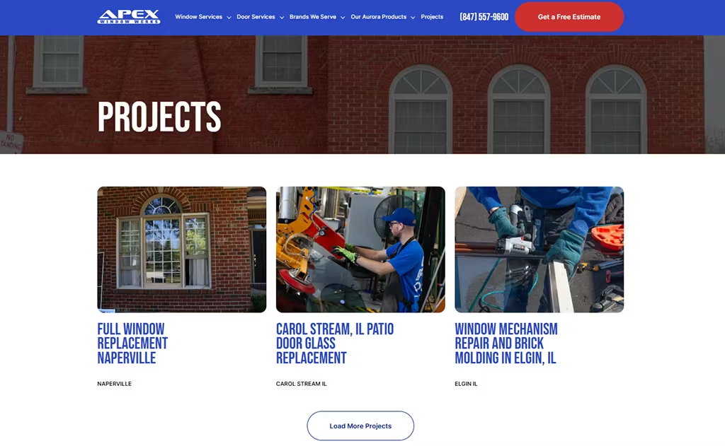
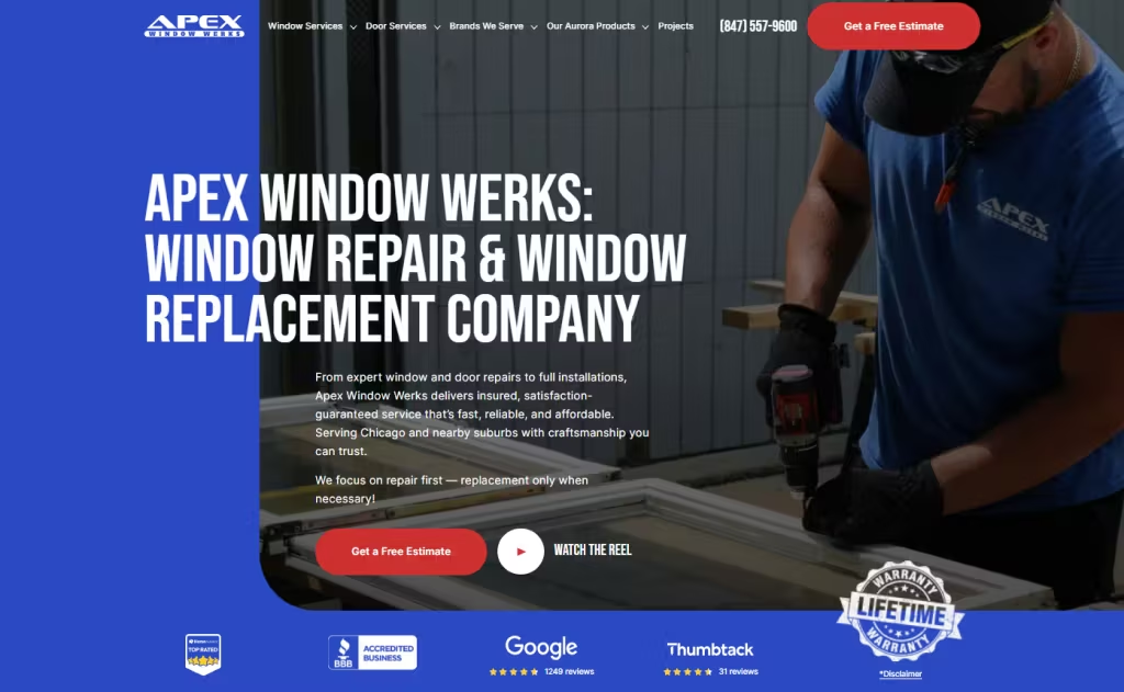
Want a masterclass in brilliant contractor website design? Apex Window Werks is a great example!
The clean blue-and-white layout, bold red “Get a Free Estimate” CTA, and clear messaging (“We focus on repair first”) instantly inspire confidence in the reader.
The homepage backs this up with strong social proof: over 12,000 happy clients, 4.8 average ratings, and badges from the top review platforms!
After partnering with Comrade, Apex saw a 1,063% increase in organic traffic and a 55% drop in cost per lead. All in all, this was a website that paid for itself (and then some!)
3. Quality Exteriors
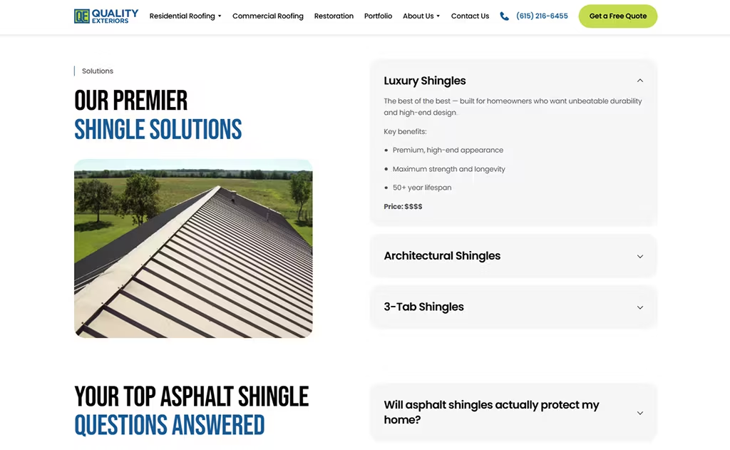
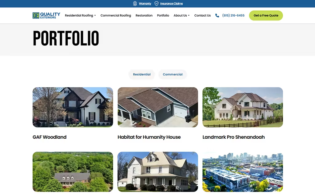


This one raised our eyebrows. Quality Exteriors has one of those contractor websites that looks fresh.
They orient the reader instantly with the headline: “Roofers Serving Middle Tennessee.”
From there, you also see a “Free Quote” CTA that “sticks” i.e., follows you as you scroll.
We personally love how easy it is to browse roof replacements, storm repair, or commercial roofing right on the homepage.
And don’t ignore the trust factors! Mentions like “100% customers recommend us” eases homeonwer anxiety instantly.
Roofing is a costly investment. That’s why QE is a prime example of what a 10/10 contractor website service can do.
4. Fluid-Aire Dynamics
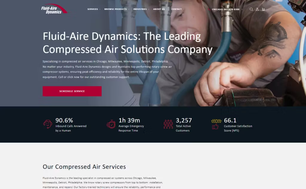
We strongly recommend shortlisting Fluid-Aire Dynamics.
Their site grabs the eye by using bold red accents on its buttons, and strong mentions of 3,000+ active customers.
People love to see numbers like that! Once you scroll a bit, you’ll see that Fluid even has a fly-through video of their Chicago Office. That type of behind-the-scenes content humanizes them.
If you have the budget for a custom video like this… go for it!
After partnering with Comrade to build this site, Fluid-Aire Dynamics saw a 1,127% jump in organic traffic and 955% more leads, proving the worth of a strong contractor web design.
5. Kitchen Cabinet Guys
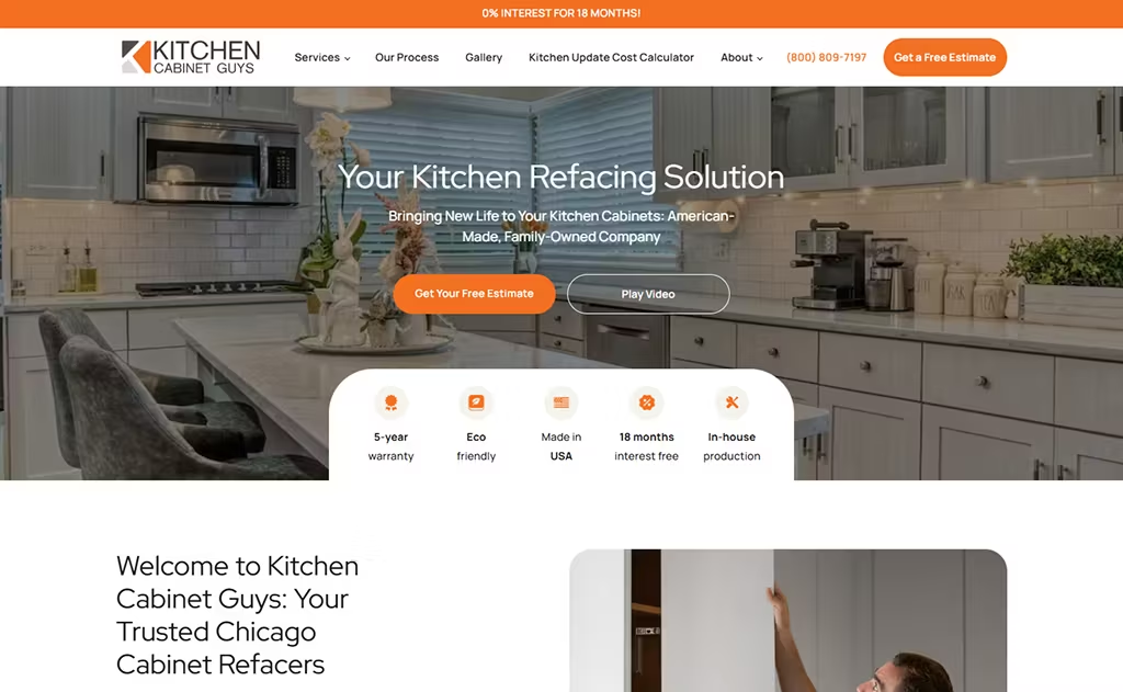
Kitchen Cabinet Guys is another worthy contender. Check out their modern website design for contractors.
Confession: We built this! We intentionally chose the bright orange palette to pull visitors in.
The hero section leads with “Your Kitchen Refacing Solution,” and a clear “Get Your Free Estimate” button. You also see a 4.9-star rating, which as we all know, is a great trust-booster.
From there, their service blocks are easy to skim, making it simple for readers to explore refacing, door replacement, or thermofoil repair.
After partnering with Comrade, KCG saw results! Their organic traffic leaped by 16,450% and online leads skyrocketed by 194%, proving how powerful website design for contractors can be.
6. Forbel Commercial Security Systems

This contractor website took us by surprise.
It appears stodgy at first glance with longer content sections, and a gray aesthetic, but then surprised us with pops of orange and friendly team pictures.
Their hero section is as clear as can be: “We plan, design, install, and integrate.”
You’ll notice how the page immediately backs up its credibility with real numbers: 421,800+ security devices installed, 1.63M sq. ft. protected, 748+ happy customers.
Scroll a bit, and everything is laid out exactly how a busy property manager wants it — Video Surveillance, Access Control, Intercoms, Fire Alarms.
If you want a contractor website that builds trust in seconds, this one sets the bar.
Running low on jobs this month? Think about hiring a contractor SEO agency and save yourself the costly mistakes.
7. Euro Maids
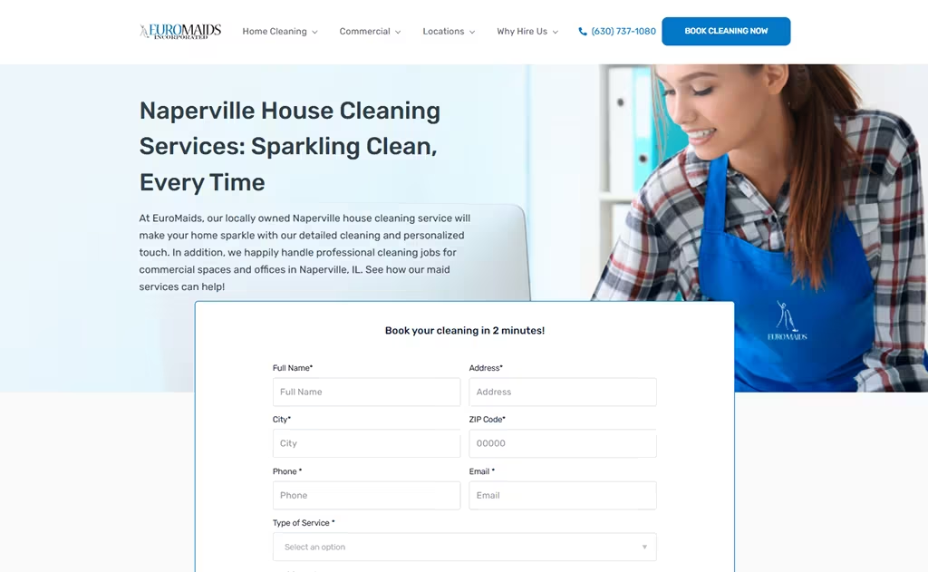
Euro Maids is another great pick (you’ll soon see why)!
It’s one of those RARE contractor websites that’s friendly, but still exudes confidence.
The second you land on the homepage, you’re greeted with a form: “Book your cleaning in 2 minutes!” backed by a sweet $45 savings deal.
We personally like the value props (“insured cleaners,” “eco-friendly products,” “on-time arrival”). Nervous homeowners love stuff like this.
And yes, we built this. After our redesign, Euro Maids saw a 11,671% improvement in traffic. This is an example of how website design for cleaning contractors can translate directly into leads and revenue.
8. Stone Center
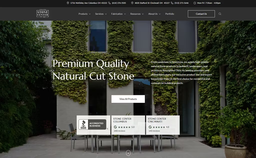
Stone Center’s website gives off “premium” energy.
Yes, we built this. And yes, we made some very intentional choices!
We chose a soothing gray-and-white palette to do justice to its high-end products and pricing. From there, we immediately back it up with “trust booters”: a 5-star rating on Google and 72 years on the market.
Up top, you see: locations, hours, featured products, and quick links to Columbus or Cincinnati ordering. Convenience is king, after all.
Did the effort pay off? After Comrade’s redesign, Stone Center got a massive 6,700% increase in qualified leads, so we’d say, yes!
Struggling to rank on page #1 and get leads? Read our guide to Local SEO for Contractors.
9. Granite Selection
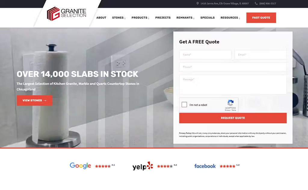
What is the first thing you notice about Granite Selection’s website?
For us, it’s the eye-catching images of their work, right in the header!
Take note of the form up top. It’s fantastic for conversions (we’ll even show you proof).
For a customer, seeing 14,000+ slabs in stock is exciting and assures them they have options. You’ll also see attractive pictures of each stone countertop as you scroll.
Remember, in this business, adding attractive visuals is so important. It’s literally what keeps people browsing, and eventually booking.
With Comrade’s redesign and marketing strategy, Granite Selection saw 780% more qualified leads and a 1,615% surge in organic traffic. We told you we had proof!
This is a testament to great contractor website services.
10. Safety Garage Door
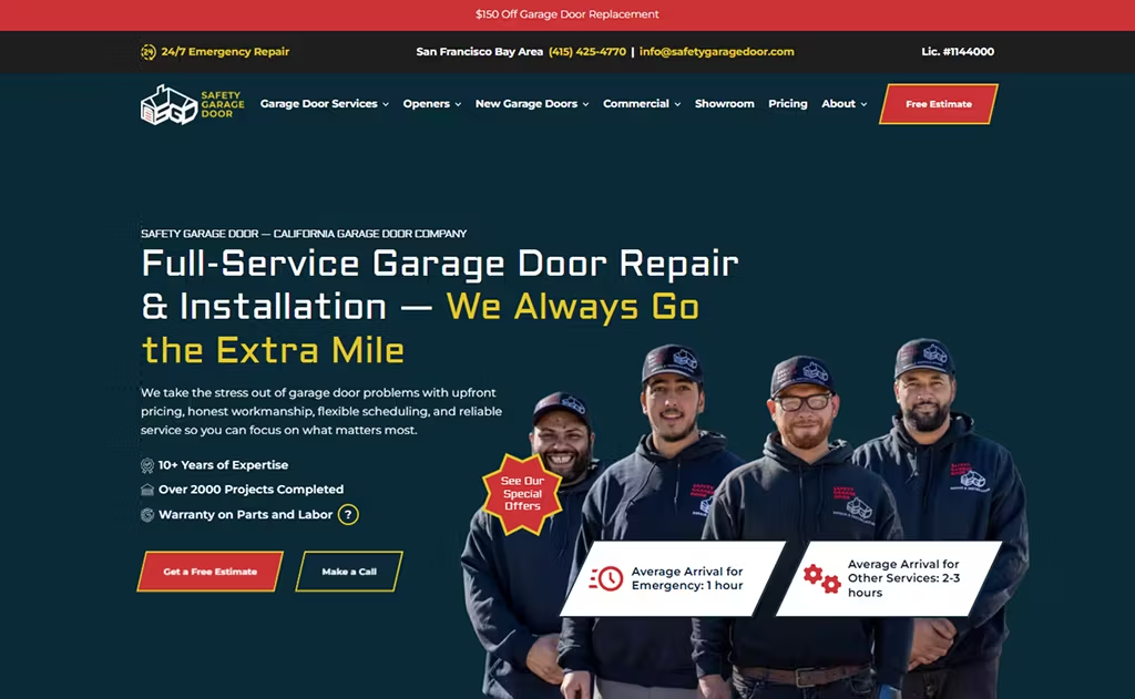
Safety Garage Door’s website is very Millennial and Gen Z-friendly.
It has a sleek, attractive look, with great conversion boosters in the header: “10+ Years of Expertise” and “2000 Projects Completed.”
One thing that sets it apart from the other websites on this list is the variety of special offers, going as high as $150 off their garage door repair.
Fun fact: We built this site! Comrade revamped their website and marketing, and Safety Garage Door saw 736% more qualified leads, along with 33% more organic traffic, and an 84% drop in cost per lead. All in all, a rousing success.
11. Cedar Rustic Fence
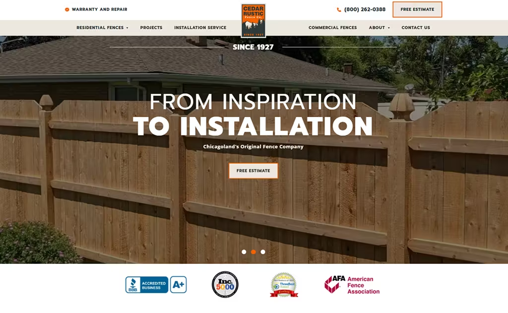
“150,000 fences installed.” That’s one of the first things you see on Cedar Rustic Fence’s website, and it’s a very impressive stat!
Their homepage is packed with this kind of credibility. With 97 years in business, 10M+ LF of fences manufactured, and thousands of cedar, vinyl, aluminum, and chain-link options, they make it easy for homeowners to take action.
Did the website pay off? Well, when Comrade rebuilt their digital strategy, Cedar Rustic saw 461% more qualified leads and 306% more organic traffic. So, we’d say yes!
12. HX Home Solutions
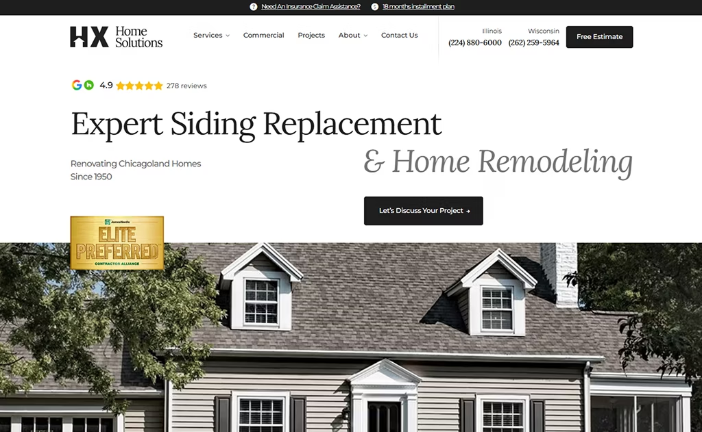
If you want to reinforce your legacy, take a peek at HX Home Solutions’ website.
One of the first things you read is: “Renovating Chicagoland Homes Since 1950.” Boom! Just like that, credibility established.
We also love that they clearly mention their offerings: siding, roofing, windows, and full home remodels in Chicagoland. This is supported with plenty of 5-star testimonials (very impressive!).
Overall, this site makes it super easy for Chicago homeowners to find a home reno solution, and even seek insurance-claim support.
This is the kind of website people remember.
13. Majestic Tiles
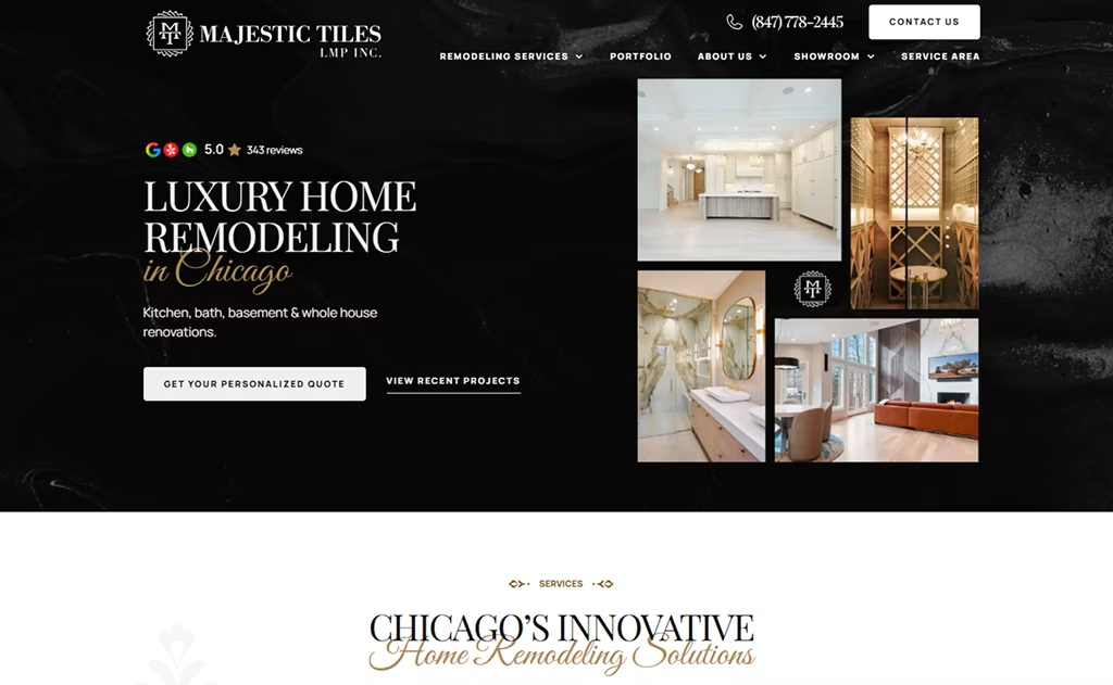
Thinking about building a luxurious site? Check out Majestic Tiles.
It’s one of those remodeling websites that exudes its tagline to a T: “Bespoke, Luxury Remodeling”.
They use all the hallmarks associated with a premium experience, including deep blue and gold accents, along with attractive photography. We want to redo our entire homes after this.
To set the nervous homeowner at ease, Majestic Tiles treats them to 5-star ratings across 300+ reviews.
As always, testimonials go very far. This site stacks them to the rafters! Great job, overall.
14. Aurora Doors and Windows
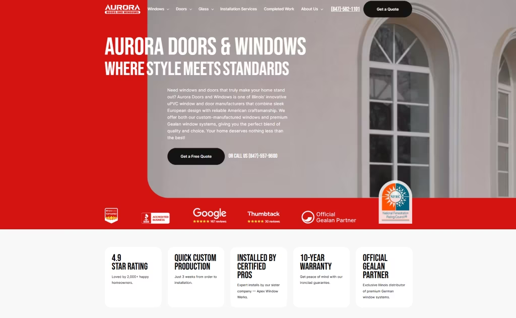
Aurora Doors & Windows is one of those sites you open and instantly think, “Okay… these people know what they’re doing.”
The red-accented homepage kicks off with a detailed header along with a “Get a Free Quote” button and contact number.
You’ll notice the standouts right away: 4.9-star ratings, 10-year warranty, fast 3-week custom production, and plenty of window options.
They make it clear that they’re Illinois’ official Gealan partner, delivering premium German engineering with certified local installation. That kind of upfront messaging always lands!
Bring Your Vision to Life! With 18 years of experience, you can trust our contractor website development team with your project.
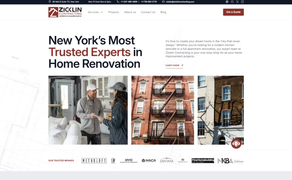
15. Zicklin Contracting
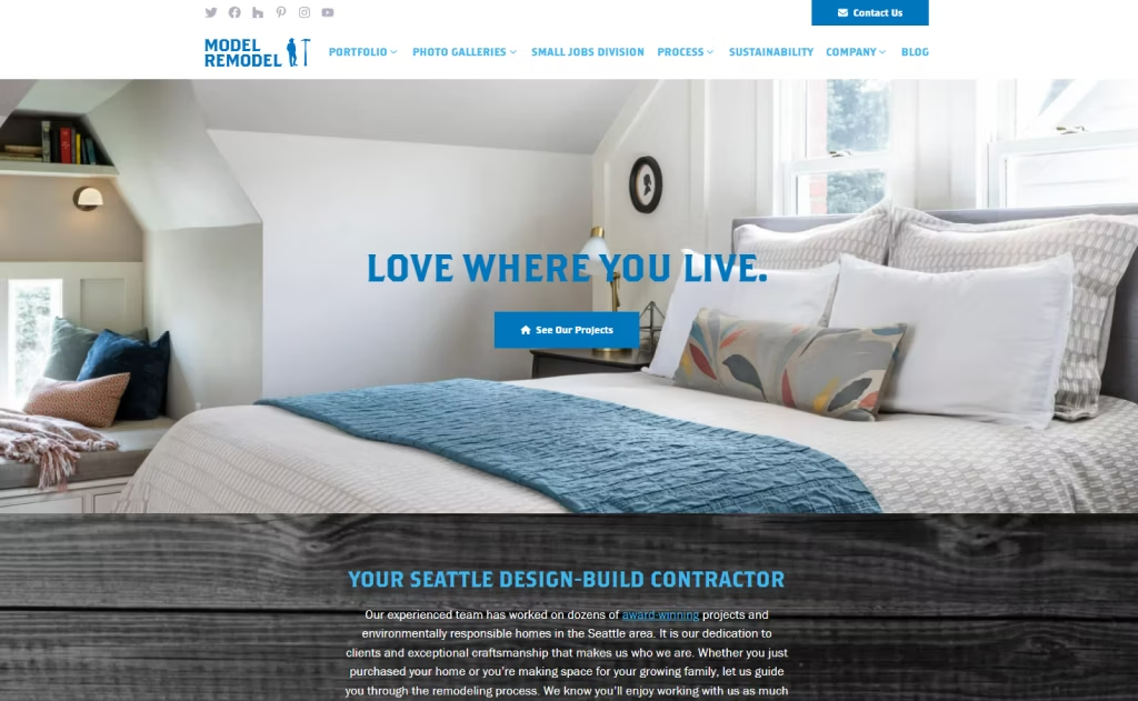
16. Model Remodel
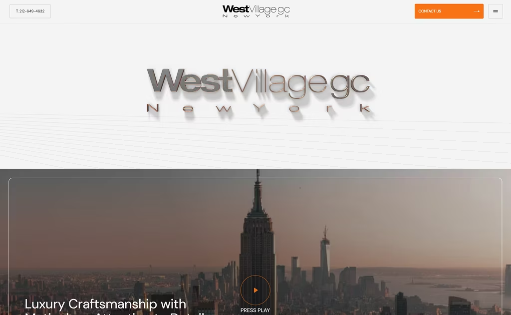
17. West Village General Contracting
18. Triond

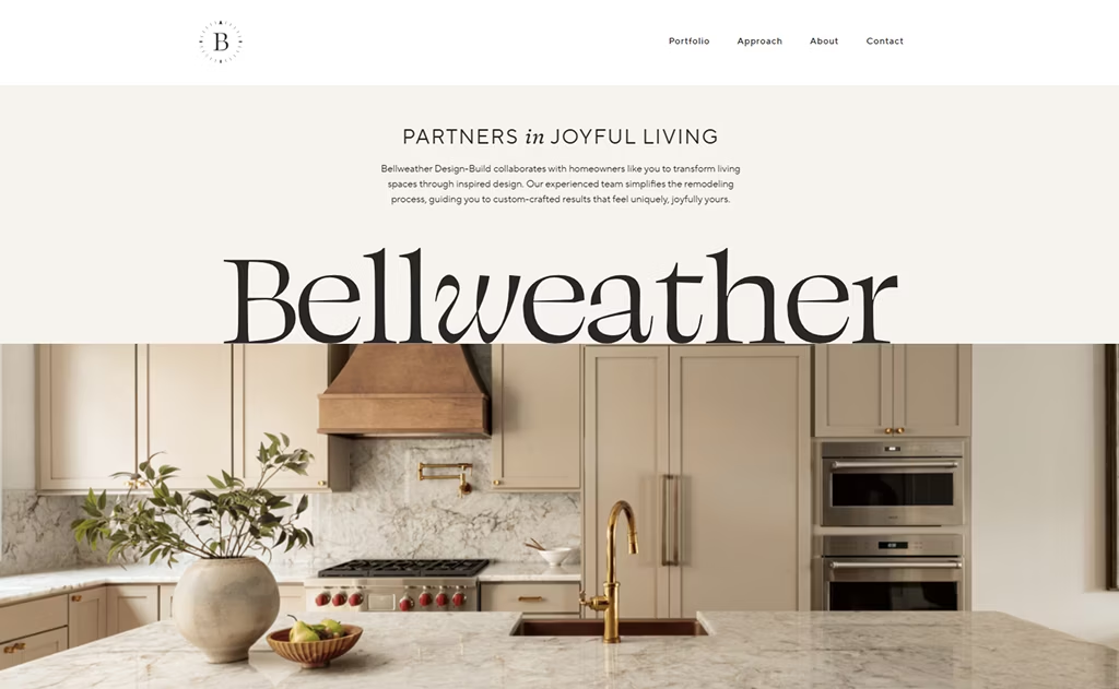
19. Bellweather Design-Build
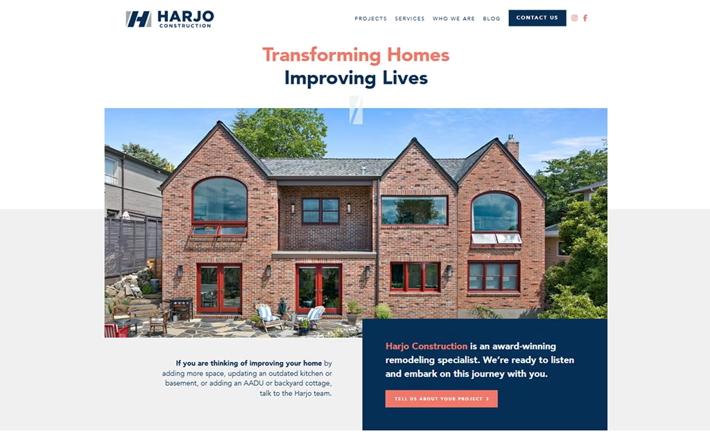
20. Harjo Construction
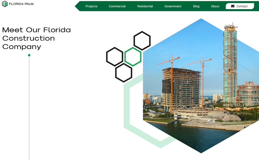
21. Florida Palm
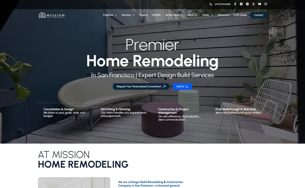
22. Mission Home Remodeling
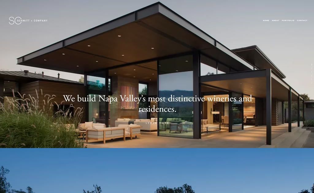
23. Schmitt Company
24. Oasis Builders
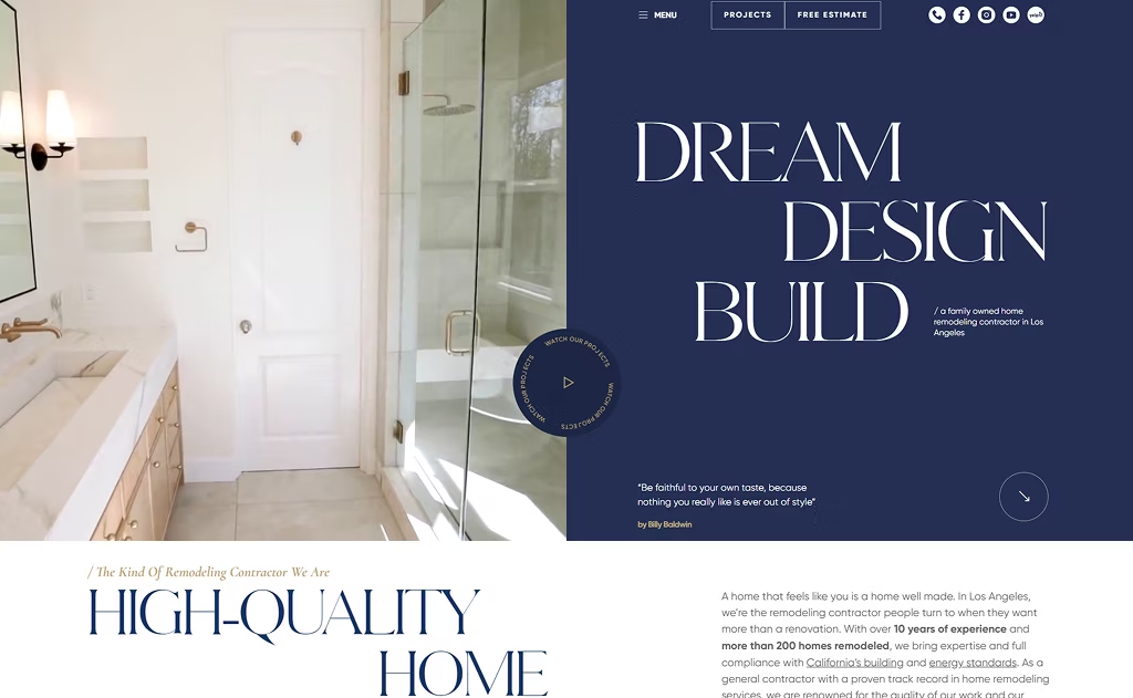
25. DPR Construction
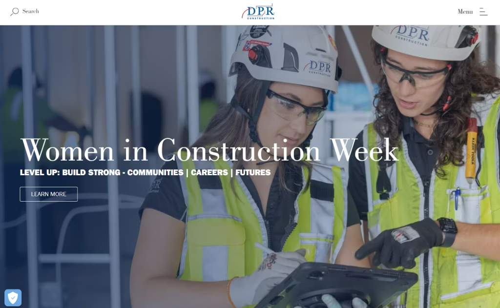
26. DYNA
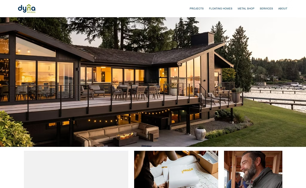
27. Castle Homes
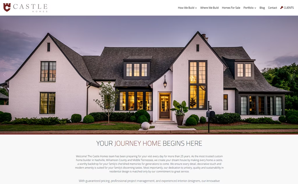
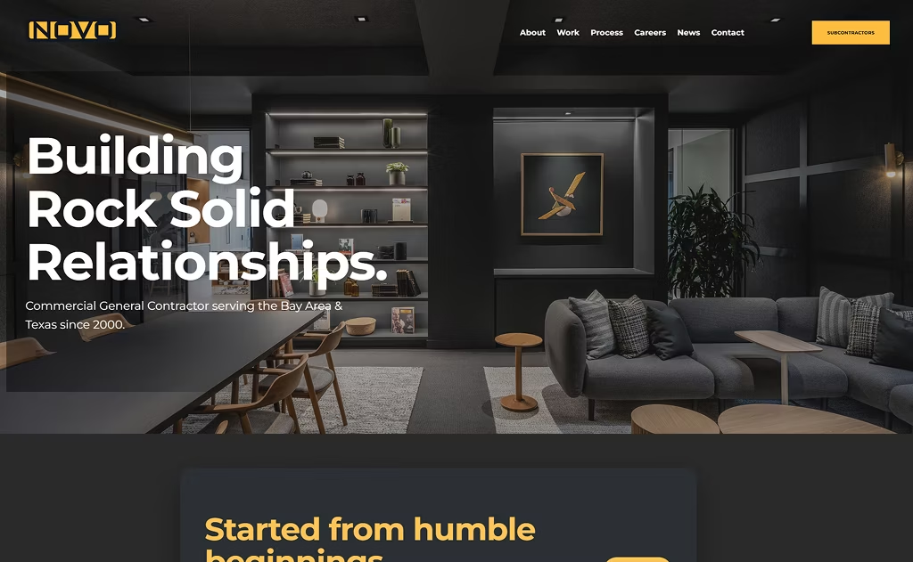
28. Novo Construction
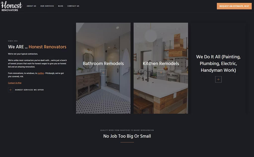
29. Honest Renovators
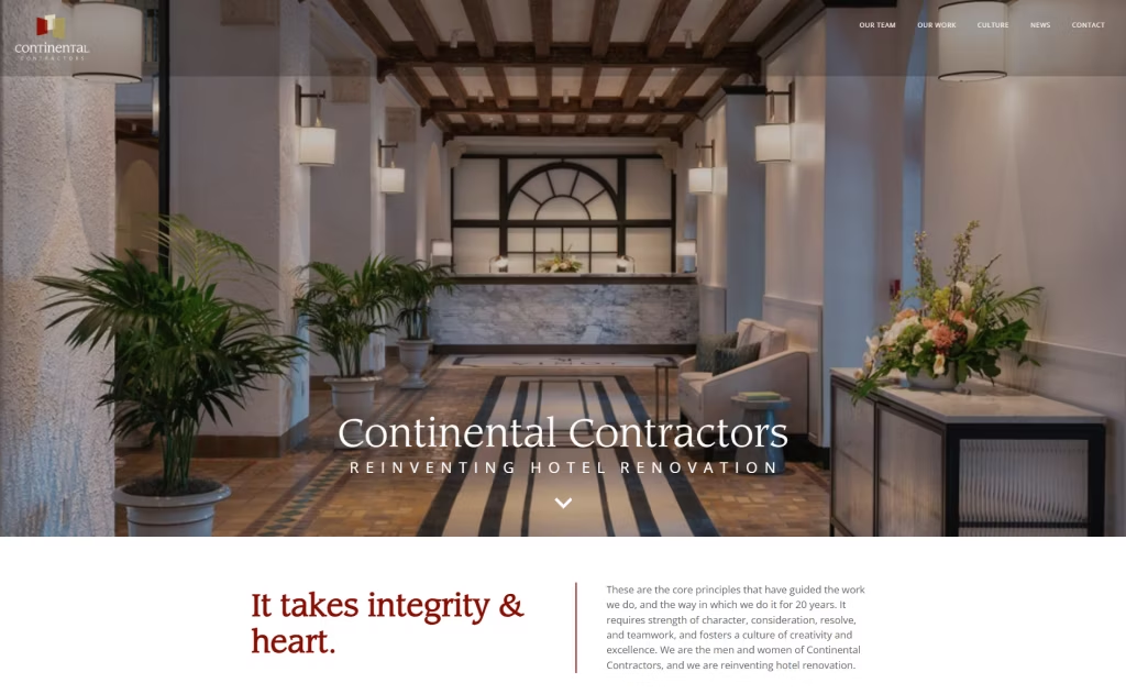
30. Continental
What Makes the Best Contractor Websites? Key Design Elements
As we mentioned at the beginning, there are a few things to consider when designing contractor websites that make it extremely easy for construction companies to attract new business.
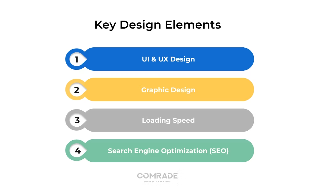
UI & UX Design
UI and UX design go hand in hand to shape how visitors experience your contractor website.
UX (User Experience) focuses on the journey — how easily someone can go from reading a blog post to contacting you.
UI (User Interface) is the visual side — the layout, buttons, and overall look that make interactions feel smooth and intuitive.
With a strong UI/UX, you can dramatically reduce bounce rates, boost conversions, and strengthen your online presence. And with mobile devices driving 63% of organic searches, a mobile-friendly design is vital.
Graphic Design
Use strong graphic design to give your contractor website clarity, impact, and flow!
Instead of crowding the homepage, a well-designed site highlights ONLY what matters — your logo, navigation, headline, CTA, and clean visuals that showcase your work.
White space (which can boost readability by up to 20%) keeps everything breathable and prevents your homepage from feeling overwhelming.
By arranging elements with intention, you create a website that’s easy to navigate.
Loading Speed
Your contractor website should load in 3 seconds or less! After that mark, your bounce rates skyrocket, with nearly 40% of consumers abandoning slow pages.
Even a one-second delay can tank conversions and lower your visibility on Google.
Fast-loading websites consistently earn more traffic, more leads, and better engagement. If your site feels sluggish, tools like Pingdom can help you diagnose issues so you can compress images, clean up code, or upgrade hosting for a smoother, faster user experience.
Search Engine Optimization (SEO)
These 30 contractor web designs aren’t just beautiful to look at. They also rank well on Google.
That’s where the eyeballs are! That’s why you need a strong SEO strategy.
On-page SEO helps search engines (like Google) rank your content. This means having a great site structure along with highly relevant keywords.
We also stress the importance of technical SEO to ensure your site is mobile-friendly and loads in under 3 seconds.
But hey, don’t forget local SEO! This optimizes your Google Business Profile to get found by local homeowners; basically, your actual customer base.
Together, these strategies boost visibility, attract qualified leads, and strengthen your Contractor SEO!
How We Selected the Best Contractor Websites
We didn’t just pick good-looking sites. We chose 30 contractor websites that perform.
Each one excels in user experience, trust-building, and conversion strategy. Here are the exact criteria we used:
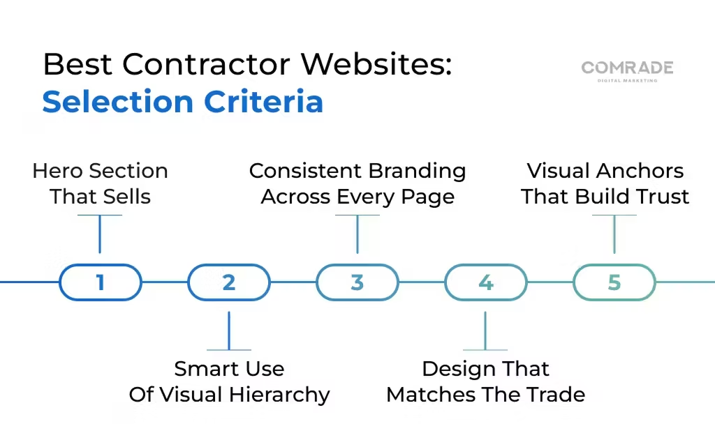
Hero Section That Sells
A great contractor website grabs attention right away. We looked for hero sections with bold visuals, clear headlines, and strong calls-to-action.
These sites make it obvious who they serve and why they’re the right choice — all within the first 3 seconds of landing on the page.
Amazing Visual Hierarchy
The 30 contractor website examples you just saw are not accidental.
You’ll notice that every single one guides users through the right info with one single goal: To get them to hit that “Contact” button.
From our list of 30, you’ll see we chose websites that use great colors, spacing, and a logical flow to serve this goal. Again, go take a look.
The user’s next steps should always be obvious and intuitive.
Consistent Branding on Every Page
To quote Forbes: “Prioritizing consistency will help you build a strong brand that is instantly recognizable and beloved by its audiences.”
We agree! That’s why every single page on your site must have consistent colors, fonts, messaging, and imagery.
And the payoff is real. Design Rush points out that brand consistency can contribute 10 to 20% to a company’s revenue growth.
Design Should Complement Your Trade
Imagine an affordable roofing contractor whose website features photos of premium interior living rooms.
These do not match.
It would make more sense for this roofing site to show off before-and-after roof replacements, high-climbing safety gear, and affordable pricing quotes.
The best contractor websites reflect their specialty in words and visuals. Don’t drop the ball here.
Visual Anchors That Build Trust
Trust signals matter.
We selected websites that prominently feature reviews, certifications, badges, warranties, and completed projects.
These visual anchors instantly communicate reliability and reduce buyer hesitation, making it easier for visitors to say, “Yes — this is the contractor I want.”
Your Website Start Here
Hire a Professional Contractor Website Design Company
You just saw 30 of the best contractor websites, and we hope you’re feeling inspired!
But here’s the truth: knowing the top elements is one thing… building a high-performing site on your own is another.
Without the right skill set, it’s easy to burn time, lose leads, and make costly mistakes.
Contact Comrade today. For over 18 years, our team has been tirelessly doing web design for contractors. 100+ clients have seen lead increases as high as 400% after launching their new websites.
Let’s build your new site together: Explore our web design services today.
Frequently Asked Questions
-
What should a contractor website include?
It is important that your contractor website includes information about your firm, its areas of expertise, and its workers. Also, show how clients can contact you on your contact page.
-
Should a contractor have a website?
In today’s world, contractors can benefit a lot from having their own website, and given the low cost of entry, there’s no excuse not to do so.
-
Why do contractors need a website?
All in one, it serves as a business card, a sales pitch, and a portfolio. A contracting website serves the most important function of facilitating communication. Displaying your contact information prominently and providing a quick way to contact you empowers homeowners to begin a conversation
-
Where do you offer web design services for contractors?
Comrade originates in Chicago, but we worked all around the United States. We can help your business grow and increase revenue whenever you are. We have offices across most major cities in the US. For example, we can offer digital marketing services in Cleveland or New Orleans. You can even find our internet marketing experts in Cincinnati! If you want to know more about our Minneapolis digital marketing agency or find out how exactly we can help you, contact us via the phone or email.
