Modern furniture websites are often the first interaction customers have with brands. A website can make or break brand perception. Case in point: 75% of people base a company’s credibility on its website.
So, your potential furniture customers are judging your furniture store based on your online presence. Working with an experienced web agency that understands your furniture stores’ goals and customers, can have a positive impact on your brand.
The truth is, whether you’re an outdoor furniture, vintage furniture, or custom furniture brand, most stores offer the same thing, i.e., “high-quality furniture” that appeals to customers’ budgets and sensibilities.
So, how do you stand out?
By designing a remarkable website where form and function meet!
A great furniture website design incorporates the following:
- UI and UX design
- Graphic design
- Loading speed
- SEO
- Your unique selling proposition
With all the contemporary websites available today, it can be challenging to find a look and feel that distinguishes your furniture store from everyone else’s.
To help, we’ve assembled an impressive list of the best online furniture stores that meet the highest digital marketing standards. Thoughtful design, fast loading times, user-friendly navigation and beautiful aesthetics were some of the criteria we considered when compiling this inspiring list.
Furniture Websites You Should Visit
Ballard Designs
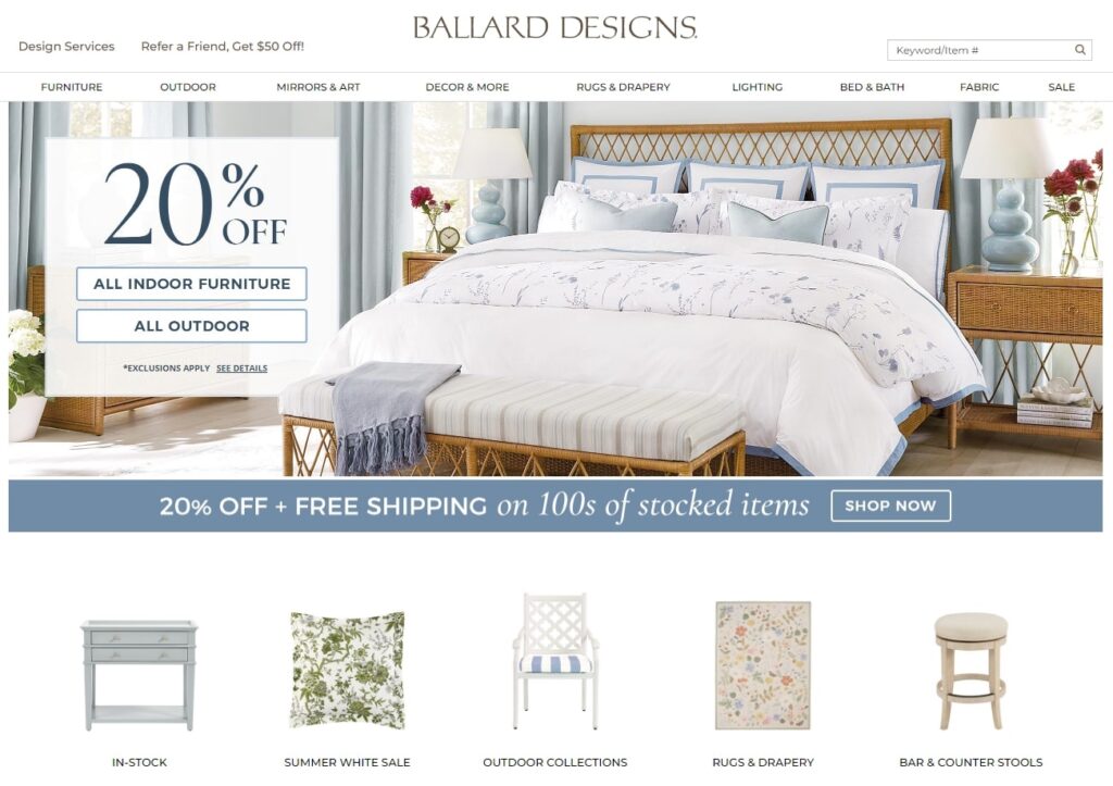
The first site in our list of top furniture sites is Ballard Designs. It’s remarkable due to its superior functionality, which includes product tags across its entire layout of rooms. Its enticing hero-banner discount offer is also a smart advertising tactic to increase furniture buying online.
IKEA
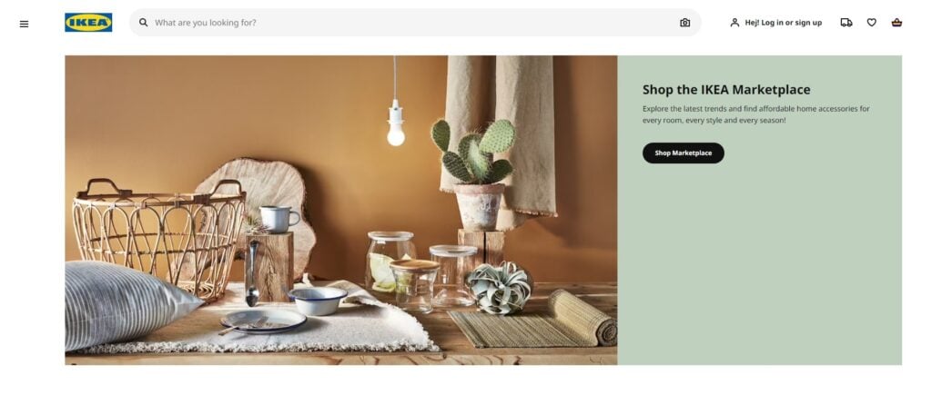
This Swedish furniture company needs no introduction. Ikea mastered the use of the website search bar. It knows that most customers come to its website searching for something like a bed, dining room table or a chest of drawers, for example.
Instead of making visitors scroll through countless catalogue pages, it helps them find exactly what they want. It’s also divided its products according to rooms, for easier navigation. Lastly, its decor app is a brilliant marketing tool, allowing customers to virtually design their interiors with their product ranges.
Henge
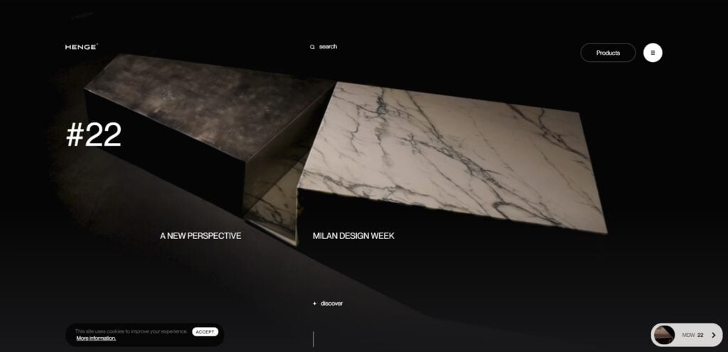
This award-winning website effortlessly showcases the company’s philosophy and aesthetic appeal with timeless pieces, made from natural materials. Its autoplay video is evocative and an excellent illustration of how to visually convey a unique selling point. On the landing page, the text “Milan Design Week” immediately signifies this luxury furniture brand is high-end.
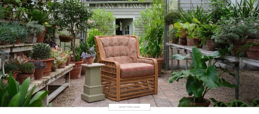
Bunny Williams Home
The most distinctive aspect of this site is its unconventional design, which effectively uses white space to emphasize its striking visuals. Their “Point of View” blog is a great content marketing resource that offers visitors inspiration, insight into finished projects as well as interior decor tips.
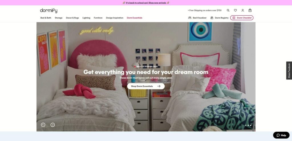
Dormify
Due to TikTok, there’s been an unprecedented rise in dorm room interior design, and Dormify does well to capitalize on this trend. Like IKEA, Dormify has a bedroom visualizer that helps shoppers decide what furniture to buy online, as well as a dormitory registry making it easier for others to purchase gifts too. It’s a good example of how to appeal to a younger demographic.
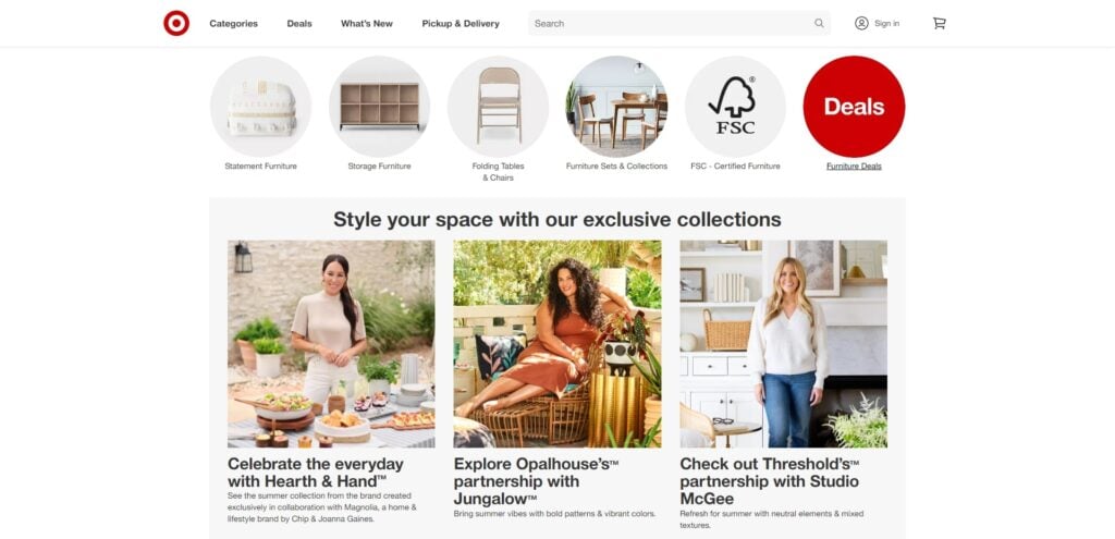
Target
While not the most imaginative website, Target’s filtering capabilities offer a streamlined user experience. It’s an excellent example of how brick-and-mortar businesses can successfully have eCommerce sites, too.
And while the website may err on the pragmatic, without too much visual appeal, Target isn’t a bespoke high-quality furniture store web design company. Therefore, the website actually does a good job of appealing to its target audience. What you see is what you get, and that’s what Target customers pay for.
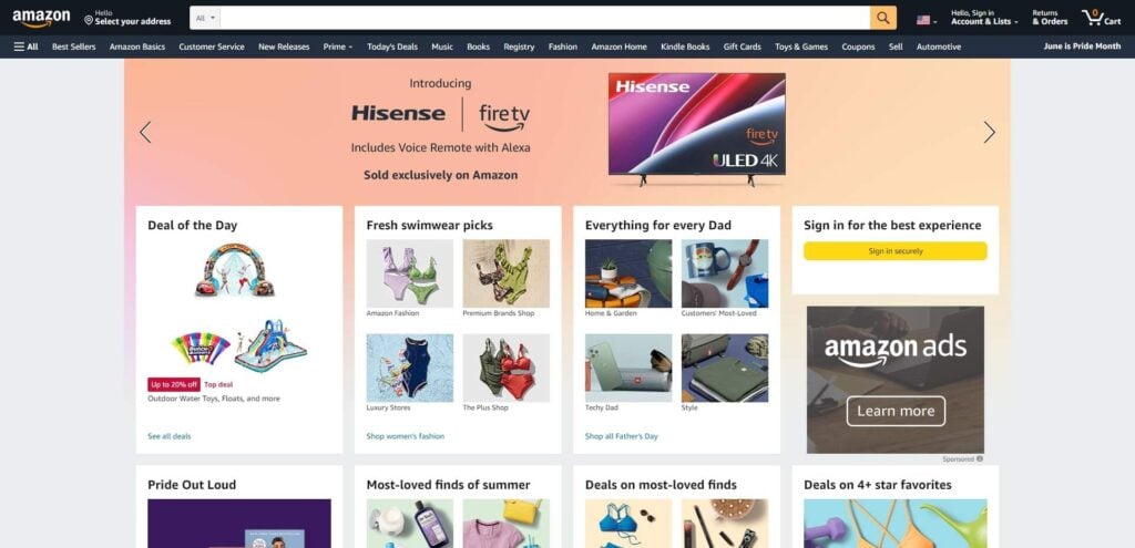
Amazon
While not the most imaginative website, Target’s filtering capabilities offer a streamlined user experience. It’s an excellent example of how brick-and-mortar businesses can successfully have eCommerce sites, too.
And while the website may err on the pragmatic, without too much visual appeal, Target isn’t a bespoke high-quality furniture design company. Therefore, the website actually does a good job of appealing to its target audience. What you see is what you get, and that’s what Target customers pay for.
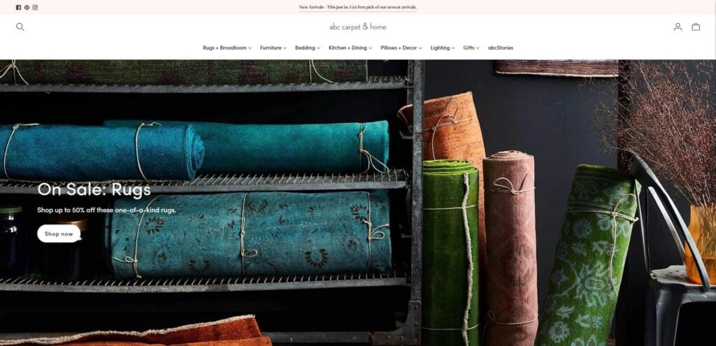
ABC Carpet & Home
This website is unique, like ABC Carpet and Home’s interior design products. Its blog section provides another great example of how to create effective content marketing. Topics range from transforming your space to using lighting as a sculpting tool.
It also requires users to log in before they can do online shopping. Having user accounts increases retention, helps users transition between devices, and provides furniture companies with increased opportunities to personalize marketing messages to targeted customers.
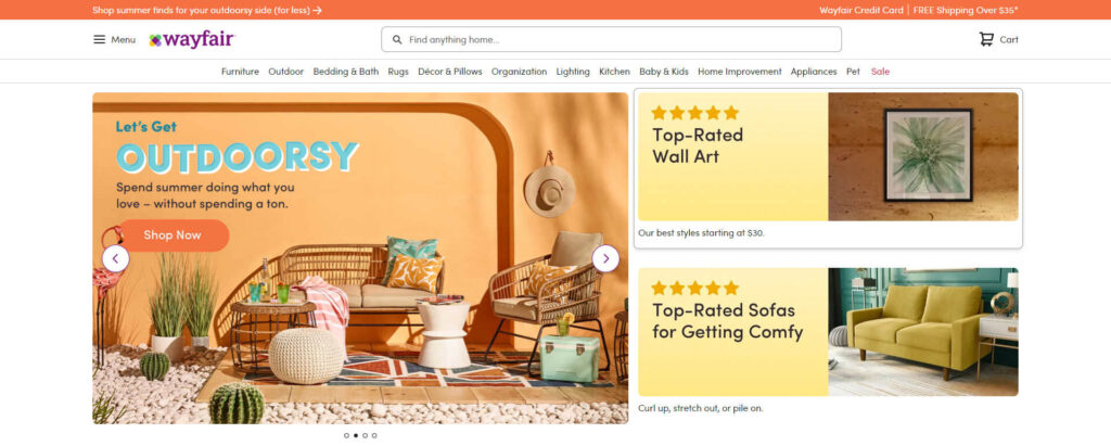
Wayfair
Wayfair believes every person should be able to discover exactly what they’re looking for quickly and easily, which is precisely what you’ll experience on their website via the appealing interface, top-quality UX, and simple-to-use filters.
They also allow users to search for products according to personality traits like, “shade seeker” or “expert lounger,” which is a smart way to introduce users to new products they might not initially be looking for.
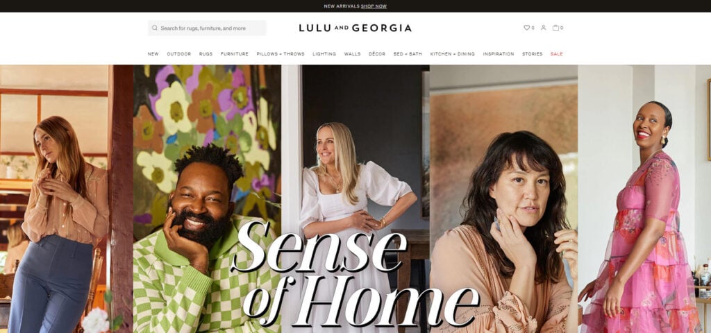
Lulu And Georgia
Lulu & Georgia is an online home decor store that sells the finest and trendiest furniture and decor items. If you’re searching for something stunning, vintage or bohemian-inspired, this website is one to visit. It illustrates how a minimalist design with attractive images can still entice new customers through the “virtual” door.
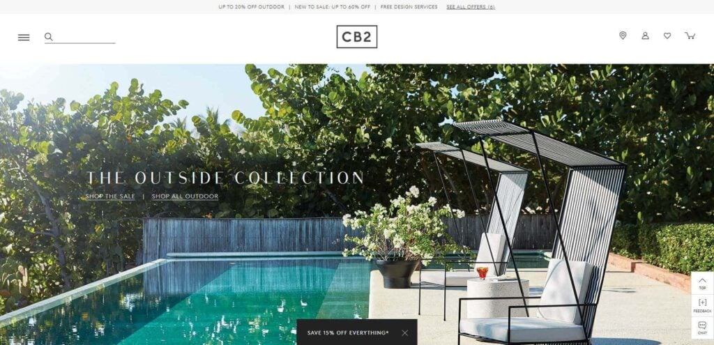
CB2
CB2 is a wonderful, user-friendly, well-designed website that offers furniture and other items for decorating. Its strong emphasis on visuals immediately grabs viewers’ attention, while its autoplay video encourages visitors to click through to their bespoke furniture collection.
Interestingly, they also categorize products by shipping duration with “pickup,” “ready to ship,” and “ships within 6 weeks.” CB2’s product detailed descriptions also provide enough information for customers to know whether the furniture fits their needs.
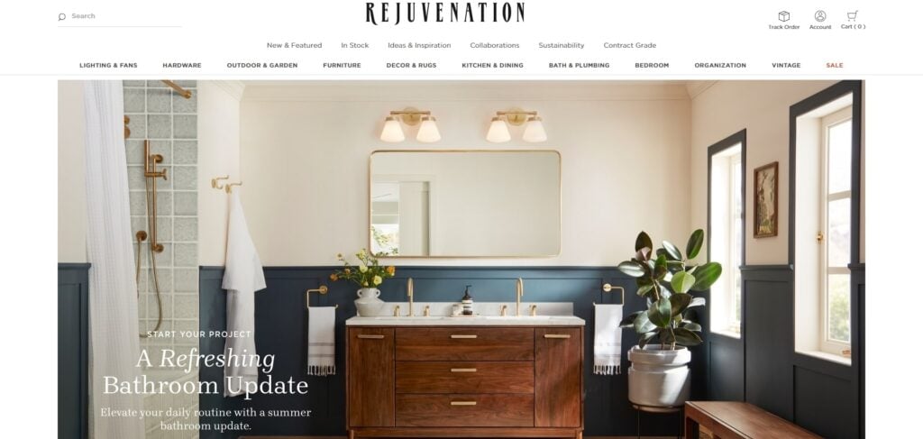
Rejuvenation
One of the many proven tactics we use in digital marketing is lead capture forms. These capture information to build your email list while sharing important content with your audience. This is the first thing that pop-ups when you visit Rejuvenation’s website, which is a smart way to attract new leads.
Additionally, the website’s extensive drop-down menu helps visitors find the perfect home improvement products while offering endless inspiration. Because the website is content-rich, it encourages visitors to stick around longer, providing more conversion opportunities.
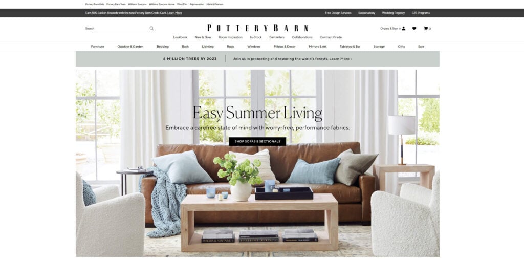
Pottery BARN
The simple design and beautiful imagery are robust examples of high-quality UX. Pottery Barn’s horizontal menu with drop-down categories is user-friendly, while its hero image advertising furniture discounts encourages viewers to find out what’s on sale.
On the far right of the gray navigation bar is a red “sale” tab, which stands out against the gray, encouraging visitors to view their discounted products. Here, Pottery Barn’s smart use of color leads visitors further down the sales funnel.
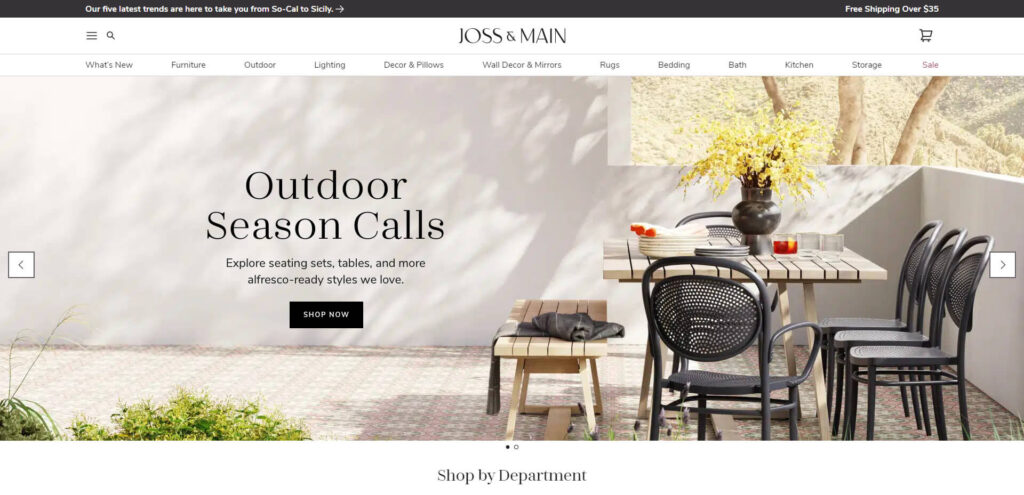
Joss & Main
This well-designed website allows visitors to curate wish lists of their favorite items. Wish lists signify a customer’s interest in products without an immediate intent to purchase. This is especially useful to marketers because it provides insight into what customers like, and helps companies shape their retargeting ads and content marketing campaigns, so they appeal to customers’ preferences.
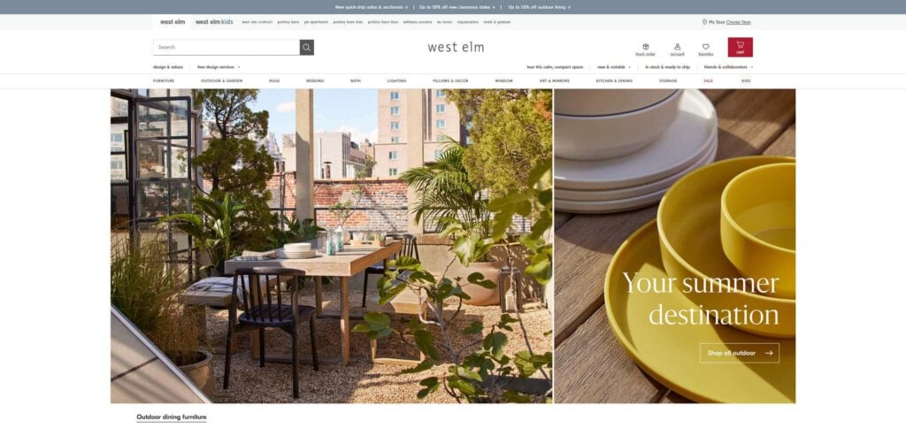
West Elm
What stands out about West Elm’s website is its bestseller section and its free design crew service. This content-rich website makes it impossible not to want to explore their product ranges and blog.
They also have a banner clearly highlighting the perks of purchasing their furniture pieces. Like Pottery Barn, their sale tab and shopping cart icon are also red, which immediately attracts visitors’ eyes. This website illustrates a content and feature-rich website can still maintain fluid navigation.
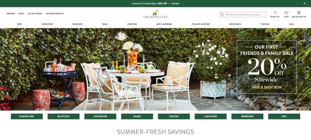
One King’s Lane
While bright colors and user-friendly navigation makes this website stand out, it’s the interior design packages that truly provide a competitive advantage. They explain exactly how the service works, and what’s included in each package, as well as the price. Despite the volume of information, its attractive layout makes it easy to digest.
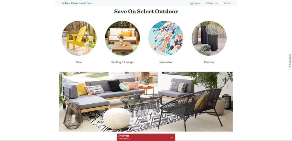
World Market
World Market has a lot to offer, and its well-organized navigation menu lets users focus on its affordable price range and unique products. Continuously updating its inventory, the business does not miss a beat in ensuring customers are privy to its latest product releases.
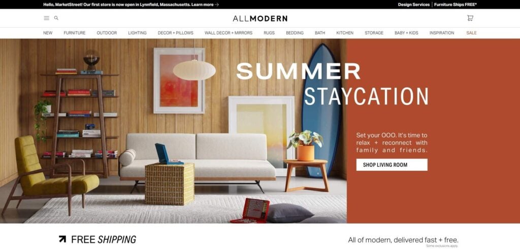
Allmodern
The striking design of AllModern distinguishes it from other eCommerce furniture sites due to its jewel-tone color palette, which is very much on-trend. Despite the wide range of different furniture styles on offer, they’ve kept their branding cohesive, which is present through their strong visuals.
Their “community-approved” section is also a smart way to market products with social proof. Most consumers read reviews before purchasing, and this curated list taps into the customer need to purchase community-verified products.
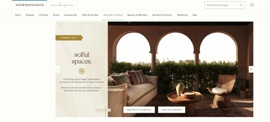
Anthropologie
What’s unique about Anthropologie’s website is its ability to seamlessly transition between showcasing fashion, accessories, beauty products, furniture and more. Its “anthro-living-home” page has an attractive banner highlighting designer collections, which is a great idea if you want to simultaneously market both specific decor styles and individual designers’ work.
Birch Lane
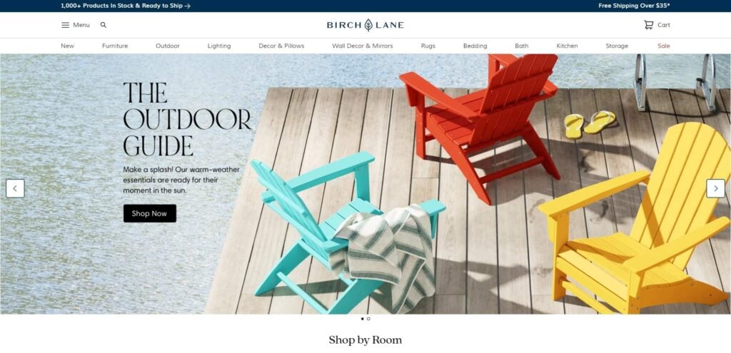
Birch Lane’s website does a perfect job at marketing its classic furniture designs made from quality materials. It allows customers to view products either by room or style, which are both smart navigational options. The website also makes a point to highlight its content marketing material via lookbooks or suggested buying guides.
Dot & Bo
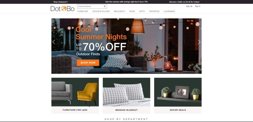
This eCommerce site offers many high-quality products for a complete office or home remodel. Simple, and easy to use, it provides customers with a comprehensive buying experience, from start to finish, whether they’re looking for dining room tables or accent furniture.
Jayson Home
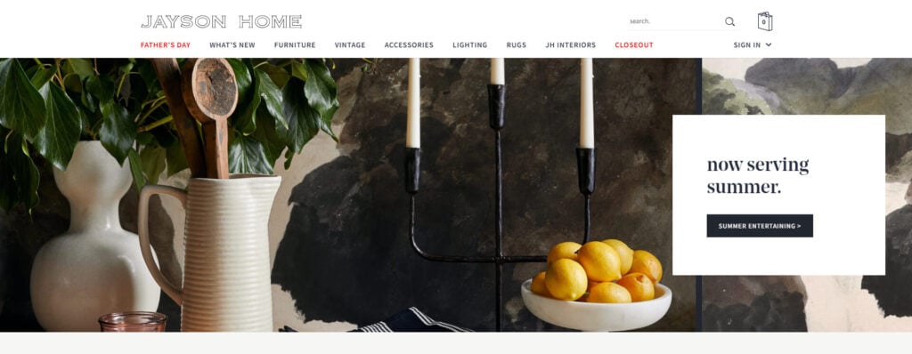
Another great website, Jayson Home’s menu does two things; firstly, it markets products according to special occasions (Father’s Day), and secondly, it immediately alerts visitors to what’s new. This is a smart strategy for loyal customers who are likely to have a high customer lifetime value (CLV).
Furniture Websites From Around the World
Drommel
Ideal for the modern-day online shopper, this website’s hamburger menu keeps the design sleek and navigable. This menu choice makes sure everything is tucked away neatly and prevents users from getting distracted from the core functions you want them to see.
&TRADITION
This Danish brand sticks to its aesthetic design roots with a minimalist layout and muted palette. Its simple hero video also embodies the brand’s minimalist ethos, perfectly communicating its values and messaging. What’s nice about this website is its uncluttered design allows viewers to focus on what matters most; the modern furniture pieces.
House and Home Publications
Houzz
Houzz is a famous online community and website dedicated to all things home and decor. Its horizontal menu has distinct calls to action. So, instead of merely having words like “inspiration” or “professionals,” they’ve got “get ideas,” “find professionals,” and “shop products”. The verbs illicit a much stronger call to action, and is something you might want to add to your own quality furniture website.
The House is Beautiful
This website is a great resource for furniture and remodeling ideas, packing in loads of strong visuals and inspiration. Although it has a lot of content, the layout allows users to easily navigate through each page. The hamburger menus also contribute to its neat design, succinctly categorizing content, without cluttering the homepage.
What Makes an Effective Furniture Website Design?
A stylish furniture website is usable and consistent. If your website isn’t properly designed, then trying to make other parts consistent will just result in poor design. Therefore, it must first be usable. Here’s how:
Furniture Web Design: UI & UX Best Practices
Professional furniture website design starts with user experience (UX) that makes online furniture stores engaging and enjoyable. When developing custom furniture websites, it’s critical to consider the overall feel of a user’s experience when they’re looking through your sectional sofas or finding out more about your company before they buy furniture online.
For instance, what is the experience like from reading about your company to finding its contact details? UX designers consider the customer’s journey from their point of interest until their point of purchase.
UI is to do with how your furniture shopping website looks and functions. It determines how intuitively and easily a customer can do what they need to do on your website. We’ve all experienced being on a website and being unable to find adequate contact details. This is an example of poor UI.
Therefore, UI is about ensuring the layout is delightful and enjoyable, whereas UX concerns the ease of use. Both are needed to improve customer experience and website rankings.
Satisfied clients tend to bring more conversions because they recommend furniture retailers to others. Besides this, they also become more loyal and will return, which increases ROI—all this from a “simple” website design!
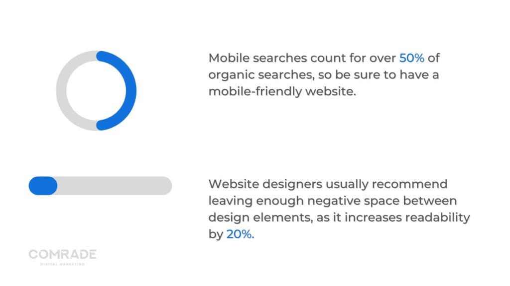
A quick tip on attractive furniture websites: Mobile searches count for over 50% of organic searches, so be sure to have a mobile-friendly website. Google also ranks websites according to their mobile versions. This simply means your website should be viewable and easy to use across cellphones, laptops, tablets and desktop computers.
Graphic Design
We’re visual creatures, so presenting information in an easily digestible way is critical in helping customers retain the data you present them with.
What do we mean?
If you place a large video banner on your home page, every website visitor will see it. However, if you place a “buy now” link underneath it in a 12-point font, chances are, visitors won’t click on it.
The human eye follows a certain path when we read, and you want to guide it with well-placed content by leading their eyes (and buyer’s logic) naturally. Always structure visual characteristics in such a way that visitors can understand information.
An intelligently designed website is simple. It features important information, without clutter. Website designers usually recommend leaving enough negative space between design elements, as it increases readability by 20%.
Loading Speed
Did you know that a one-second website page loading delay can lead to a 7% reduction in conversions? A famous study by FactCompany found a one-second delay for the eCommerce giant Amazon could lose them $1.6bn in revenue per year.
Ideally, and according to Google, you want your website to load within two seconds. At the two-to-three second mark, bounce rates increase and the users will start to abandon your online shopping website.
Fast-loading websites receive more organic traffic and sales. A lot of this is simply related to psychology. We find a faster website to be professional and reliable, and equate this speed to efficiency, trust, and confidence.
Pingdom is a great tool to measure website speed. If yours is too slow, you might consider compressing images, deleting unnecessary code, decreasing advertisements or upgrading or getting a new web host.
Search Engine Optimization (SEO)
In furniture website design, SEO shapes many choices, including the back-end (website architecture), decisions about what a website looks like, and the information it contains.
On-Page SEO
These are all the measures that can be taken directly within a website to improve its position in search rankings. It entails using target keywords in body copy, headers, meta titles, and meta descriptions.
Having a strong on-page SEO strategy helps search engines understand what your website is about. Only once they have this information will they display your contemporary furniture website for relevant search queries.
Technical SEO
Technical SEO refers to actions performed to help search engines crawl your website and enhance user experience (UX). Mobile-friendliness, website speed and site structure are all part of technical SEO web design.
It’s basically everything to do with a website’s backend—all the invisible components that make a website work. Technical SEO makes sure your website is easy to navigate with zero technical issues that may prevent it from being ranked on search engine results pages.
In most cases, you’ll need to hire an SEO specialist, who knows how to code, to perform this type of optimization.
Local SEO
97% of users search online to find local businesses; therefore, modern furniture businesses serving a particular region or location will benefit from local SEO. This strategy can help furniture brands be more visible in local search results.
With local SEO, your furniture business will get found online by customers already searching for your services. It’s simple: A more visible company gets more customers, sales, and revenue. To implement local SEO, you need to sign up for a free Google My Business account and follow the guidelines.
Unique Selling Proposition
A unique selling proposition (USP) is the one thing that makes your business better than the competition. This can be cheaper shipping costs, white-glove delivery, the best mid-century modern coffee table, etc.
You name it, every furniture business has a USP. You probably already know yours, but would potential clients be able to tell?
When potential customers visit your website, they should be able to learn what sets you apart from others. Ensuring your marketing material and web copy communicate this is super important. If you sound generic, potential customers will think you are.
Write fresh and unique copy that’s compelling and tells a story about who you are and positions you as the best furniture retailer. You want prospective customers to clearly understand why they’re better off doing business with you and not your competitors.

Important Furniture Websites Marketing Tips
What is the best way to market furniture?
The best way to market furniture is to create a comprehensive digital marketing strategy that covers multiple online platforms and channels. To maximize reach and engagement, it’s important to use a blend of paid and organic tactics, such as search engine optimization (SEO), content marketing, social media advertising, email campaigns, influencer partnerships, and more.
First off, you should analyze the current landscape of your target audience on each platform you plan to engage with—this could include conducting competitor research or using audience data from sources like Google Analytics or Facebook Insights. Then create an audience persona profile based on the insights gathered; this will help inform what type of content resonates best with and appeals most to your target demographic.
Next up is SEO: optimizing your website for relevant keywords can do wonders in helping potential customers find you when they’re searching online. This includes making sure all meta tags are properly configured across pages; structuring titles and descriptions accurately; strategically utilizing heading tags; making sure internal links are set up correctly between blog posts; creating fresh content regularly for link-building opportunities; using high-quality images; setting up Google My Business listings for local businesses & so forth. There’s also Mobile SEO if you want even more coverage!
Content marketing is also essential in helping create connections with potential customers who have already shown interest in furniture shopping by following blogs or other pieces of information related to the industry—like interior design tips/tricks or lifestyle advice associated with being a homeowner in general (think HGTV-style). Share stories about happy customers who bought furniture from your business or showcase new products through detailed descriptions & lifestyle photography showcasing how it looks inside the home environment–these types of visuals evoke trust & authority among readers that yours is the right company to choose over others!
Social media advertising should be part of any modern digital strategy for getting the word out about your business’s latest promotions or featured items too–Facebook Ads Manager & Twitter Ads would both be great tools here if the budget allows it as these can be extremely effective avenues given their scalable nature plus ability measure ROI directly back into sales leads/conversions etc.. Additionally consider partnering up with influencers if possible who can help spread awareness about what makes buying from our store unique compared to competitors – think Instagram Stories highlighting how much customer service matters, especially during difficult transaction times like navigating delays due to returns, etc. Lastly don’t forget email campaigns either which might not sound sexy but keep the existing customer base engaged through carefully crafted updates and newsletters featuring exclusive deals geared specifically at them!
How do you attract customers to furniture?
Attracting customers to furniture requires a multifaceted approach. First, you need to create an experience for customers that is both enjoyable and informative. You can do this by having knowledgeable salespeople on hand who can help guide them through their purchase decision and answer any questions they may have. Additionally, you should make sure that your store is aesthetically pleasing; consider displaying vignettes of different pieces of furniture together along with other accessories so customers can get a sense of what their own home could look like with the items they’re purchasing.
Another important aspect of attracting furniture customers involves creating an online presence for your business. With digital marketing becoming increasingly popular, it’s essential to make sure your website is up-to-date, has accurate product descriptions, clear photos and videos illustrating how the pieces look in person – preferably shot in lifestyle settings – as well as plenty of customer reviews or testimonials available for potential buyers to read before making their purchase decision. In addition to having a website, ensuring that we are active on social media platforms such as Instagram or Pinterest can also help bring potential buyers into our stores since many shoppers prefer researching products online before hitting the stores themselves.
Finally, staying competitive when it comes to price points and promotional discounts will also go a long way in helping us attract more customers for our furniture store! Consider offering loyalty programs or special offers if people shop with you often enough – these small incentives usually create quite an impact on potential buyers who might be convinced that shopping from your store would be worth it due to its cost effectiveness!
Improve Your Furniture Store Website with Professional Web Design
You might have a clear idea of what you want your striking new website to look like, but lack the skill set to bring it to life. And, as you’ve probably realized by now, building a website is more than just designing an attractive web page.
Comrade Digital Marketing Agency provides digital marketing expertise and services with one aim: to grow your revenue. Whether you need a more modern style website or are looking to improve technical SEO, we’re your one-stop-shop for all your marketing needs. Contact us to build a website that achieves your business goals.

