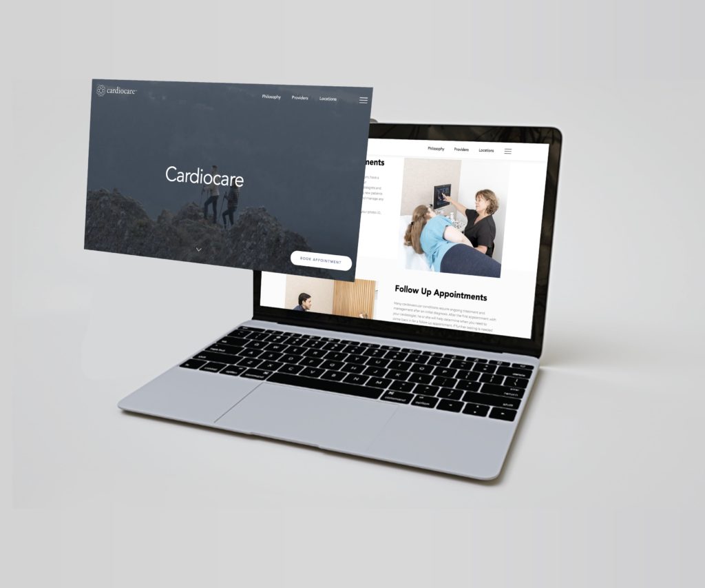
Creating a stunning website that is also user-friendly is no easy task. Whether it’s orthopedic websites or another industry, striking the perfect balance between aesthetics and functionality to showcase the expertise and care of orthopedic professionals takes expertise. Not sure where to begin? Our team at Comrade Digital Marketing is here to break it all down.
When it comes to the best orthopedic websites, there are a number of stellar examples online today. To help you get a feel for the standards for orthopedic websites today, we’ve curated a list of the 10 most impressive orthopedic websites, each a masterpiece of user-centric design. Whether you’re a seasoned web designer or just getting started, these websites will spark your imagination and set you on the path to crafting extraordinary orthopedic web experiences. Let’s get into it!
Why Should Orthopedic Companies Prioritize Website Design?
It should be no surprise in 2024 that standing out in the digital landscape takes a bit more effort than it used to. With nearly every business launching a website of their own, standing out from the crowd takes heightened expertise, and enticing design, and, above all else, a user-friendly experience. Not convinced? Here are the top five reasons why orthopedic companies should invest in their website design.
Professional Image: A well-designed website reflects a professional image, instilling trust and credibility in orthopedic companies among potential patients and partners.
User Experience: A user-friendly website enhances the overall experience for visitors, making it easier for them to find information, schedule appointments, and navigate the site.
Accessibility: Prioritizing website design ensures that the content is accessible to individuals with disabilities, meeting legal requirements and reaching a broader audience.
Mobile Responsiveness: A responsive design adapts to various devices, including smartphones and tablets, optimizing the user experience and increasing accessibility.
Competitive Advantage: A visually appealing and functional website can set orthopedic companies apart from competitors, attracting more patients and driving business growth.
A stellar website isn’t just a luxury—it’s a necessity. Elevate your practice’s image, enhance user experiences, ensure accessibility, and gain a competitive edge by prioritizing website design. By doing so, you’ll be on your way to reaching new heights in the orthopedic field.
Comrade Digital Marketing Agency can help you with the above if you’re unsure how to go about it. Schedule a free consultation.
10 Outstanding Orthopedic Website Designs
Looking for design inspiration for orthopedic websites? Look no further! We’ve compiled a list of the 10 top orthopedic websites that showcase exceptional design, user-friendly interfaces, and innovative features. Whether you’re a web designer, a healthcare professional, or simply seeking inspiration, explore these websites to elevate your online presence. Explore our favorite orthopedic websites below for a bit of inspiration!
1. CurPoint Orthopedic
CurPoint Orthopedics’ website sets the gold standard in design, focusing on simplicity and user-friendliness to serve the restorative medicine community. With a homepage that grabs your attention instantly with a clear “Book a Consultation” button, they make reaching out a breeze. Effortless navigation through menus like “Services,” “Conditions Treated,” and “Technology” ensures a seamless browsing experience. Their design strikes the perfect balance between informative content and an intuitive layout, making it easy for you to discover CurPoint’s groundbreaking treatments and expertise in non-operative cell-based therapies.
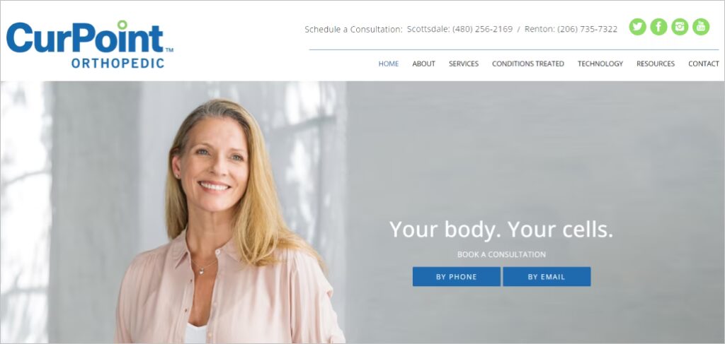
What truly sets them apart is their dedication to building trust and credibility. Dive into the detailed bio of their lead practitioner, Dr. Patrick N. Bays, and you’ll find an impressive list of qualifications and experience that solidify CurPoint’s leadership in orthopedic surgery. They go the extra mile by explaining complex medical concepts like “Restorative Cell Therapy” in plain language, ensuring that their website is not only informative but also accessible to everyone.
2. Florida Center for Orthopedics
The Florida Center for Orthopedics sets the bar high with its user-friendly website design, catering to patients’ needs from the get-go. What sets it apart? The website places accessibility tools front and center, allowing users to personalize their experience with features like text size adjustments, grayscale mode, high contrast options, and more. This thoughtful approach showcases their commitment to inclusivity and patient well-being, even in the digital realm.
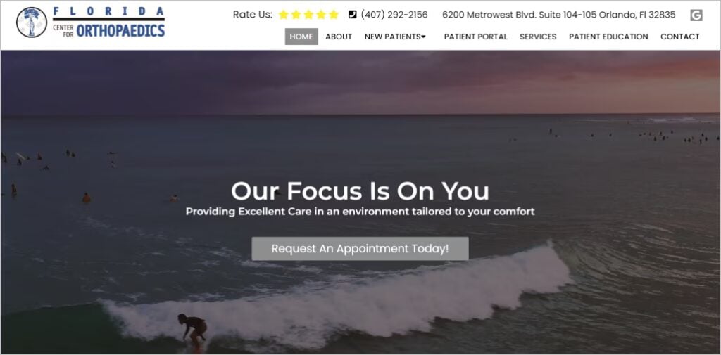
But that’s not all. The website boasts a straightforward navigation menu featuring essential tabs like ‘Home,’ ‘About,’ ‘New Patients,’ ‘Patient Portal,’ ‘Services,’ ‘Patient Education,’ and ‘Contact.’ This intuitive layout ensures visitors can swiftly access the information they seek without unnecessary complexity. With prominent call-to-action buttons like ‘Request an Appointment’ and ‘Call Us,’ user engagement is elevated, making it effortless for patients to connect with the center. It’s a design that revolves around the patient, prioritizing ease of use and accessibility—a must-have for any healthcare provider’s website.
3. Dearborn & Associates
Dearborn & Associates’ website stands out as a go-to source of orthopedic design inspiration, seamlessly fusing style and function. It not only caters to the needs of all users but also takes inclusivity to a whole new level with features like Control-F11 and Control-F10 shortcuts, ensuring a smooth experience for visually impaired visitors.
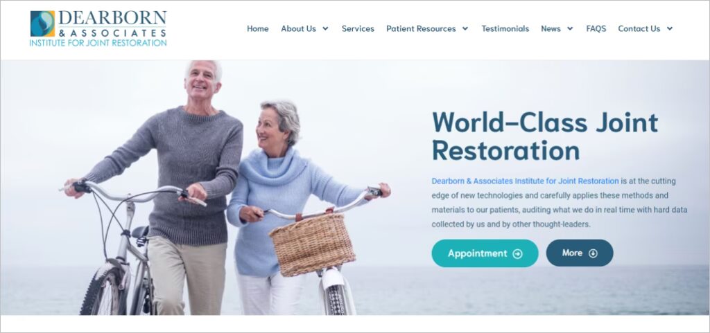
Navigating the site is a breeze, thanks to its crystal-clear menu with sections like ‘Home’, ‘About Us’, ‘Services’, and ‘Patient Resources’. But what sets it apart are the engaging titles like “Recent Hip Replacement Presentation by Dr. Dearborn” that add a personal touch, establishing a direct connection between users and the experts behind the practice, while updating them on the latest work they’ve done.
The website’s layout strikes the perfect balance between being informative and inviting, addressing common concerns like “Knee Pain?” and “Hip Pain?” right from the get-go. Contact information for different locations, including Fremont and Menlo Park offices, is easily accessible, demonstrating a commitment to user convenience. With a smart use of space and colors that enhance readability and aesthetics, this website is a great example of orthopedic design strategy.
4. Rehabilitation Consultants
The Rehabilitation Consultants website is a shining example of how orthopedic websites can seamlessly blend functionality and aesthetics. What truly sets it apart is its unwavering commitment to accessibility, exemplified by features like Control-F11 and Control-F10, catering to visually impaired users right from the start. This dedication to inclusivity not only allows for all potential clients to access their site, but also sets a remarkable standard for medical websites.
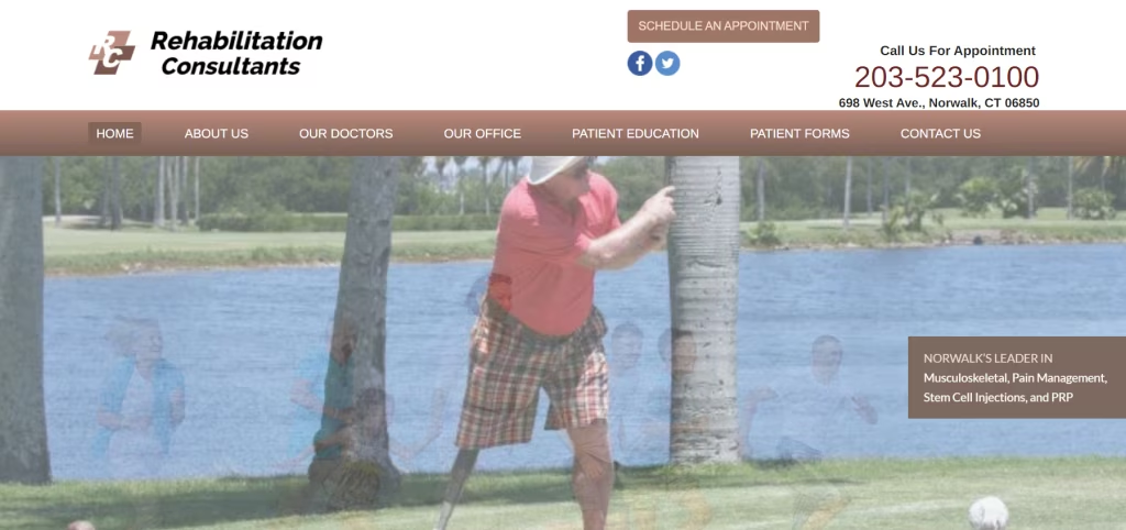
Beyond accessibility, the website boasts an intuitively designed layout that ensures smooth navigation for every visitor. Key services such as “Spasticity Management – Botox,” “IT Pumps for Pain Management and Spasticity,” and “PRP and Stem Cells” take center stage, making it effortless for users to access vital information. The use of clear, concise language and strategically placed buttons like “Schedule an Appointment” elevates the user experience, offering straightforward pathways to essential actions. This thoughtful design approach not only enhances user engagement but also mirrors the professionalism and care that define their medical services.
5. Bitterroot Health
When it comes to orthopedic website design inspiration, Bitterroot Health Orthopedics stands out. From the moment you land on the page, you’re greeted with reassuring information about their expert orthopedists and their ability to diagnose and treat bone and muscle pains with care.
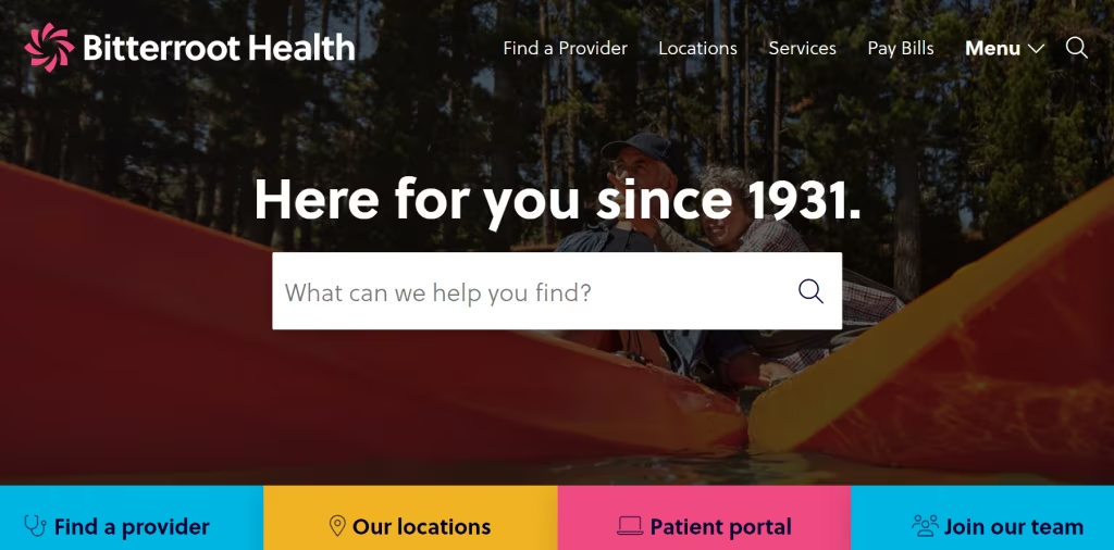
But it doesn’t stop there. Bitterroot Health goes the extra mile in addressing patient concerns with clear, concise language. They promise comprehensive treatment plans and the least invasive treatments, showing empathy towards their visitors.
What truly sets this website apart is its impeccable organization. They’ve neatly categorized their services, from arthritis to sports-related injuries, making it a breeze for users to find exactly what they need. Plus, they’ve strategically placed calls-to-action, like the easily accessible “Sports Physicals form” and an invitation to get in touch with their team. It’s not just informative; it’s engaging.
With its simple yet user-centric design, Bitterroot Health Orthopedics sets the bar high for orthopedic website inspiration.
6. Carl Talmo Orthopedic Surgery
Dr. Talmo’s orthopedic website is a great example of contemporary web design, flawlessly balancing form and function. The homepage beckons visitors with its immaculate, clutter-free layout, spotlighting essential services such as “Cutting-Edge Joint Replacement” and “Revolutionary Hip & Knee Solutions” through captivating, easily navigable sections. This user-friendly design ensures that patients can effortlessly access the information they seek, whether they’re exploring treatment options or delving into Dr. Talmo’s expertise. Furthermore, the soothing color palette and professional visuals instill a profound sense of trust and serenity—crucial attributes for any medical website.
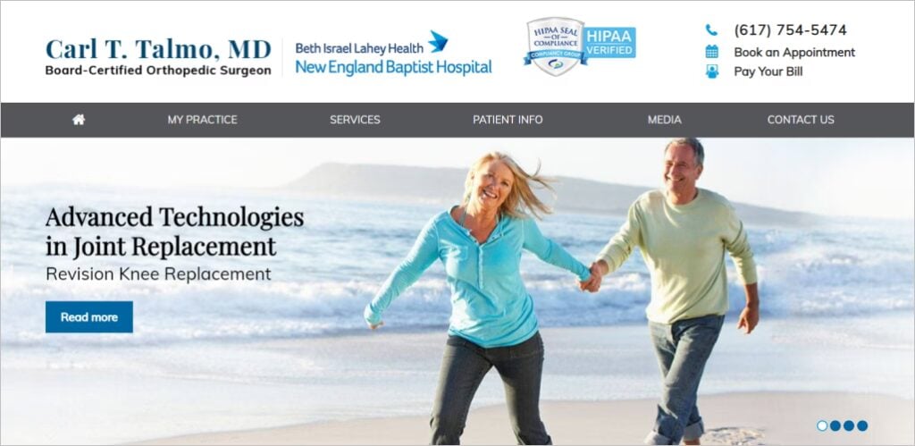
User engagement is clearly prioritized, with interactive features like prominently placed “Schedule an Appointment” and “Convenient Bill Payment” buttons. This not only enhances the overall user experience but also streamlines the patient’s journey, from initial exploration to decisive action. Moreover, the inclusion of heartfelt patient testimonials and in-depth service descriptions offers a comprehensive glimpse into what to anticipate, further solidifying Dr. Talmo’s reputation. This website’s design thoughtfully caters to the audience’s needs, keeping them top of mind throughout the experience.
7. Advanced Orthopedic Center
The Advanced Orthopedic Center’s website features a user-friendly design, offering a great standard in the medical realm. With an intuitively structured layout, it allows patients to effortlessly explore a wide array of services, from General Orthopedics to Interventional Pain Management. The homepage conveys the center’s unwavering commitment to “Repair, Restore, Recovery,” striking a chord with visitors in search of relief and healing. Notably, the site’s use of clear, action-oriented buttons like “Learn More” beneath each service section ensures seamless navigation, elevating the overall user experience.
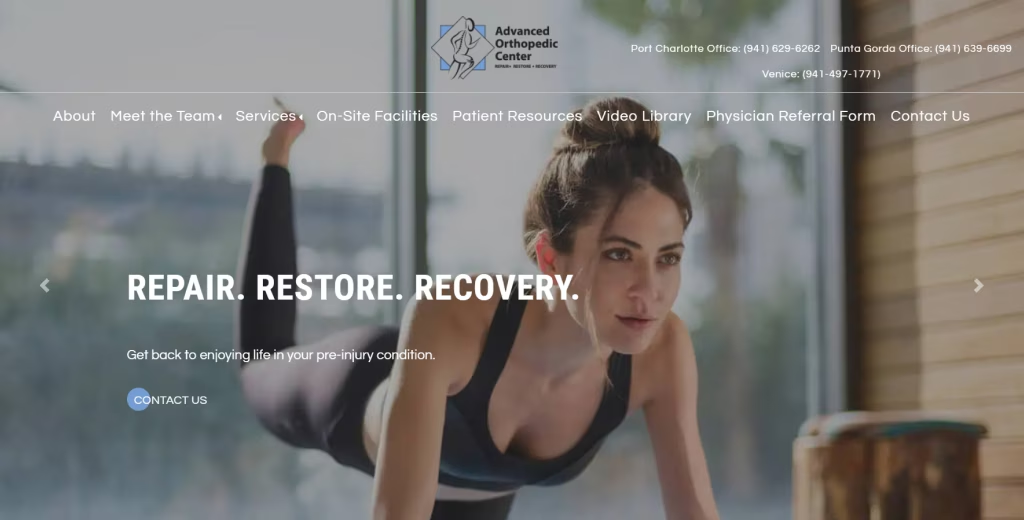
Furthermore, the website excels in showcasing its team of experts, cultivating trust and confidence. The “Meet the Team” section transcends mere names, offering a gateway to understanding the depth of care provided. Each service, whether it’s Sports Medicine or Spine Surgery, is linked to the relevant specialists, creating a personalized touch. This approach, coupled with patient testimonials and a wealth of educational resources, transforms the website into more than just a service portal; it becomes a valuable resource for patient education.
8. Orthopaedic Institute of Henderson
The Orthopaedic Institute of Henderson’s website is another one of the best orthopedic websites to check out. Its sleek and intuitive layout beckons visitors with buttons like “Request Appointment” and “Patient Portal,” ensuring a seamless online journey. The homepage skillfully highlights core services like “Orthopedic Surgery,” “Arthroscopy,” and “Sports Medicine,” making vital information easily accessible to patients.
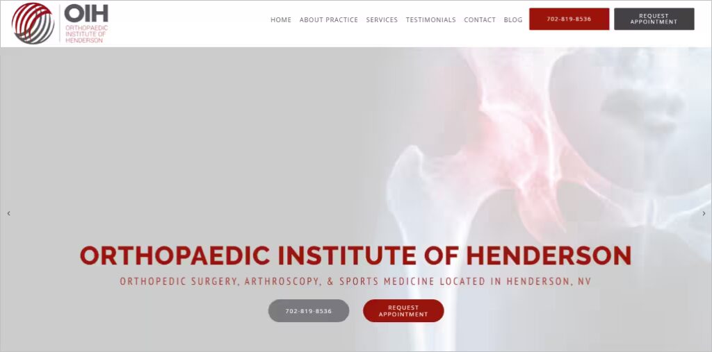
Beyond aesthetics, the website forges a personal bond with potential patients. Prominently featured testimonials provide real-life endorsements that instill trust and credibility. Phrases such as “Dr. Hoer was extremely professional” and “All staff members are very professional and pleasant” resonate as powerful affirmations of the institute’s unwavering commitment to quality care. By strategically leveraging social proof alongside a polished, professional design, the Orthopaedic Institute of Henderson stands as a wonderful example of the best orthopedic websites.
9. New England Orthopedic Surgeons
The website of New England Orthopedic Surgeons (NEOS) is another top-notch, user-friendly orthopedic website. With an intuitive layout that effortlessly guides patients through sections like ‘Our Providers’, ‘Services’, ‘Patient Info’, and ‘Appointments’, NEOS ensures stress-free navigation in a medical context where quick access to information is paramount.
NEOS further impresses with its captivating visuals that walk visitors through specialized areas like ‘Hip & Knee’, ‘Shoulder & Elbow’, and ‘Sports Medicine’. These visuals not only enhance the site’s appeal but also swiftly connect patients to the information they seek.
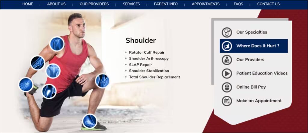
What sets NEOS apart is its interactive elements, such as the ‘Where Does It Hurt?’ feature, which fosters patient engagement and a patient-centric approach to diagnosis. This, combined with easily accessible buttons like ‘Request an Appointment’ and ‘Online Bill Pay’, elevates user convenience.
The website’s thoughtfully chosen color scheme and fonts contribute to an overall sense of professionalism and trustworthiness. These design choices reflect NEOS’s deep understanding of patients’ needs and anxieties, making their website not just a source of information but also a comforting digital space for those in search of orthopedic care.
10. Bawa Orthopedic
Dr. Harpreet Bawa’s orthopedic website is a shining example of patient-centered design. From its warm and inviting homepage to its user-friendly navigation, this site prioritizes your needs. With a prominent “Schedule An Appointment” button, finding essential information is a breeze. The soothing colors and clean layout enhance your experience as you explore procedures like anterior total hip replacement, total knee replacement, and robotic-assisted surgery.
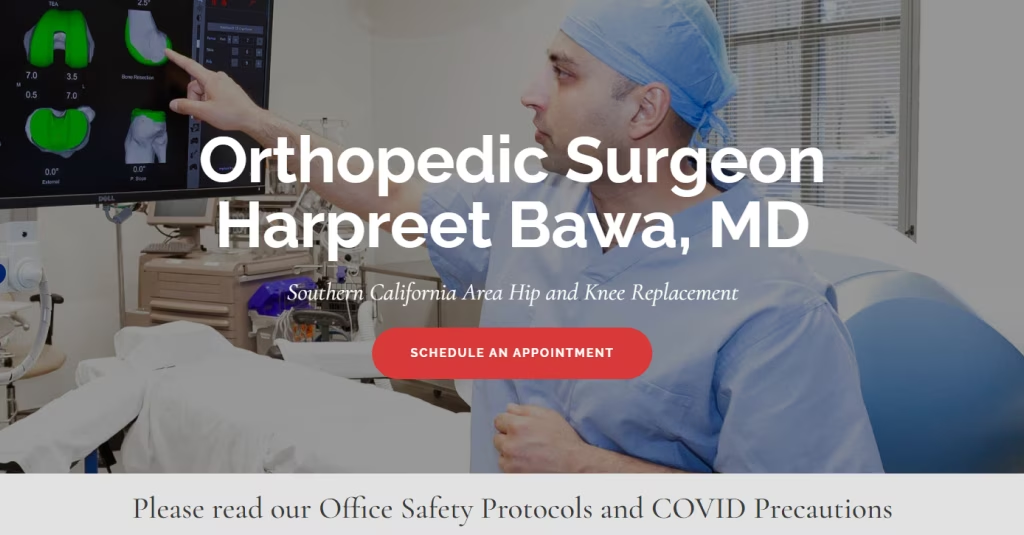
But what truly sets this website apart is its personal touch. Real patient testimonials showcase the remarkable outcomes achieved under Dr. Bawa’s care, instilling trust and hope in prospective patients. Accessibility features, including options for visually impaired users, highlight a dedication to inclusivity, ensuring that everyone can access crucial information effortlessly. It’s with these clear and honest design elements that Bawa Orthopedic stands out from the rest.
Delivering Business Results: Our Digital Marketing Case Studies
Tips to Create a Standout Orthopedic Website Design
Like what you see from some of the best orthopedic websites we shared? You can take these examples and make them your own! But where do we begin? To help you make your orthopedic website design stand out, we are sharing seven of our top tips to elevate your website and garner new views and clients. Let’s break it down.
1. User-Centric Approach
When designing your orthopedic website, it’s essential to put your users at the forefront of your strategy. A user-centric approach means understanding the needs, preferences, and expectations of your patients and potential clients. Start by conducting thorough research to identify what your target audience is looking for when they visit your website. What information are they seeking? What questions do they have about orthopedic treatments or procedures? By gathering this valuable insight, you can tailor your website’s content and design to meet their specific needs. This not only enhances user experience but also helps in building trust and credibility, ultimately leading to higher patient engagement and conversions.
To maintain a user-centric focus, consider implementing user-friendly features such as easy-to-use appointment scheduling tools, informative articles about common orthopedic conditions, and clear calls to action that guide visitors toward the information they seek. Additionally, regularly gather feedback from your website visitors to make ongoing improvements. By continuously optimizing your website based on user feedback and preferences, you’ll ensure that your orthopedic website stands out as a valuable resource in the healthcare industry.
2. Clear Navigation and Menu Structure
A well-structured navigation menu is the backbone of a standout orthopedic website. When visitors arrive at your site, they should be able to quickly and intuitively find the information they need. Ensure that your menu is clear, concise, and logically organized, with main categories like “Services,” “Conditions Treated,” “About Us,” and “Contact.” Subcategories can further break down information into manageable sections, making it easy for users to navigate through your content without feeling overwhelmed.
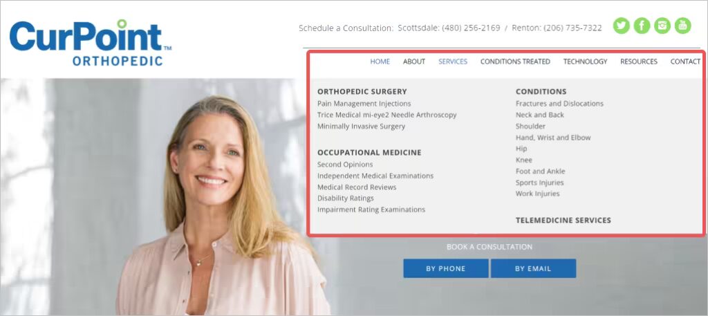
In addition to a well-organized menu, consider incorporating a search function to allow users to find specific information efficiently. Make sure that each page has clear headings and subheadings, and use descriptive and concise labels for navigation links. Simplicity and clarity are key to ensuring that visitors can access the information they require quickly and easily, leading to a positive user experience and leaving a lasting impression of professionalism and competence in the field of orthopedics.
3. Mobile Responsiveness
Nowadays, more people than ever are turning to their mobile devices to browse websites, and you need to meet them where they are. To create a standout orthopedic website, it’s crucial to prioritize mobile responsiveness. Your site should adapt seamlessly to various screen sizes and orientations, ensuring that users have a consistent and enjoyable experience, whether they are using a smartphone, tablet, or desktop computer. Mobile-responsive design not only improves user satisfaction but also positively impacts your search engine rankings, as Google rewards mobile-friendly websites.
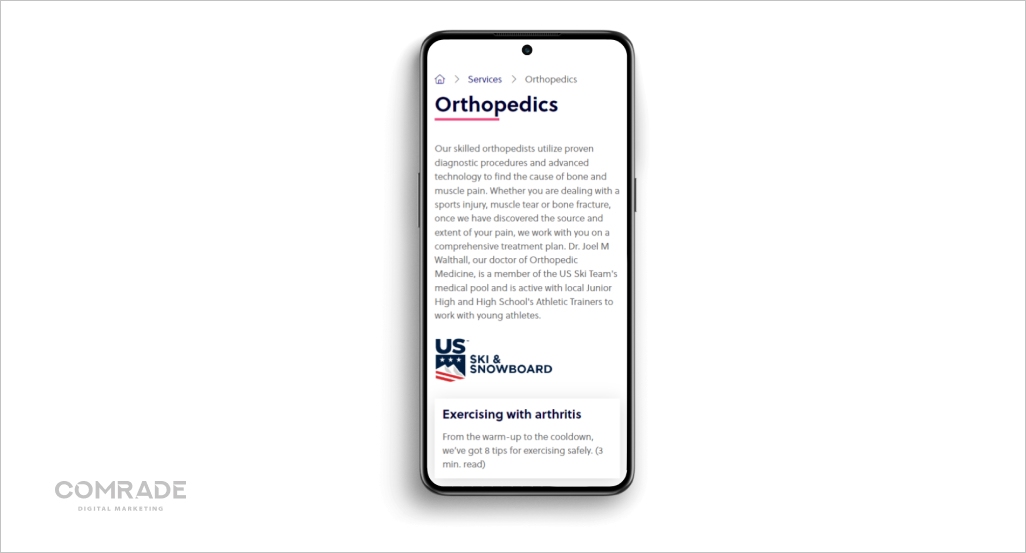
To achieve mobile responsiveness, work with a skilled web developer who can implement responsive design principles. This may involve optimizing images and content for smaller screens, adjusting the layout, and ensuring that buttons and links are easily clickable with touch gestures. By prioritizing mobile responsiveness, you’ll broaden your reach and make it convenient for potential patients to access your orthopedic services, ultimately setting your website apart from competitors who may not have embraced this essential aspect of modern web design.
4. High-Quality Visual Content
First impressions are crucial in the healthcare industry, and top-notch visual content plays a pivotal role in crafting an exceptional orthopedic website. Invest in professional photography and graphics to showcase your clinic, medical staff, and facilities. Visual elements such as images and videos can convey a sense of trust, professionalism, and expertise to potential patients. Utilize visually appealing infographics or diagrams to simplify complex medical concepts and procedures, making them more accessible and engaging for your audience.
Moreover, consider incorporating interactive elements like 3D models or animations to explain orthopedic conditions and treatments. Visual content not only enhances the aesthetics of your website but also aids in patient education and engagement. When visitors encounter visually appealing and informative content, they are more likely to stay on your site, learn about your services, and ultimately choose your orthopedic practice for their healthcare needs.
5. Patient Testimonials and Case Studies
One of the most effective ways to build trust and credibility on your orthopedic website is by showcasing patient testimonials and case studies. Real-life success stories from previous patients can provide powerful reassurance to potential patients who are considering your services. Encourage satisfied patients to share their experiences and outcomes on your website, including before-and-after photos where applicable. Make sure these testimonials are genuine and detailed, emphasizing the positive impact your orthopedic care has had on their lives.
In addition to testimonials, consider publishing in-depth case studies that highlight challenging orthopedic cases you’ve successfully treated. Describe the patient’s condition, the treatment plan, and the results achieved. Case studies offer a more comprehensive view of your expertise and demonstrate your ability to address complex orthopedic issues. When presented effectively, patient testimonials and case studies can set your orthopedic practice apart, assuring potential patients that they are in capable hands.
6. Search Engine Optimization (SEO) Strategies
Creating a standout orthopedic website goes beyond aesthetics; it also involves ensuring that your site is easily discoverable by potential patients searching for orthopedic services online. Implementing strong SEO strategies is essential to rank well on search engines like Google. Start by conducting keyword research to identify the most relevant and frequently searched terms related to orthopedic care in your area. Incorporate these keywords naturally into your website’s content, including blog posts, service descriptions, and landing pages.
Optimize your website’s technical aspects, such as site speed, mobile-friendliness, and schema markup, to improve your search engine ranking. Build high-quality backlinks from reputable sources in the healthcare field, and regularly update your content with informative articles and blog posts that address common orthopedic concerns and questions. By investing in SEO, you can increase your online visibility, attract more organic traffic, and position your orthopedic practice as a trusted and authoritative resource in your specialty.
7. Contact Information and Accessibility Features
There’s no reason a prospective patient should have to spend time digging for your contact information. To avoid losing patients before they even reach you, ensure that your contact information, including phone numbers, email addresses, and a physical address with a map, is prominently displayed on every page of your website. Make it as simple as possible for visitors to get in touch with you, whether they have questions, want to schedule an appointment, or need urgent medical assistance.
Consider adding accessibility features to your website, such as options for text resizing, contrast adjustments, and keyboard navigation. These features accommodate users with disabilities and make your site more inclusive, aligning with web accessibility guidelines and regulations. An accessible website not only serves a broader audience but also demonstrates your commitment to patient care and inclusivity, setting you apart as a compassionate and patient-focused orthopedic practice.
Conclusion
Feeling inspired? So are we. When it comes to the best orthopedic websites, it’s all about perfectly meshing design and user-friendliness for an accessible, yet engaging experience. And there’s a lot of wonderful orthopedic websites already doing this. From sleek and modern layouts to user-friendly navigation, these top 10 orthopedic websites showcase the perfect blend of aesthetics and functionality, and now you can too.
Need a little help to take your website to the next level? Our team at Comrade Digital Marketing is here to lend a hand. Our team of experts specializes in crafting tailored digital solutions that will set you apart in the competitive healthcare landscape. Contact us today, and we will work with you to land your orthopedic practice on the list of the best orthopedic websites in no time.
Frequently Asked Questions
-
How can I measure the success of my orthopedic website design?
To gauge the success of your great orthopedic website design, ensure you stay up to date with key metrics such as website traffic, bounce rate, conversion rate, and patient inquiries or appointments facilitated by the design team. Continuously monitoring these indicators will help you assess the effectiveness of your healthcare information-centric website and make necessary enhancements for optimal performance.
-
Is it necessary to include a blog on my orthopedic website?
While not mandatory, having a blog on your orthopedic website can prove highly beneficial. It enables you to disseminate informative content related to orthopedic doctors, orthopedic surgeons, and patient information. Through your blog, you can share articles, provide updates on medical advancements, and offer tips for maintaining orthopedic health. Additionally, a blog can enhance your website’s SEO, helping it rank better in search results, and establish your website as an authoritative source in the field of orthopedics.
-
Can I handle orthopedic website design on my own, or should I hire a professional designer?
While some healthcare professionals may have the skills to create a basic website, hiring a professional web designer is often recommended for achieving an outstanding orthopedic website. Professionals have the expertise to create a visually appealing, user-friendly, and SEO-optimized website that aligns with your practice’s goals and values.


