Today, many of your clients are finding your chiropractic practice through a quick search online, and much of their decision-making process will rely on the first impression you offer – your chiropractic website design. Having a professional chiropractic website is essential for attracting new patients and building trust. In a field where trust and professionalism are paramount, having a well-designed website can set you apart from the competition and attract new patients. But with so many design possibilities, finding the right inspiration can be overwhelming.
To help you navigate this creative journey, our experts at Comrade Digital Marketing have compiled a list of ten exceptional chiropractic website designs that excel in aesthetics, functionality, and patient engagement. These examples offer a blend of modern design trends, user-friendly features, and compelling content that can inspire you to elevate your site. Dive in and discover how these standout designs can transform your online presence and make your chiropractic practice stand out!

10 Custom Chiropractic Websites to Inspire Your Design
It’s time to revamp your chiropractic website with an eye-catching new design that will enhance patient trust and boost engagement. To help you build an amazing chiropractic website, explore these 10 chiropractic website design examples for inspiration. From user-friendly layouts to intuitive navigation, these sites showcase effective strategies to attract and retain clients. Let’s uncover how these designs can transform your practice.
1. The Joint Chiropractic

The Joint Chiropractic website showcases professional chiropractic website design at its finest. It features a clean and modern layout with a focus on user experience. Key design elements include clear and prominent call-to-action (CTA) buttons such as “Find a Location” and “New Patient Special,” making it easy for users to navigate and take action. The site emphasizes convenience and affordability, which are key selling points highlighted through simple and direct messaging. Additionally, the use of patient testimonials and educational resources builds trust and engages visitors.
Key Features:
User-Friendly Navigation: Easy access to important sections like “Plans & Pricing” and “Find a Location.”
Clear CTAs: Prominent buttons for scheduling and special offers.
Patient Testimonials: Builds credibility and trust.
Educational Content: Articles and guides that inform and engage users.
Responsive Design: Ensures a seamless experience across devices.
2. Milton Chiropractic Clinic
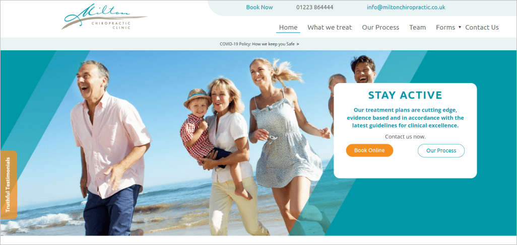
Milton Chiropractic’s website exemplifies modern chiropractic web design by combining user-friendly navigation with an inviting aesthetic. The homepage immediately draws visitors in with a clean layout, featuring high-quality images and a soothing color palette that conveys professionalism and care. Key sections like “Services” and “Meet the Team” are prominently displayed, providing easy access to essential information to get to know the company. The site also includes clear and compelling calls-to-action (CTAs) such as “Book an Appointment” and “Contact Us,” which are strategically placed to encourage user engagement.
Key Features:
Clean and Inviting Design: The use of a soothing color palette and high-quality images creates a professional and welcoming atmosphere.
Easy Navigation: Prominent sections like “Services” and “Meet the Team” allow users to quickly find relevant information.
Effective CTAs: Strategically placed CTAs like “Book an Appointment” encourage user interaction and facilitate conversions.
Mobile-Friendly: The responsive design ensures a seamless experience across all devices, enhancing accessibility.
Trust Signals: Patient testimonials and professional credentials are displayed to build trust and credibility with current and potential patients.
3. Modern Chiropractic Chicago
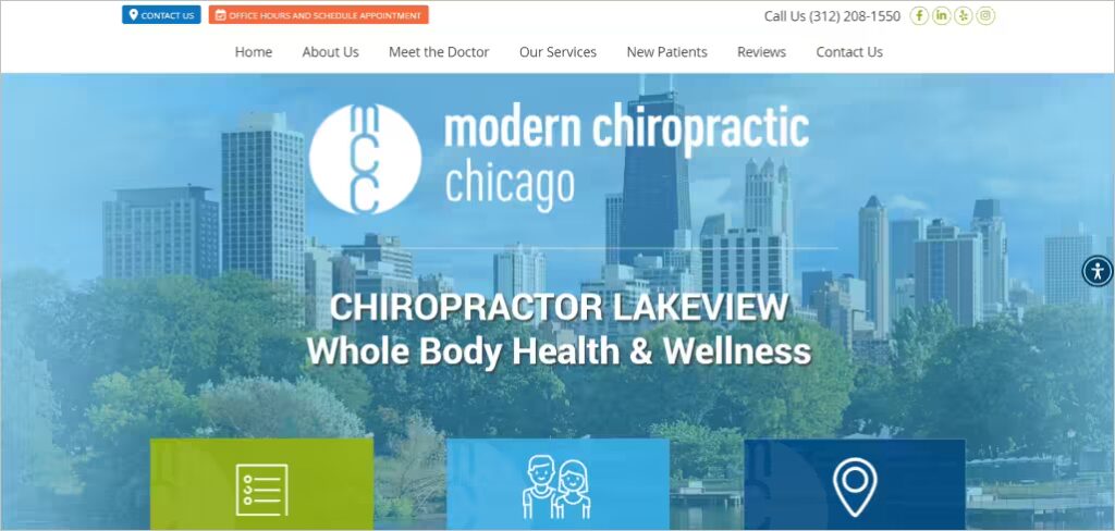
Modern Chiropractic Chicago’s website stands out for its combination of a modern, aesthetically pleasing design and user-centric functionality. The homepage effectively highlights their comprehensive services, catering to diverse patient needs with easy-to-read sections. The site prioritizes patient convenience with clear scheduling options and a responsive design. The “Meet the Doctor” section humanizes the practice, fostering a connection with potential patients. Plus, the vibrant images and straightforward language enhance user engagement and trust.
Key Features:
Comprehensive Service Display: Showcases a wide range of treatments.
Convenient Scheduling Options: Prominent “Schedule Now” button and easy appointment booking.
Responsive Design: Ensures accessibility across all devices.
Engaging Visuals: High-quality images that create a professional yet welcoming atmosphere.
Patient-Centric Content: Detailed doctor profiles and patient testimonials build trust and rapport.
4. Advanced Chiropractic Relief
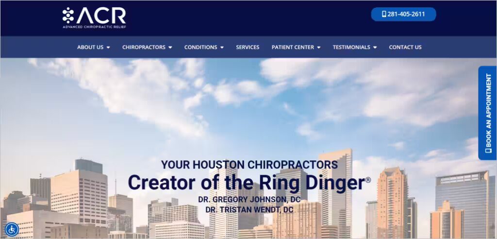
The Advanced Chiropractic Relief website is an exemplary model of effective chiropractic web design, focusing on a patient-centric approach with a wealth of educational content. The site features a professional and clean layout that highlights the practice’s unique techniques and experienced staff. The homepage immediately draws attention to their specialized treatments with prominent CTAs such as “Book an Appointment” and “Get Relief”. Additionally, the use of video testimonials and detailed information on conditions treated builds credibility and trust with potential patients.
Key Features:
Patient-Centric Design: Detailed information about conditions and treatments.
Clear CTAs: Prominent “Book an Appointment” and “Get Relief” buttons.
Educational Content: Videos and articles that inform and engage visitors.
Unique Selling Points: Highlights specialized techniques like the Ring Dinger®.
Professional Layout: Clean, easy-to-navigate design that emphasizes credibility.
5. Katherine Chiropractic

Katherine Sports & Family Chiropractic’s website is a perfect example of a comprehensive and welcoming user experience. The design is clean and professional, with a strong focus on family care and sports-related chiropractic services. The homepage is structured to provide easy access to essential information, such as services offered and booking options. Key CTAs like “New Patient Online Bookings” and “Contact Us” are clearly visible, promoting user engagement. The site also emphasizes personalized care and patient education through detailed content and helpful resources.
Key Features:
Family and Sports Focus: Tailored services for different patient needs.
User-Friendly Layout: Easy navigation to key information and booking options.
Clear CTAs: Prominent booking and contact buttons.
Educational Content: Informative sections about chiropractic care and its benefits.
Professional and Inviting Design: Clean aesthetic that appeals to a wide audience.
6. Healing Hands Chiropractic
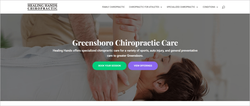
Healing Hands Greensboro’s website is a prime example of an engaging and functional chiro web design project. It features a clean, professional layout with a focus on specialized care and patient education. The homepage is well-organized, highlighting various services, such as family chiropractic and sports therapy, with easy access to booking and contact options. In addition, the inclusion of patient testimonials and detailed bios of the chiropractic team helps build trust. Furthermore, educational content on common conditions and chiropractic treatment techniques enhances user engagement and confidence in the practice.
Key Features:
Service Diversity: Comprehensive list of specialized services and conditions treated.
Patient Testimonials: Builds trust and credibility.
Team Bios: Detailed information about the chiropractic team.
Educational Resources: Informative articles on chiropractic care and techniques.
Clear Booking Options: Prominent “Book Your Session” button for easy scheduling.
7. Chiropractic First
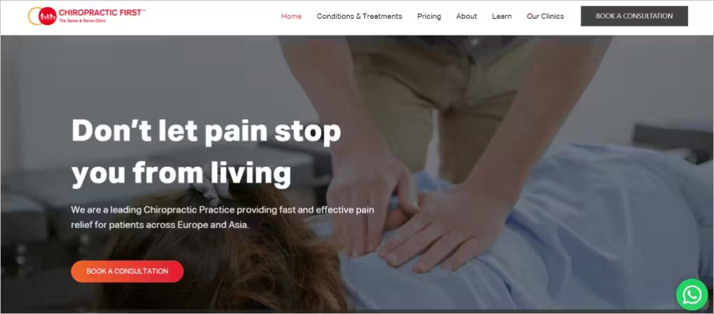
Chiropractic First’s website is a prime example of excellent chiropractic web design, combining aesthetics with functionality to create an engaging user experience. The homepage greets visitors with a professional, clean design that utilizes a harmonious color scheme, promoting trust and calmness. The navigation is straightforward, with clear menus that help users find information effortlessly.
Prominent call-to-actions (CTAs) are strategically placed throughout the chiropractic site, encouraging users to book appointments or contact the clinic without feeling intrusive. Additionally, the site features educational content, patient testimonials, and detailed service descriptions, enhancing credibility and providing valuable information to visitors.
Key Features:
Clean and Professional Design: A visually appealing and well-organized layout.
Strategic CTAs: Prominently placed buttons to encourage appointments and inquiries.
Educational Content: Valuable information on services and conditions treated.
Patient Testimonials: Builds trust and provides social proof.
Easy Navigation: User-friendly menus for effortless information access.
Examples:
Navigation Menu: Simple and intuitive, ensuring users can quickly find what they need.
Homepage CTA: “Book an Appointment” button stands out without being overwhelming.
Service Pages: Detailed descriptions with supporting images and FAQs for clarity.
8. 528 Chiropractic

5280 Chiropractic’s website is an excellent example of user-friendly and informative chiropractic web design. The homepage is well-structured with intuitive navigation, highlighting essential services and patient information. It also includes clear and accessible CTAs like “Schedule Appointment” and “New Patient Paperwork” that make it easy for visitors to engage. Additionally, the site features a detailed “Meet the Doctor” section and educational resources on various conditions and treatments, enhancing trust and knowledge.
Key Features:
Intuitive Navigation: Easy access to services and patient resources.
Clear CTAs: Prominent scheduling and contact options.
Educational Resources: Comprehensive information on chiropractic care.
Doctor Profiles: Detailed bios build trust and connection.
Insurance Information: Transparent details on accepted insurance and payment plans.
9. Goodyear Chiropractic
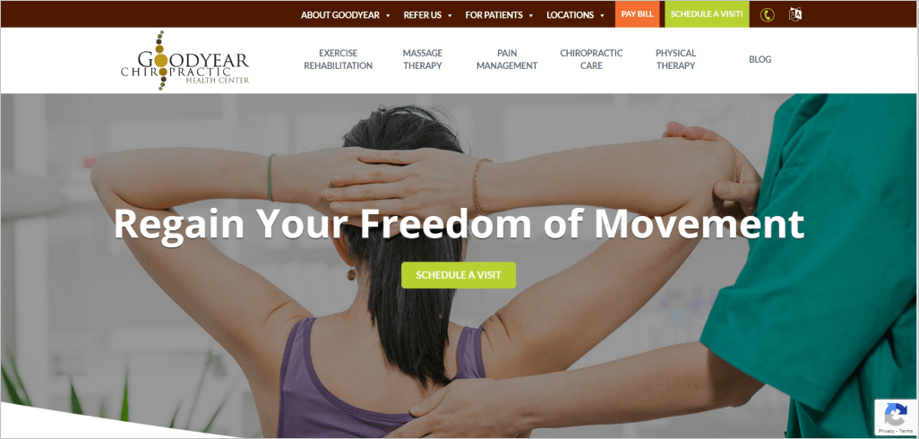
Goodyear Chiropractic Health Center’s website stands out with its comprehensive and patient-centric design. The homepage is visually appealing, featuring clear and compelling images that highlight their health services. The site provides detailed information about various treatments, making it easy for visitors to understand their options. Prominent CTAs like “Schedule a Visit” encourage immediate engagement, while patient testimonials and success stories build trust and credibility.
Key Features:
Visually Appealing Design: Engaging images and clean layout.
Comprehensive Service Information: Detailed descriptions of chiropractic treatments and conditions.
Patient Testimonials: Real stories that build trust.
Prominent CTAs: Easy scheduling and contact options.
Insurance Information: Clear details about accepted insurance plans.
10. South Loop’s Premier Chiropractor
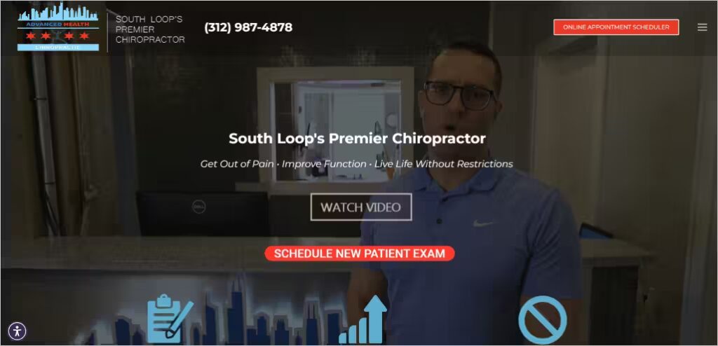
South Loop Chiropractor’s website stands out with its clean, modern design and focus on patient convenience. The homepage prominently features essential information about services and treatment options. It also highlights unique approaches like Chiropractic BioPhysics and K-Laser Therapy. For ease of use, the site includes clear, actionable CTAs such as “Schedule New Patient Exam,” streamlining the process for visitors to book appointments. Additionally, detailed doctor profiles and numerous patient testimonials build trust and credibility.
Key Features:
Modern, Clean Design: Easy to navigate and visually appealing.
Unique Treatment Options: Highlighting Chiropractic BioPhysics and K-Laser Therapy.
Clear CTAs: Easy appointment scheduling with prominent buttons.
Doctor Profiles: Builds trust with detailed bios.
Patient Testimonials: Numerous reviews enhancing credibility.
Comrade Digital Marketing Agency can help you with the above if you’re unsure how to go about it. Schedule a free consultation.
What Are the Essential Features of a Chiropractic Website
First impressions are everything, and to put your best foot forward, creating an effective chiropractic website is crucial. With the right design and features, you can ensure a seamless user experience that highlights your services and builds trust. Discover the essential features every chiropractic website should have to stand out and engage potential clients. Let’s break down the key elements!
1. Clear and Prominent Contact Information
Having clear and prominent contact information is essential for any chiropractic website, as it serves as the first point of connection for potential patients. This information should be easily visible on the homepage, ideally in the header or footer, to ensure that visitors can quickly find the clinic’s phone number, email address, and physical address. Including clickable links for phone numbers and emails enhances user experience, making it convenient for patients to reach out without having to copy the information manually. Additionally, integrating a Google Maps link helps new patients easily locate the clinic, reducing barriers to visiting the practice.
Furthermore, the contact section should extend beyond just the basics, specifically including office hours so patients know when they can reach you. This will help limit questions, as potential patients often want to know when they can schedule their visits. Additionally, incorporating a contact form allows users to submit inquiries directly through the website, fostering engagement. Providing multiple contact methods—such as phone, email, and social media—demonstrates the clinic’s commitment to accessibility, ensuring that patients feel welcomed and supported from the moment they land on the site.
2. Information About Services Offered (Adjustments, Therapies, Etc.)
A well-structured section detailing the services offered is fundamental to a chiropractic website. This section should comprehensively outline various treatments such as spinal adjustments, physical therapy, massage therapy, and specialized care for specific conditions.
Each service description should not only explain what it entails but also highlight the benefits, helping patients understand how these treatments can improve their health and well-being. Using engaging visuals, such as images or videos of the procedures, can enhance understanding and draw in potential clients who may be unfamiliar with chiropractic care.
In addition to treatment descriptions, incorporating frequently asked questions about services can address common concerns and misconceptions. This not only educates visitors but also builds trust in the clinic’s expertise. Providing clear information about any specialties, such as pediatric chiropractic or sports injury rehabilitation, can also help attract a targeted audience, allowing potential patients to find exactly what they need while establishing the clinic as a knowledgeable authority in the field.
3. Patient Testimonials and Reviews
Patient testimonials and reviews are critical components of a chiropractic website, as they provide social proof and build credibility. Featuring authentic testimonials prominently on the homepage or a dedicated testimonials page helps potential patients see the positive experiences of others, allowing them to find those with similar concerns to them and learn about their success with your chiropractic treatment. Highlighting specific stories about successful treatments can resonate with visitors, giving them hope and encouraging them to choose the practice. Including photos of patients (with consent) adds a personal touch that can further enhance relatability and trustworthiness.
Additionally, incorporating third-party review platforms like Google Reviews or Yelp within the website can enhance transparency. Potential patients often seek independent reviews before making health decisions, so displaying these reviews can positively influence their choice. Encouraging satisfied patients to leave feedback and share their experiences also fosters community and engagement, creating a feedback loop that ultimately benefits the clinic’s reputation and growth.
4. Blog or Resource Section for Health Tips and Updates
A blog or resource section dedicated to health tips and updates is a valuable asset for a chiropractic website to share your expertise and provide key insights for potential clients. This section serves as an educational platform where chiropractors can share insights about various health topics, treatment options, and wellness strategies.
Regularly updating the blog with relevant content not only helps position the clinic as an authority in the field but also improves search engine optimization (SEO) by incorporating keywords related to chiropractic care. Topics might include tips for maintaining spinal health, the importance of posture, or updates on the latest chiropractic techniques.
Moreover, a well-maintained blog can encourage patient engagement and return visits to the website. By providing useful information, the clinic can build a loyal online community while fostering relationships with existing patients. Encouraging readers to subscribe to the blog or follow on social media can further enhance engagement, allowing for broader reach and promoting the clinic’s services and events.
5. Online Appointment Booking Functionality
Incorporating online appointment booking functionality is an essential feature for modern chiropractic websites. This convenience allows patients to schedule appointments easily, without needing to call during office hours, catering to busy lifestyles.
A user-friendly interface where visitors can select services, choose a date and time, and receive instant confirmation can significantly enhance the overall user experience. This feature not only saves time for both the clinic and patients but also reduces no-show rates by streamlining the booking process. By providing an online marketing solution that includes online booking, you can effectively convert visitors into patients, improving both the clinic’s efficiency and patient satisfaction.
Additionally, offering online booking can provide valuable data for the clinic, such as peak booking times and patient preferences, which can inform operational decisions and improve efficiency. As a website provider, including features like reminders or follow-up emails for upcoming appointments can further enhance patient satisfaction and engagement, showing that the clinic values its patients’ time and health.
6. Mobile-Friendly Design for Easy Access on Smartphones
A mobile-friendly design is essential for chiropractic websites, given the increasing use of smartphones for browsing. A responsive design ensures that the website adapts seamlessly to different screen sizes, providing an optimal viewing experience for users on various devices.
This adaptability not only improves user experience but also enhances SEO rankings, as search engines prioritize mobile-friendly sites in their algorithms. Patients are more likely to engage with a site that is easy to navigate on their phones, which is particularly crucial for scheduling appointments or accessing information on the go.
Moreover, a mobile-friendly design should incorporate touch-friendly elements, such as large buttons and simple navigation menus, to facilitate ease of use. This design approach can lead to higher engagement rates and lower bounce rates, ultimately translating into more inquiries and appointments. With the increasing reliance on mobile devices for information and communication, ensuring that a chiropractic website is optimized for mobile access is no longer optional but a necessity for attracting and retaining patients.
Conclusion
The right chiropractic website design can make a world of difference in how your practice is perceived and how effectively you attract new patients. To help enhance your website and, ultimately, your public image, our ten examples and tips will help set your website on the right track. With these examples in mind, it’s clear that a professional, user-centric design that addresses the needs and concerns of your potential clients is a must. Whether you’re looking for custom chiropractic websites with a sleek modern look or a warm, welcoming feel, our chiropractic web design services can help your practice stand out.
At Comrade Digital Marketing, we understand the unique challenges of the chiropractic industry and are dedicated to crafting websites that not only meet but exceed your expectations. Let us help you create a stunning online presence that captures your practice’s essence and drives results. Reach out to us today and discover how our digital marketing expertise can help elevate your chiropractic practice above the rest.

