With the average American spending a whopping 7 hours and 4 minutes per day staring at different screens, ophthalmology websites have become crucial for connecting patients with quality eye care. The National Eye Institute predicts visual impairments will double by 2050, making it essential for ophthalmologists to have an effective medical website presence. You need a strong and eye-catching website to be able to retain clients as they come. After all, when patients search for the best eye care due to eye movement disorders or to know about their eye health, they will likely turn to the web first.
However, since there are so many websites out there, it can be challenging to stand out and showcase your expertise in a way that resonates with potential patients. A thoughtfully designed website forms the initial introduction to empower lives of those living with common eye diseases like cataracts, dry eyes, glaucoma, etc. Making this virtual representation appealing directly impacts real-world client acquisition and retention.
This guide will discuss 14 standout ophthalmology sites, their aesthetic appeal, and what makes them stand out. We will explore techniques on how to create a great ophthalmology website design.

14 Best Ophthalmology Websites
First impressions matter more than ever a lot. So, a website needs to be very welcoming while conveying the messages the website owner is sending. Below are 15 ophthalmology sites with intuitive designs you can use as examples for your website design.
1. Kraff Eye Institute
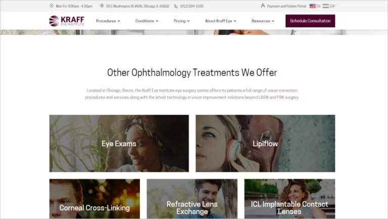
Kraff Eye Institute is a leading LASIK eye surgery center in Chicago. The prominent display of the practice’s working hours, location, and contact information on the homepage is a thoughtful touch that shows the practice’s commitment to patient convenience. As website visitors scroll down, they come across a quiz. This helps potential clients determine if they qualify for LASIK surgery, which is a unique and engaging feature that sets the practice apart from others in the field.
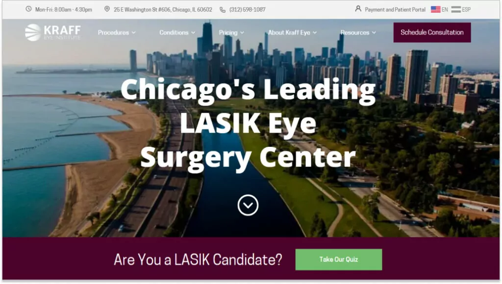
Visitors can also view logos of innovative laser vision correction organizations in Illinois that Dr. Colman Kraff is a part of, which adds to the practice’s credibility. The site’s clear and concise information about the treatments and services offered, along with the inclusion of reviews and testimonials, helps build trust with potential clients.
To cater to Spanish-speaking clients, the site is optimized for Spanish speakers and features a logo in the top right corner that allows users to view the site in Spanish. The optimization for Spanish speakers is also a great touch, making the site accessible to a wider audience.
2. Eye Surgeons of Indiana
The Eye Surgeons of Indiana website takes a trust-building approach by highlighting their board-certified ophthalmologists and optometrists with over 250 combined years of experience. The attention to FREE LASIK Consultations and the practice’s doctors, self-tests, and reviews on sites like Google are also great touches, as they show the practice’s commitment to patient satisfaction.
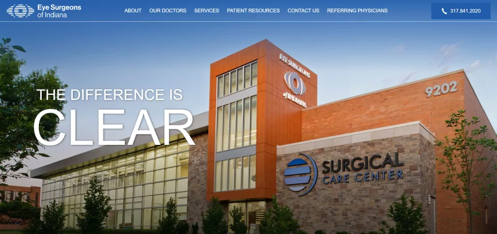
Using burger menus to neatly organize the site’s content is also a great feature, making it easy for website visitors to access the information they need. Finally, the live chat feature is a nice addition, allowing potential clients to start the practice quickly and easily.
3. Northwest Eye Surgeon
The web design for Northwest Eye Surgeon effectively showcases the practice’s commitment to patient-centered care and its expertise in various eye conditions. The prominent video on the homepage allows potential patients to hear directly from satisfied clients, which can help build trust and credibility. The clear display of the practice’s specialties and client reviews further reinforce their reputation for excellence.
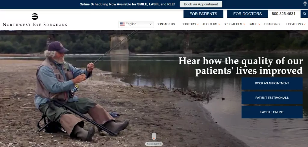
Additionally, mentioning their pediatric team’s mission to bring vision to Grenada is a unique and commendable effort that sets the practice apart. The drop-down menus above the homepage provide more detailed information about the practice’s services and locations, making it easy for visitors to find what they need.
4. Eye Specialists & Surgeons of Northern Virginia
The clean and simple design of Eye Specialists & Surgeons of Northern Virginia’s website effectively communicates the practice’s focus on providing high-quality eye care. The photo section for the team and services is a great way to introduce visitors to the practice’s experienced and skilled healthcare professionals.
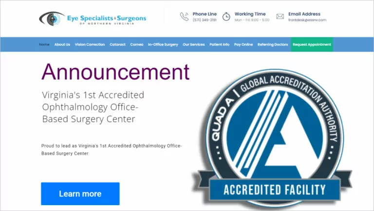
The prominent display of reviews, testimonials, and statistics further establishes the practice’s reputation for excellence. The easy-to-find contact information and drop-down menus on the homepage make it simple for visitors to get in touch with the practice or learn more about their services.
5. Houston Eye Associates
The straightforward design of Houston Eye Associates’ website effectively communicates the practice’s focus on providing expert eye care. The prominent marketing message on the homepage effectively highlights the practice’s unique selling points and sets them apart from competitors.
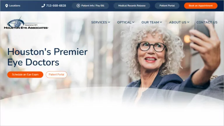
Furthermore, the easy-to-find review stats and section listing the services offered further reinforce the practice’s reputation for excellence. The feature of the practice’s inclusion in various publications and their association with high-end brands like Gucci, Tom Ford Eyewear, and Ray Ban adds an element of prestige and credibility. The drop-down menus above the homepage provide more detailed information about the practice’s services, team, and contact information, making it easy for visitors to find what they need.
Don’t let your eye care practice stay invisible online. Dominate local searches with proven ophthalmology SEO strategies designed for your success.
6. CCRS
The web design for CCRS effectively showcases the practice’s commitment to patient-centered care and its expertise in various eye conditions. The prominent video on the homepage gives potential patients a glimpse into the practice’s culture and what they can expect during their visit. The buttons for requesting an appointment, testimonials, and online vision assessment are easily accessible and prominently displayed.
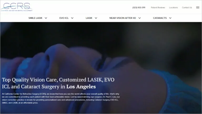
Showcasing the practice’s milestones and solutions offered is also a great way to build trust and credibility. The use of photo proofs and famous individuals like Jimmy O. Yang adds an element of prestige and relatability. The drop-down menu above the homepage provides more detailed information about the practice and its services, making it easy for visitors to find what they need.
7. COA Vision
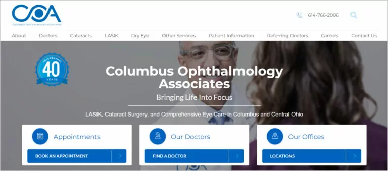
COA Vision’s website’s simple and informative design effectively communicates the practice’s focus on patient care and their specialties. The prominent display of the practice’s mission statement and reviews from past clients helps build trust and credibility. The section for the practice’s doctors is a great way to introduce visitors to the skilled professionals behind the practice. The use of drop-down menus for more detailed information is also a helpful feature. The website effectively conveys the practice’s commitment to providing high-quality eye care.
8. The Midwest Center for Sight
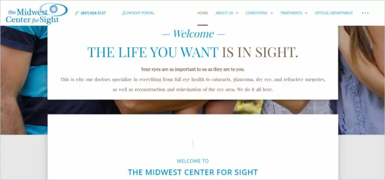
The minimalist design of The Midwest Center for Sight’s website effectively conveys the practice’s focus on simplicity and patient-centered care. The warm welcome message and smiling people on the homepage help create a welcoming and inviting atmosphere. The prominent display of the practice’s services and the machine used for certain treatments helps build trust and credibility. The easy accessibility of the practice’s reviews, team, map location, and working hours is also a great feature. The use of drop-down menus for more detailed information is a helpful feature, allowing visitors to find what they need easily.
9. Texas Eye Surgeons
The website features a minimalistic design that effectively communicates the practice’s focus on technology and patient-centered care. The homepage slider showcases the practice’s advanced technologies, and the “Are you a LASIK candidate?” Quiz is a great way to engage potential patients and provide valuable information.
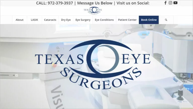
High-quality images and clear headings make it easy for visitors to understand the practice’s services and what sets them apart. The reviews from satisfied customers and prominent call-to-actions (CTAs) encourage visitors to take action and schedule an appointment.
10. New York Ophthalmology
New York Ophthalmology website stands out with its unique animated template that creates a friendly and approachable atmosphere. The practice’s mission and services are clearly communicated through simple and concise language, and the use of animations and graphics adds visual interest and helps to engage visitors.
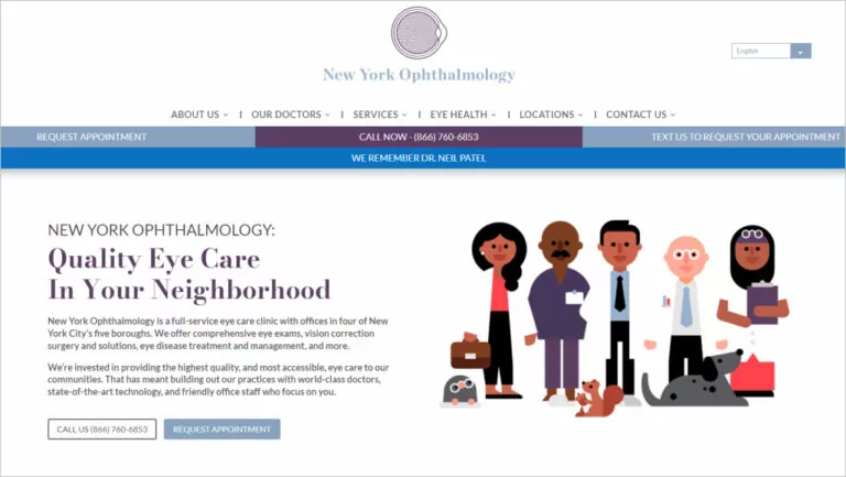
Furthermore, the testimonials and prominent CTAs encourage visitors to take action and schedule an appointment. The drop-down menu provides more in-depth information about the practice’s services, which is helpful for potential patients looking for specific information.
11. Complete Eye Care
Another website features a minimalistic design to effectively communicate the practice’s focus on comprehensive eye care and patient satisfaction. The homepage features high-quality images and clear headings that make it easy for visitors to understand the practice’s services and what sets them apart.
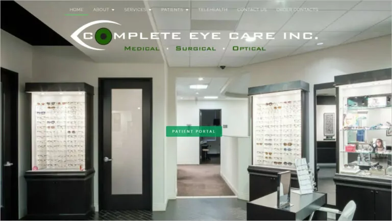
Additionally, the testimonials from satisfied customers and prominent CTAs encourage visitors to take action and schedule an appointment. The drop-down menu provides more in-depth information about the practice’s services, which is helpful for potential patients looking for specific information. The live chat feature allows visitors to quickly and easily get the information they need and request an appointment.
12. Vision Veritas
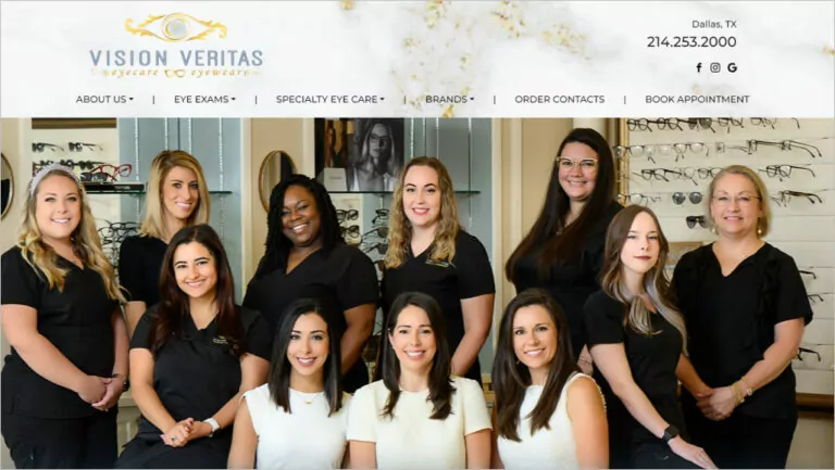
Vision Veritas’ website greets visitors with a photo of their friendly staff, immediately establishing a personal connection and emphasizing the practice’s commitment to patient care. The clean and modern design effectively showcases the practice’s services and technology, and the prominent call-to-actions (CTAs) encourage visitors to take action and schedule an appointment.
13. South Shore Eye Care
The website effectively communicates the practice’s focus on patient satisfaction and cutting-edge technology. The interesting taglines and prominent CTAs encourage visitors to take action and request an appointment. The easy-to-navigate menu bar provides more in-depth information about the practice’s services and specialties.
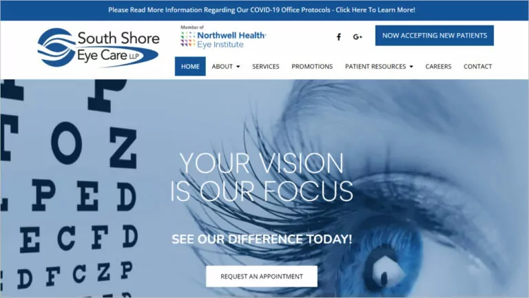
Furthermore, introducing the new surgeon and highlighting their specialty adds a personal touch and emphasizes the practice’s commitment to excellence.
14. Eye Care for the Adirondacks
Eye Care for the Adirondacks’ website features a clean, modern design that communicates the practice’s commitment to comprehensive eye care and patient satisfaction. The minimalistic approach effectively showcases the practice’s services and doctors, and the easy-to-navigate menu bar provides more in-depth information about the practice’s locations and contacts.
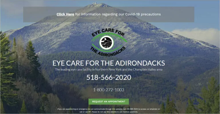
Additionally, the drop-down menu provides more specific information about the practice’s services, which is helpful for potential patients looking for specific information.
Comrade Digital Marketing Agency will help you envision the perfect design for your website. Schedule a free consultation.
How to Create an Effective Eye Clinic Website and Ophthalmology Practice Design
Since your website takes center stage as a primary representation of your practice from the moment someone searches for an eye doctor online, you need an intuitive design paired with helpful, specialized elements. But with countless strategies to consider, how do you create a website that reflects the quality of care and service an ophthalmology practice provides?
1. Be Professional
A professional ophthalmology website reflects your eye care services, so crafting a polished online presence inspires patient confidence from the start. Appearances matter greatly online—prioritize clarity, simplicity, and tidiness. Make sure the website is free of distractions like unnecessary bulk. Instead, focus on insightful information presented logically. This allows users to perceive your practice emphasizes patient care. Leave a composed impression aligning with expertise.
2. Feature Clear Branding
Help visitors quickly grasp what sets you apart by distinctly showcasing your approach. Whether a customized specialty, personalized care philosophy, or state-of-art tools, highlighting distinguishing qualities upfront answers why they should choose you. Incorporate consistent visuals, a memorable logo, and a compelling tagline to establish an identity that remains top-of-mind. Clear branding efficiently attracts qualified candidates and builds recognition in the community over time.
3. Clearly Outline Your Practice
To showcase your full scope reassuringly, feature self-introductory sections. Highlight multi-specialty talents, on-site services, and any affiliated locations. Give readers a full understanding of your capabilities upfront through comprehensive, digestible explanations. Do not leave people wondering what you specifically treat. Details demonstrating a well-rounded staff and amenities also help form accurate first impressions of confidence and convenience.
4. Create Conversion Oriented Design
Always put the user experience first to efficiently guide interested visitors towards valued outcomes. Place booking buttons and contact fields prominently near at the top page. Craft compelling calls-to-action focused on the next best actions like “view available dates” rather than mundane buttons.
5. Optimize Your Website
For ophthalmologist websites, the user experience and eye health content define crucial first impressions. Many people expect simple satisfaction, like fast load times, regardless of location, since a slow-loading website leads to high bounce rates. Therefore, you need to evaluate pages objectively. Large images, unnecessary plugins, and non-optimized coding drag down performance. So, streamline by removing unused files, compressing photos, and employing caching where possible. Use hosting providers that ensure your vision practice loads in under two seconds.
6. Create a Mobile-Friendly Design
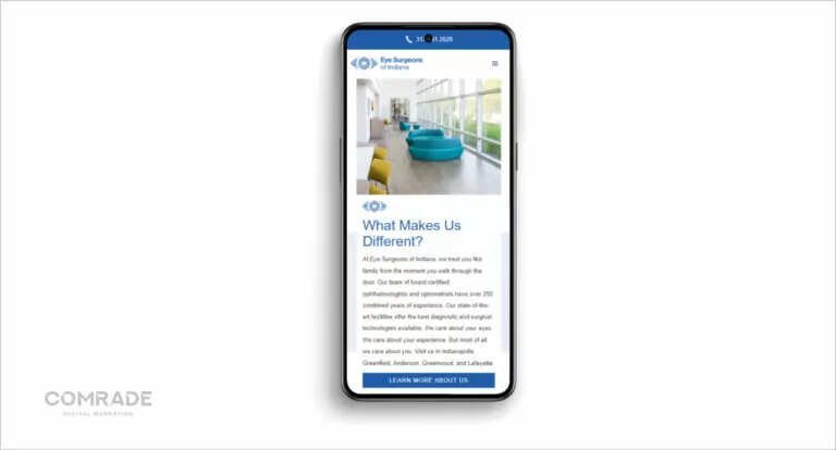
So many individuals search for services online through their mobile phones, especially local ones. Prioritize responsiveness by crafting compact yet impactful displays that can showcase your services effectively across varying screen sizes. Implement features like fluid image and text resizing to help ensure a simple, intuitive navigation experience whether someone is browsing from a smartphone or laptop. A mobile-optimized site meets users where they are, furthering your practice’s accessibility.
7. Be SEO-Friendly
The rule of thumb is always to put users first. However, this doesn’t mean you should neglect search engines like Google since they come second. Search engines prioritize user-centric content. Therefore, create informative pages and craft educational content such as clinical atlases, online textbook, and case presentations optimized around common queries like how to protect sight, prevent vision loss, and more.
Furthermore, prioritize important keywords and add them organically to boost search engine rankings. Include basic metadata and structured data for rich results. You also need to monitor analytics and refine your efforts based on the results from the analysis. Keep in mind that being findable means being accessible to prospective clients seeking trusted doctors near them.
8. Differ From Your Competitors
Stand apart boldly with fresh perspectives. What philosophy or special focus expresses your distinct values? Curate an image and tone recognizably “you” through customized visuals, a memorable motto, and even aesthetic touches like signature colors. Feature client portraits or specialist biographies. Be as authentic in your approach as possible.

Climb the search engine ladder - rank higher on Google with SEO solutions guaranteed to work
Build a New Ophthalmology Website with Comrade
With the importance of medical website design and strong online presence, getting your ophthalmology website right is crucial for connecting with patients seeking quality eye care. While examining high-performing examples is helpful, truly standing out requires customizing an approach that rings true to your unique practice. This is why you need to partner with the right agency, which makes all the difference.
Comrade Digital Marketing Agency offers a full suite of solutions specifically tailored to ophthalmologists seeking to build or renovate their online hub. Our strategic guidance and UX expertise can help bring your vision for a standout website to life. Contact us today to learn more about our web design services and how we can help you build a new ophthalmology website that exceeds your expectations.
