
A great handyman website doesn’t just show what you do — it shows you mean business. When design, trust, and personality come together, visitors instantly feel they’ve found the right person for the job. The best sites make that first impression count, turning quick visits into booked appointments.
Clean layouts, clear service details, and easy contact options aren’t just nice to have — they’re what build trust and drive action. The right design makes your skills shine, showing homeowners you’re reliable, professional, and ready to help.
Below, you’ll find 20 of the best handyman website designs out there. Each one nails the balance between style and substance, proving that even the most practical trades can have a website that looks sharp and works even harder.
The Must-See Handyman Websites for Design Inspiration
1. Fixer
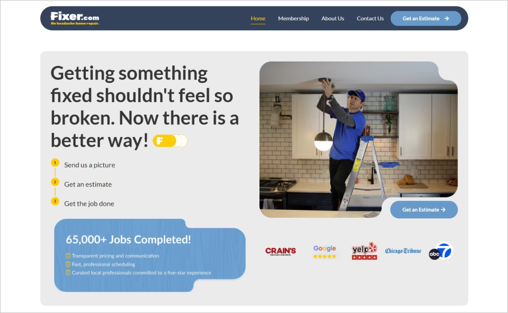
Industry: Handyman / Home Repair Services
Fixer’s homepage greets visitors with a bold promise — “Getting something fixed shouldn’t feel so broken” — anchored by a clean, streamlined hero section that guides users through a simple three-step process: upload, estimate, and job execution. The prominent call-to-action “Get an Estimate,” crisp iconography for each service type, and a modern gradient frame all reinforce a tech-forward, trustworthy impression.
Scrolling reveals smart structuring: the “How Fixer works” segment explains their unique workflow, while the icon-based service list and testimonial section amplify credibility. Their use of whitespace, clear typography, and consistent blue accents ensures clarity and builds confidence — an outstanding example of blending utility with aesthetic appeal for a handyman brand.
2. Mr. Handyman
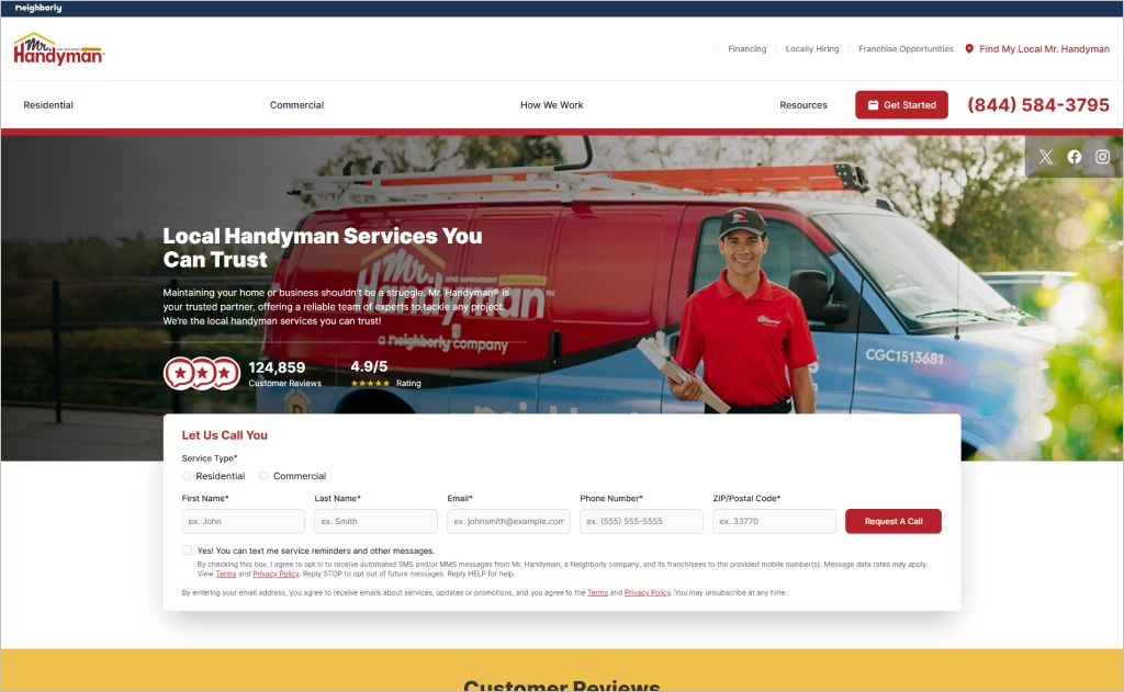
Industry: Handyman / Home Repair Services
The homepage of Mr. Handyman welcomes visitors with a friendly tone and authentic imagery of uniformed technicians, signaling professionalism and trust right off the bat. They’ve integrated bold badges and promises — such as the “Done Right Promise®” — which stand out and reinforce credibility without overwhelming the visitor. Pairing this with a straightforward header navigation and persistent contact options ensures visitors can act quickly.
As you scroll, the site skillfully uses large service cards with subtle hover effects and a consistent color palette that ties back to the brand’s identity. The blog section and cost guides add depth, suggesting not just services but expertise. The overall layout is clean, responsive, and optimized for clarity — ideal for users who just want the repair solution without unnecessary fluff.
3. Trailside Handyman
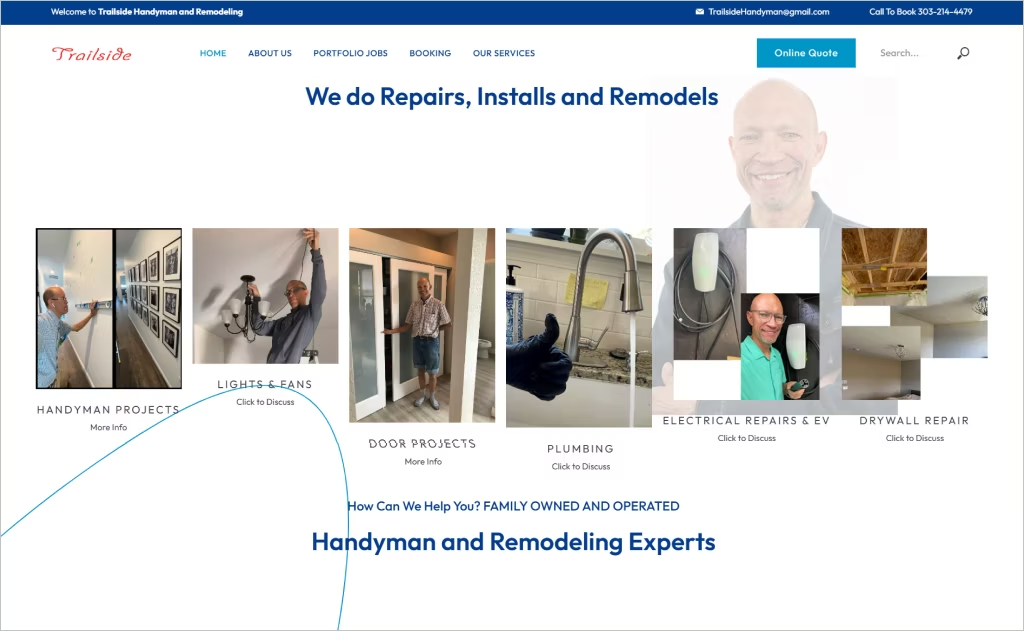
Industry: Handyman / Home Repair Services
The Trailside Handyman website opens with a full-width hero photo of the founder in action, instantly giving a personal touch and setting a tone of craftsmanship. The navigation is minimal and welcoming, while the consistent earth-toned palette and clean typography deliver a grounded, professional feel that aligns with the brand’s “neighborly expert” positioning.
Scrolling down, the site features real project imagery paired with short service blurbs, making it easy to scan what the business does. Contact details and area coverage appear prominently, reducing friction for a customer in a hurry. The balance of visual authenticity with direct usability makes this site notable among handyman designs.
4. Zach of all trades
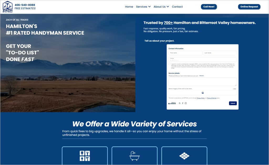
Industry: Handyman & Home Improvement
The website for Zach of All Trades presents a clean, professional aesthetic with plenty of white space, modern typography, and large service-highlight images right on the homepage. The hero statement “Get Your ‘To-Do List’ Done Fast” immediately clarifies value, and the navigation bar gives quick access to major service categories (kitchen & bath remodels, tile work, decks, etc.).
Where the design stands out is in its trust-building elements: a bold “Licensed and Insured” banner, client testimonial headline, and a call to action for a free estimate prominently placed above the fold. The consistent service icons with imagery and the structured listing of service areas (Hamilton, Corvallis, Victor, etc.) add local authority.
5. Kiger Custom Creations
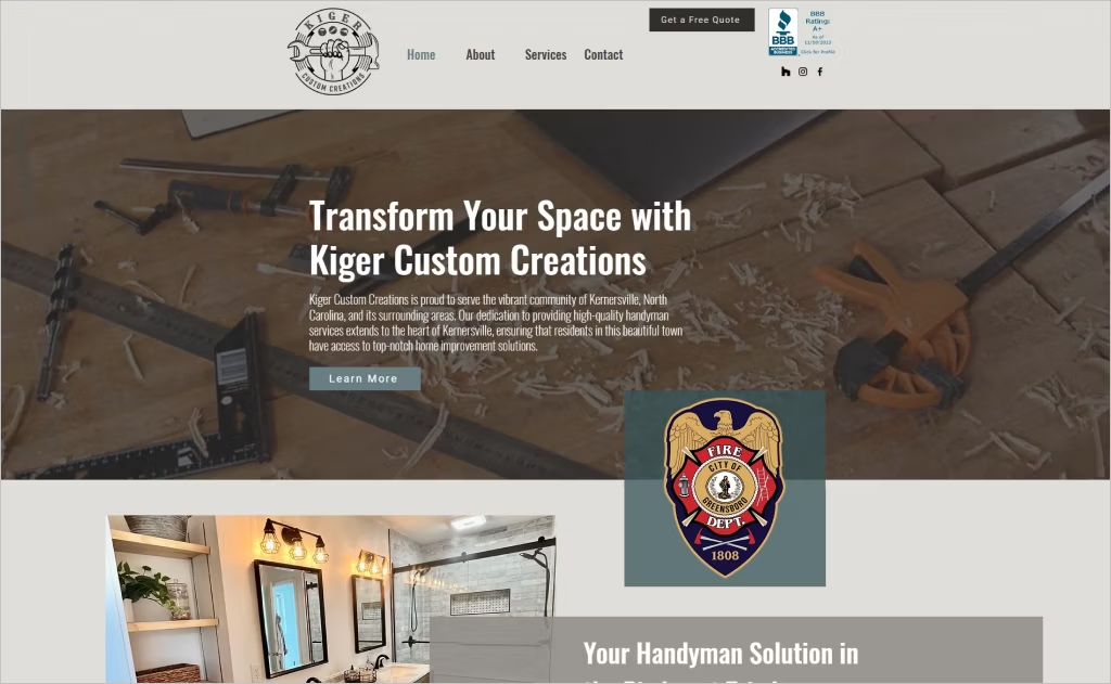
Industry: Handyman & Home Improvement
The website for Kiger Custom Creations makes a strong visual impression with full-width project imagery and a muted colour palette that puts the craftsmanship front and centre. Sub-pages emphasise storytelling, for instance, the “About” page traces the owner’s two-decade construction background and ties in community service, injecting personality and authenticity.
Beyond aesthetics, the site excels at converting interest into action. The “Services” menu is clearly defined, and each category — from flooring to decks — leads to dedicated pages that blend bold headings with a “Book A Free Estimate” call-to-action. This structure not only educates but gently nudges visitors toward engagement, making it a standout among handyman websites.
6. Hernandez Handyman, LLC
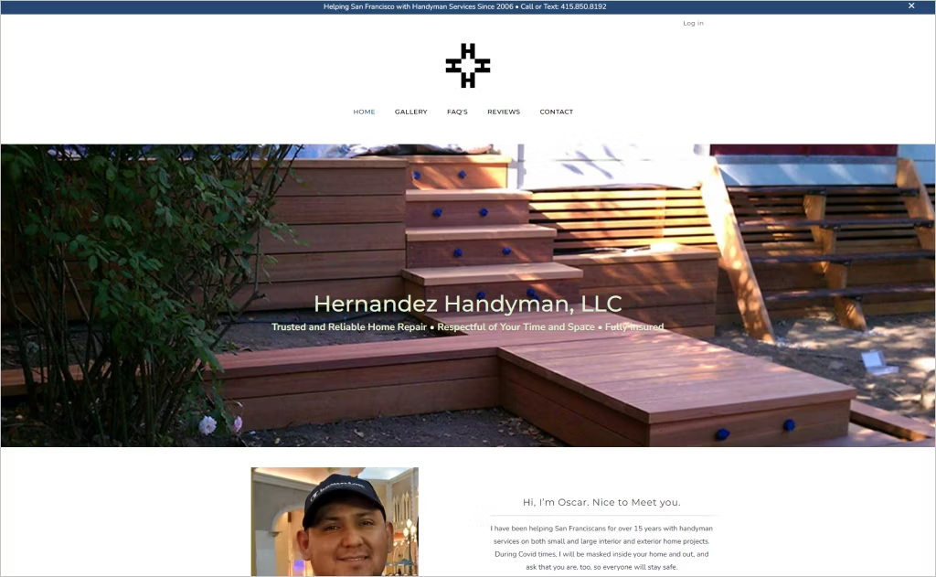
Industry: Handyman & Home Improvement
the owner’s name and photograph, and clearly states “Trusted and Reliable Home Repair” alongside experience since 2006. The gallery section showcases real project photos — from outdoor fences to interior detail work — bringing authenticity and visual proof of skill.
The design excels in clarity of service scope by using a neatly organized FAQ page that answers common client questions about rates, insurance, and scheduling upfront. Soft color accents and ample whitespace keep the layout approachable while the prominent “Call or Text” contact line at the top reinforces accessibility and responsiveness.
7. ToddSunn Company
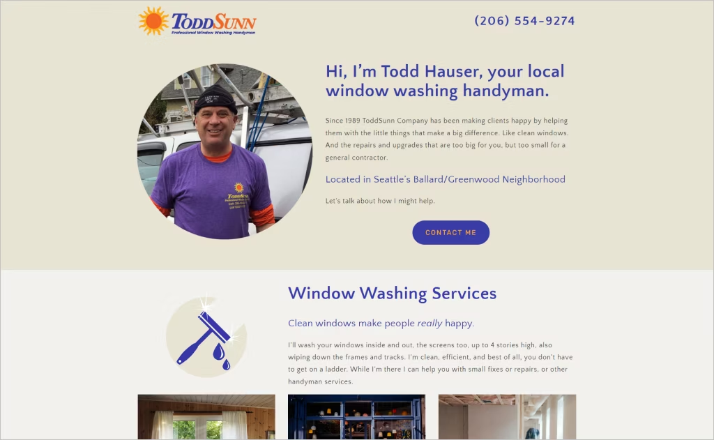
Industry: Handyman & Home Improvement
The website of ToddSunn Company captures attention with a bold headline that blends a specialty (“window washing”) with handyman services, showcasing unique positioning. A hero photo of the owner anchors the homepage, while subtle animations guide the eye down to testimonials — giving prospective clients a sense of craft and personality.
Throughout the site, the layout remains uncluttered, and local focus shines with neighborhood references (“Ballard/Greenwood”) and direct contact information front and center. The styling uses distinct service categories with descriptive copy, making it easy for visitors to navigate from window cleaning to general home-maintenance tasks — all underscoring reliability and specialization in one platform.
8. Shadow Creek Home Service
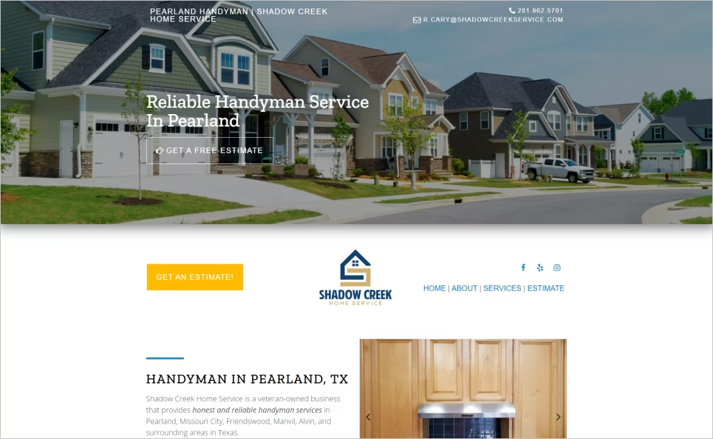
Industry: Handyman & Home Improvement
On the website for Shadow Creek Home Service, the design stands out thanks to a streamlined “Get An Estimate” form that’s visible from the homepage, making conversion simple. The layout features clean service listings and a testimonial carousel that adds credibility by showcasing appreciative client words.
Additionally, the site highlights the owner’s background in a professional yet personable way — mentioning military service and union carpentry — to build trust and character. The use of bold headings, consistent iconography for each service type, and a section detailing “Service Areas” all contribute to a highly user-friendly experience tailored to local homeowners.
9. One Man & A Toolbox
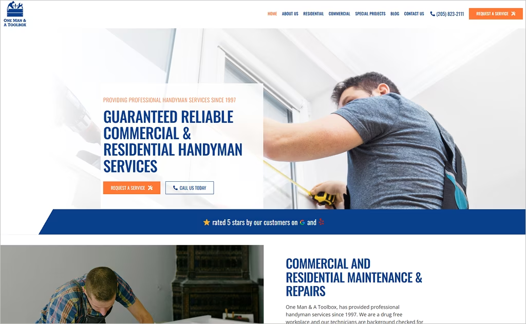
Industry: Handyman & Home Improvement
The website for One Man & A Toolbox stands out with its trust-reinforcing claims — “since 1997,” “licensed, bonded & insured” — incorporated right into the header, helping visitors trust the service from the first moment. The homepage flows into a well-organized “Request a Service” form, which collects details like photos or videos of the project, making it easy for users to initiate contact and for the company to respond efficiently.
Visually, the site uses a crisp, professional layout with clear sectioning of residential vs. commercial services, reinforcing the versatility of their offerings. The clean typography paired with direct calls-to-action (“Call Us Today”, “Request Service”) maintains focus without visual clutter, making the user experience streamlined and user-friendly.
10. Fix-It Friend
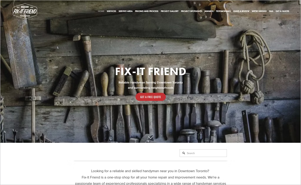
Industry: Handyman & Home Improvement
The website for Fix‑It Friend uses bold, full-screen calls to action (“GET A FREE QUOTE”) right at the hero section, instantly guiding visitors toward engagement. Visitors are met with a highly detailed pricing breakdown and process outline, giving transparent insight into how estimates are structured and building trust from the start.
What makes the site especially distinctive is its deep “Meet the Team” narrative and a strong emphasis on craftsmanship and customized service (including welding and custom fabrication services). The navigation is extensive and content-rich — featuring service-area maps, project galleries, and testimonials — clearly positioning the company as a high-end, skill-driven choice in its market.
11. Roby Services
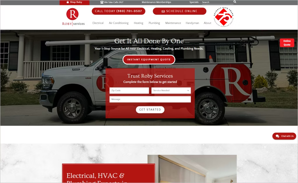
Industry: Handyman Services
The website for Roby Services opens with a bold red-brand visual identity and seamless navigation that instantly positions them as a full-service provider across drywall to HVAC. Stunning photography of their technicians and trucks enhances authenticity, while the “Get started” form with ZIP-code capture right on the homepage creates a friction-free funnel. Their consistent tagline, “Get It All Done By One,” underlines their wrap-around service model, reinforcing the unique value of one contractor handling multiple trades.
Diving deeper, the site uses a well-structured layout: trust badges like third-generation heritage, “white-glove” service promises, and a dedicated “Maintenance Memberships” page featuring clearly laid out benefits like routine inspections and discounts. The design employs plenty of whitespace, bold headers, and clear segmentation so users quickly grasp the breadth of services and feel confident.
12. The Ultimate Handyman
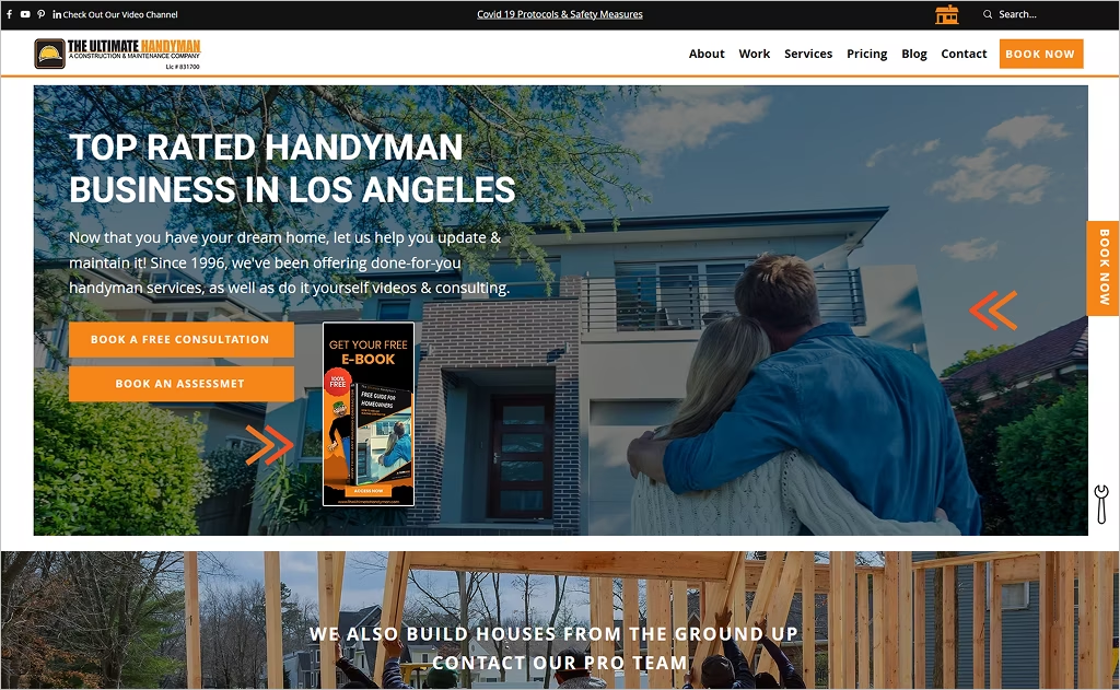
Industry: Handyman / Home Repair Services
The Ultimate Handyman website brings a dynamic, energetic presence to the handyman space with its high-contrast orange accent colour and full-width hero featuring an animated arrow and moving background visuals. Right away, it signals action and expertise. The prominent “BOOK NOW” button appears not just once but repeatedly as you scroll, turning the intake process into a clickable journey rather than a static page.
What sets it apart further is the integration of rich educational content: a blog section with thumbnails for practical ‘How-to’ articles and a video channel link raise the brand from service provider to trusted advisor. The header clearly states “Since 1996,” which adds credibility, and the services include both residential and commercial, shown via clean image grids, giving visitors instant breadth of capability.
13. Handyman Connection
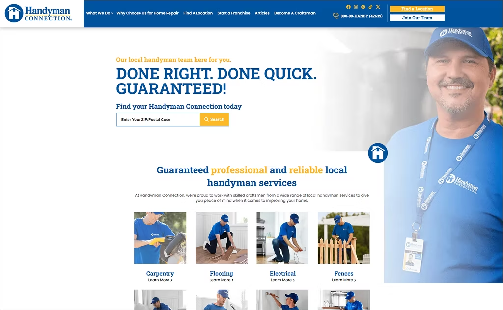
Industry: Handyman / Home Repair Services
The website of Handyman Connection stands out with its robust visual consistency — deep-blue and bold yellow accents mirror the brand’s “trusted craft” messaging, while full-width imagery of real crews at work reinforces authenticity. The hero section immediately features a smart search bar for finding local services by ZIP code, which pushes the visitor straight into action. The navigation menu neatly groups “What We Do,” “Articles,” “About,” and “Start a Franchise,” making it easy for both customers and prospective franchisees to find what they need.
Digging deeper, the site blends credibility and content effortlessly: a counter proclaiming completed jobs lends social proof, and a dedicated “Articles” blog section addresses homeowner concerns with insight and resources. The presence of franchise-related calls throughout the footer reminds visitors of the network’s size and professionalism. Overall, the design feels both expansive and localized, safe and action-oriented.
14. Ace Handyman Services
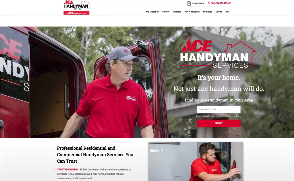
Industry: Handyman / Home Repair Services
The Ace Handyman Services website opens with a crisp layout that uses bold white space to frame its brand-affiliated blue and red palette, conveying both professionalism and trust. The “Find Your Local Ace Handyman” search bar sits front and center, ensuring visitors can quickly access local services. Visuals of technicians in branded uniforms lend authenticity and immediately communicate that this is not just a listings site but a coordinated national network.
Further down the page, large typography highlights their promise of “Handyman Services You Can Trust,” reinforcing both the breadth of services and reliability of the brand. Service categories such as drywall, painting, and carpentry appear in clean icon-based grids, making choices visible at a glance. Combined with clear messaging and strong brand alignment to the parent co-op Ace Hardware, the design feels both expansive and shopper-friendly.
15. House Doctors
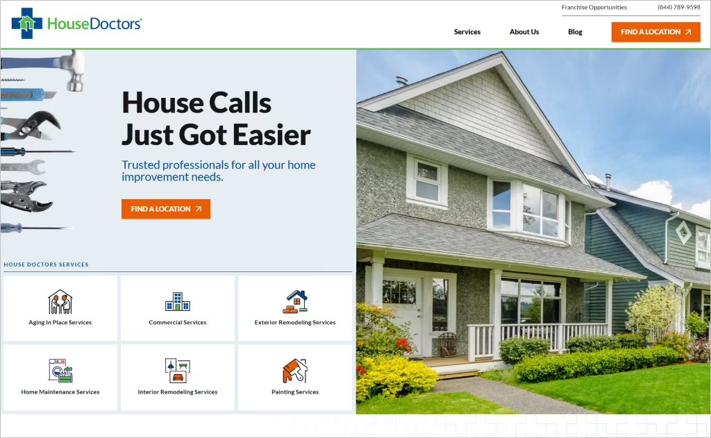
Industry: Handyman / Home Repair Services
The website of House Doctors projects a welcoming yet rugged professional vibe, with rich photography of uniformed technicians and well-lit project sites conveying skilled workmanship from the moment you land. A standout feature is the prominent location-finder dropdown paired with a “Free Estimate” call-to-action that adapts based on region, making it feel responsive to your neighborhood.
What really differentiates the site is its thoughtful storytelling — smooth transitions introduce the brand’s 20+ years of experience and one-year labour guarantee, reinforcing trust without heavy sales jargon. The clean layout uses a palette of deep teal and bright accents, which balances approachability and credibility in a market where reliability counts.
16. Honey Homes
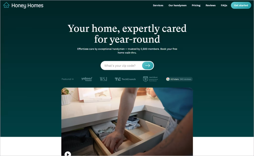
Industry: Handyman / Home Repair Services
The Honey Homes website impresses right away with its membership-model clarity, displaying its “one dedicated handyman” promise right in the hero area and backing it with sleek icons for the accompanying app-based task list. The minimalist design uses generous white space and a fresh color palette that gives the membership model a tech-savvy, upscale feel.
Scrolling down, you’ll find dynamic visuals of the team in action alongside modern UI features like interactive pricing cards and a step-by-step “How it works” flow. The site emphasizes continuity and personalization — each member gets a familiar face and a long-term relationship: an element rarely highlighted so strongly in this industry.
17. Hank’s Handyman

Industry: Handyman / Home Repair Services
The website for Hank’s Handyman captures attention with a bold headline proclaiming “DFW’s #1 Rated Handyman Service since 2019,” which immediately conveys credibility and local dominance. The imagery features clean, high-quality photos of teams on-site, paired with a vivid orange accent that energizes the white-space layout. The layout is smartly split between the primary handyman offering and pest/weed services, giving visitors a clear sense of the multi-service capability without clutter.
Digging deeper, the site features an interactive “Service Area” page highlighting the exact counties served and offering a “$49 off service” promotion that feels timely and actionable. The navigation remains simple while fluorescent call-to-action buttons for “Schedule Service Online” appear repetitively as you scroll, making it easy to convert without distraction.
18. HandyPro
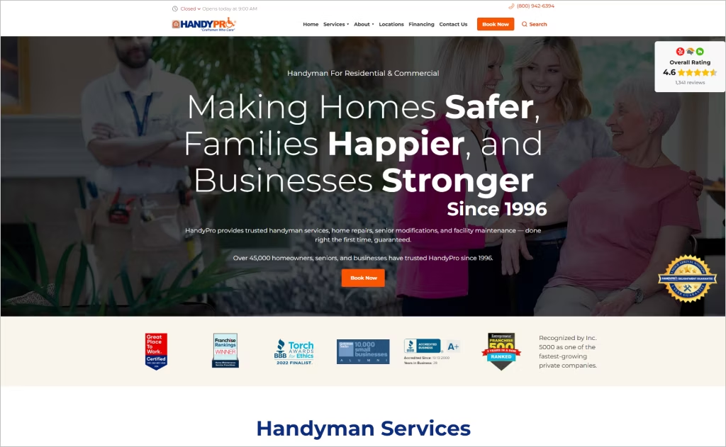
Industry: Handyman / Home Repair Services
The HandyPro website uses a structured, trust-centric layout that emphasizes both longevity and reliability — phrases like “over 25 years of experience” and “Certified Craftsmen” are upfront. The intuitive site framing uses clear white space with teal accent strips, helping key promises like “labor guaranteed” and “show up on time or you’ll get $30 off” stand out visually.
What makes the design notably distinctive is the seamless integration of its proprietary scheduling app, “TruztPro,” highlighted alongside textual promises so visitors see tech convenience and human service together. The gallery of past projects and interactive location pages also reinforces local-service scale and personalizes the brand, turning what could be a generic handyman site into a polished, service-brand experience.
19. Mr. Does All
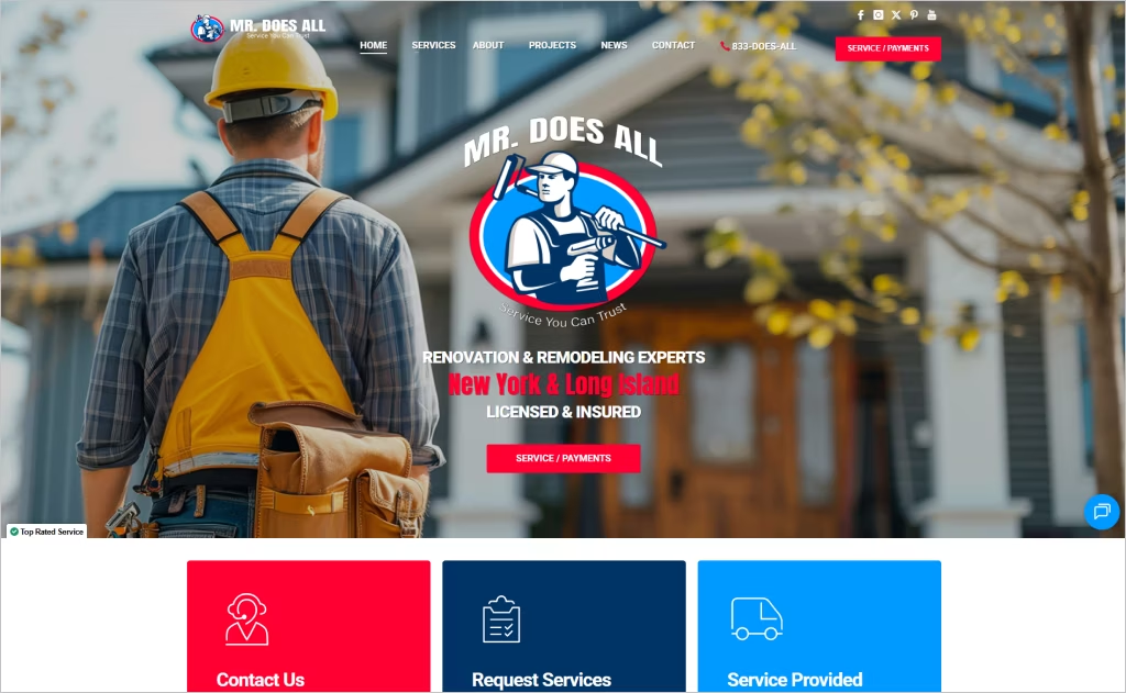
Industry: Handyman / Home Repair Services
The Mr. Does All website opens with no fluff — just the essential “Licensed & Insured” badge front and center, paired with crisp, full-width visuals of real technicians at work. The design’s bold typography and straightforward colour palette keep focus on service rather than gimmicks, instantly building confidence in their New York & Long Island credentials.
Scrolling down reveals a robust “Projects” section showcasing past renovations in a clean, grid-style layout — this gives visitors a tangible feel for quality and scope. The navigation remains uncluttered yet comprehensive, listing everything from flooring and carpet to cleanouts and furniture assembly, which reinforces the “all-in-one” brand promise without sacrificing clarity.
20. Columbus Handyman
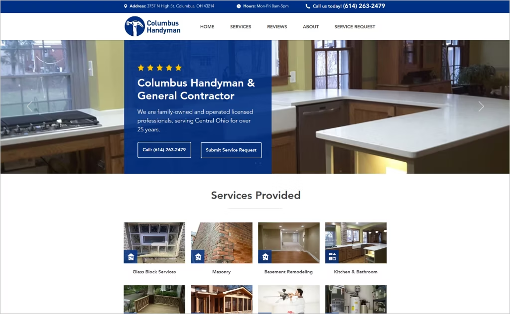
Industry: Handyman / Home Repair Services
The Columbus Handyman website greets visitors with a reassuring tagline about being family-owned and licensed for over 25 years in Central Ohio, giving the design a grounded, local narrative. Embedded contact and “Submit Service Request” CTAs appear in both the header and footer, making outreach straightforward and consistent across pages.
The design leverages a compact services list that stays accessible even as you scroll, enabling a quick sense of breadth without overwhelming newcomers. Against a neutral palette, subtle accent colours highlight specials and coupons, while the “What Our Clients Say” testimonial panel adds credibility and a human touch.
Want to speak with an expert?
Call us at (872) 242-1074
How to Design a Website That Shows Off Your Handyman Expertise
Creating a professional handyman website isn’t just about listing your services — it’s about building trust, showing skill, and turning visitors into clients. A great handyman website combines clear messaging, visual proof of work, and effortless usability. Here’s how to do it right:
1. Define Your Brand and Target Audience
Before you design anything, decide who you are and who you serve.
- Establish your identity: Are you a solo handyman with a personal touch, or a larger team offering full-service repairs?
- Pick a tone: Friendly and local? Or professional and corporate? Your color palette, logo, and copy should match this tone.
- Know your audience: A homeowner looking for small repairs has different needs than a property manager seeking ongoing maintenance. Tailor your visuals and wording accordingly.
Pro Tip: Write a tagline that instantly tells visitors what you do, such as “Reliable Home Repairs You Can Count On” or “Fast, Friendly, and Skilled Handyman Services Near You.”
2. Showcase Your Work with Strong Visuals
Nothing builds credibility like before-and-after photos or short video clips of your completed projects.
- Create a “Gallery” or “Projects” page showing transformations, neatness, and craftsmanship.
- Use real photos — not stock images — to earn trust.
- Include customer testimonials next to visuals for extra impact.
Bonus Tip: Use consistent lighting and angles when taking photos; this helps your work stand out professionally.
3. Make Navigation Simple and Mobile-Friendly
A cluttered website can lose you clients fast.
- Keep menus clean: Home | Services | Gallery | Reviews | Contact.
- Add clear calls-to-action (CTAs) like “Request a Quote” or “Book Now.”
- Ensure the site loads quickly and looks great on smartphones — most homeowners will search for you on their phones.
Tip: Use a sticky “Call Now” button on mobile so clients can reach you instantly.
4. Highlight Trust and Professionalism
Show why you’re the right choice.
- Include licenses, insurance badges, certifications, or years of experience.
- Display real customer reviews (from Google or Yelp) directly on your site.
- Add a personal section — a friendly headshot with a brief story of how you started your handyman business helps connect with visitors emotionally.
Pro Tip: Add a short “Why Choose Us” section that summarizes your reliability, fast response times, and satisfaction guarantee.
5. Optimize for Local SEO and Lead Generation
Your website should bring you new business, not just look nice.
- Use location keywords like “handyman in Austin, TX” throughout your pages.
- Add your business to Google Maps and connect it with your site.
- Include a contact form, click-to-call phone number, and live chat (if possible).
Advice: Start a blog offering quick home maintenance tips — this builds trust, improves your search ranking, and keeps clients coming back.
Your Website, Your Best Tool
A strong handyman website isn’t just about showing off your services — it’s about building trust, standing out from the competition, and turning visitors into loyal clients. The best designs balance professionalism with personality, making it easy for potential customers to take action.
These top 20 handyman website designs prove that a well-crafted online presence can make all the difference in attracting steady business and keeping your schedule full. Clean layouts, sharp branding, and user-friendly features are what separate great sites from the forgettable ones.
If you’re ready to give your handyman business a website that truly works for you, Comrade Digital Marketing is here to help. We create custom, high-performing websites that attract clients and grow your business. Reach out today and let’s build a site that gets results!