
Your website is often the first impression people have of your home building business — and we all know first impressions matter. A great site doesn’t just look good; it shows your style, highlights your work, and makes potential clients excited to work with you.
The best home builder websites strike a perfect balance between beauty and usability. They showcase projects, tell a story, and make it easy for visitors to navigate, get inspired, and reach out. In today’s competitive market, a well-designed website can be just as important as the homes you build.
In this article, we’ve rounded up 30 of the most inspiring home builder websites. Whether you’re looking for ideas for your own site or just want to admire some incredible designs, these examples prove that a website can feel as welcoming as a front door — inviting, memorable, and impossible to ignore.
The Most Inspiring Home Builders Websites of 2026
1. West Point Development
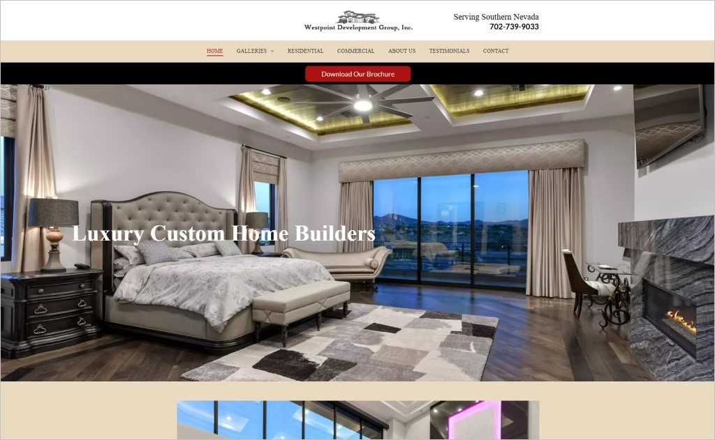
Industry: Custom Home & Residential / Commercial Building Construction
The Westpoint Development site stands out visually with large, high-quality hero images and a clean, elegant layout that immediately communicates luxury custom homes. Navigation is simple, with clear sections for galleries, residential, commercial work, about, testimonials, and contact. The visual hierarchy emphasizes beautiful photography, allowing visitors to quickly see styles and past projects.
Design-wise, it fuses strong branding and trust signals: “In Business Since 1988,” combined with family history and decades of experience, are front and center. The “Free Estimate” call to action appears early and repeatedly, encouraging engagement. The aesthetic is balanced — traditional warmth (through imagery and textures) meets modern clarity in typography and white space.
2. Schumacher Homes
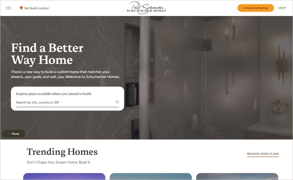
Industry: Custom Home Construction / Home Builder
The Schumacher Homes website uses a clean, structured layout that immediately invites users to explore custom home plans. Bold imagery, a carousel of trending homes, and interactive tools like “Customize Floor Plan” and “Try Lot Vision” help visitors visualize their dream homes. The site balances beautiful visuals with functionality — transparent pricing, options menus, and a step-by-step process section create clarity as soon as you land.
What makes it stand out is its focus on user control and personalization. Visitors are guided to pick architects’ plans or build entirely custom, while being able to tweak details like ceiling heights or fixtures. The site gives strong signals of trust through large numbers — over 23,000 homes, model homes count, and regional service info — plus awards and recognition displayed prominently.
3. Montana Build
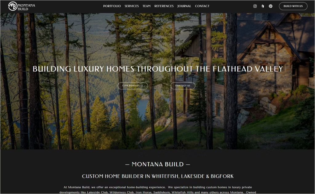
Industry: Custom Home Building / Luxury Residential Construction
Montana Build’s website immediately captures attention with sweeping, high-resolution images of custom homes set against stunning Montana backdrops. These visuals pull you in, offering a glimpse into the lifestyle their homes are designed to create.
The overall layout is sleek and intentional — minimal navigation (Portfolio, Services, Team, Journal, Contact) ensures visitors stay focused on the imagery and message. Every design choice, from typography to spacing, balances high-end luxury with a warm, grounded tone.
Strategic calls to action like “Build With Us” and “Start your Dream Home Here” are always within reach, paired with an easy-to-explore portfolio that makes engaging with the brand feel effortless and inviting.
4. Sims Luxury Builders
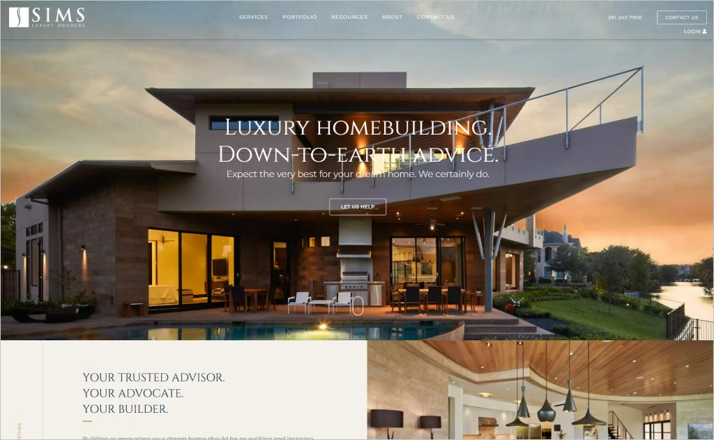
Industry: Construction / Custom Luxury Home Building
Sims Luxury Builders’ website immediately exudes sophistication, thanks to its stunning full-width photography and clean, minimal design. The homepage makes a powerful first impression with bold visuals, elegant typography, and spacious white space that lets the work speak for itself.
Navigation is intuitive and purposeful. Clear menu items like “Portfolio,” “Services,” and “Client Testimonials” help visitors quickly find what matters most. Each section is thoughtfully structured, guiding users through their craftsmanship, values, and service areas with ease.
What really sets the site apart is its storytelling. It weaves emotional, trust-building language (“your advocate… your builder”) with tangible proof of experience and range. Visual hierarchy, subtle hover effects, and well-placed calls to action gently invite deeper exploration without ever feeling pushy.
5. California Home Builders
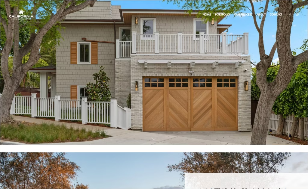
Industry: Custom Homes & Renovations, General Contracting
The California Home Builders site catches your eye with its polished portfolio grid of featured projects — photos of Rancho, La Jolla, and Solana Beach homes all presented as visual storytelling. Subtle transitions and high-contrast text over images let the work shine without overwhelming the viewer.
Its “Our Process” section is especially clean, using numbered steps with concise descriptions that feel personal and professional. Typography choices — spacious, modern sans serif fonts — and a restrained palette lend credibility, while the family-owned backstory and local focus connect emotionally without clutter.
6. Maronda Homes
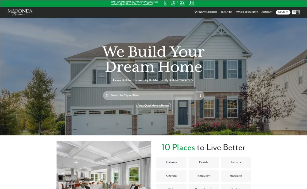
Industry: Real Estate / Residential Home Building
The Maronda Homes website instantly draws visitors in with sweeping, high-quality visuals that showcase model homes, floor plans, and scenic neighborhood views. These rotating hero images are paired with clean typography and a spacious layout, all working together to evoke a sense of “dream home living.”
The site’s warm color palette blends earthy tones with crisp whites, striking a balance between comfort and professionalism. Navigation is smooth and intuitive — users can easily filter by state, community, or home type right from the homepage.
Interactive features like virtual tours, galleries, floor plans, and “design online” tools are front and center, making the browsing experience both engaging and informative. Key links like About, Contact, and the Customer Portal remain accessible at the top, no matter where you go.
7. Stanley Martin
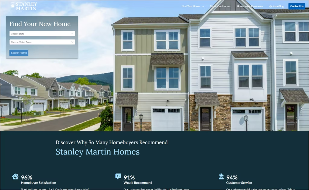
Industry: Residential Real Estate and Home Building
Stanley Martin’s website makes a strong first impression with its clean design and emotionally resonant messaging, like the tagline “Your Life is Our Blueprint.” The homepage highlights beautiful images of move-in-ready homes, paired with lifestyle-oriented copy that emphasizes living in the moment, not waiting for it.
Customer testimonials are front and center, adding authenticity and trust through real stories from homeowners across multiple states. Navigation is simple and intuitive, guiding users effortlessly to resources and community info. The site strikes a perfect balance between professionalism and warmth, using inviting typography and generous white space throughout.
8. Cornerstone Homes
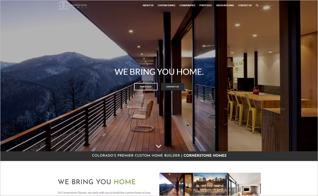
Industry: Custom Home Building
Cornerstone Homes’ website captivates with its bold, contemporary aesthetic featuring dramatic full-screen imagery of luxury mountain properties. The clean, minimalist navigation and sophisticated typography create an upscale, aspirational feel that perfectly mirrors their high-end Colorado custom builds.
The site brilliantly showcases their sustainable communities through immersive visuals and strategic white space, letting the stunning architecture speak for itself. The design-build integration messaging flows seamlessly through elegant transitions, making complex concepts feel approachable while maintaining an exclusive, premium brand presence.
9. Shea Homes
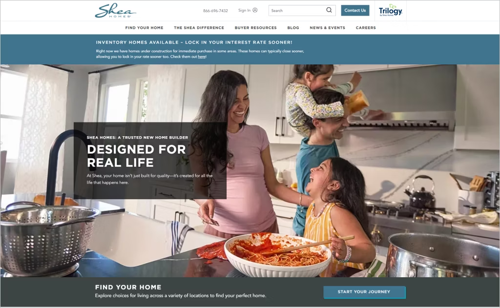
Industry: Residential Construction
Shea Homes captivates with its emotionally driven design approach centered around the tagline “designed for real life.” The homepage features warm, lifestyle-focused photography showing families in authentic moments rather than sterile architectural shots, creating an immediate emotional connection with potential homebuyers.
The site excels through intuitive navigation that segments offerings by location and lifestyle categories like 55+ communities, master-planned developments, and quick move-in homes. Clean typography, generous white space, and strategically placed calls-to-action guide users effortlessly through their home search journey while maintaining an upscale yet approachable aesthetic.
10. D.R. Horton
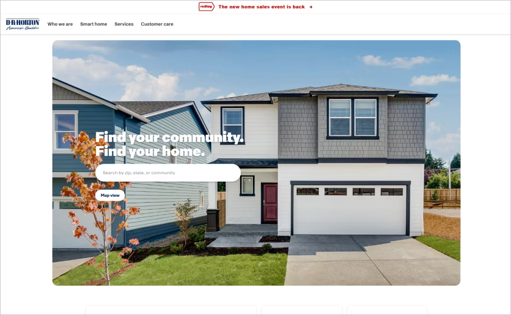
Industry: Residential Home Construction
D.R. Horton’s website radiates a sense of modern simplicity, using generous white space and immersive full-width photography to immediately pull visitors into inviting, aspirational spaces. The design feels open and calm, giving the homes themselves room to shine.
Right at the top, the homepage makes a strong first impression with a sleek hero section and an easy-to-use search bar. It’s a thoughtful touch that makes exploring available homes feel effortless while keeping the overall look clean and polished.
Throughout the site, there’s a smart balance of professionalism and warmth. Crisp typography, the confident “America’s Builder” tagline, and neatly organized content blocks help guide users without the overload — delivering a premium yet approachable experience from start to finish.
11. Smith Douglas
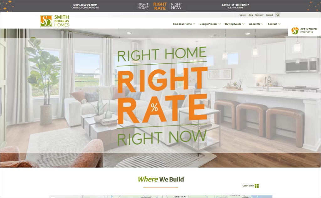
Industry: Residential Home Building
Smith Douglas embraces a clean, customer-centric design philosophy that prioritizes interactive visualization tools. The homepage seamlessly integrates their “Visualize Your Dream Home” feature, allowing users to navigate through community selection, homesite mapping, and home customization in an intuitive flow that transforms abstract browsing into tangible decision-making.
The design stands out through its emphasis on transparent value communication and social proof integration. Rather than overwhelming visitors with technical specifications, the site weaves authentic homebuyer testimonials throughout the experience while maintaining clear pathways to pricing information and financing resources, creating trust through both design simplicity and content authenticity.
12. NVHomes
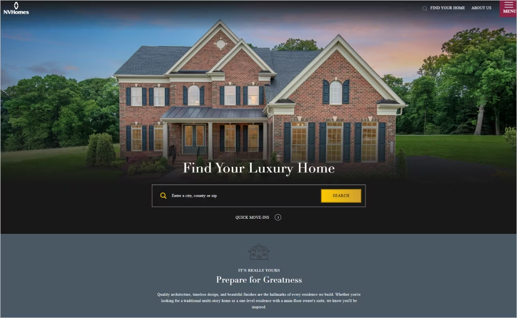
Industry: Residential Construction
NVHomes delivers an elevated digital experience through sophisticated minimalism and luxury-focused storytelling. The design embraces generous whitespace, elegant typography, and a restrained color palette that mirrors the premium positioning of their homes, creating an atmosphere of refined exclusivity.
High-quality lifestyle photography dominates the layout, paired with carefully curated messaging about “architecture as everything” and thoughtful design philosophy. Custom divider elements and strategic content hierarchy guide visitors through an emotional journey rather than a transactional browsing experience, positioning homeownership as aspirational artistry.
13. Toll Brothers
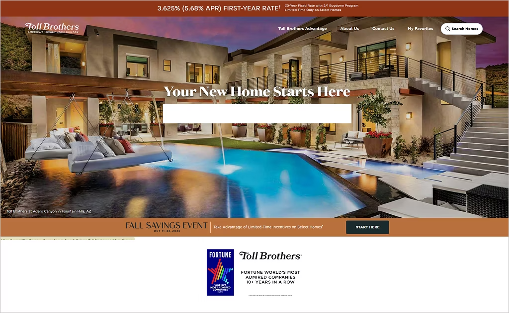
Industry: Luxury Home Construction
Toll Brothers delivers an immersive visual experience through expansive, high-resolution photography that showcases architectural craftsmanship with cinematic quality. The homepage employs elegant parallax scrolling that creates depth and sophistication, mirroring the luxury positioning of their homes.
The design emphasizes white space and refined typography that evokes premium lifestyle branding rather than typical construction sites. Strategic use of full-screen imagery with minimal text overlays allows the quality of their homes to speak first, while intuitive navigation guides visitors through customization options and community locations with effortless elegance.
14. Madrone Construction
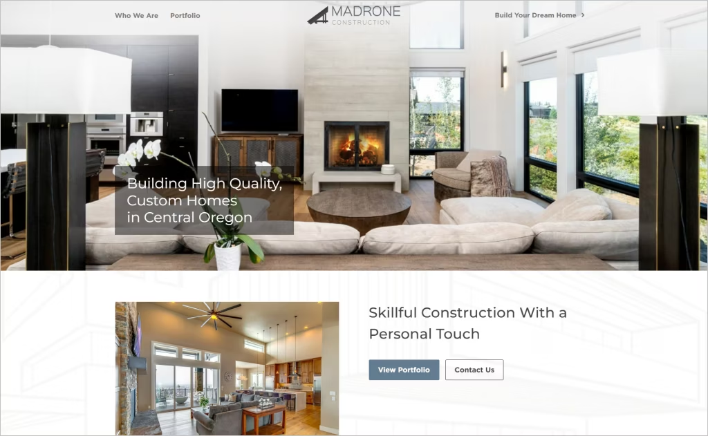
Industry: Custom Home Construction
Madrone Construction’s website immediately draws you in with stunning, high-resolution images of their custom Central Oregon homes, beautifully framed by the region’s natural landscape. The visual experience is immersive and aspirational from the first scroll.
Clean lines, ample white space, and a minimalist layout reflect the same craftsmanship and attention to detail that define their homes. The site’s messaging is clear and confident, grounded in the values of quality, integrity, and experience.
Everything — from the refined color palette to the graceful typography — feels purposeful. Thoughtful design choices and smart visual hierarchy guide users smoothly from inspiration to inquiry, reinforcing Madrone’s position as a trusted luxury home builder.
15. Belmonte Builders
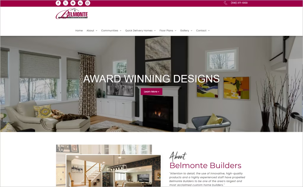
Industry: Custom Home Construction
Belmonte Builders’ website captivates through its sophisticated visual hierarchy, where expansive hero imagery of meticulously crafted homes immediately establishes luxury positioning. The design employs elegant whitespace and refined typography that mirrors the precision craftsmanship evident in their builds.
The site’s strategic use of client testimonials integrated seamlessly within the layout creates an authentic narrative flow. Soft transitions between sections and a muted color palette evoke the same attention to detail promised in their homes, making the digital experience feel as carefully curated as their physical properties.
16. KB Home
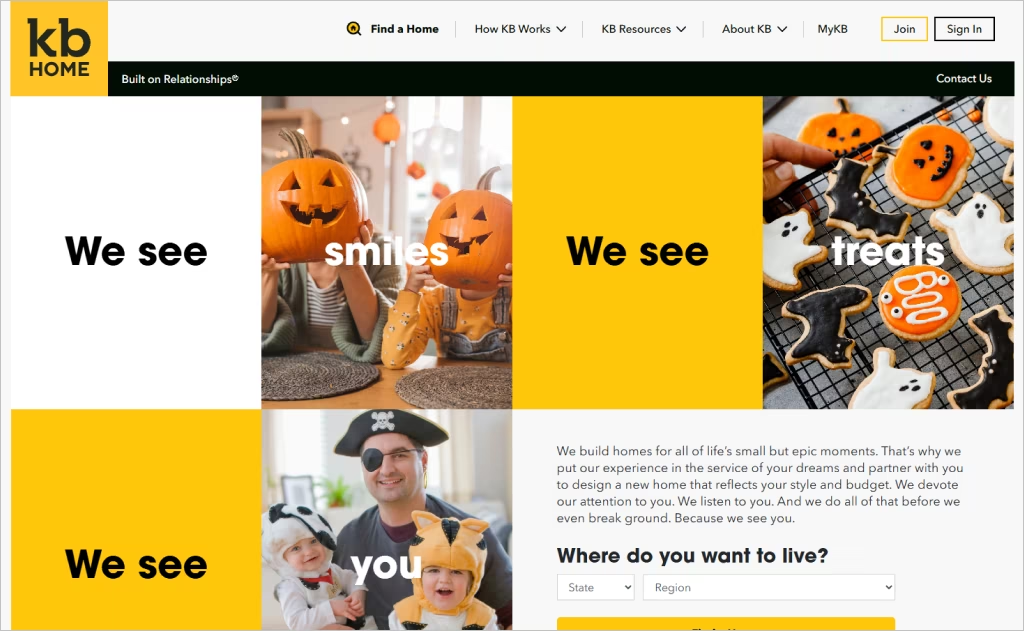
Industry: Residential Construction
KB Home’s website masters emotional storytelling through bold typography and intimate photography that captures genuine life moments. The homepage features an elegant scroll-triggered design where large, poetic phrases like “We see you” and “We see dreams” unfold progressively, creating an almost cinematic experience that feels personal rather than transactional.
The design cleverly balances aspiration with practicality by seamlessly integrating their customization tools and sustainability features into the narrative flow. High-quality lifestyle imagery alternates with clean informational sections, while the color palette remains warm and inviting, making the complex homebuying journey feel approachable and human-centered.
17. DC Builders
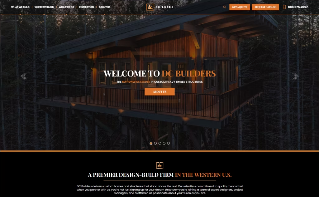
Industry: Custom Timber Frame Homes & Structures
DC Builders’ website immediately draws you in with its warm, rustic charm. Rich wood textures and earth-toned hues echo the essence of their timber frame craftsmanship, setting a tone of elegance and authenticity.
Striking full-screen visuals showcase their completed projects like scenes from a film, giving you a clear sense of their premium quality. The smooth scrolling and subtle sticky menus enhance the experience without ever feeling over-designed.
Their logo blends old-world craftsmanship with modern minimalism, symbolizing their philosophy: timeless construction paired with clean, contemporary aesthetics. It’s a thoughtful touch that reflects their design-build expertise perfectly.
18. Landsea
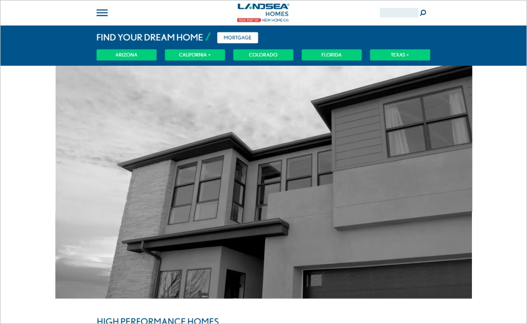
Industry: Residential Home Construction
Landsea Homes creates an immersive visual experience through expansive hero imagery that showcases stunning architectural photography and lifestyle moments. The design balances sophistication with accessibility, using generous white space and clean typography that guides visitors effortlessly through their homebuilding journey.
The website stands out with its emphasis on storytelling through authentic homeowner testimonials paired with breathtaking property visuals. Interactive community maps and intuitive navigation create a seamless exploration experience, while subtle animations add polish without overwhelming the content-forward approach.
19. Seel Homes
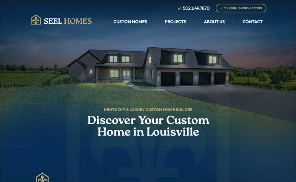
Industry: Custom Home Building & Remodeling
Seel Homes’ website offers a polished and user-friendly experience, reflecting the company’s commitment to quality craftsmanship. The homepage features a clean layout with high-resolution images of custom homes, providing visitors with a visual representation of the company’s work.
Interactive elements, such as the “Schedule a Consultation” button, are prominently displayed, encouraging user engagement. The website’s design emphasizes simplicity and elegance, aligning with Seel Homes’ brand identity and making it easy for potential clients to navigate through their services and portfolio.
Overall, the website effectively showcases Seel Homes’ expertise and dedication to delivering exceptional custom homes.
20. CMK Builders
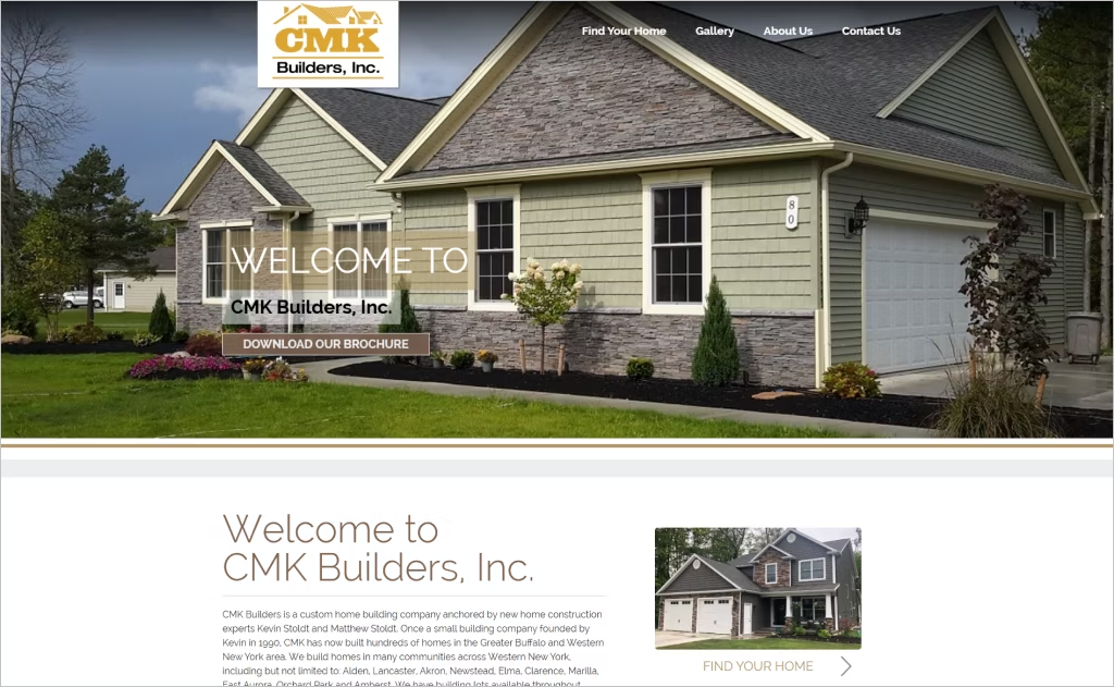
Industry: Custom Home Building
CMK Builders’ website showcases a clean, photography-forward approach that immediately establishes trust through expansive imagery of finished homes. The design employs generous white space and an intuitive navigation structure that guides visitors seamlessly from inspiration to consultation.
What distinguishes this site is its balance between aspirational visual storytelling and practical information delivery. High-resolution project galleries dominate the experience while strategically placed calls-to-action and builder credentials create a conversion-focused design that never feels pushy or sales-driven.
21. Desert Star Construction
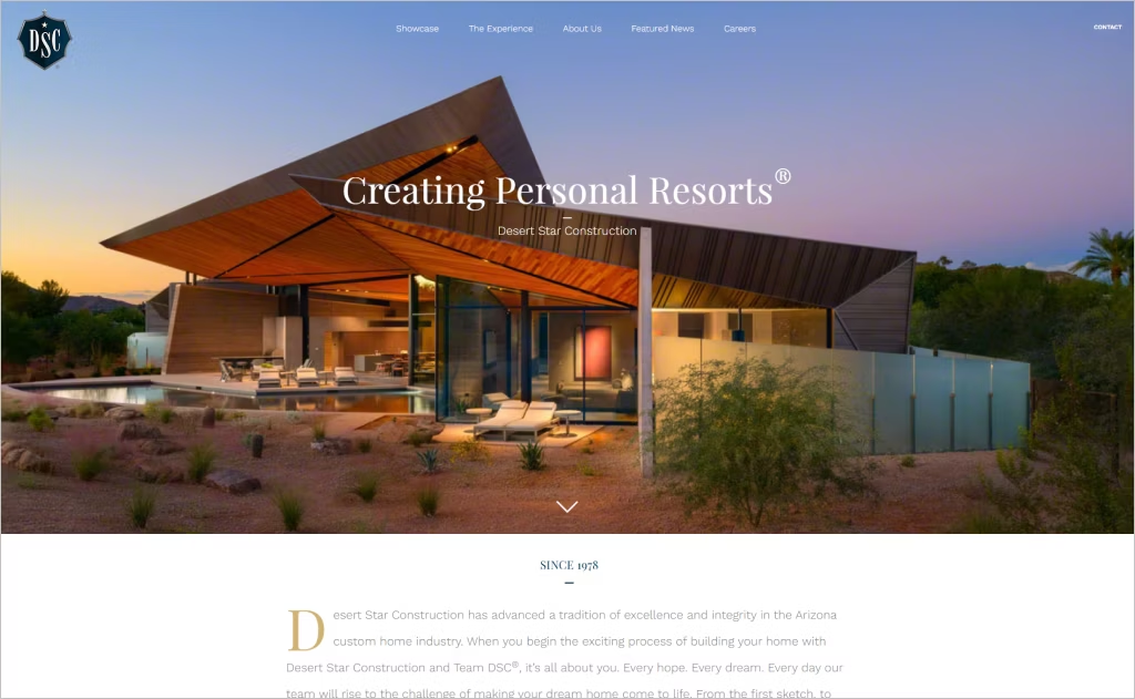
Industry: Luxury Custom Home Construction
Desert Star Construction’s website immediately conveys a sense of refined luxury. Its clean, minimalist design reflects the elegance of the homes they craft, with spacious layouts, elegant fonts, and photography that does most of the talking.
Navigation feels effortless and intuitive, echoing their “DSC Standard” of precision and excellence. Each page is thoughtfully curated to showcase not just projects, but an entire philosophy of high-end craftsmanship and attention to detail.
What really sets them apart is the balance of professionalism and warmth. With authentic testimonials and their standout “Leadership Architect” positioning, they come across as both highly credible and genuinely client-focused — something rare in the luxury construction space.
22. E2 Homes
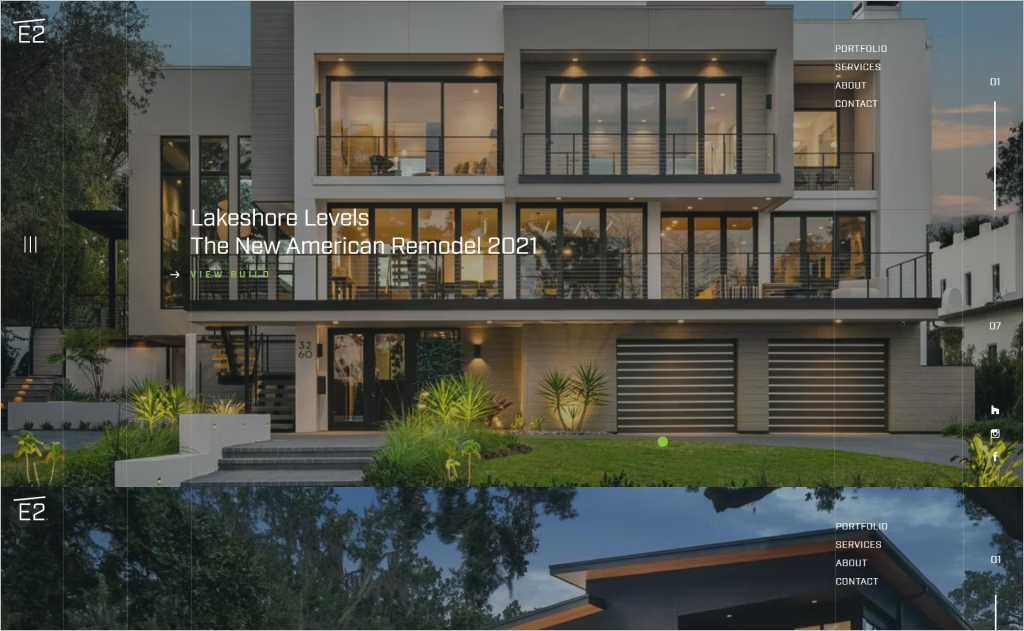
Industry: Custom Home Building & Remodeling
E2 Homes showcases a sophisticated, gallery-first approach that immediately positions their work as high-end artistry. The homepage features expansive, full-screen imagery with minimal text overlay, allowing their custom builds to speak through visual storytelling rather than marketing copy.
The navigation is refined and uncluttered, emphasizing elegance over information density. Subtle animations and generous whitespace create a luxury brand experience that mirrors the premium nature of their custom construction services, making visitors feel they’re touring an architectural portfolio rather than browsing a traditional contractor website.
23. D&W Homes
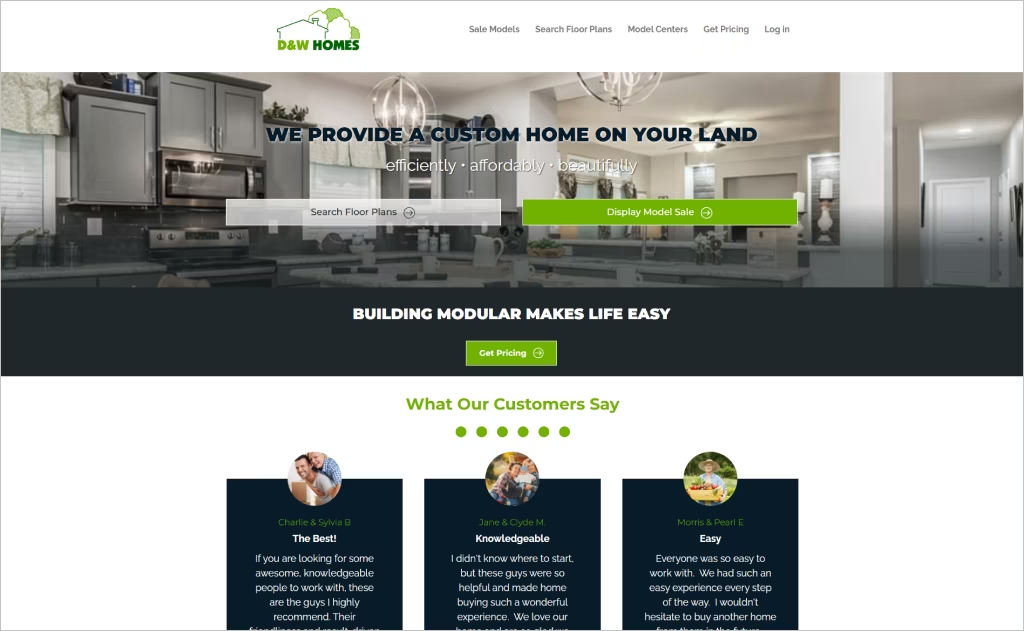
Industry: Modular Home Building
D&W Homes embraces a clean, lifestyle-focused design that transforms modular construction into an aspirational experience. The website brilliantly uses circular customer photography and an inviting visual hierarchy that feels personal rather than corporate, breaking away from typical builder templates with its warm, welcoming aesthetic.
The three-stage journey framework — “dream it, build it, love it” — creates narrative flow throughout the site, making complex construction processes feel approachable. Bold typography paired with generous whitespace and strategically placed testimonials establishes trust while maintaining modern sophistication that elevates modular homes beyond their practical reputation.
24. Bloomfield Homes
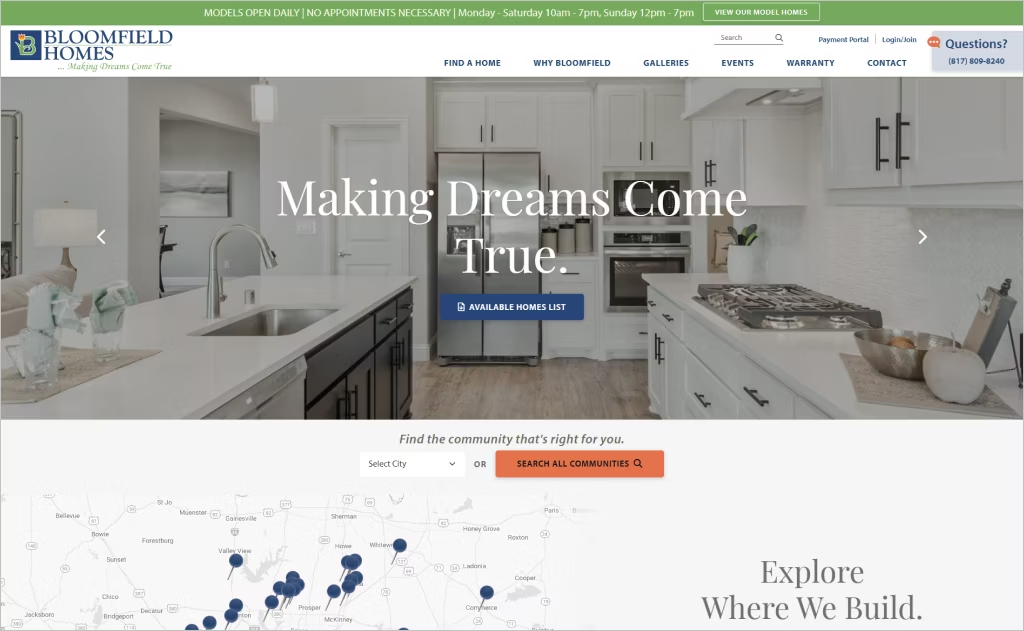
Industry: Residential Home Construction
Bloomfield Homes’ website captivates through bold hero imagery showcasing luxury interiors paired with clean typography that immediately communicates their premium positioning. The design balances aspirational photography with practical navigation, making their “upgraded living is our standard” philosophy visually tangible.
The interface cleverly integrates industry accolades directly into the homepage layout, building credibility while maintaining aesthetic flow. Strategic use of whitespace around personalization features and community exploration tools creates an uncluttered experience that guides visitors naturally toward engagement without overwhelming them with information.
25. Cullum Homes
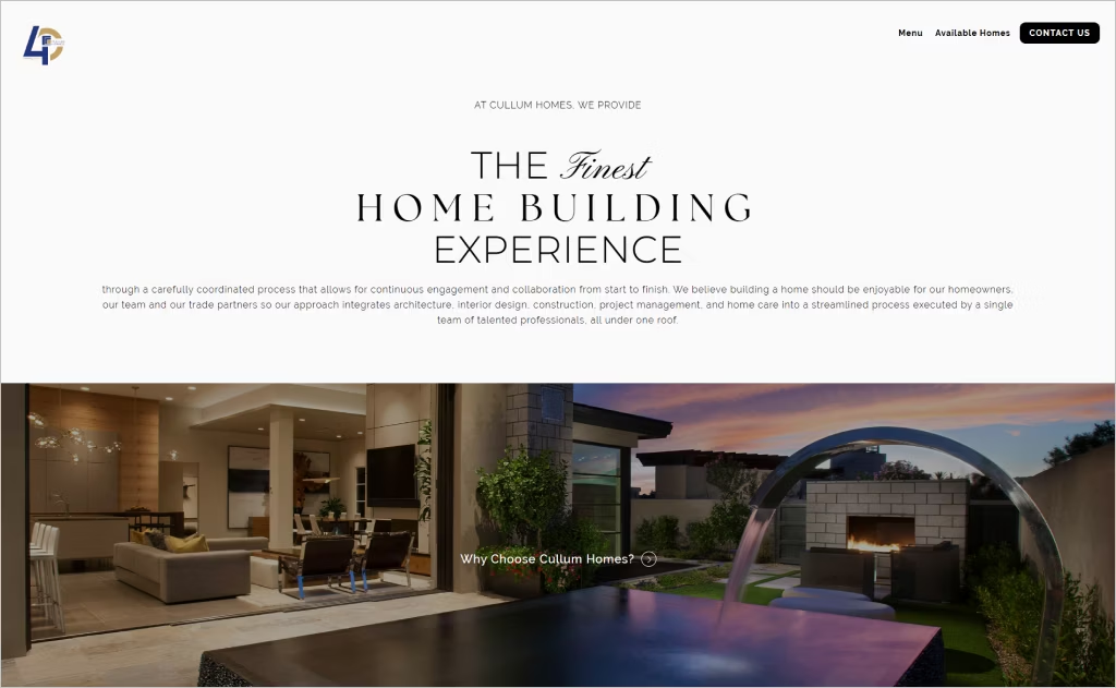
Industry: Luxury Custom Home Building
Cullum Homes captivates visitors with dramatic full-screen hero sections that showcase Arizona’s stunning architecture through layered imagery and bold typography. The design emphasizes whitespace and elegant transitions, creating a premium browsing experience that mirrors the luxury they build.
The streamlined navigation and sophisticated color palette of warm neutrals against crisp whites reflect their “all under one roof” philosophy. Every element breathes exclusivity, from the carefully curated photography to the understated animations that guide users through their comprehensive building process without overwhelming the senses.
26. Fortin Construction
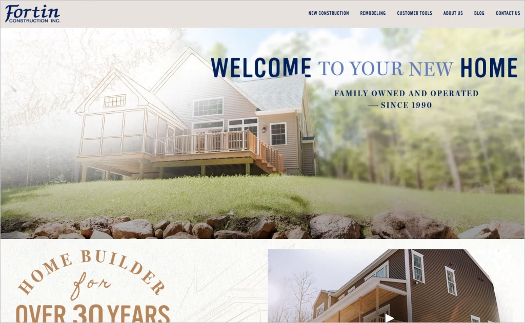
Industry: Custom Home Construction
Fortin Construction’s website embraces a clean, customer-focused design that prioritizes ease of navigation and trust-building through authentic photography of completed projects. The homepage immediately establishes credibility with warm imagery of real homes rather than stock photos, creating an inviting atmosphere that mirrors their relationship-driven approach to building.
What distinguishes this design is its straightforward functionality paired with strategic calls-to-action that guide visitors seamlessly through their decision-making journey. The emphasis on their state-of-the-art showroom and turnkey packages is woven naturally into the layout, making complex construction processes feel accessible and manageable for prospective homeowners.
27. Lennar Corp
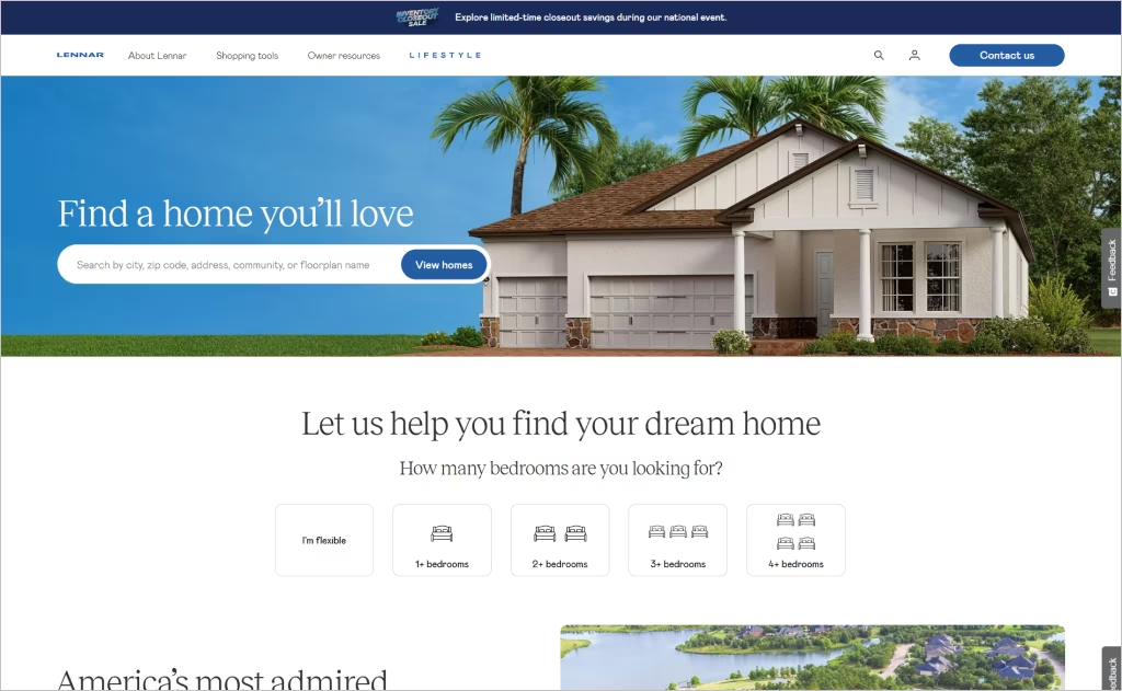
Industry: Residential Home Construction
Lennar’s website captivates through cinematic full-screen imagery that rotates between stunning home exteriors and lifestyle vignettes, creating an aspirational yet attainable atmosphere. The navigation brilliantly segments by home type rather than just location, making it intuitive for buyers to envision their specific lifestyle needs.
The integrated ecosystem stands out most, seamlessly connecting mortgage pre-qualification, home-selling partnerships with Opendoor, and community searches within a unified digital journey. Weekly “hot deals” highlighted prominently add urgency while maintaining sophistication, avoiding typical discount-driven aesthetics that could cheapen the brand perception.
28. Bill Huey + Associates
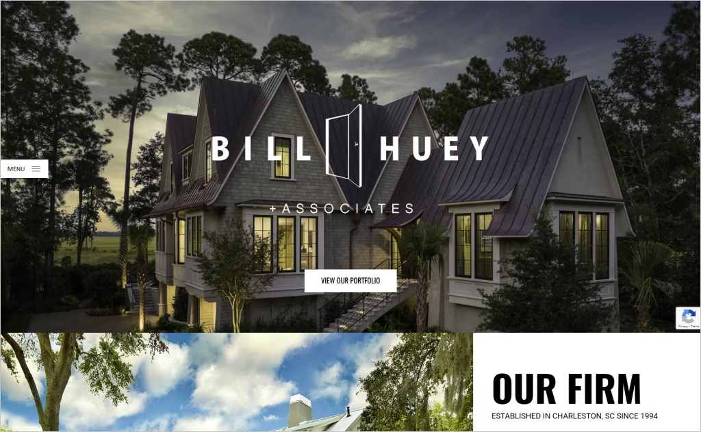
Industry: Home Building / Architecture
Bill Huey + Associates brings minimalist elegance to life through a gallery-inspired layout that echoes the firm’s architectural ethos. The generous use of white space and striking, full-width imagery puts the spotlight on the work itself — no distractions, just pure design.
Smooth transitions and a clutter-free interface make navigation feel intuitive and calm. Everything is designed to enhance the user’s experience, not overwhelm it.
A muted color palette paired with refined typography creates a polished, accessible feel. It’s a quiet sophistication that reflects both Charleston’s heritage and the firm’s commitment to precision and thoughtful detail.
29. Harvest Homes
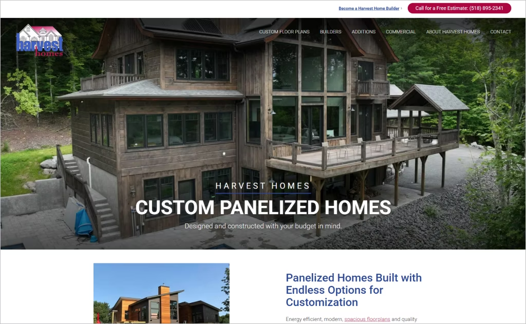
Industry: Panelized & Prefab Home Construction
Harvest Homes showcases a refreshingly clean, process-driven design that transforms complex home building into digestible visual stages. The homepage employs an intuitive step-by-step narrative with large imagery and circular icons, guiding visitors through their panelized construction method without overwhelming technical jargon, making custom home building feel accessible and transparent.
The site’s strategic use of whitespace and restrained typography creates breathing room around compelling construction photography. Rather than flashy animations, the design relies on honest visual storytelling that builds trust through clarity, perfectly reflecting their controlled manufacturing environment philosophy while maintaining a welcoming, customer-focused aesthetic.
30. Betenbough Homes
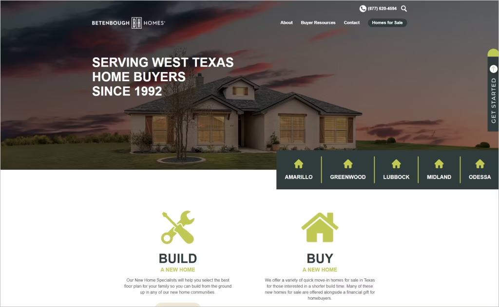
Industry: Residential Home Construction
Betenbough Homes instantly builds trust with its regionally grounded message: “Serving West Texas home buyers since 1992.” This clear focus creates a strong first impression and speaks directly to its core audience.
Navigation is intuitive, with city-based links front and center, helping buyers quickly find homes in their local market. The layout feels thoughtfully organized, emphasizing clarity without visual clutter.
Instead of overloading the page with imagery, the design uses clean typography, generous whitespace, and clear calls to action. The result is a warm, user-friendly experience that reflects the builder’s commitment to transparency and service.
Want to speak with an expert?
Call us at (872) 242-1074
How to Design a Website That Showcases Your Remodeling Expertise
Your website is your digital showroom — the first place potential clients go to evaluate your craftsmanship, vision, and reliability. In an industry where trust and visual impact are everything, a well-designed home builder website can be the difference between a curious browser and a signed contract.
Here are the 5 main steps to create a website that truly showcases your expertise and converts visitors into clients.
1. Lead with Stunning Visual Storytelling
You have just 0.05 seconds to make a first impression — make it unforgettable.
Your homepage should immediately convey quality through stunning visuals. That means professional architectural photography with perfect lighting — not phone snapshots. Invest in high-impact images and video that stop visitors in their tracks.
Start with a full-width hero slider that showcases your best builds in a variety of styles. Add immersive features like 360° virtual tours and sweeping drone footage so people can feel your craftsmanship before they ever set foot on-site.
Your visuals should whisper luxury — and shout attention to detail.
2. Build Trust Through Social Proof and Credibility
Homebuyers need reassurance before making their biggest investment.
Display testimonials, awards, and certifications prominently to establish credibility and ease concerns.
- Showcase video testimonials from satisfied homeowners sharing their experience
- Display industry certifications, awards, and years in business
- Include recognizable logos of suppliers and partners you work with
Pro tip: Add specific results to testimonials like “completed 3 weeks early” or “came in under budget.”
3. Simplify the Customer Journey with Clear Navigation
Every page should guide visitors toward a clear next step.
Place thoughtful calls-to-action that meet people right where they are in their decision-making process. Don’t rely on just one conversion path — offer options. Let them schedule a consultation, download a helpful buyer’s guide, browse available lots, or request a personalized quote.
Add live chat to handle quick questions in real-time, and consider creating an interactive “Build Your Dream Home” tool where visitors can explore features and get instant price estimates. It makes the experience feel personal — and fun.
Keep your contact forms short and simple. Asking for too much too soon can drive people away. The easier it is to connect with you, the more leads you’ll turn into clients.
4. Showcase Your Unique Building Process
Differentiate yourself by transparently explaining how you work. Educate visitors on your construction methods, timelines, and what makes your approach special.
- Create an interactive timeline showing each phase of construction
- Highlight unique offerings like energy-efficient builds or custom design services
- Include FAQs addressing common concerns about budgets and timelines
Advice: Add a cost calculator tool that gives visitors a ballpark estimate for their dream home.
5. Optimize for Mobile and Local Search
Most homebuyers browse on their phones while exploring neighborhoods. Ensure your site loads quickly on mobile devices and appears in local search results.
- Make all buttons and forms easily tappable on small screens
- Optimize images for fast loading without sacrificing quality
- Include location-specific content and service area maps for SEO
Tip: Add schema markup for local businesses to boost your visibility in “home builders near me” searches.
Make Your Site as Impressive as Your Homes
A website for a home builder isn’t just a place to show off projects — it’s a window into your craftsmanship, vision, and reliability. In our roundup of the 30 best home builder website designs, we’ve highlighted sites that combine stunning visuals, smooth navigation, and smart features that really make a brand shine.
From modern, minimalist layouts to interactive galleries that let visitors explore every detail, these websites prove that great design can inspire trust and excitement. If you’re looking for ideas or want to take your own site to the next level, Comrade Digital Marketing can help bring your vision to life.
Don’t settle for a website that just “exists.” Reach out to us today, and let’s create a site that impresses visitors and grows your business.