
Exceptional interior design goes beyond beautiful spaces — it begins the moment a visitor lands on a company’s website. A well-designed site sets the tone for creativity, professionalism, and trust, capturing attention within seconds.
Top interior design companies understand that their digital presence must reflect their aesthetic vision. From elegant layouts to immersive visuals, their websites become powerful tools to showcase expertise and inspire potential clients.
This curated collection highlights 20 standout interior design company websites that master the art of digital storytelling. Each example blends functionality with style, offering inspiration for anyone looking to elevate their online presence.
The Interior Designer Websites That Set Industry Trends
1. Jamie Bush & Co.
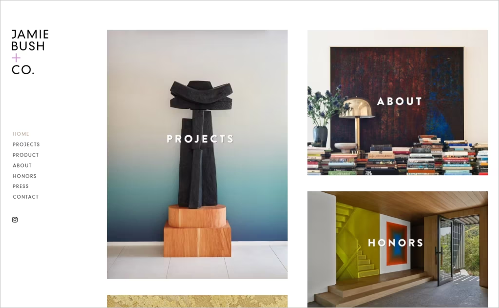
Industry: Interior Design / Luxury Residential Design
Jamie Bush & Co.’s homepage greets visitors with an elegant, full-screen image that sets a refined, immersive tone. The navigation is minimal and clean, with crisp typography and subtle hover states that keep the focus on visuals. The restrained color palette and generous white space allow the photographs of interiors to shine, while the fixed menu ensures smooth, uninterrupted browsing.
What makes this site distinctive is the seamless transition between imagery and content, with hidden scroll cues and layered text overlays that feel editorial. The “Projects” section unfolds like a magazine spread — high-resolution visuals dominate, while text emerges unobtrusively. Every detail, from elegant micro-animations to the visual balance of negative space, reinforces the brand’s sophisticated aesthetic.
2. Drake/Anderson
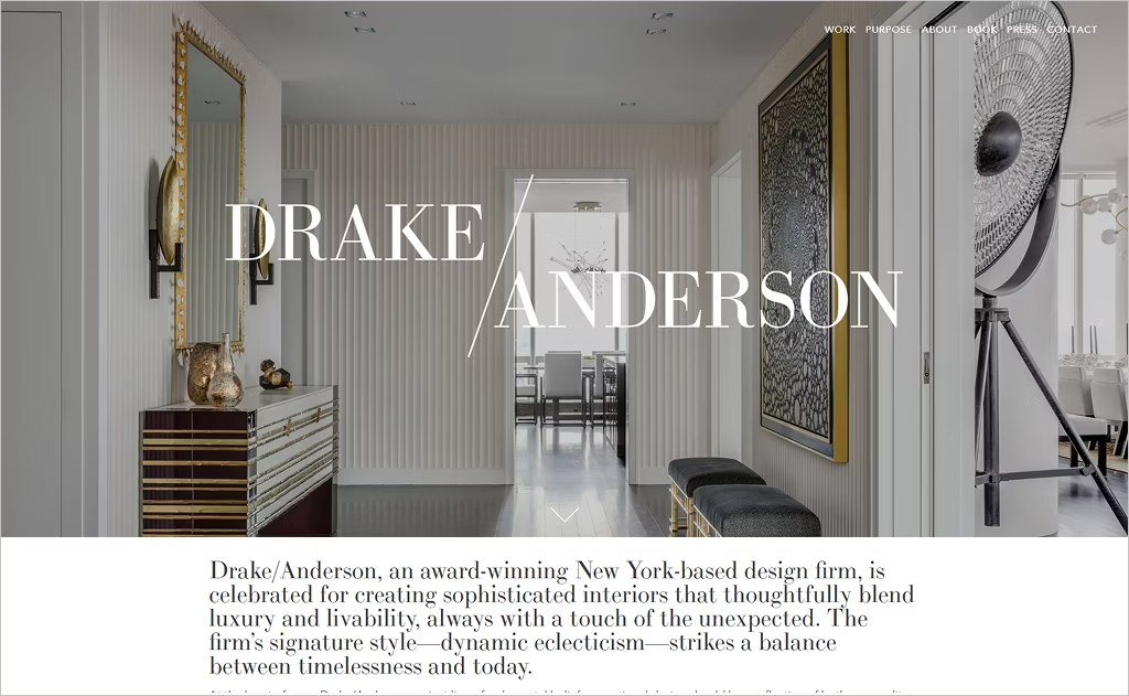
Industry: Interior Design / Residential & Hospitality
Drake/Anderson’s homepage immediately captures attention with its clever interplay of monochrome and muted accent tones, lending the site a bold yet sophisticated identity. The oversized cursor, subtle pulldown effect, and layered transitions give the site a tactile, almost editorial feel. Its vertical scroll is punctuated by full-screen imagery that alternates with intentional whitespace, creating breathing room between sections.
A striking feature is the bespoke typographic treatment: sharp serif headings contrast with a clean sans serif body, often paired with animated letter reveals that feel modern without being gimmicky. The “Work” section unveils a grid that shuffles and reorders responsively, making navigation feel playful yet polished. The site feels as much a curated experience as a portfolio — immersive, surprising, and effortlessly on brand.
3. Alexis Ring
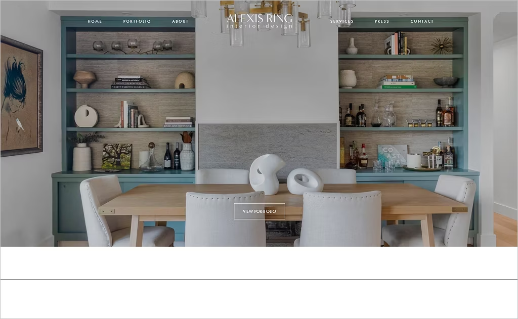
Industry: Interior Design / Residential + Boutique
Alexis Ring’s homepage feels intimate yet expansive, with a curated slideshow that fades gently into soft editorial-style sections. The header overlays subtle geometric shapes that shift slightly as you scroll, offering a sense of depth. Her navigation bar elegantly condenses into a slender fixed header, making every transition seamless.
Across the site, she embeds textured backgrounds — linens, plaster, gentle gradients — that give tactile richness without overwhelming. The portfolio page displays an artful masonry layout, with images that softly zoom on hover. The “About” page pairs candid framework shots with designer portraits, weaving personal narrative and design ethos together. Her design cues feel warm, layered, and human.
4. Amy Lau Design
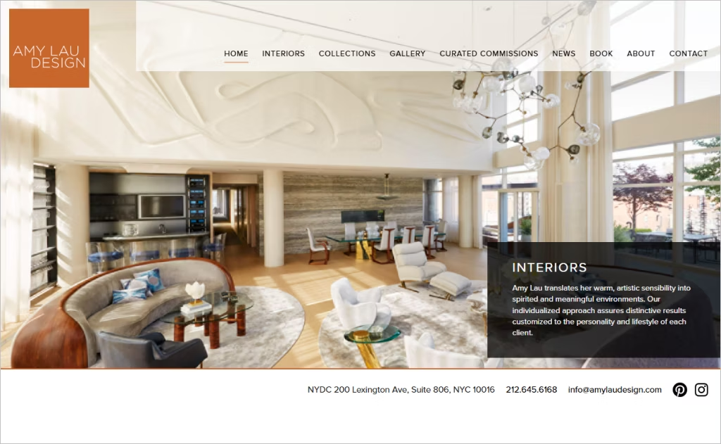
Industry: Interior Design / Bespoke Interiors & Collections
Amy Lau Design’s site greets you with refined poise: the homepage’s layered menu animation and fluid fade-in images create an eloquent entrance. Hovering over “Gallery” or “Collections” subtly reveals motion in text spacing and color gradients, drawing you into their world. The site’s modular layout adapts beautifully — each section feels intentional, never forced.
In the “Collections” section, product images expand vigorously on rollover, showcasing intricate material textures and artistic detail. Her “Curated Commissions” section frames editorial captions beside large visuals, reinforcing her role both as designer and curator of fine objects. Amy Lau’s digital identity feels artful, deliberate, and perfectly aligned with her brand’s craftsmanship.
5. Amber Interiors
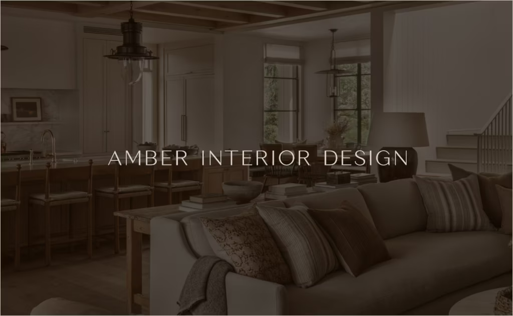
Industry: Interior Design / Residential & Lifestyle
Amber Interiors’ website strikes a balance between editorial charm and functional clarity. The homepage scrolls with layered textures — faint linen patterns peek behind images — while tinted overlays subtly uniform the visual flow. Its dynamic “Projects” gallery presents a mosaic of overlapping rectangles that shift with cursor movement, allowing users to linger visually.
What makes Amber’s site stand out is its storytelling through transitions: image crossfades, parallax scrolls, and delicate reveal animations lend continuity between sections. The “About” pages weave hand-drawn graphics and casual photography, reinforcing a personal, lived-in brand voice. All interactive cues — especially the color-shifted hover states of text and imagery — feel thoughtful, coherent, and deeply aligned with Amber’s signature aesthetic.
6. Pfuner Design
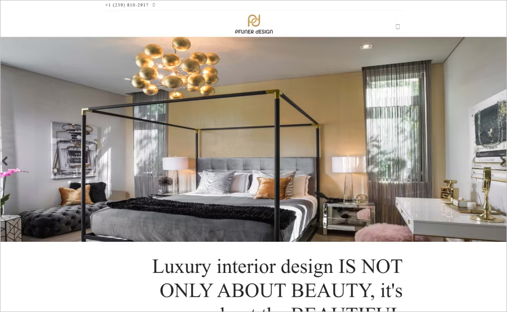
Industry: Interior Design / Luxury & Boutique Interiors
Pfuner Design’s homepage immediately draws you in with bold, declarative headers layered over high-contrast photography that feels cinematic. The navigation is tucked yet persistent, letting the content breathe while guiding you intuitively. As you scroll, section shifts subtly fade or slide, and strategic use of color accents (deep jewel tones) punctuates what is otherwise a neutral palette.
What sets this site apart is its “Shop Renata’s Design Favs” integration — blending e-commerce with portfolio in a polished, editorial way. The Testimonials section feels immersive, as client statements overlay full-width visuals, turning feedback into a story. Smooth transitions, high-fidelity images, and an elegant fusion of brand voice and commerce make this site memorable and refined.
7. Studio McGee
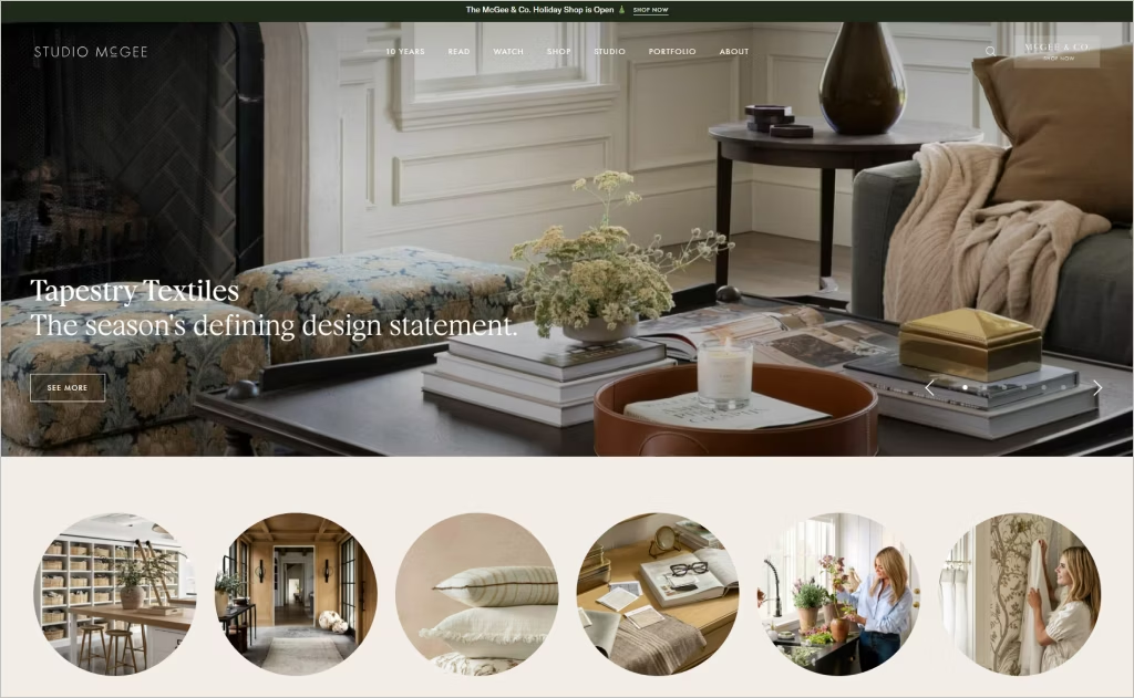
Industry: Interior Design / Lifestyle & Interiors
Studio McGee’s website blends editorial storytelling and project showcase with effortless fluency. Its blog-first layout places articles, lookbooks, and guides front and center, giving the brand personality beyond portfolio alone. The use of soft hover reveals, dynamic category filtering, and anchor-scrolled “Search by Spaces” subtly guides exploration without forcing users.
A standout detail is how product commerce and design services live side by side: the “Shop McGee & Co.” links meld directly into the design narrative. Their social media posts and webisodes are woven elegantly into the experience, turning the site into a living, evolving content hub. Rich photography, smart content structure, and multi-dimensional storytelling make this site feel like a destination, not just a portfolio.
8. Mackenzie Collier Interiors
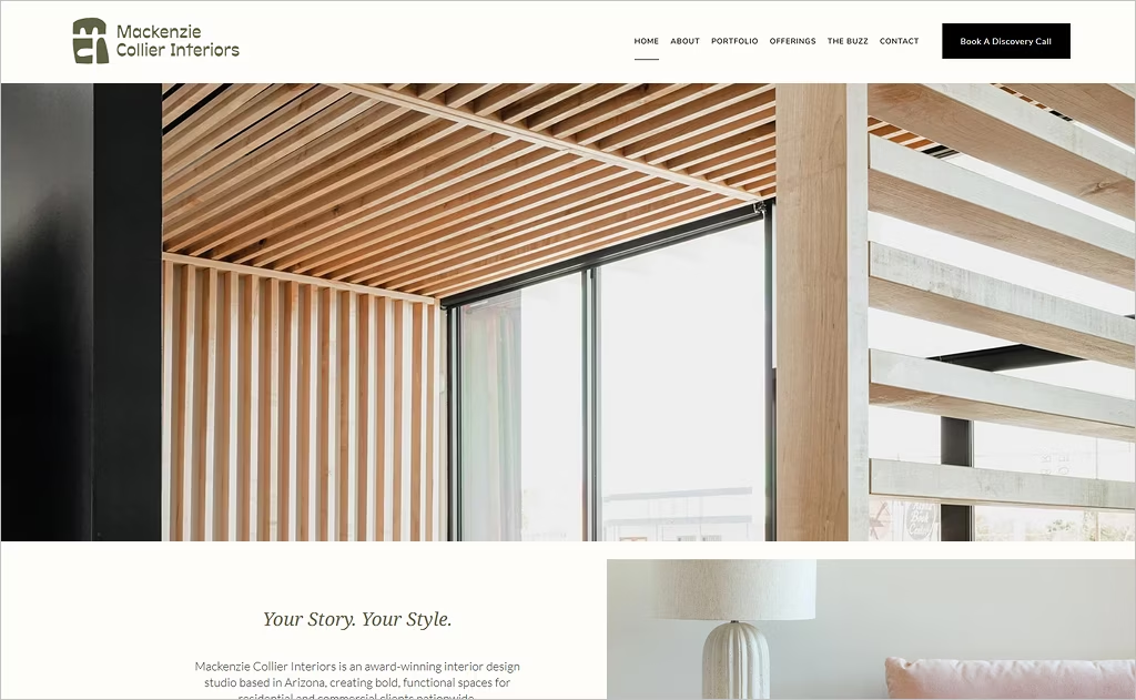
Industry: Interior Design / Residential & Commercial
Mackenzie Collier Interiors opens with confidence — bold, high-contrast hero imagery paired with a strong, declarative tagline invites you in. The site weaves in animated counters and number highlights (e.g., awards or years of experience) to lend authority without overwhelming. Gradual parallax shifts in background patterns and texture overlays add subtle movement and depth.
One memorable feature is the “Featured In” strip that slides horizontally to spotlight press logos, offering credibility in motion. The “Meet the Team” page integrates soft reveals, photo layering, and colored overlays to humanize the studio. Also, their blog section uses clean, article-style layouts and consistent visual rhythm to position the firm as both creative and thoughtful.
9. Jean Stoffer Design
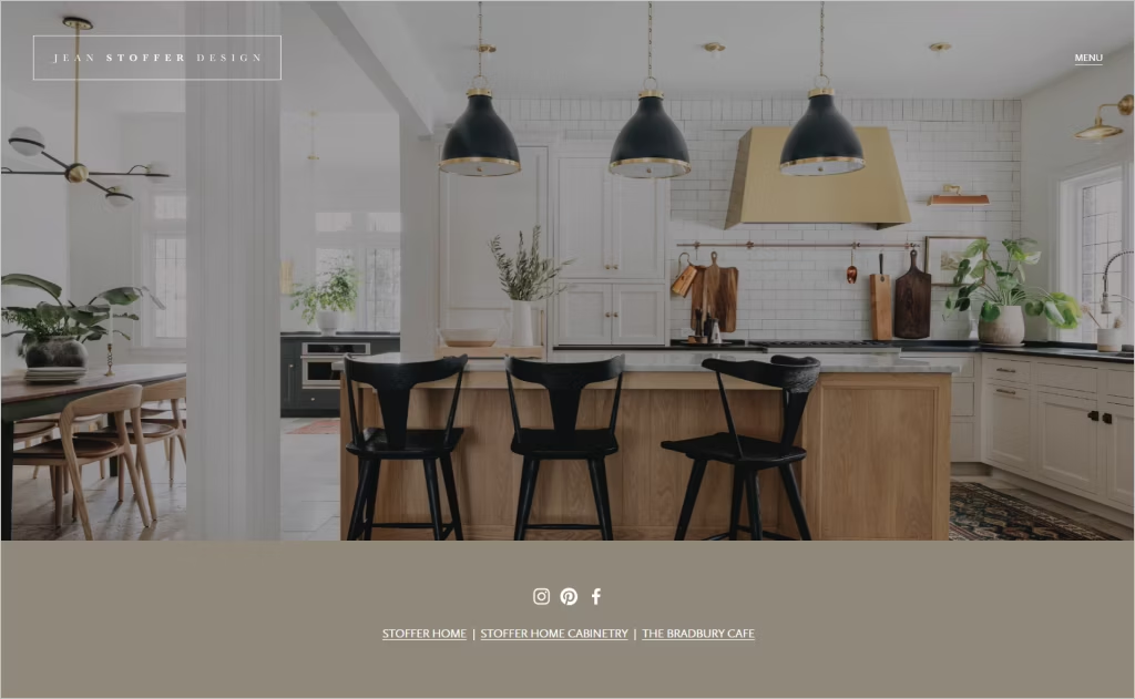
Industry: Interior Design / Modern Classic Residences
Jean Stoffer Design’s website opens with purpose — every page header anchors you with crisp typography layered over softly-tinted images, presenting a unified, intentional look. As you scroll through “Projects,” images expand in place rather than segueing to new pages, giving users an immersive, catalog-style exploration. The navigation menu is elegantly persistent but toggles subtly in size, maintaining presence without distraction.
Within the “Stoffer Home” and shop integrations, curated product collections coexist with project work, creating a seamless bridge between design and merchandise. Press logos slide in with a smooth fade, and the “The Expert” consultation call-to-action is integrated directly into the experience, making professional services feel accessible. The site’s integration of portfolios, shop, and persona forms a layered, engaging narrative.
10. Avery Cox Design
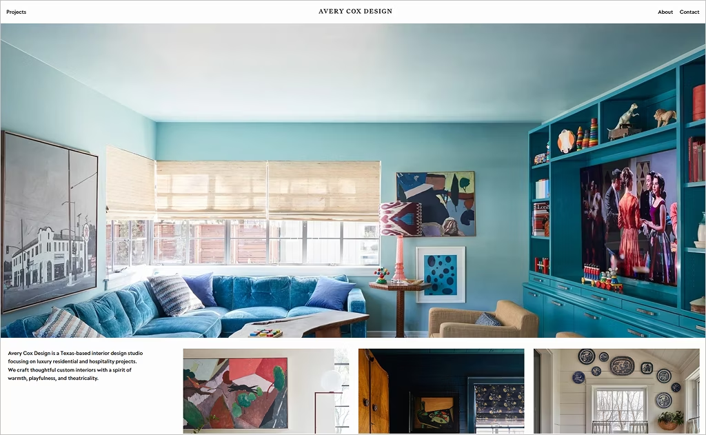
Industry: Interior Design / Luxury Residential + Hospitality
Avery Cox Design opens with a striking, full-bleed hero image layered by subtle text animation, immediately conveying drama and refinement. The main menu slides in with smooth motion while the scroll trigger reveals large, cinematic visuals of her work. As one navigates the “Projects” section, images cascade in a visually rich grid with asymmetric sizing, creating momentum and visual hierarchy.
The “About” page intertwines client testimonials, personal narrative, and editorial portraits in a storytelling layout that reads like a magazine spread. Press credentials appear dynamically, lending prestige without static listiness. Small touches — such as elegant fade-ins, responsive cropping, and unified visual pacing — make this site feel curated yet warm, theatrical yet grounded.
11. Bria Hammel Interiors
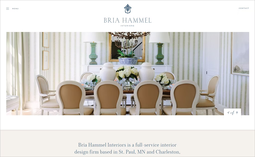
Industry: Interior Design / Residential & Lifestyle
Bria Hammel Interiors strikes a compelling balance between sophistication and accessibility. The homepage features a soft scroll that transitions you into their “Portfolio” and “Services” sections without disjointed jumps. Hover effects on images subtly brighten exposures, inviting deeper inspection. Their navigation integrates a “Shop Our Decor Line” link alongside design services, blending commerce and creativity in one fluid experience.
In the “Portfolio” archive, project thumbnails include dynamic sorting filters (by style, locale, etc.) that let users tailor their visual journey. The “Downloadable Investment Guide” callout is persistent but nonintrusive, encouraging client engagement without interrupting flow. Bria’s blog lives harmoniously with project work, lending personality and narrative depth to the designer’s voice.
12. Key Interiors
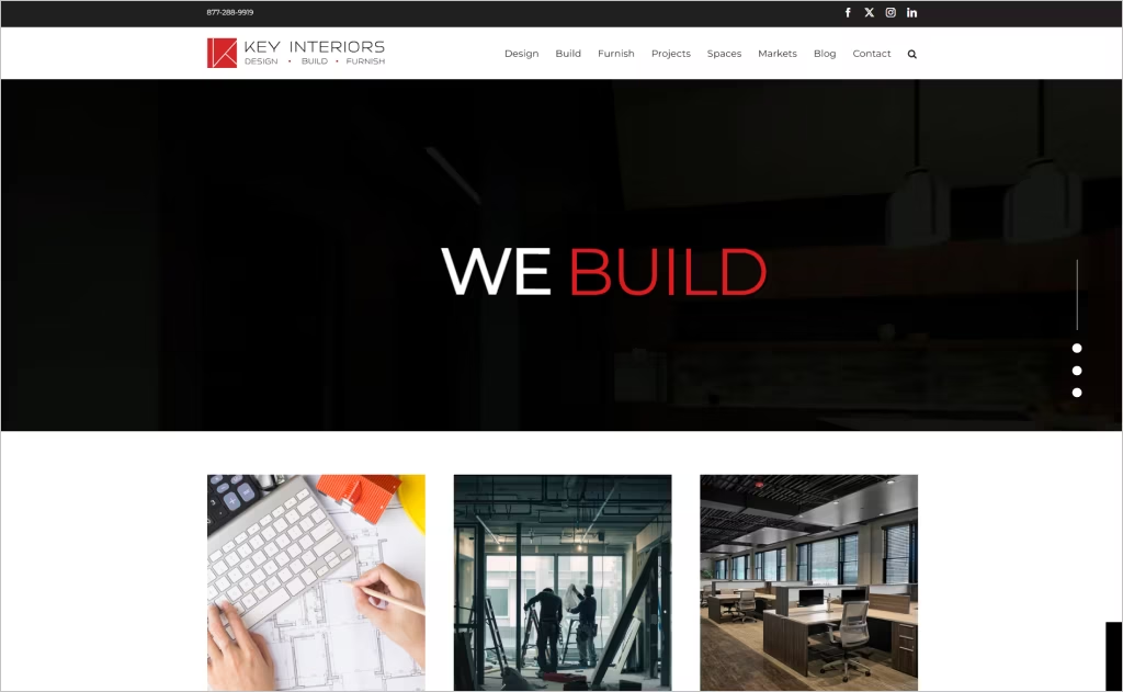
Industry: Commercial Interiors / Design + Build
Key Interiors greets you with a bold “Design | Build | Furnish” tagline layered atop expansive visuals that immediately convey its turnkey capabilities. The menu is minimal but functional, leading to a homepage that efficiently segments services while weaving in brand ethos — “human-centric workplaces” and “memorable impressions” appear as lightweight overlays.
The project showcase uses strong logo carousels and responsive imagery of real client spaces, establishing credibility through visual storytelling. Their blog feeds into the homepage seamlessly, layering thought leadership next to projects. With consistent typography, strategic whitespace, and clear calls-to-action (like “Start a Project” and “Meet the Team”), the site feels polished, pragmatic, and authority-driven.
13. Jeremiah Brent
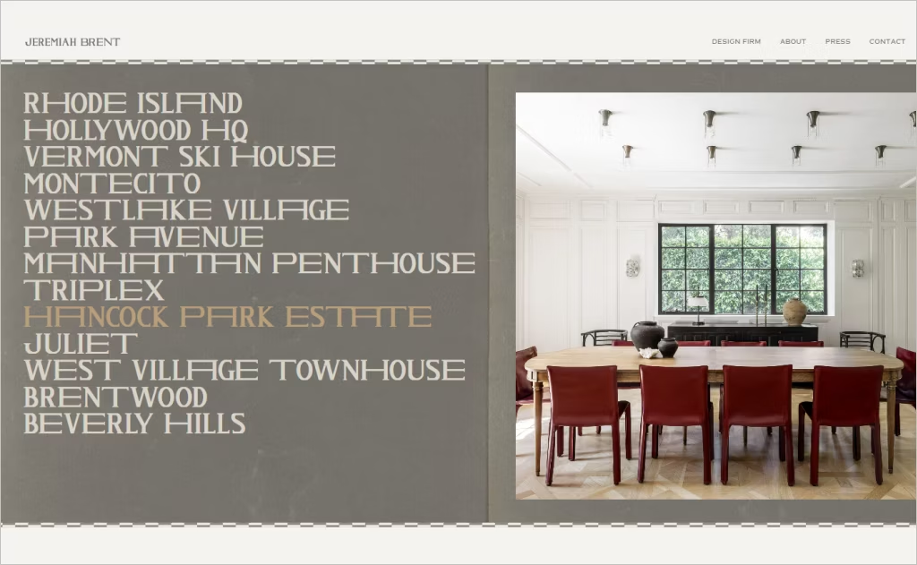
Industry: Interior Design / Residential & High-End
Jeremiah Brent’s site opens with a refined grid of project titles front and center — no hero slider, just confident curation. The scroll reveals layered typography that animates into place, while project links subtly scale and shift. As you explore “Design Firm,” the site uses alternating full-bleed imagery and split-screen layouts to keep momentum and visual variety.
In the “Shop / Atrio” integration, product launches are framed with editorial sensibility — large thumbnails, elegant hover states, and magazine-style spacing that bridge commerce with creative identity. Even the press page feels tailor-made: full-width spreads, overlapping text, and oversized quotes make media coverage feel like part of the portfolio narrative. The result is polished, artful, and distinctly Brent.
14. Ciatti Design
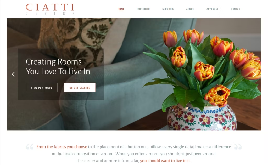
Industry: Interior Design / Residential & Commercial
Ciatti Design greets you with a clean, confident tagline, “Creating Rooms You Love To Live In,” framed by high-impact hero imagery that immediately grounds the studio’s ethos. The homepage uses a restrained but elegant layout, with overlapping semitransparent buttons (“View Portfolio,” “Get Started”) that feel inviting without overwhelming. The navigation remains simple and clear, guiding users through services, portfolio, and ethos in a linear flow.
A subtle standout is how the site weaves texture and softness — faded fabric visuals behind text blocks hint at textile depth without clutter. The “About” page emphasizes personal connection by naming Marlene Ciatti and listing service areas directly, giving the brand warmth and a sense of locale. Every visual and structural choice reinforces that careful balance of custom, lived-in luxury.
15. Kati Curtis Design
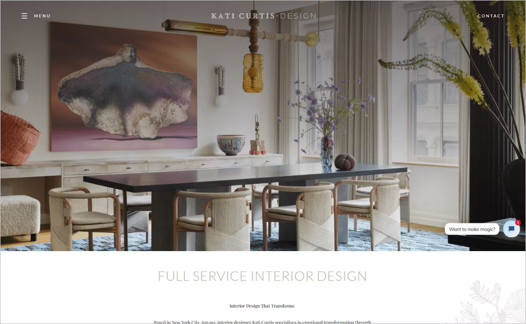
Industry: Interior Design / Bespoke Residential & Experiential
Kati Curtis Design opens with poetic messaging layered over a simple hero shot, immediately framing her brand as emotionally driven and intentional. The site leans into storytelling: text blocks break conventional grids, with color accents and pattern glimpses that hint at personality behind the visuals. Calls-to-action like “Get In Touch” are integrated boldly but subtly, never jarring the aesthetic.
A notable design element is the way press, blog, and portfolio are interwoven — not siloed. Press features slide in as you scroll, tying media back into her narrative weave. The “Services” and “About” pages balance aspirational imagery with grounded descriptions, and the site uses texture and layered overlays to evoke depth while staying clean. Every transition and layout decision feels carefully orchestrated to echo the designer’s voice.
16. Jessica Helgerson Interior Design (JHID)
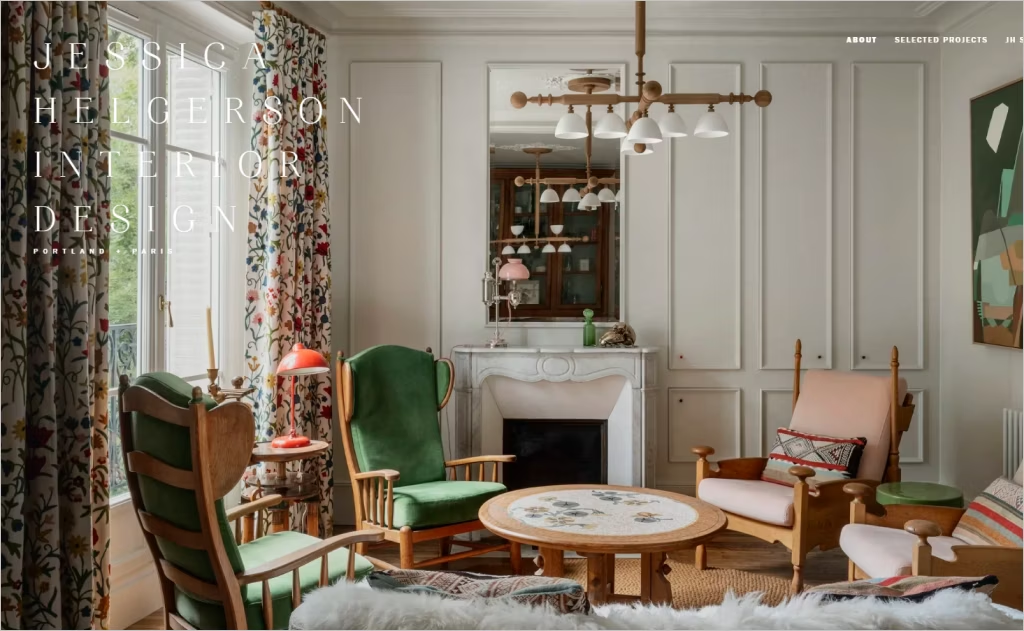
Industry: Interior Design / Boutique & Residential
Jessica Helgerson Interior Design’s homepage feels grounded and elegant, with crisp navigation linking Portland and Paris studios, reflecting her bi-coastal presence. The imagery grid on the main page is thoughtfully cropped and layered, giving each project vignette a painterly feel. Overlays of project names are balanced and unobtrusive.
What distinguishes JHID’s site is the way she merges her portfolio with her shop: the “JH Shop” link sits alongside “Selected Projects,” making her curated goods feel as vital as her designs. Project pages themselves feature ambient, full-width slideshow sequences with rich color harmonies. The overall tone feels both refined and deeply personal.
17. Elite Design Studio
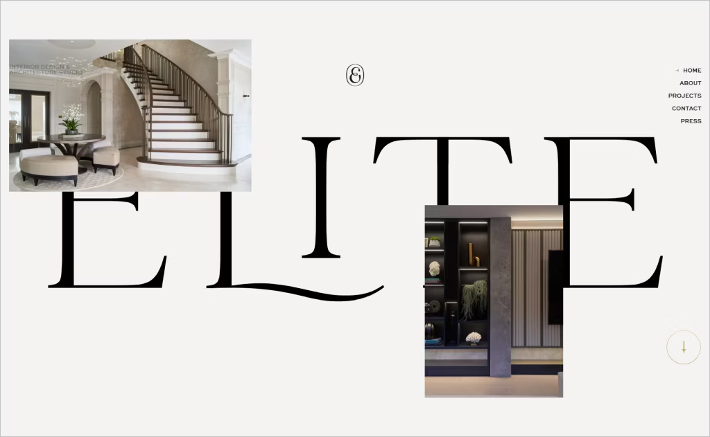
Industry: Interior Design / Architecture & Interiors
Elite Design Studio’s homepage introduces their ethos with sharp, full-screen project stills and an understated tagline — clean, confident, and focused. They use minimal navigation, letting the imagery and project names dominate the first impression. Hovering project names gives an elegant reveal effect, indicating a refined attention to micro-interaction.
What truly distinguishes this site is how project pages cascade into immersive vertical galleries, with seamless fade overlays and ample margins that emphasize negative space. Their “About” and “Press” sections integrate dynamic mosaics of team portraits and media coverage. The deliberate pacing of scroll animations and the crisp way content transitions feel curated and professional, making each visit feel custom and commanding.
18. Nina Magon
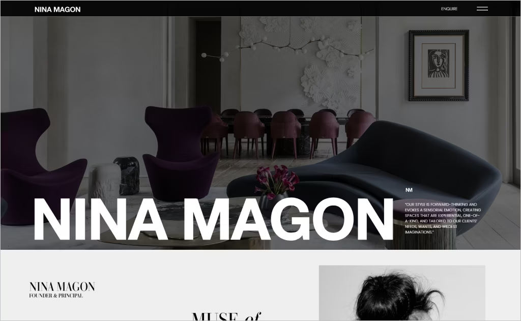
Industry: Interior Design / Luxury Residential & Commercial
Nina Magon’s website opens with bold, sensorial statements layered over dramatic photography, instantly framing the studio as visionary and daring. Rather than a static hero, she uses a rotating mosaic of featured projects — Residential, Hospitality, Culinary, Commercial — all visible from the outset, encouraging exploration. The menu’s “Explore” prompt feels like an invitation rather than a navigation tool, enhancing immersion.
On project pages, Nina uses full-width imagery with subtle overlays and soft type animation, allowing visuals to carry narrative weight. The site inserts “Bespoke Offerings” sections with editorial styling, showing how her design and product realms converge. The press and collection pages adopt a magazine-style layout with asymmetric cropping, making the experience feel curated, tactile, and uniquely expressive.
19. Jean-Louis Deniot
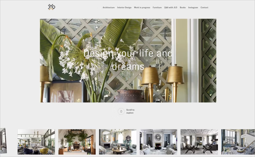
Industry: High-End Interior Design / Luxury Residences
Jean-Louis Deniot’s website opens with a restrained, refined presence — no flashy hero slideshow, just a poised grid of project snippets that beckon quietly. Scroll reveals softly animated overlays, elegant transitions, and a sense of spatial rhythm. His “Projects” section presents works in a tonal palette, pairing rich photography with deep shadows and delicate type so each image feels like a living tableau.
What truly distinguishes Deniot’s site is the way it merges his design identity with his furniture and decor ventures. The “Furniture” section sits as an integral branch of the brand, and press features are woven into the narrative as atmospheric spreads. The result is a site that feels editorial, highly curated, and deeply aligned with his world of sophisticated craftsmanship.
20. Jacobs Interiors
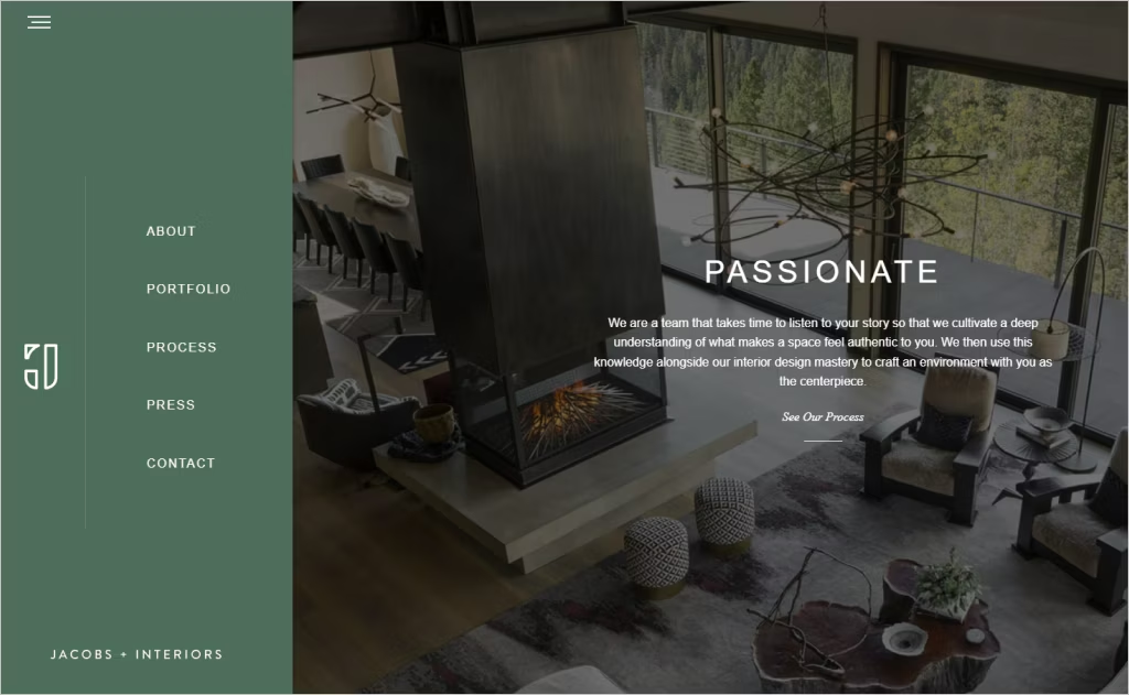
Industry: Interior Design / Bespoke Residential
Jacobs + Interiors opens with a strong editorial voice, layering powerful keywords like “Passionate,” “Creative,” and “Transformational” onto compelling photography. The repeated vertical statements give a poetic rhythm, guiding visitors through brand messaging before visual projects even appear. Their “See Our Process” and “See Our Portfolio” CTAs are integrated into the flow, inviting engagement without distraction.
On project pages, Jacobs leans into atmospheric storytelling: high-resolution images spill full-screen with minimal framing, and careful sequencing lets each space breathe. The “Process” page is elevated from mere copy — it visualizes stages and guides, making client journeys tangible. The marriage of narrative, confidence, and visual restraint gives the site a distinct, authoritative voice.
Want to speak with an expert?
Call us at (872) 242-1074
How to Design a Website That Reflects Your Interior Designer Talent
Your website isn’t just an online presence — it’s your digital studio. A well-crafted site can reflect your aesthetic sense, communicate your brand’s personality, and turn browsers into loyal clients. Follow these five essential steps to design a website that truly embodies your interior design expertise.
1. Craft a Visually Stunning First Impression
Your homepage is the virtual doorway to your creative world. It should immediately capture attention with elegant visuals, sleek typography, and cohesive color palettes.
- Use high-resolution portfolio images that highlight your signature style.
- Keep your layout minimal and clean — just like a well-designed space, it should breathe.
- Integrate subtle animations or video backgrounds to add depth and emotion.
Pro Tip: Think of your homepage as your elevator pitch — bold, beautiful, and unforgettable within seconds.
2. Tell Your Story Through Thoughtful Branding
Your clients aren’t just buying your designs — they’re buying your perspective.
- Create an “About” page that narrates your design philosophy, process, and inspiration.
- Feature a professional portrait to humanize your brand and build trust.
- Use consistent branding elements — logo, fonts, and color schemes — to reinforce your identity across every page.
Remember: Authentic storytelling transforms visitors into believers.
3. Showcase Your Portfolio Like an Art Gallery
Your portfolio is your masterpiece collection. How you present it determines how potential clients perceive your expertise.
- Divide your projects by style or space type (e.g., residential, commercial, modern, classic).
- Use before-and-after sliders to highlight transformation stories.
- Add case studies or brief project narratives that reveal your design process, challenges, and solutions.
Bonus: Integrate interactive galleries or video walkthroughs for a more immersive experience.
4. Make It Effortlessly Functional
Great design balances beauty with usability. A visually rich site must also offer seamless navigation.
- Ensure responsive design — your interior design site should look stunning on any device.
- Optimize page load speed to keep visitors engaged.
- Add clear calls-to-action (CTAs) like “Book a Consultation” or “View Portfolio.”
- Incorporate an easy-to-use contact form or scheduler to simplify inquiries.
Think like a client: Can they find what they need within three clicks?
5. Build Trust With Social Proof & Content
Establish credibility by showcasing real-world success and ongoing expertise.
- Display client testimonials and press features.
- Include awards or certifications that validate your professional standing.
- Add a blog or design tips section to demonstrate ongoing knowledge and creativity.
Pro Insight: Regularly updating your content signals growth, professionalism, and passion.
Partner with Experts Who Understand Interior Design
Beautifully crafted interior design websites prove how powerful digital presence can be when style meets strategy. Each example highlights the importance of blending creativity with functionality to attract clients and showcase expertise.
Comrade Digital Marketing specializes in helping interior designers achieve that same impact online. Our tailored strategies ensure your brand stands out with stunning design and strong SEO performance that drives measurable results.
Ready to elevate your interior design business with a website that truly reflects your vision? Partner with Comrade Digital Marketing today and let us create a digital presence that inspires and converts.