
Franchise brands thrive on trust, clarity, and consistency — and the best franchise website designs bring all three together in an instant. In a world where prospects make decisions in seconds, standout sites capture attention with sleek visuals, sharp messaging, and an unmistakable sense of authority.
These top franchise websites prove that great design is more than aesthetics; it’s about guiding users effortlessly toward the information they need. From inviting layouts to intuitive navigation, each example shows how smart UX can elevate a brand’s credibility and conversion power.
Whether you’re building a new franchise site or refreshing an existing one, these 20 exceptional designs offer a glimpse into what truly sets industry leaders apart.
The Most Inspiring Franchise Website Designs to Explore
1. Papa John’s
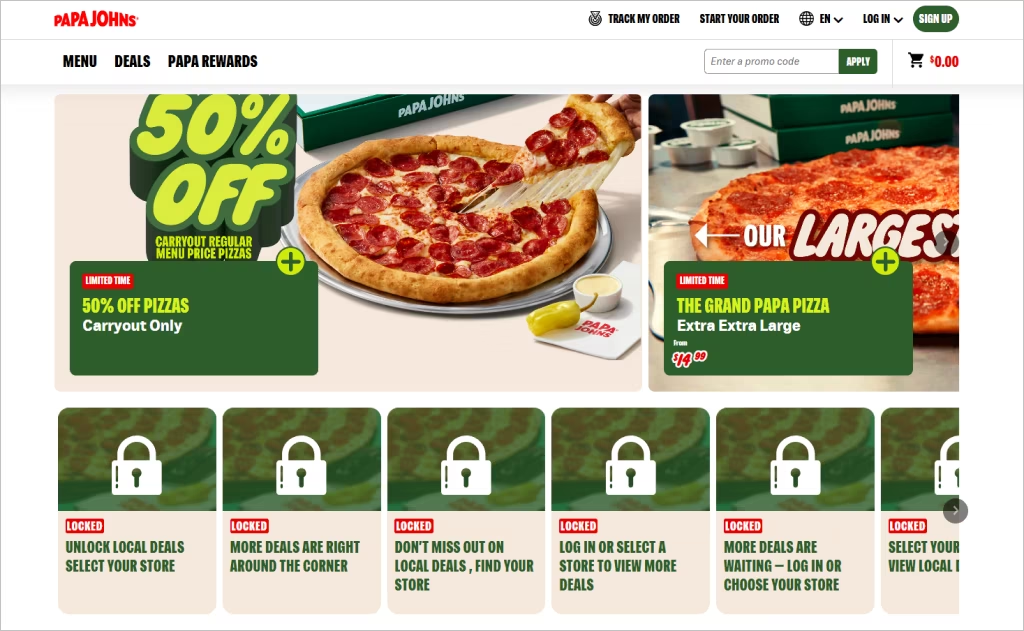
Industry: Quick-service pizza franchising
The homepage of Papa John’s grabs attention with a bold hero message, “Order Pizza Delivery & Pick Up!” positioned against a clean, action-driven layout. Visual cues such as the prominent brand logo, vibrant food imagery, and an app download prompt immediately funnel visitors toward ordering. The design strikes a dynamic balance between vibrant photography and functional clarity, making it easy for users to act quickly.
What distinguishes this franchise site is its uncluttered navigation and customer-centric approach. The crisp “OPEN” button offers instant engagement, while strong contrast and large typography enhance readability across devices. Accents of red and green align with brand identity, and appetising imagery engages visually. Simple, purposeful design choices serve the dual goals of reinforcing the franchise brand and driving conversion in a streamlined way.
2. 7-Eleven
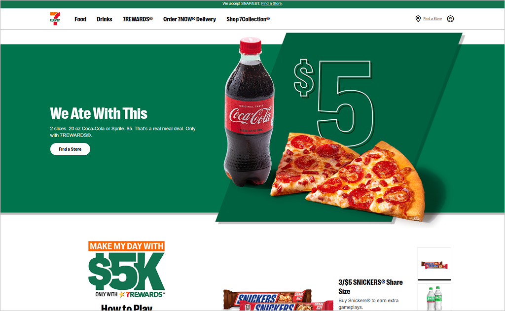
Industry: Convenience retail
The website of 7‑Eleven captivates with its vibrant “always open” message and rich visual balance of promos, store locator, and loyalty features. A dynamic carousel showcases timely offers, and the “Find a Store” function stays prominent. Clean segmentation — shopping, fuel, careers — gives visitors direct paths without clutter.
Another standout is the intuitive integration of the brand’s digital ecosystem: clear calls to download apps and discover rewards programs reinforce engagement. The strategic use of bold icons and minimalist color accents ensures key actions pop while the site remains mobile-friendly. Back-office content like franchise info and blog features feels organized yet secondary, letting the convenience message shine.
3. Starbucks
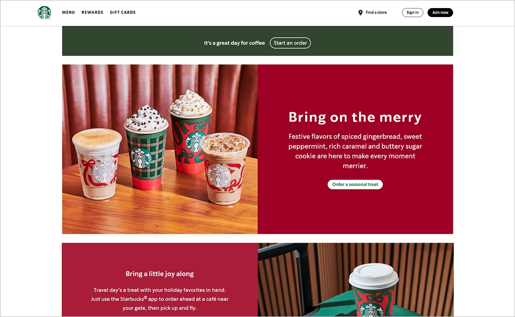
Industry: Specialty coffeehouse
The Starbucks website employs striking full-width imagery of the brand’s signature green tone combined with rich visual textures, creating an immersive atmosphere that evokes the warmth of its cafés. A smooth, high-impact hero video or image at the top greets visitors, while subtle parallax and micro-animations draw attention to sections like featured beverages, rewards, and seasonal stories.
What really sets this site apart is the depth of content that supports brand ethos: dedicated pages for sustainability, community engagement, and accessibility demonstrate purposeful storytelling. The site also emphasizes seamless digital-to-physical experience by featuring store locations, mobile app integration, and personalized account access. The result is a refined, cohesive user journey that reinforces the brand’s premium position in the franchise space.
4. Subway
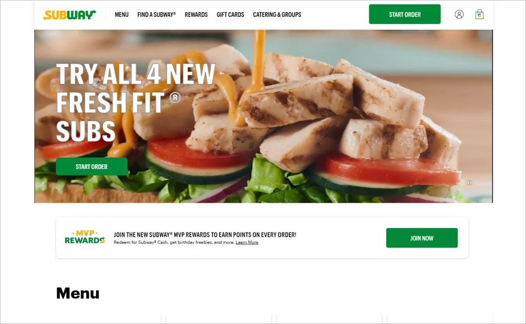
Industry: Quick-service sandwich franchises
The website of Subway surprises with a strong emphasis on localization and menu variety: region-specific filters, easy access to nutrition data, and a “Find a Subway” locator prominently featured engage both global and domestic visitors. A vibrant ingredient gallery with crisp imagery reinforces the brand’s “fresh” promise and invites exploration beyond simple ordering.
What truly elevates the design is the flexible modular system behind the site. Designers built a responsive framework that supports dynamic promotions, loyalty integration, and mobile-first layouts across markets. Consistent iconography and clean typography give the brand a modern voice while maintaining its recognisable footprint in a crowded franchise field.
5. Domino’s
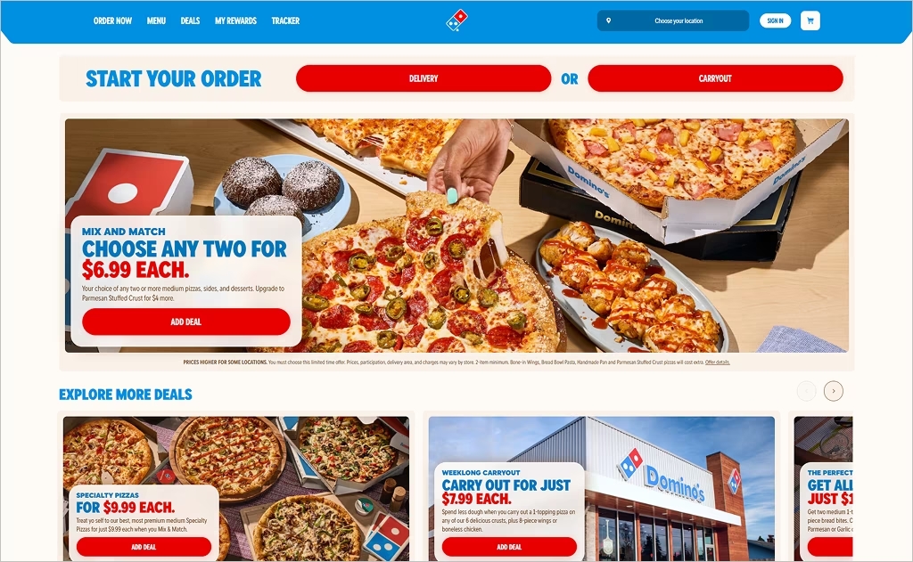
Industry: Quick-service pizza
The website of Domino’s immediately stands out with its striking visual hierarchy: a bold “Order Online” call-to-action paired with large, mouth-watering photography draws users into the experience from the first second. The layout leverages high-contrast color blocks and oversized typography to guide visitors toward the desired action, while a simplified top-nav keeps the focus squarely on the order path.
Beyond the initial layer, the site excels in delivering clarity and speed: region and storefront detection, streamlined menu categorization, and integrated login make the ordering flow friction-free. The use of real-time update indicators (for offers or order tracking) and the modular grid system ensures consistent adaptation across devices, reinforcing the brand’s promise of fast, reliable delivery.
6. Signarama
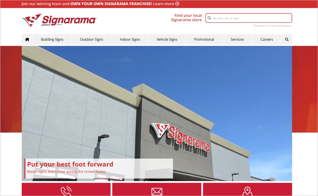
Industry: Commercial signage & visual communications
The Signarama website opens with high-resolution project imagery that instantly communicates craftsmanship and scale. A prominent navigation bar labels service categories like “Building Signs”, “Outdoor Signs”, and “Vehicle Signs”, which gives visitors a clear path into the brand’s wide-ranging capabilities. The clean white background and consistent red accent tie in with the franchise’s brand palette while keeping the visuals focused on client work.
Further differentiating the site is the dual-track approach: one path for prospective clients seeking signage solutions and another for entrepreneurs curious about franchise ownership. Interactive features such as the “Find Your Local Signarama Store” locator and the “Own a Signarama franchise” invite form are seamlessly integrated, signalling both consumer and business development stories within the same platform.
7. Puddin’
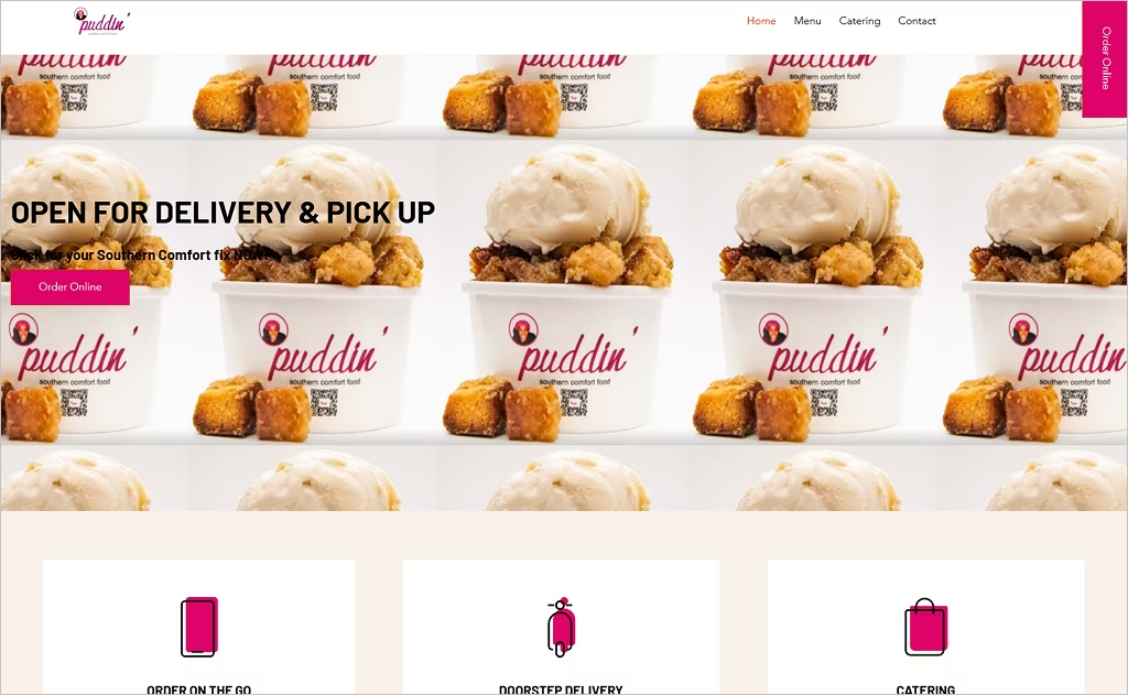
Industry: Southern comfort food & fast-casual franchise
The Puddin’ website uses playful pink accents and inviting food photography to showcase its Southern comfort dishes with personality. A full-width hero introduces the brand’s identity, backed by clean white backgrounds that keep the design light and approachable. Navigation stays minimal with “Menu”, “Catering”, and “Order Online” options clearly displayed to reduce friction for users.
What sets the site apart is its storytelling embrace of authenticity: the founder’s image subtly appears, reinforcing the human behind the brand. Visual cues such as fun icons and a “Follow @DCPuddin” social prompt build community engagement. Subtle parallax transitions and spaced-out layout frames give each section room to breathe, reinforcing a friendly modern vibe around down-home food.
8. Smoothie King
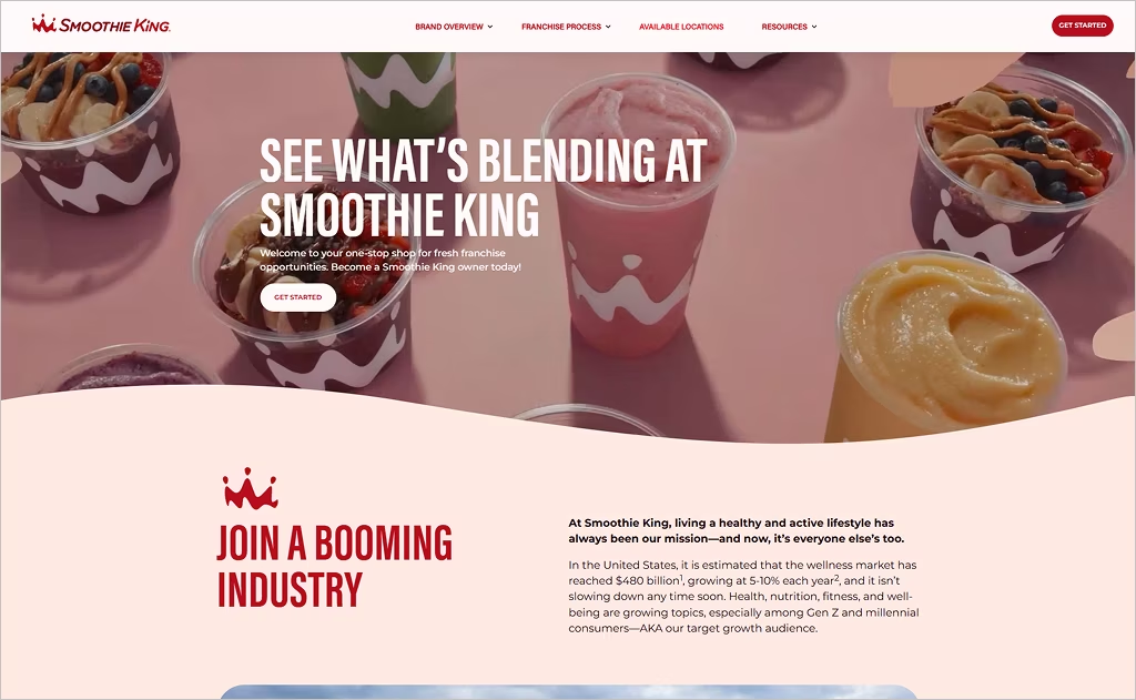
Industry: Health & wellness quick-serve franchise
The website of Smoothie King opens with vibrant visuals and large-format photography that reflect its mission of promoting active lifestyles. Strong use of the signature red hue paired with clean white space creates a vivid contrast and immediate brand recognition. The “See What’s Blending” headline and prominent statistics (like average unit volume and store count) guide potential franchisees toward confidence-building metrics.
What really brings this site to life is the interactive territory map that invites users to explore available markets alongside a creative “recipe” metaphor for the ownership journey — turning franchise steps into smoothie ingredients and blending concepts. That playful yet professional touch helps the brand stand out in the franchise landscape.
9. Cinnabon
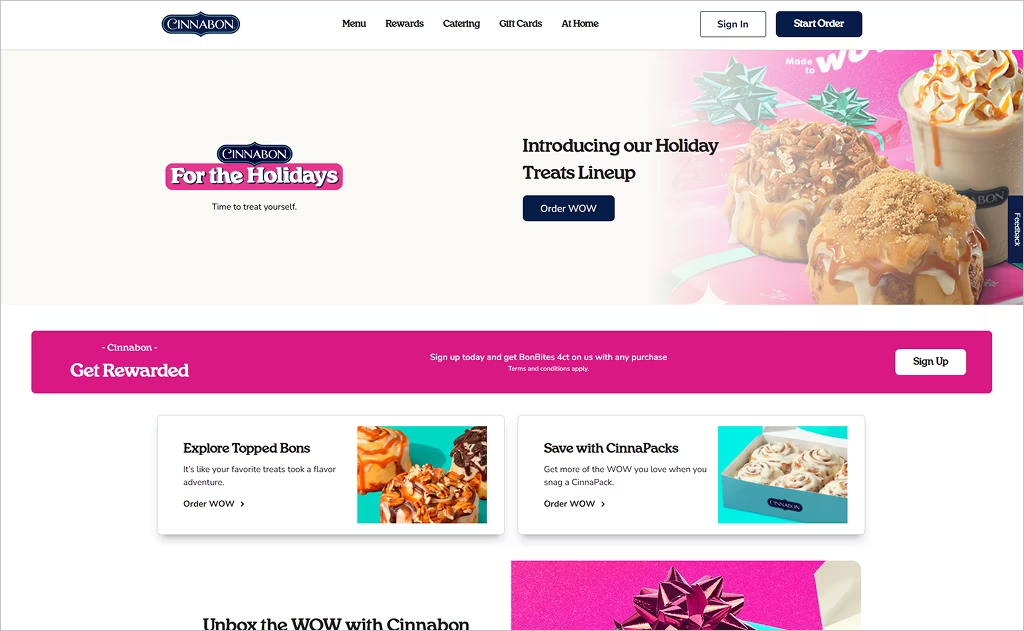
Industry: Bakery and quick-serve franchises
The website of Cinnabon makes an immediate impact with its rich, warm visual palette centered around cinnamon-roll textures and deep browns that evoke the scent of fresh baking. A full-bleed hero image of the signature swirl invites visitors into a sensory experience while large style typography and whitespace convey premium quality. The sticky-glaze visuals feel indulgent yet polished, reinforcing the brand’s gourmet appeal.
What stands out additionally is how the site uses subtle motion effects and a layered menu structure: product categories slide into view with smooth transitions, and nutritional info is tucked elegantly into expandable panels. Store-finder and online ordering are seamlessly integrated into the footer, keeping the menu and story aspects front and center.
10. RE/MAX
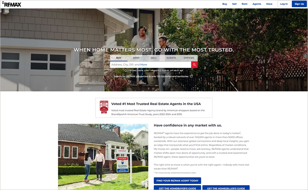
Industry: Real estate brokerage franchise
The website of RE/MAX immediately projects global authority through its clean use of white space, bold typography, and a high-impact hero search bar that invites visitors to “Find a home” right away. Sophisticated imagery accentuates property listings, while the prominent use of the red-white-blue palette reinforces brand consistency and builds trust across diverse markets.
What makes the site especially distinctive is its layered content architecture: dedicated hub sections for buyers, sellers, and agents present tailored journeys with seamless access to market insights, tools, and local-office portals. Integration of responsive filters and interactive property maps ensures usability on mobile devices, while strategic micro-copy guides visitors effortlessly toward action.
11. Chick-fil-A
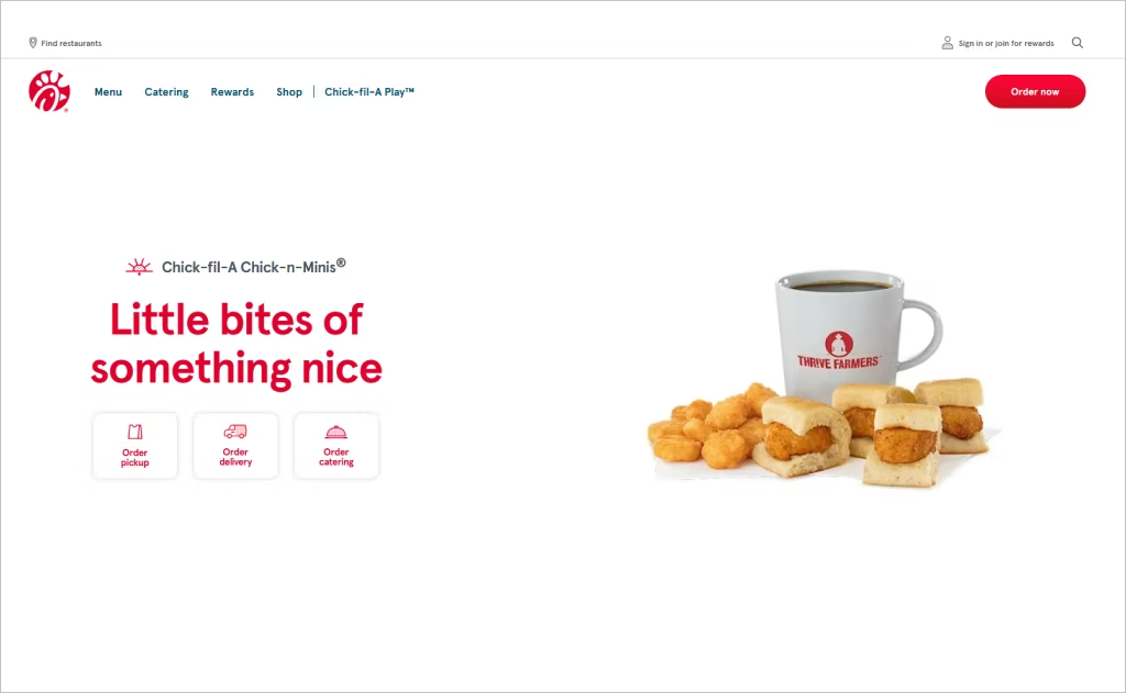
Industry: Quick-service chicken restaurants
The Chick‑fil‑A website draws visitors in with friendly, bold visuals and a vibrant red accent that echoes the brand’s signature identity. The navigation appears straightforward yet layered, with an inviting “Find a Restaurant” search bar and prominent “Order Now” button that sit atop a simplified layout. The site also embeds community-driven storytelling, enabling users to read real guest and team member moments via the “It’s the Little Things” section.
What makes the site especially distinctive is its integration of digital-experience features such as the app-driven ordering system and a dedicated kids and family content hub (“Chick-fil-A Play”). These elements reinforce the user journey beyond food ordering, making the site feel like a holistic lifestyle experience rather than a standalone franchise homepage.
12. The UPS Store
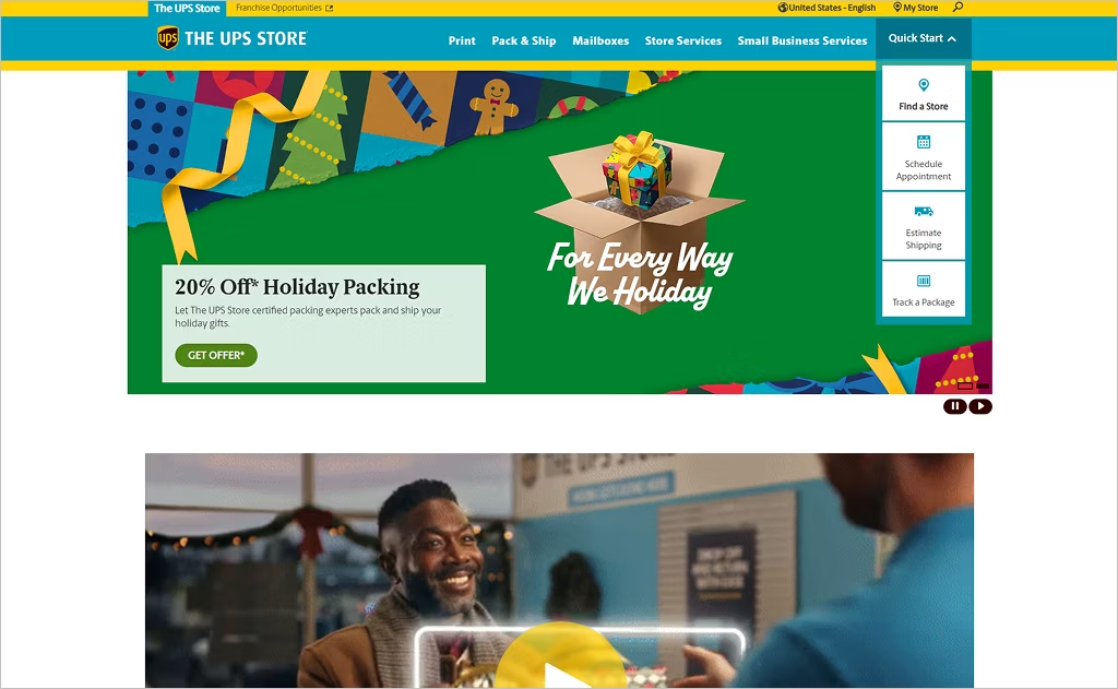
Industry: Retail print & shipping services
The website of The UPS Store leverages a crisp, professional design with clean lines and ample white space, elevating what might otherwise be seen as a purely transactional service. Strong use of bold headings such as “Find a Store” and “Schedule Appointment” immediately orients visitors; the imagery features real-world packaging and print projects, grounding the brand in everyday business-support work.
What makes this site especially distinctive is its “local-first” microsite strategy that empowers each franchised location with its own search-optimized page and localized content. The website also integrates tailored service-category paths like printing, mailboxes, and business services that display relevant tools and offers depending on user interest.
13. BatteriesPlus
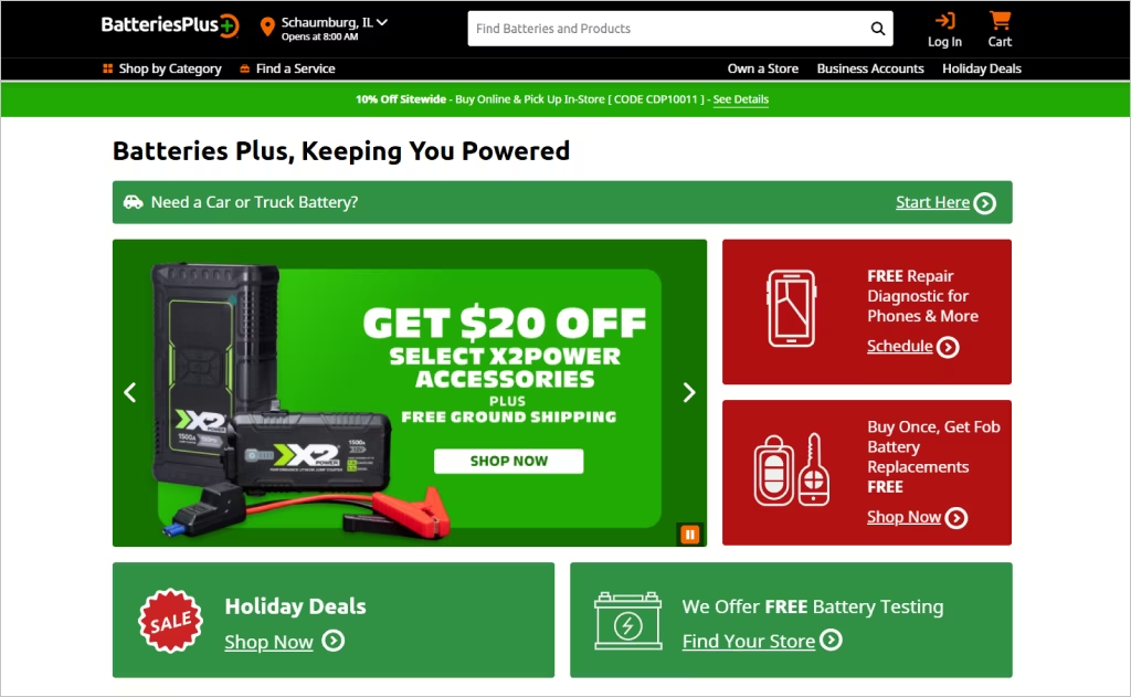
Industry: Retail specialty — power solutions and repair services
The website of Batteries Plus showcases a clean, grid-based layout that efficiently supports its broad service offering from auto batteries to phone repair. The main navigation dynamically surfaces key service categories such as “Lighting” and “Gear & Equipment,” helping visitors visually scan and jump directly to their needs. A carousel of promotional offers prominently appears, driving urgency and conversions.
A standout feature is its strong emphasis on service availability and store localization — each user is prompted to select a store, immediately tailoring content like hours, services, and offers. The website’s redesign emphasized mobile-friendliness and experience optimization across devices, ensuring that complex product categories and service paths remain accessible and intuitive.
14. Tim Hortons
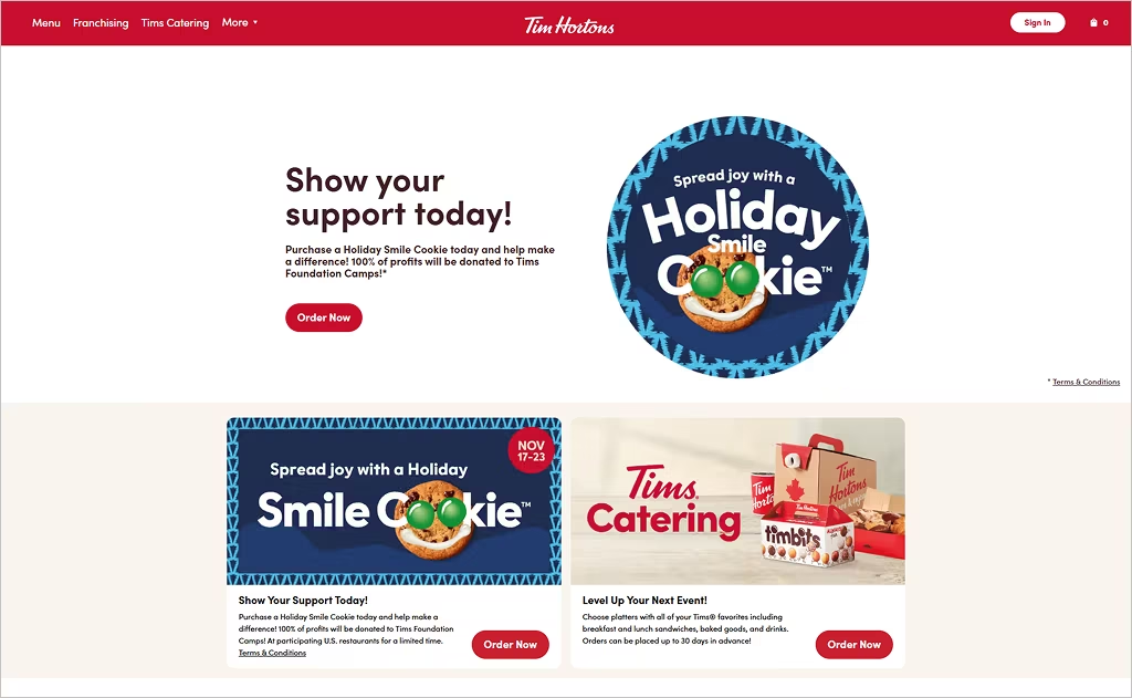
Industry: Quick-service coffee and bakery
The website of Tim Hortons draws visitors in with a clean and engaging layout that showcases its menu items through high-quality imagery and rich textures reflecting freshly baked goods. The use of warm color tones paired with oversized hero visuals evokes a cozy café atmosphere online. The homepage features a clear, persistent navigation bar and a store-locator module that slides into view as users scroll, accelerating local engagement.
One standout element is the site’s campaign integration: limited-time promotional banners change dynamically and are tied to interactive pop-ups that highlight seasonal offers and loyalty perks. The footer includes a prominently placed newsletter signup blended into an image of product placement that feels organic rather than intrusive. Combined with subtle hover animations over menu categories, the site feels both modern and inviting.
15. Wendy’s
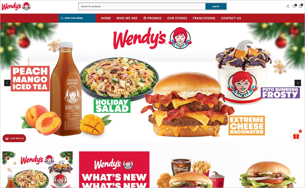
Industry: Quick-service burger franchise
The website for Wendy’s Philippines opens with a clean hero image and a prominent “View Our Menu” prompt that immediately pulls users into selection. Large category tiles for “Holiday Collection,” “What’s New,” and “Burgers” invite exploration of seasonal and core items, while the top navigation clearly separates “Promos,” “Our Stores,” and “Franchising,” making it easy for both consumers and potential franchisees.
A unique feature is the localized presentation of brand history and ethos through the “Who We Are” section, which succinctly shares the founder’s legacy and the brand promise of “fresh, natural, high-quality ingredients.” The site also subtly incorporates an e-commerce feel with cart icons and wishlist features tucked into product categories, blending fast-food styling with web-retail mechanics for a modern franchise web experience.
16. McDonald’s
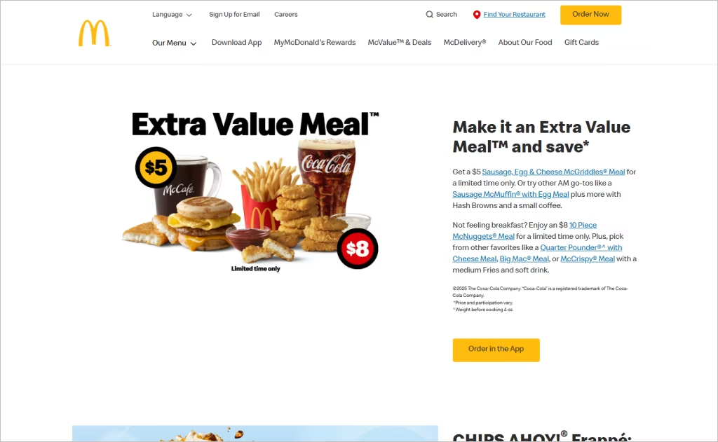
Industry: Quick-service burger franchise
The website of McDonald’s embraces a global-scale framework yet delivers local relevancy through its modular design system built for diverse markets. The refreshed look incorporates bold typography, oversized visuals of signature menu items, and clean, minimalist grids — all part of a global digital design system that ensures consistency across regions.
In addition to visual styling, the site integrates smart UX features like location-aware menus and responsive carousels that adapt to device and geography. Videos on food pages, plus streamlined mobile flows for ordering and offers, enhance user engagement and conversion. These thoughtful interactions elevate the brand’s web presence into an experience that feels both familiar and forward-looking.
17. KFC
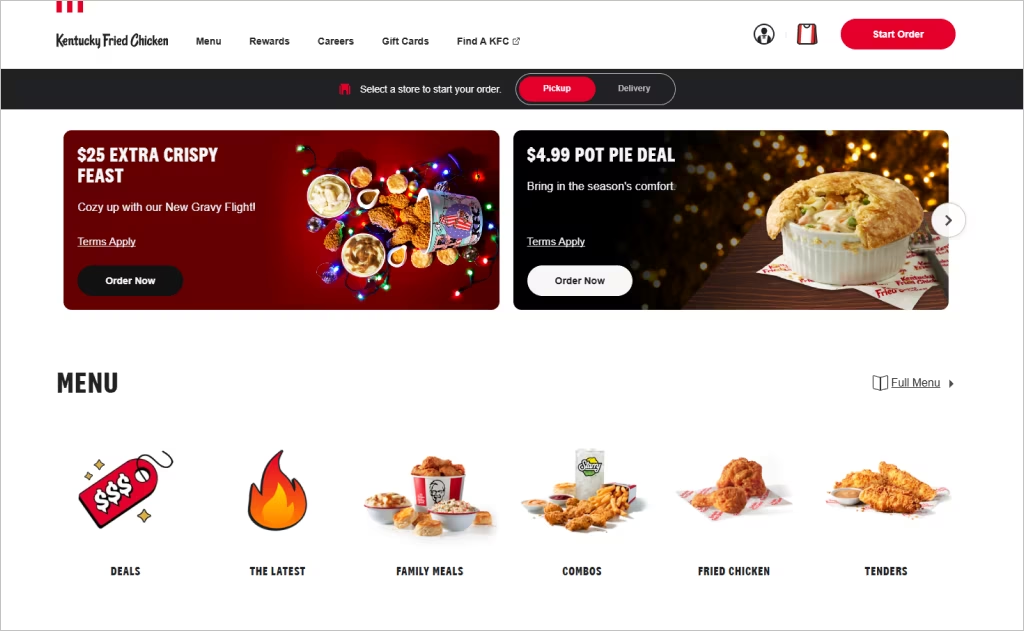
Industry: Food & Beverage / Quick-Service Restaurant Franchise
KFC’s website stands out with a lean, bold design grounded in its iconic red, black, and white color palette. Rather than a long, scrolling layout, the homepage features a dynamic slider and a horizontal menu bar, which lends a modern, interactive feel. The pop-out menu from the header is both unexpected and user-friendly, breaking away from typical fast food site designs.
What makes KFC’s site especially effective is its blend of storytelling and utility. High-contrast typography keeps the brand voice crisp and clean, while full-screen landing pages for individual menu items layer in rustic photography and nutritional info — reinforcing KFC’s heritage while enabling conversion.
18. Ace Hardware
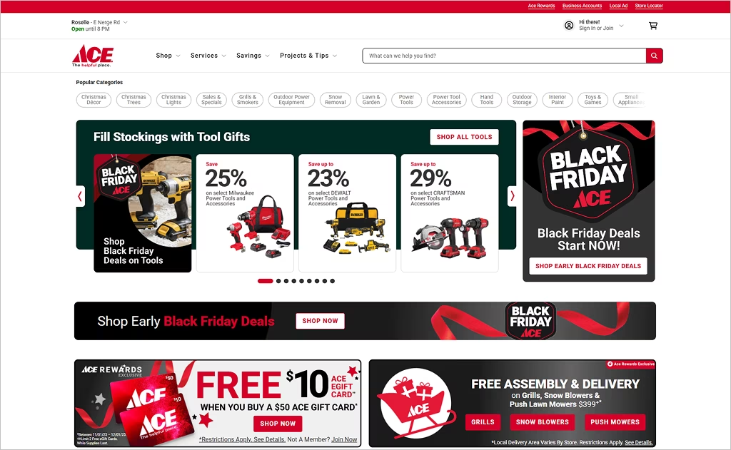
Industry: Home improvement / Hardware Retail
Ace Hardware’s website presents a clean, well‑organized homepage that immediately reflects its “helpful” brand identity. Navigation is intuitive with prominent categories — tools, outdoor power, paint, garden — making product discovery effortless. The use of high‑quality brand logos (e.g., Weber, Traeger, Milwaukee) in the header reinforces Ace’s wide product offering.
What sets Ace Hardware’s website apart is its balance between e-commerce and community. The “Order Online, Pick Up in 15 Minutes” feature leans into its franchise model, promoting the convenience of local pickups while maintaining a national storefront. The design supports its cooperative ethos: you get a sleek, modern shopping experience, but with the feel of a neighborhood hardware store.
19. Burger King
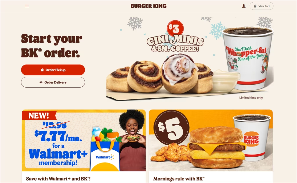
Industry: Fast‑food / Quick Service Restaurant
Burger King’s website makes a strong visual statement with its bold, clean layout and retro-inspired branding. The homepage centers on high‑impact, fire-grilled imagery that reinforces the brand’s “flame-grilled” identity, while warm reds and subtle blues evoke its classic bun‑logo palette. Typography is modern yet nostalgic, tying in seamlessly with Burger King’s refreshed visual identity.
Functionally, the site balances appetizing visuals with clear calls-to-action — visitors can easily order, explore menu items, or learn about food quality. The “Real” food narrative is integrated gracefully, emphasizing the removal of artificial ingredients with simple, digestible content. This fusion of bold design and brand storytelling makes the website both visually striking and strategically effective.
20. Anytime Fitness
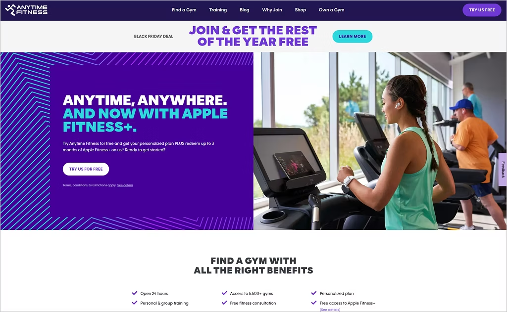
Industry: Fitness / Gym Franchise
Anytime Fitness’s website projects a modern, clean look anchored in a simple color palette of purple, white, and soft neutral imagery. The hero section immediately delivers its core promise — “Anytime, anywhere” — via a bold call‑to‑action (“TRY US FOR FREE”) that’s repeated for clarity and conversion. The navigation bar clearly segments key paths: find a gym, training, blog, why join, and shop, making exploration intuitive.
What makes the site distinctive is how it fuses community feel with the convenience of 24/7 access. The visuals emphasize real members in real gym settings, reinforcing authenticity and belonging. Behind the scenes, the structure supports accessibility — Anytime Fitness publicly states its commitment to WCAG 2.0 AA standards. The design balances motivational imagery, clean typography, and a focused UX, reinforcing the franchise’s approachable yet powerful brand.
Want to speak with an expert?
Call us at (872) 242-1074
How to Design a Website That Demonstrates Your Franchise Authority
A franchise website isn’t just a digital presence — it’s the first impression for potential franchisees, customers, and partners. A well-designed franchise website establishes credibility, showcases authority, and boosts trust. Here’s how to ensure your website reflects your franchise’s authority and professionalism.
1. Establish a Strong Brand Identity
Your franchise’s website should immediately convey who you are and what sets you apart. This means:
- Consistent branding: Use your logo, colors, fonts, and tone consistently across all pages.
- Clear value proposition: Communicate what makes your franchise unique, why your products or services are superior, and why people should engage with you.
- High-quality visuals: Professional photography, videos of your locations, and graphics can create an instant impression of authority and professionalism.
Tip: Include a short “About the Franchise” video on your homepage. Seeing real people and stories behind the brand builds instant trust.
2. Make Navigation Intuitive and User-Friendly
Authority isn’t just about visuals — it’s about usability. A confusing website can erode credibility. Ensure your website is:
- Simple and clear: Logical menus and clearly labeled pages help visitors find information quickly.
- Mobile-optimized: Most users browse on smartphones; a responsive design is a must.
- Fast-loading: Speed is crucial — slow pages make your brand seem outdated or unreliable.
Bonus Tip: Include a dedicated section for prospective franchisees, clearly outlining the steps to join your franchise and frequently asked questions.
3. Showcase Social Proof and Success Stories
Nothing demonstrates authority better than real-world results. Highlight:
- Testimonials: Customer reviews and franchisee experiences build trust.
- Case studies: Show concrete success stories of locations that have thrived under your franchise model.
- Press features: Awards, media mentions, or industry recognition boost your credibility.
Advice: Use a mix of video and written testimonials. Videos feel authentic and engaging, making them more persuasive than text alone.
4. Optimize for Lead Generation and Engagement
An authoritative franchise website is also a high-performing business tool. Ensure your website:
- Has clear calls-to-action (CTAs): Whether it’s “Request Franchise Info” or “Book a Consultation,” make actions obvious.
- Offers downloadable resources: Franchise brochures, eBooks, or investment guides position your brand as knowledgeable and helpful.
- Integrates contact forms and chatbots: Instant communication builds trust and makes your franchise approachable.
Pro Tip: Track website engagement metrics to see which content resonates most with potential franchisees. Authority comes from both perception and measurable results.
5. Maintain Thought Leadership Through Content
A franchise that demonstrates expertise through content earns respect and authority. Focus on:
- Educational blog posts: Cover industry trends, business tips, and franchise-specific insights.
- Guides and FAQs: Answer questions your prospects are actively searching for.
- Regular updates: Fresh content shows that your franchise is active, relevant, and authoritative.
Tip: Highlight a “Franchisee Resources” section with insights on marketing, operations, and success strategies — positioning your brand as an expert in supporting its partners.
Turn Strong Design Into Franchise Growth
A great franchise website does more than look good — it creates an experience that feels seamless, trustworthy, and unmistakably on-brand. The top examples above show how thoughtful design can simplify decision-making, strengthen brand identity, and make every location feel connected.
But the real magic happens when design, strategy, and performance come together. The strongest franchise sites seamlessly blend clean visuals with smart UX, robust SEO, and clear conversion paths that effectively turn visitors into loyal customers. When those pieces align, the entire franchise network benefits.
Comrade Digital Marketing is here to help you bring that vision to life. If you’re ready to elevate your franchise’s online presence and build a website that truly works for you, reach out — let’s create something powerful together.