
Great design starts with inspiration, and construction websites are a treasure trove of ideas. From sleek modern homes to bold architectural statements, these platforms showcase creativity that turns ordinary projects into extraordinary spaces.
Beyond aesthetics, they offer practical insights, trends, and solutions that help architects, builders, and homeowners bring their visions to life. Whether it’s a cozy renovation or a large-scale commercial build, exploring these sites can spark fresh ideas and save valuable time.
We’ve compiled 25 standout construction websites that inspire, inform, and elevate every project. Dive in and discover the creativity that could shape your next build.
1. Turner Construction
Industry: Construction / Construction services / Engineering
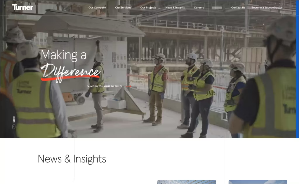
The Turner Construction website opens with a bold, full-width hero image combined with succinct messaging (“Making a Difference”) that immediately establishes both scale and mission. Visual cues like directional arrows and minimal but purposeful calls to action (e.g., “Browse Our Projects”) invite exploration without overwhelming the visitor.
Its site layout emphasizes modular content sections with generous white space, allowing distinct blocks — projects, services, insights — to breathe and be scanned easily. Clean typography, consistent iconography, and subtle hover animations lend a refined professionalism.
The navigation is intuitive, with a clear hierarchy and dropdowns that let users reach deep sections (markets, ESG, careers) without losing context. The sticky header ensures users can jump between major segments seamlessly.
2. McCarthy
Industry: Construction / General contracting
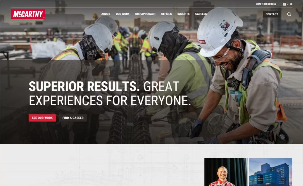
McCarthy’s website welcomes visitors with a striking, high-resolution hero slider that rotates through its landmark projects, instantly conveying scale and credibility. Bold visuals paired with clean, minimal text create a memorable first impression.
The site’s consistent grid layout keeps project thumbnails and content cards neatly aligned, making browsing effortless and visually pleasing. Subtle hover effects bring images to life without being distracting, while clear typographic hierarchy naturally guides attention from headlines to supporting details.
Navigation is smooth and intuitive: dropdown menus reveal deeper content without losing context, and a persistent header ensures users always know where they are as they explore McCarthy’s extensive portfolio.
3. Blach Construction
Industry: Construction / General contractor
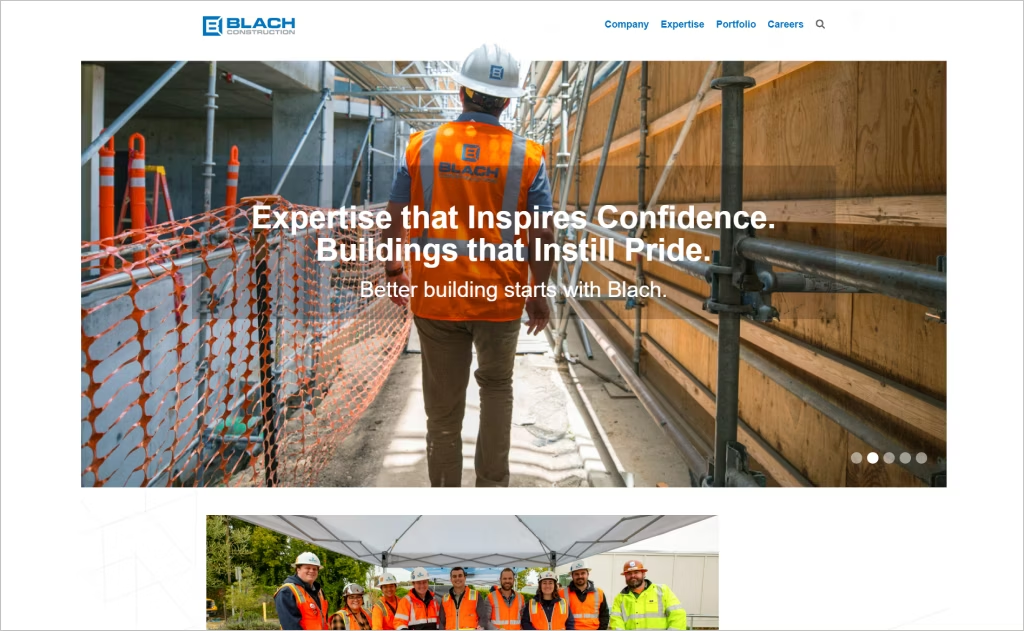
When you land on the Blach Construction website, you’re greeted by a bold hero image paired with the tagline: “Expertise that Inspires Confidence.” It instantly sets the tone — professional, yet approachable.
High-resolution project photos rotate across the screen, offering a clear sense of the company’s scale and capabilities. The navigation is simple and intuitive, with services, portfolio, and company culture easy to find. Sticky scrolling keeps key pages within reach at all times.
A consistent use of logos and sleek monochromatic icons creates a modern, cohesive look that complements the striking photography. Generous white space and clear typographic hierarchy make the content easy to read and visually balanced.
Calls to action like “Let’s Build” and “View Projects” are thoughtfully placed, guiding visitors naturally toward engagement without ever feeling pushy. The result is a website that’s as inviting as it is impressive.
4. DPR Construction
Industry: Construction / General contracting
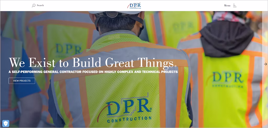
DPR Construction’s website immediately commands attention with its bold, full-screen hero imagery that communicates scale and ambition. The crisp typography feels modern yet grounded, while the restrained palette and generous white space let project visuals breathe without clutter.
Navigation flows intuitively, with an elegant sticky header and subtle micro-interactions that respond on hover, creating a sense of craftsmanship and polish. The “Projects” section integrates immersive visuals and dynamic overlays, letting users explore case studies without losing context.
The site balances form and function with its clean grid layout, efficient load performance, and mobile responsiveness. Its creative layering of content — text, imagery, animated elements — gives a premium, editorial feel rare in the construction world, elevating DPR’s brand through design.
5. PCL Construction
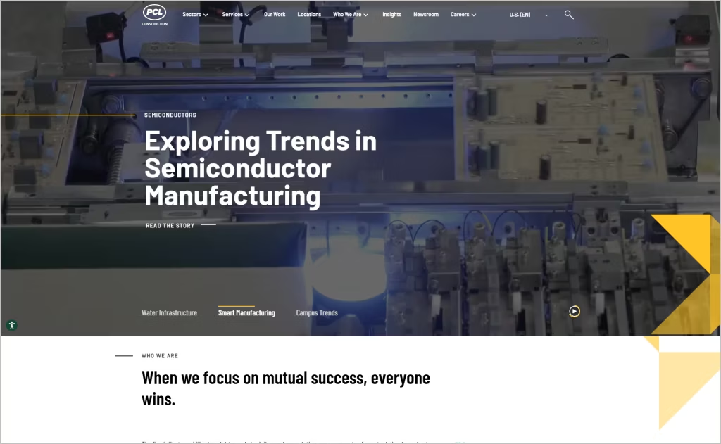
Industry: Construction
The PCL Construction website opens with a bold, full-bleed hero slider where high-impact project visuals morph seamlessly, each transition reinforcing the brand’s scale and sophistication. Subtle preloading and animated overlays heighten the drama while preserving performance.
Throughout the site, clean typography contrasts sharply against immersive photography, and sections unfold with refined scroll-triggered animations that guide users without overwhelming them. Navigation remains intuitive with well-structured dropdowns and sticky menus that elevate usability.
And what truly sets PCL apart is the polished interplay between storytelling and data: project dashboards, case-study visuals, and embedded dynamic elements convey technical depth while remaining elegantly accessible.
6. Harper Construction
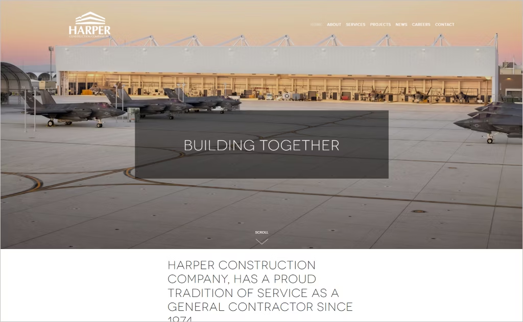
Industry: General contracting / Construction
The Harper Construction website makes an immediate impression with a bold, full-screen hero image showcasing one of their completed projects, paired with a headline like “Building together” that instantly conveys credibility and vision. A clean, fixed navigation bar stays visible as you scroll, making it easy to explore Projects, Services, News, and Contact at any time.
High-quality project photography and plenty of whitespace give the site a sleek, modern, and architectural feel. The “Projects” section is thoughtfully organized, letting the work shine through concise copy and striking visuals. Subtle animations and fade-in effects add a contemporary touch without feeling distracting.
A restrained color palette of neutrals with carefully chosen accent tones reinforces a professional, trustworthy brand identity, resulting in a polished and confident online presence.
7. Castle Homes
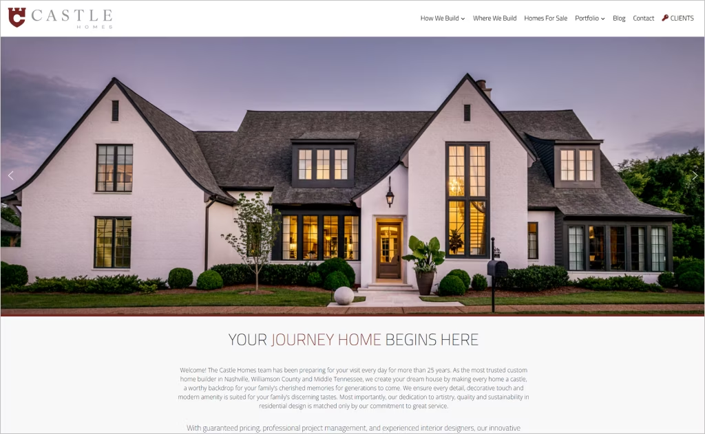
Industry: Custom home building / Residential construction
Castle Homes’ website makes a striking first impression with its bold, full-width hero slider showcasing gorgeous, high-resolution photography that immediately conveys sophistication. The overlay text, “Your Journey Home Begins Here,” draws the eye without taking away from the visuals.
Navigation is simple and intuitive, with well-organized drop-down menus under “How We Build,” “Portfolio,” and “Our Process,” helping visitors explore both technical details and creative inspiration. The Portfolio section is visually rich and thoughtfully divided — categories like Recent Projects and Design Elements & Details make it easy to browse by style or feature.
The site also balances storytelling with branding. Client testimonials with star ratings are front and center, while calls to action like “Contact Us” or “Homes For Sale” are consistent, accessible, and always inviting. The result is a website that perfectly blends luxury, trust, and ease of use.
8. Paddy Creek Builders
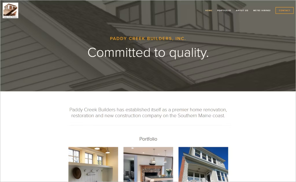
Industry: Home construction / Renovation & Restoration
Paddy Creek Builders’ website immediately grabs attention with its striking project galleries, featuring compelling “before and after” images and vivid photography set against clean, light backgrounds. Every design choice highlights the craftsmanship and architectural detail, letting the work speak for itself.
The site strikes a perfect balance between elegance and usability, pairing classic serif headings with simple, readable body text that conveys both heritage and trust. Navigation feels effortless: clearly labeled drop-downs like New Construction, Restorations, and Renovations make it easy to explore their portfolio.
What really sets the site apart is its thoughtful touches — like the “Our work has been seen in…” section, which subtly showcases press and recognition, and testimonials paired with real project photos that reinforce authenticity.
Consistent spacing, muted accent colors, and careful alignment give the site a polished yet inviting feel, making it both beautiful and easy to use — a true reflection of Paddy Creek Builders’ attention to detail and quality.
9. JHL Constructors
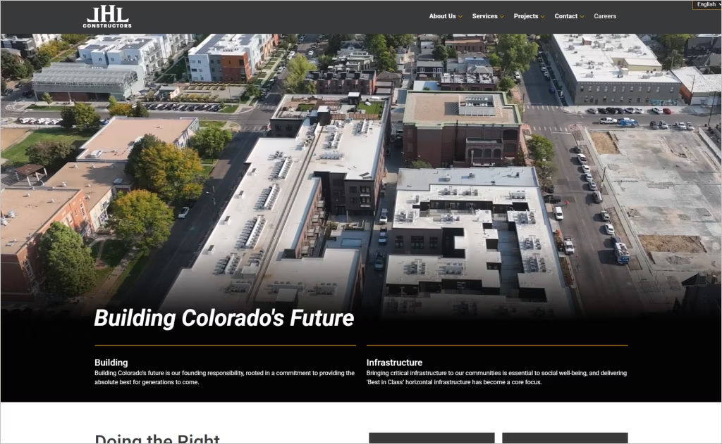
Industry: Construction / Infrastructure & Vertical building
JHL Constructors’ homepage makes a bold visual impact by leading with a full-screen hero slider that features real project imagery, immediately conveying credibility and scale. Their use of clean typography, consistent grid layout, and high-quality photos gives the design a polished, professional feel.
The navigation is minimal and structured (About, Services, Projects, Contact), making it easy to explore without clutter. Project pages feel immersive, with generous white space around visuals and captions to let the work “speak” for itself.
Finally, subtle interactive touches — like fade-in transitions, consistent hover states, and responsive scaling — enhance user experience without overwhelming, balancing modern web aesthetics with functional clarity.
10. Barrett Made
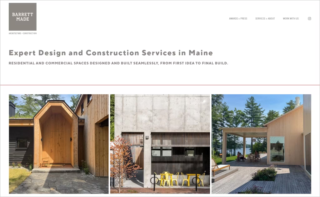
Industry: Architecture / Construction / Design-Build
Barrett Made’s homepage immediately draws you in with bold, full-screen images of their completed projects. The simple navigation — Awards, Services, About, Work With Us — keeps the spotlight on their work without any clutter. A neutral color palette and generous white space give each image room to breathe, reflecting both sophistication and craftsmanship.
The typography is subtle but deliberate — modern, light, and well-spaced — enhancing readability while letting the visuals take center stage. Their tagline, “Made to Stand Out,” is short, confident, and memorable. The layout flows effortlessly, guiding visitors from hero images to project highlights, then to their mission and contact information.
Altogether, the site feels intentional, polished, and bespoke — perfectly mirroring Barrett Made’s commitment to quality and detail in every project.
11. Robins & Morton
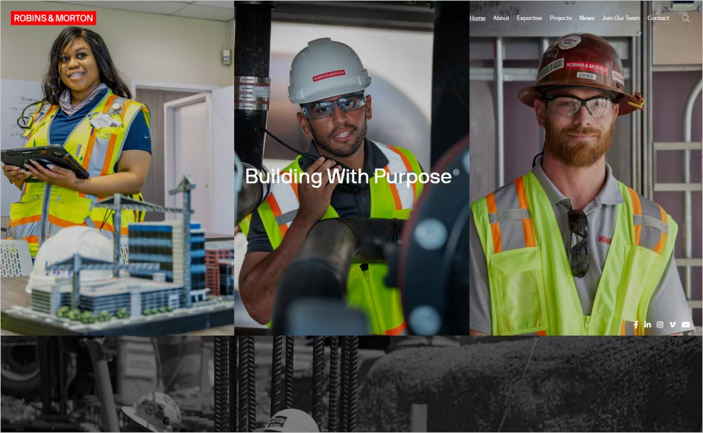
Industry: Modern construction
Robins & Morton’s homepage leads with bold imagery of real projects and people, immediately conveying scale, credibility, and human-centered construction. The navigation is clean and intuitive, with a sticky menu that ensures access to key sections like Projects and Expertise without clutter.
They integrate project microsites, allowing clients to drill into safety docs, news, webcams, and delivery schedules — a smart, deep layer of functionality embedded in the UX.
Overall, the design balances strong branding (notably their signature red), modern layout, and usability to support both marketing and operational communication.
12. Joel & Co. Construction
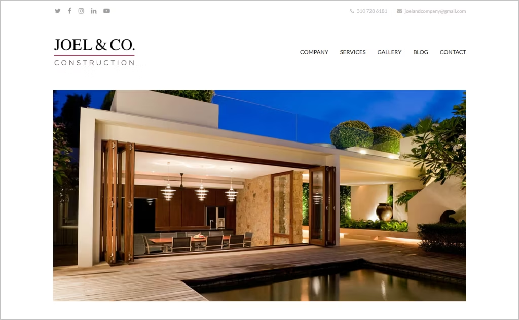
Industry: Construction / General contracting
Joel & Co. Construction’s website immediately stands out with a clean, professional look, featuring large hero images that showcase real project work. The site’s color palette and typography are consistent and thoughtfully chosen: bold headers, readable body text, service icons that break up content visually, and plenty of white space so the pages never feel crowded.
Trust-building elements — like licensing information, a contact phone number, location details, and a company motto emphasizing communication and craftsmanship — reinforce credibility. Visual storytelling shines through in the gallery and service icons, connecting the technical side of their work with its emotional appeal. Visitors can see both the beauty and precision of their projects.
Overall, the layout strikes a careful balance between imagery and informative text, making the website feel polished, reliable, and perfectly suited for a business where design and construction quality go hand in hand.
13. R&O Construction
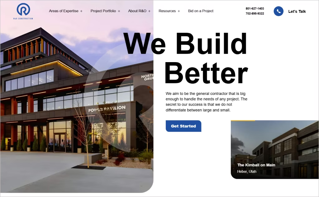
Industry: Commercial construction
The R&O Construction website stands out with its strong visual hierarchy and clean layout. The homepage leads with “We Build Better” as a headline, followed by prominent “Get Started” calls to action. Their portfolio preview uses large, high-quality images laid out by project segment, which helps visitors get immediate visual insight into their expertise.
Another standout is how navigation is structured: key service areas like Preconstruction, Construction, Safety, Technology, etc., are clearly labeled and easy to access. The site also integrates their credentials — history, values, leadership — without overwhelming the visitor, so trust is built early.
Finally, the site balances functionality and design through responsive imagery, clean typography, and consistent spacing. The “Projects” section filters by type, which enhances usability, while the footer includes essential contact details, “Let’s Talk,” and social media links.
14. McDermott
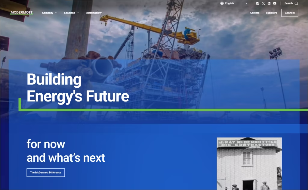
Industry: Engineering, Procurement, Construction & Installation
McDermott’s website grabs attention with striking visuals and bold messaging like “Building Energy’s Future.” Full-width panels highlight global impact, featuring stats such as “30,000+ bright minds” and “30+ global locations,” instantly conveying scale and credibility.
Navigation is intuitive yet comprehensive. The top menu, with sections like “Company,” “Solutions,” and “Sustainability,” guides investors, partners, and communities to relevant content quickly. Modular content blocks mix images and concise text, keeping the site clean, responsive, and mobile-friendly.
The site balances legacy with innovation. “Our History” traces milestones, while “Project Spotlights” and “Energy Transition” highlight ongoing initiatives, showing McDermott’s commitment to both its achievements and future growth.
15. Walsh Group
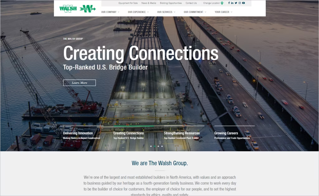
Industry: Custom construction
The Walsh Group website is clean and visually clear, with bold headings, crisp typography, and impactful imagery that quickly communicate their focus: “Delivering Innovation,” “Creating Connections,” and “Growing Careers.” The upfront region selector smartly tailors content to show projects and presence across North America.
Navigation is intuitive, with sections like “Our Company,” “Experience,” “Services,” and “Our Commitment,” making key information easy to find. Generous white space, consistent fonts, colors, and image styles give the site a polished, professional feel, reflecting their heritage and scale.
The homepage balances mission and value statements with project highlights, showing both capability and credibility. Beyond listing services, it emphasizes their history, sustainability, safety culture, and community impact — building trust with clients and potential recruits alike.
16. Ozanne Construction
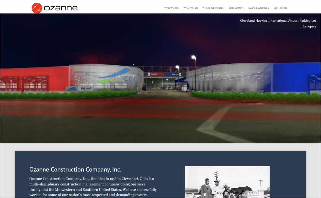
Industry: Construction management / Multidisciplinary construction
Ozanne Construction’s website stands out with its strong sense of credibility immediately upon arrival: a clean, structured layout presents Who They Are, What They Do, Where They’ve Been, Why Ozanne, etc., which gives users clarity about purpose and services from the outset.
Visually, the use of large, high-quality images of real projects paired with client testimonials overlaying them builds trust, and makes the site feel grounded in real work. The featured projects section is well-integrated, giving a portfolio that’s immediately tangible.
Also strong is how the site balances professionalism with approachability: minimalist typography, ample white space, and intuitive navigation help the user to focus on content rather than being overwhelmed. The “60+ Years In Business” banner reinforces legacy while design keeps it modern.
17. Suffolk
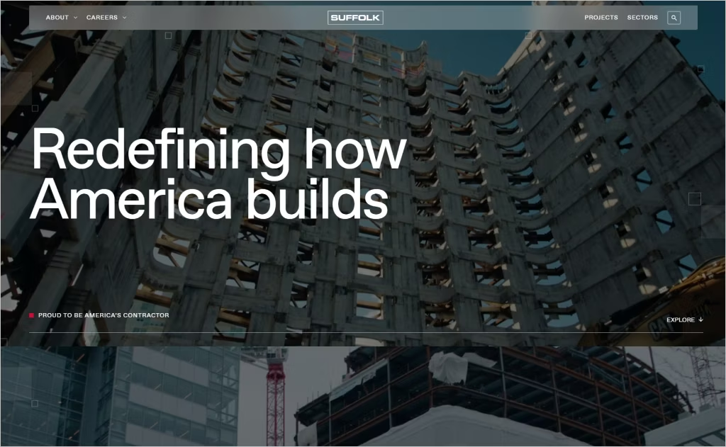
Industry: Construction / General contracting
Suffolk’s homepage immediately captures attention with a clean, modern hero section featuring bold statements like “Redefining how America builds” and “Proud to be America’s Contractor” over vibrant, high-quality imagery. Key stats — annual revenue, locations, and core strengths (Data & AI, Proven Technologies, Advanced Expertise) — are highlighted for an instant, impressive overview.
As you scroll, interactive elements and striking visuals bring the site to life. The animated square-pattern graphic adds energy, while project and tech-focused photos show real people at work, reinforcing authenticity. Navigation is clear — “Projects,” “Sectors,” “About” — making it easy for clients, talent, and communities to find what they need.
Overall, the design balances innovation with credibility. Generous white space, a consistent color palette, and refined typography convey professionalism, while subtle details like live dashboards and overlay visuals highlight Suffolk as a tech-forward, future-focused builder.
18. C.W. Matthews
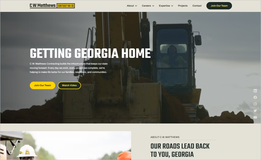
Industry: Heavy highway construction / Infrastructure
The C.W. Matthews website impresses instantly with a clean, professional hero section: a striking nighttime paving image, a clear mission — “Getting Georgia Home” — and bold calls-to-action like “Join Our Team” and “Watch Video.” Dark visuals paired with bright text give immediate impact.
Navigation is simple and intuitive, with sections like “About,” “Expertise,” “Projects,” and “Careers” easy to find. Scrolling reveals a balanced layout of text, images, and whitespace. “Expertise” icons clearly highlight asphalt paving, bridges, concrete, and design-build, making the firm’s services instantly clear.
What sets the site apart is its mix of humanity and capability. Worker photos, leadership bios, a values section, and even a career quiz showcase culture, while big numbers — 27 asphalt plants, multiple divisions, and 78+ years of history — communicate scale and trust.
19. Schmitt + Company
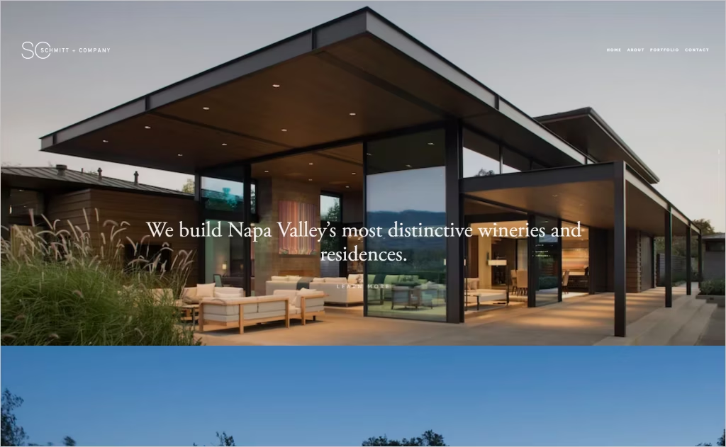
Industry: Custom residential and winery estates / General contracting
The Schmitt + Company website instantly impresses with a clean, elegant hero section that showcases Napa Valley’s natural beauty through stunning, high-quality photography. Large, airy typography and generous white space draw attention to their tagline: “We build Napa Valley’s most distinctive wineries and residences.”
The portfolio section tells its story visually, pairing striking images with just enough text to spark curiosity. Navigation is seamless, letting users explore detailed case studies that highlight craftsmanship, materials, and design care.
Every detail reflects consistency and quality. The muted, natural color palette, refined typography, and subtle calls to action create a premium, approachable feel. Thoughtful design touches — image-led layouts, careful margins, and precise alignment — reinforce the firm’s reputation for sophistication, detail, and craftsmanship.
20. Snyder Construction Group
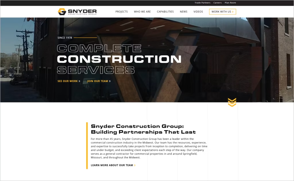
Industry: Commercial construction
Snyder Construction Group’s website presents a clean, modern design that effectively showcases their extensive experience and commitment to quality. The homepage features a prominent call-to-action, inviting visitors to explore their work, which is seamlessly integrated into the site’s layout.
The navigation is intuitive, with clear categories such as “Projects,” “Who We Are,” and “Capabilities,” allowing users to easily find relevant information. This structure highlights their comprehensive service offerings and expertise in various sectors.
Additionally, the site emphasizes its strong client relationships and safety standards, reinforcing trust and professionalism throughout the user experience.
21. H.J. Russell
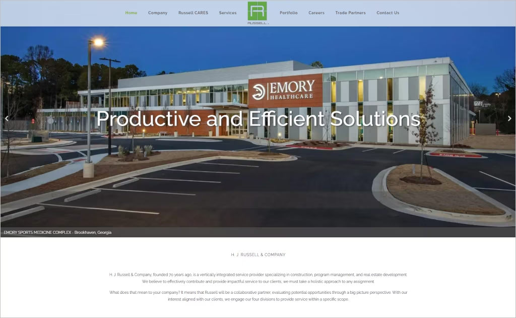
Industry: Construction, Program management, Real estate development
H.J. Russell & Company’s website presents a polished, professional design that reflects its 70+ years of expertise. The homepage prominently features the tagline “Delivering Exceptional Results,” accompanied by dynamic project visuals and clear navigation options. This layout effectively communicates the company’s commitment to excellence.
The site offers intuitive access to various service areas, including construction, program management, and real estate development, through well-organized menus and dropdowns. This structure ensures visitors can easily find relevant information.
Additionally, the “Russell CARES” section highlights the company’s dedication to community impact, enhancing its reputation as a socially responsible organization.
22. CECCO
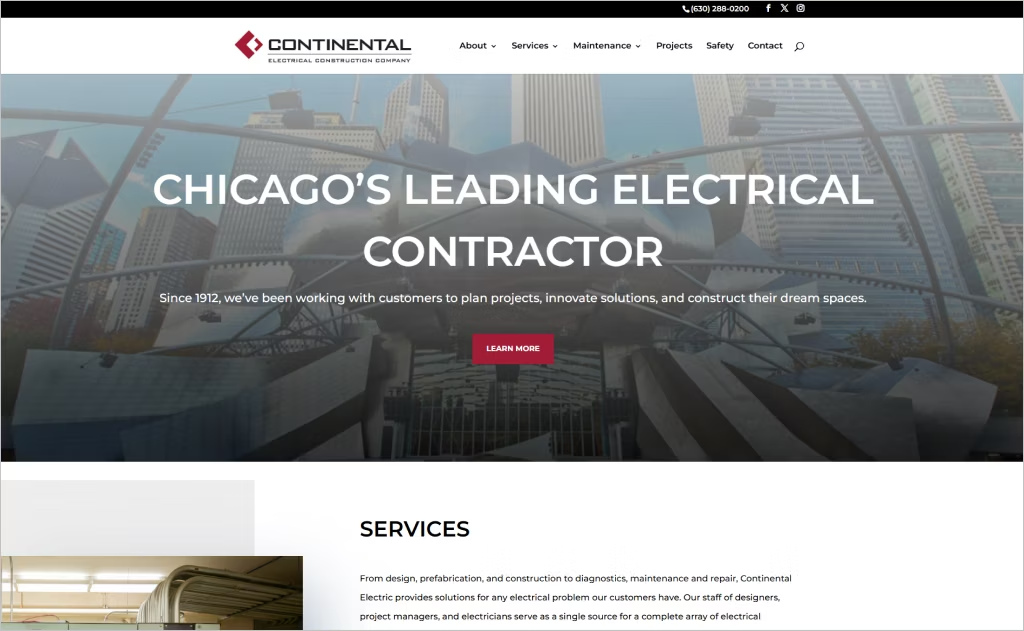
Industry: Electrical construction
CECCo’s website features a clean, professional design that emphasizes its extensive experience and broad service offerings. The homepage prominently displays their slogan, “Chicago’s Leading Electrical Contractor,” immediately establishing credibility. A dynamic project showcase highlights their diverse portfolio, from healthcare facilities to commercial spaces, underscoring their versatility.
The site offers intuitive navigation with clearly labeled service categories, including electrical, low voltage, and design/build solutions. Each service page provides detailed descriptions, ensuring visitors understand CECCo’s comprehensive capabilities.
Responsive design ensures optimal viewing across devices, while the inclusion of BIM modeling and project delivery services reflects Continental Electrical Construction Company’s commitment to innovation and efficiency.
23. Kiewit
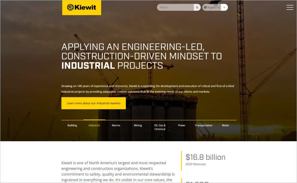
Industry: Construction and engineering
Kiewit’s website captivates with its bold, full-width imagery that immediately showcases its large-scale projects. The homepage features a dynamic slider highlighting various sectors, emphasizing the company’s diverse expertise.
The design employs a sleek color palette of yellow, black, and white, reinforcing brand identity while maintaining a professional tone. High-quality visuals and compelling videos effectively communicate the company’s capabilities and achievements.
Navigation is intuitive, with a sticky menu bar facilitating easy access to services, careers, and corporate information. This user-friendly structure ensures visitors can effortlessly explore the site.
24. Sweenor Builders
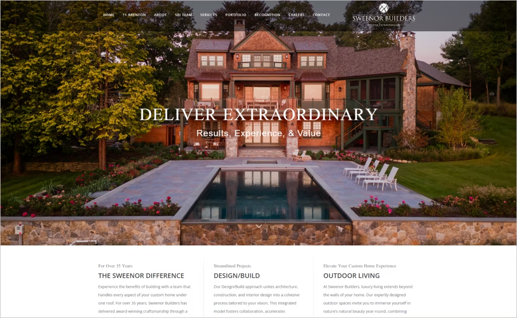
Industry: Custom home building and remodeling
Sweenor Builders’ website exudes professionalism through its clean, minimalist design. The homepage features a black-and-white photo of architects at work, setting a serious tone that emphasizes craftsmanship and attention to detail.
The “Projects” section showcases large, high-quality images of completed homes, allowing visitors to explore their portfolio effortlessly. Each project includes downloadable PDF case studies, offering in-depth insights into the design and construction process.
The site also highlights the company’s collaboration with This Old House, enhancing its credibility. Overall, the website effectively communicates Sweenor Builders’ commitment to quality and client satisfaction.
25. Desert Star Construction
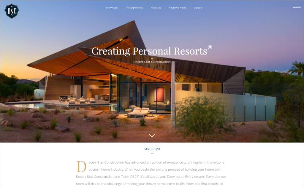
Industry: Custom home construction
Desert Star Construction’s website is a masterclass in storytelling, combining striking visuals with sophisticated design. From the moment visitors land on the homepage, a dynamic hero image slider brings their luxury custom homes to life, instantly capturing attention. Clean typography and intuitive navigation make exploring the site effortless, ensuring a smooth and enjoyable experience.
The portfolio section truly shines, offering high-resolution photos and videos that highlight every detail of their projects. It’s more than a showcase of craftsmanship — it lets potential clients imagine their own dream homes coming to life.
With a fully responsive design, the site looks stunning and works flawlessly on any device. Twice honored with the AZIMA award for “Best Website,” Desert Star Construction’s online presence mirrors the same level of excellence and attention to detail that defines their homes.
How to Create a Website That Reflects Your Construction Expertise
Your construction website should do more than exist — it should showcase your portfolio, establish trust, and bring in new business. The right construction website design can convert visitors into loyal clients by highlighting your strengths and reliability. Here’s how to make it happen:
1. Define Your Brand and Target Audience
Before designing, clarify your brand identity and understand your audience. Are you focusing on residential homes, commercial buildings, or specialized construction projects? Knowing this will shape the design and content of your site.
- Showcase your unique value: Do you offer sustainable building, custom design, or large-scale commercial projects?
- Tailor messaging: Speak directly to your target clients, addressing their needs and concerns.
- Map out your site structure: Organize pages around services, projects, testimonials, and contact info.
Pro tip: Use a clean, professional layout that reflects your construction style — think solid lines, bold visuals, and a structured design.
2. Highlight Your Projects with a Strong Portfolio
Your portfolio is the centerpiece of your construction website — it’s where your skills and creativity truly shine. Dedicate individual project pages to your best work, sharing not just the finished results but also the story behind each project: the challenges you overcame, the materials and techniques you used, and the impact it had for your clients.
And visual presentation is key. Use high-quality galleries, slideshows, or interactive before-and-after sliders to make your work come alive for visitors. People want to see tangible proof of your expertise, so let your craftsmanship take center stage and speak for itself.
3. Build Trust with Credentials and Testimonials
Clients hire construction experts they can trust. Your website should highlight your reputation and reliability.
- Client testimonials: Include real names, company logos, and photos if possible.
- Certifications and licenses: Display all professional credentials, safety certifications, and construction industry awards.
- Press and media features: Highlight coverage in magazines, news articles, or online platforms.
Advice: Consider video testimonials or project walkthroughs to make trust-building more personal and compelling.
4. Optimize User Experience (UX) and Mobile Performance
Your construction business website should feel effortless to use — fast-loading, responsive, and simple to navigate, no matter what device someone is on. Since most potential clients will check you out on their phones or tablets, a mobile-friendly design isn’t just nice to have — it’s essential.
Make it easy for visitors to take action by placing clear calls-to-action, like “Request a Quote” or “Schedule a Consultation,” on every page. To build visibility and trust, add SEO-friendly content, plus practical tools like contact forms, maps, and even live chat so clients can connect with you instantly.
5. Share Knowledge with Expert Content
Position yourself as a construction sector authority by providing valuable content that educates and informs visitors.
- Blog or tips section: Share construction trends, building tips, or renovation advice.
- Detailed project pages: Include scope, materials, challenges, and solutions for each project.
- Search Engine Optimization: Use relevant keywords like “commercial construction services” or “residential building contractor” to attract potential clients online.
Pro tip: Offer downloadable resources like construction checklists, planning guides, or budgeting templates to engage visitors and capture leads.
Want to speak with an expert?
Call us at (872) 242-1074
Turn Inspiration Into a Stunning Website
Need inspiration for your next website? These 25 best construction websites prove that the right design can make all the difference. With striking visuals, strong branding, and effortless navigation, they show how a great site can earn trust just like quality craftsmanship does.
At Comrade Digital Marketing, we understand that your construction company website isn’t just something to look at — it’s a powerful tool for attracting new clients, showcasing your work, and driving growth. That’s why we create custom, conversion-focused websites that help construction companies rise above the competition.
If you’re ready for a website that works as hard as you do, reach out to Comrade Digital Marketing today. Together, we’ll build a strong digital foundation designed to grow your business.