Cleanliness sells, and a website is often the first impression your cleaning business makes. A smart, sleek design can turn casual visitors into loyal customers in seconds.
From sparkling visuals to intuitive navigation, the best cleaning websites combine style and functionality effortlessly. They showcase services clearly while keeping the user experience smooth and engaging.
We’ve rounded up the top 25 cleaning website designs that stand out in 2026. Each one inspires with creativity, usability, and a touch of polish that every cleaning brand can learn from.
The Most Creative Cleaning Web Designs Online
1. Annie Cleaning Services
Industry: Home & Commercial Cleaning
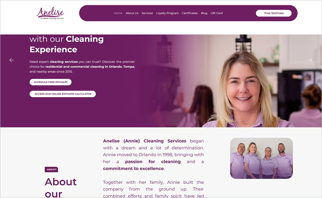
Annie Cleaning Services greets visitors with a fresh, polished first impression: a large hero banner paired with bold messaging (“Your Free Time begins with our Cleaning Experience”) immediately establishes the brand promise. The navigation is clean and well-organized, with clearly labeled sections like Services, Certificates, and Loyalty Program. Trust signals — such as awards, client logos, and “licensed, bonded & insured” badges — are visually prominent and reinforce credibility without cluttering the layout.
What sets Annie’s design apart is how it balances personality with professionalism. The loyalty program graphic adds a friendly, engaging touch, while custom imagery of the team and clients builds connection. Interactive elements like the “Online Estimate Calculator” and “Schedule Free Estimate” calls to action stand out in contrasting colors, inviting users to engage right away.
2. Better Life
Industry: Residential & Commercial Cleaning
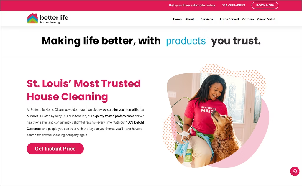
Better Life captivates with its homepage’s “Get Instant Price” feature prominently placed — encouraging visitors to engage immediately — and its consistent use of soft green accents for CTAs reinforces the eco-friendly message. The site also integrates heartfelt real customer stories above the fold, humanizing the brand and weaving narrative into design rather than tucking testimonials down below.
Further standout touches include a live, vertical “Book Now” button that stays visible during scroll, and a transparent “100 % Delight Guarantee” pledge emphasized through sticky navigation. The layout artfully blends vector illustrations and customer photos, giving it a polished yet approachable feel, while client portals and interactive pricing tools make the experience feel modern and customer-centric.
3. Sparkly House Cleaning
Industry: Residential House Cleaning
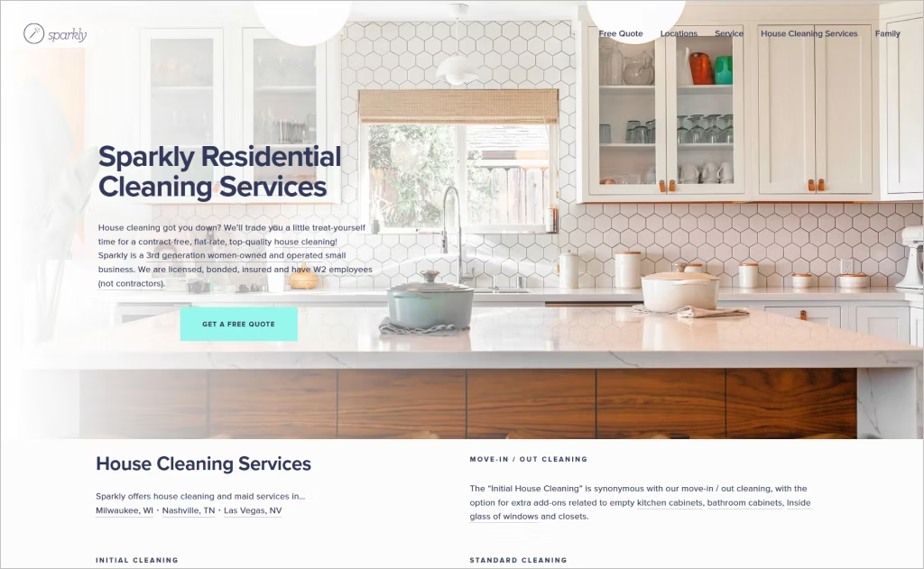
Sparkly House Cleaning’s website feels fresh, friendly, and trustworthy from the moment you land on it. The bright photos, clean typography, and generous white space make it easy to navigate and pleasant to explore. The top menu guides visitors smoothly to key pages like “Free Quote,” Services, and Careers, while trust badges such as “women-owned” and “licensed, bonded, insured” instantly build confidence.
What truly makes the site stand out is its personality. The fresh teal accents paired with crisp photography give it a modern yet friendly vibe. A scrolling testimonial section brings real customer voices to life, while clear “flat-rate” and “no hourly contractors” messages show honesty and transparency. Together, these design choices make Sparkly’s website feel both professional and genuinely caring.
4. Herb’n Living
Industry: Green & Eco Cleaning
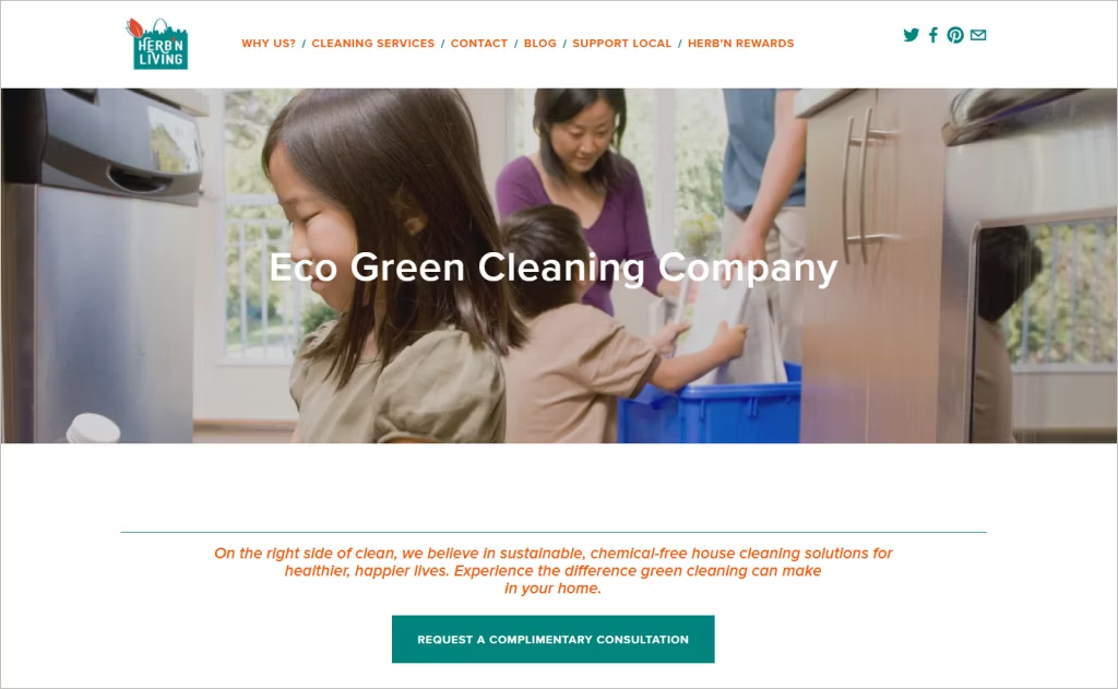
Herb’n Living’s website charms with an elegant simplicity that aligns with its sustainable mission. Its muted, earth-toned palette feels calm and reassuring, and every page subtly reinforces its identity with botanical imagery and soft gradients. The site also emphasizes locality by including a zip-code lookup in the contact/consultation section, clearly presenting service area transparency.
What stands out is their attention to team storytelling — the “Our Technicians” section gives personal mantras and profiles that humanize the brand. Their “Philosophy / Methods” pages dive into proprietary cleaning processes, water conservation, use of HEPA filters, and zero-waste protocols, making those pages both informative and brand-building. Together, these elements turn a cleaning service site into a curated, educational experience.
5. Dust Queen
Industry: Residential & Commercial Cleaning
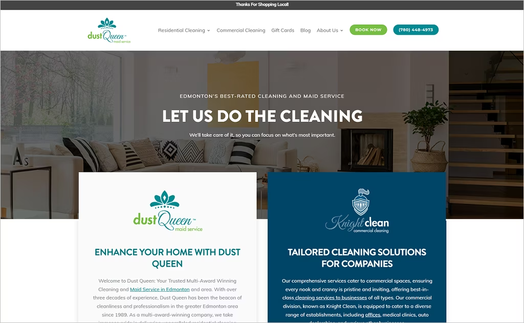
Dust Queen opens with a bold, full-width header that immediately showcases its long history and multi-award status, reinforcing trust from the start. A subtle parallax scroll effect gives depth as you move down the homepage. The services section is organized into clear tiers — cleaning packages, add-ons, commercial division “Knight Clean” — and each section uses clean separators so the page never feels crowded.
One especially striking feature is their integration of a blog with educational content, like “Deep Cleaning vs. Regular House Cleaning,” which blends SEO strategy with user value. Their colors stay consistent and light throughout the site, accented by pastel overlays that soften transitions but never dilute brand identity. Overall, it feels both polished and approachable, with excellent balance between promotion and useful content.
6. GuestPrep
Industry: Short-Term Rental Cleaning
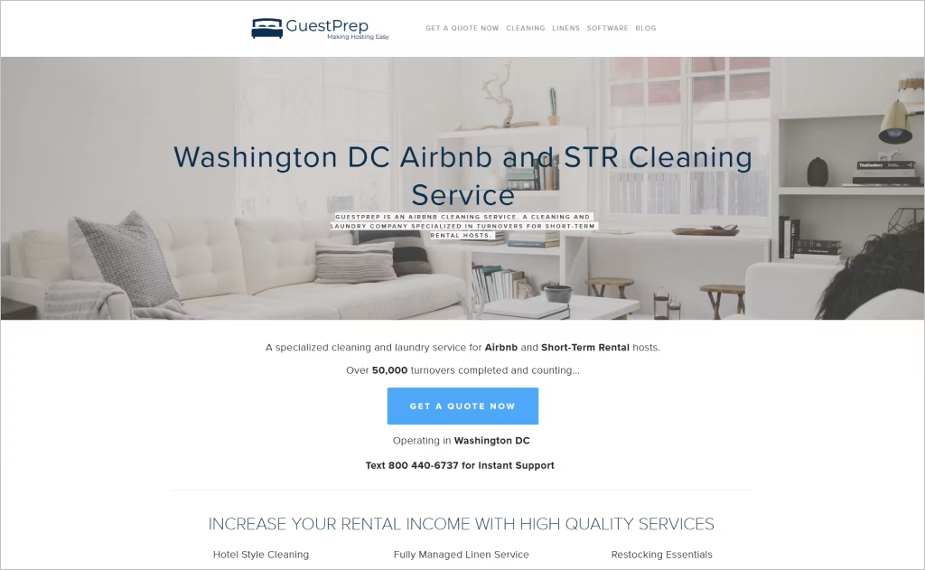
GuestPrep sets itself apart with a sleek, hotel-quality aesthetic that reinforces its specialization: the homepage greets visitors with lush imagery of pristine interiors and calming tones, immediately communicating professionalism and luxury. The prominent “Get a Quote Now” call to action stays visible at the top, while their claim of over “50,000 turnovers” provides social proof right in view.
What’s particularly striking is the modular breakdown of services — Cleaning, Linens, Restocking — each with its own image and “More info” link, making complex offerings digestible at a glance. The site also weaves in real user feedback in a carousel (“DC Super Host” quote) and displays press logos for third-party validation. Overall, GuestPrep’s design conveys reliability, niche focus, and premium service.
7. Jackie’s Home Services
Industry: Home Cleaning
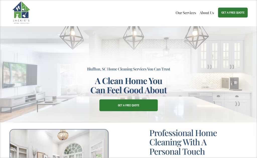
Jackie’s Home Services greets visitors with a warm tone, layering personal narrative in its “Meet Jackie” section to reveal the founder’s journey — this storytelling builds emotional depth beyond a simple “about us” page. The subtle icons peppered across the site (for reminders, fragrance, communication, quality checks) turn functional features into visual storytelling elements, making otherwise mundane service benefits feel friendly and memorable.
Even the contact form is thoughtfully structured: visitors choose their preferred communication (phone, text, email) upfront, which signals flexibility. They also weave in custom branding with a “custom room fragrance” option, giving clients a sensory touchpoint and elevating their brand identity from ordinary to bespoke.
8. SparkleanMN
Industry: Residential & Eco-Friendly Cleaning
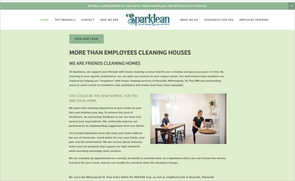
SparkleanMN immediately sets a tone of purpose with its headline, “friends cleaning homes,” weaving warmth directly into its messaging. The site’s design leans into white space and soft visuals, giving breathing room to content. Their “chemical-free house cleaning” banner is repeated with iconographic emphasis, helping the eco promise stick. The zip-code map and service area list reinforce locality.
One particularly fresh element is the client feedback interspersed in the hero section rather than hiding testimonials at the bottom, giving social proof from the start. They also offer an interactive “Rates & Services” form that unfolds smoothly, letting prospective clients see pricing transparently. The “Join the Team” section hints at company culture, turning the site into both a customer and recruitment tool.
9. Divine Maids
Industry: Residential Maid & Cleaning Services
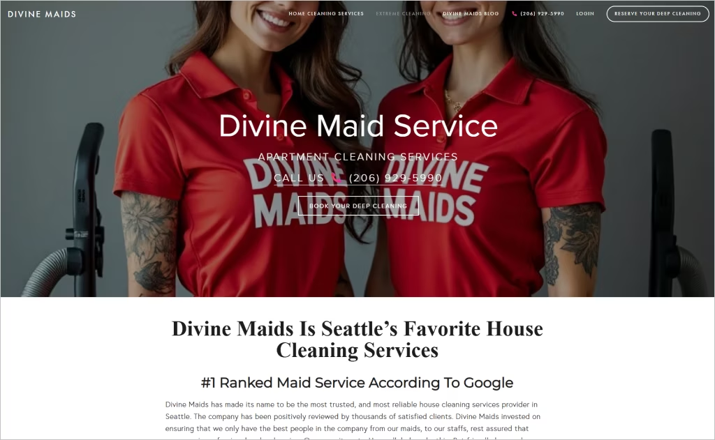
Divine Maids opens with a bold proclamation — “Seattle’s #1 House Cleaning Service” — coupled with a clean layout and prominent booking links, immediately channeling confidence. Their consistent use of full-width imagery and overlapping text blocks gives the site a contemporary and dynamic feel. A sticky top bar keeps call-to-action buttons in view as users scroll, ensuring convenience and encouraging conversion.
What truly elevates the design is the integration of “Extreme Cleaning” and “Hotelesque” service categories, making their offerings feel premium and differentiated. The site also includes a streamlined three-step process graphic for scheduling, converting complexity into clarity. Bright accent colors highlight menu selections and buttons, guiding users naturally toward booking and inquiry.
10. PROHousekeepers
Industry: Residential & Hospitality Cleaning
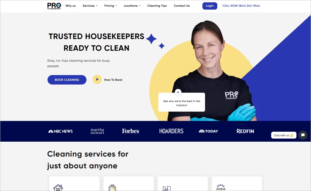
ProHousekeepers greets you instantly with a refined headline, “Trusted Housekeepers Ready to Clean,” paired with clean iconography and a soft visual palette that feels both modern and assuring. Their top navigation is robust yet uncluttered, with sections for Pricing, Locations, Gift Cards, and Cleaning Tips that gracefully blend utility with brand tone. A three-step “Book → Clean → Enjoy” visual on the homepage simplifies the user path.
What truly makes this design stand out is the multi-city service map integrated into the Locations menu, showing nationwide reach at a glance. The client testimonials populate dynamically with portraits from across regions, reinforcing local legitimacy. Their blog (“Cleaning Tips and Hacks”) is thoughtfully embedded and styled to match the brand, turning the site into both a sales and content platform.
11. Planet Maids
Industry: Residential & Commercial Cleaning
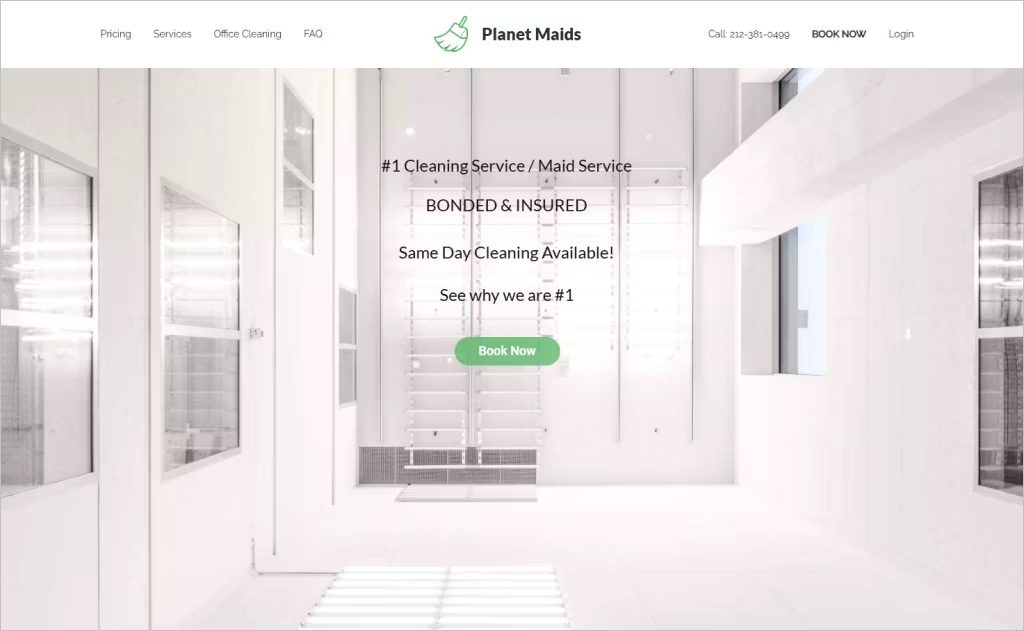
Planet Maids greets visitors with clean, structured navigation that clearly lays out service categories — Regular, Deep, Green, Airbnb Turnaround — and a bold “Book Now” CTA always in view. They emphasize transparent pricing with an upfront, detailed rate table on the homepage, letting users see cost breakdowns without digging. The layout also leverages full-width background images subtly overlaid with tinted panels to maintain readability while showcasing service imagery.
A standout feature is their dynamic “Cleaning Services Near Me” section, which lists neighborhoods and localities to reinforce territorial reach and SEO value. Their blog is integrated directly into the homepage, promoting content marketing right away. Client review snippets paired with staff background checks and credential badges deepen confidence in their professionalism.
12. Handy
Industry: On-Demand Home & Cleaning Services
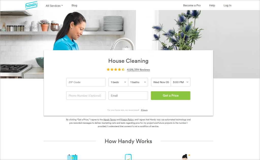
Handy impresses with its polished marketplace front: high-resolution lifestyle photos paired with concise “Book a Cleaner, Instantly” messaging set expectations immediately. The site gracefully fuses home cleaning with handyman services under one roof, using consistent iconography to differentiate those offerings. A sticky “Get Started” button and ZIP-code prompt in the header keep the funnel always open, no matter where on the page you land.
Beyond the standard layout, Handy’s strength lies in its smart UX details: the “How It Works” section is staggered visually rather than linear, giving the feel of a story rather than a checklist. Their provider profiles display star ratings and verify “Handy-approved pros,” lending legitimacy. Embedded review snippets and real-time booking availability deepen confidence and push users toward conversion.
13. Seattle Green Cleaning Fairy
Industry: Eco-Friendly Residential Cleaning
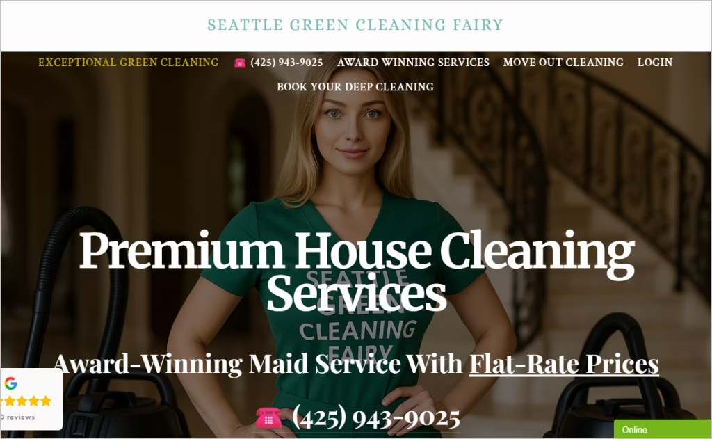
Seattle Green Cleaning Fairy strikes a memorable balance between whimsy and professionalism with its fairy motif infused throughout the site — from clean line art to soft animations — yet it never feels gimmicky. The “Award-Winning Services” label and the 4.7/5 rating feed into legitimacy, while the flat-rate pricing form is front and center, streamlining user decisions. Their service-area menu listing dozens of nearby metro zones reinforces local trust, and the “Login / Apply” tabs subtly hint at both client and employee engagement.
What distinguishes this design is the founder’s personal narrative integrated directly into the homepage, turning a business pitch into a story with heart. Their blog is woven early into the scroll, so content isn’t an afterthought, and the emphasis on minority ownership and mission feels authentic instead of token.
14. House Cleaning SF
Industry: Residential Cleaning
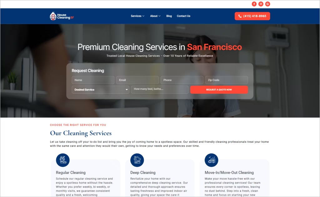
House Cleaning SF makes a splash with a minimalist layout that alternates between striking black-and-white backdrops and crisp, full-color photography, creating a dramatic visual rhythm. The homepage immediately presents a ZIP code entry field, enabling localized service discovery without forcing users deeper into the site. The navigation menu emphasizes “Services,” “Areas,” and “Rates,” putting transparency front and center.
What stands out is their use of interactive hover effects — service images subtly shift or brighten on rollover, adding a tactile feel. Their dynamic FAQ accordion expands on click, preventing clutter while offering detail. They reinforce confidence by embedding a “Trust & Safety” section mid-page, explaining screening procedures and insurance policies in plain terms.
15. Austin’s Maid Service
Industry: Residential & Maid Services
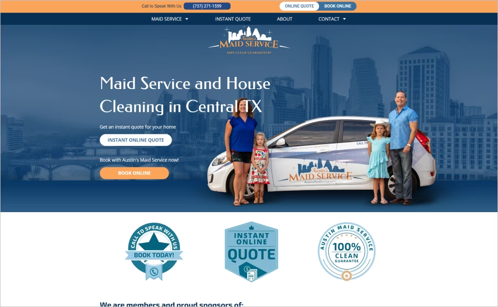
Austin’s Maid Service opens with a friendly, local voice — highlighting its Texas roots through its address, 24/7 online booking, and “Instant Quote” headline that respects the visitor’s time. The site blends family imagery with icons to humanize the brand: a family portrait anchors trust, and sparse icons outline key features without overwhelming visuals. Service area pages list dozens of cities, which reinforces coverage while boosting local SEO.
What makes this design pop is their 100 % Clean Guarantee page, complete with a clear, no-nonsense declaration and simple rules for follow-up care. Background check badges and “insured & trusted team” messages are sprinkled throughout the layout, helping users feel safe before booking. Overall, the mix of hometown warmth and structural clarity gives this site standout appeal in the cleaning niche.
16. The Maids
Industry: Residential & Commercial Cleaning
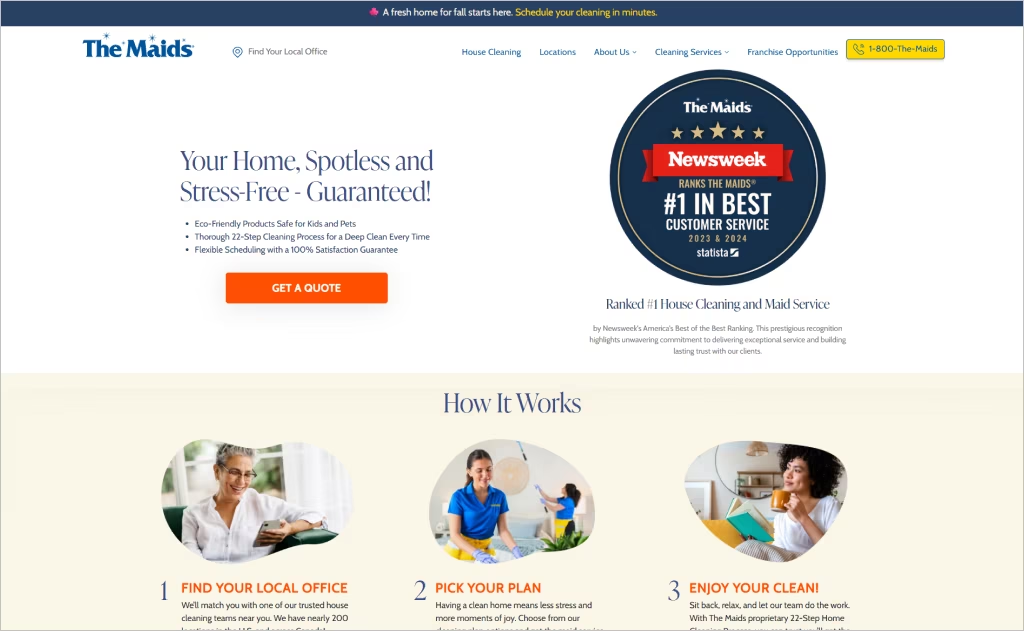
The Maids website delivers a highly professional and polished look, combining strong visual hierarchy with branding that evokes trust. It uses a crisp layout with bold typography and a consistent color palette to guide users through distinct service tiers. Their homepage features a tabbed “Services” module that allows users to toggle between offerings seamlessly, keeping content digestible.
What truly makes this site shine is how it unifies a nationwide scale with a local feel. A map-based locator and dropdown for regions hint at its broad network presence. The 22-Step Cleaning Process and franchise information are woven into the design as signature features, reinforcing expertise and brand legitimacy without disruption. Their “How It Works” flow feels on brand, not generic.
17. Synergy Maids
Industry: Residential & Apartment Cleaning
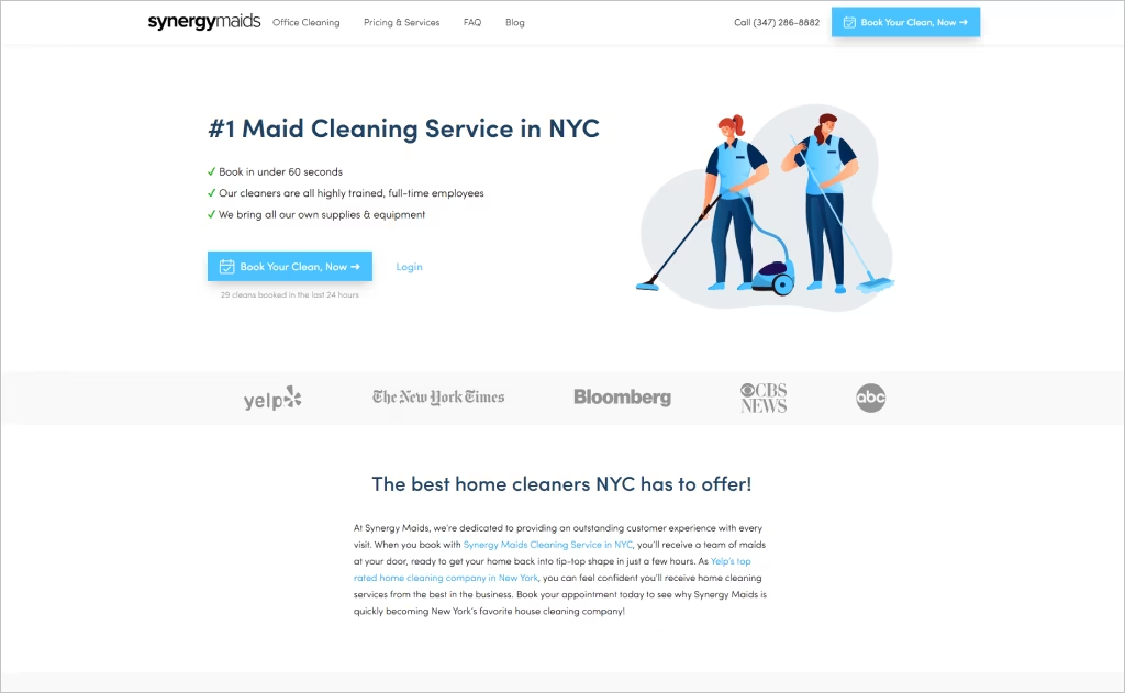
Synergy Maids opens with an energetic, city-centric claim — “Book Your Clean, Now” paired with a real-time “X cleans booked in the last 24 hours” — which conveys momentum and social proof. Their service page lists a highly detailed 55-point checklist so prospective clients can see exact deliverables, turning cleaning into a quantifiable product.
Another distinguishing design feature is their flat-rate pricing table that displays discrete tiers for studios up to multi-bedroom homes, eliminating confusion. Their booking flow is deceptively simple, yet layered: clients can pick duration, number of cleaners, extras, and payment — all in a single continuous interface. The consistent use of badges like “Yelp’s top rated” and “green supplies optional” further elevates brand trust.
18. South Beach Cleaning
Industry: Residential & Commercial Cleaning
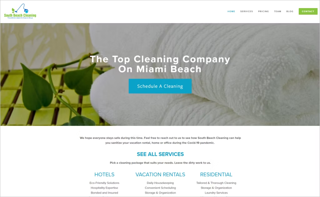
South Beach Cleaning opens with an elegant, sunlit hero image and the tagline “The Preferred Cleaner For Those On The Go,” immediately positioning itself as a high-end, on-demand service. A persistent “Schedule A Cleaning” call to action anchors every scroll, while subtle hotel imagery underscores their hospitality roots. Their navigation includes tabs like “Team” and “Apply,” signaling openness and community focus.
What truly distinguishes the design is the way they combine transparency and accountability: after every cleaning, photos are emailed to clients if no one’s home, reinforcing trust. Their “Pricing Guide” section is upfront and fluid, inviting custom package requests. A blog feed integrates with the homepage, adding content value beyond just service marketing.
19. NicenClean
Industry: Residential & Commercial Cleaning
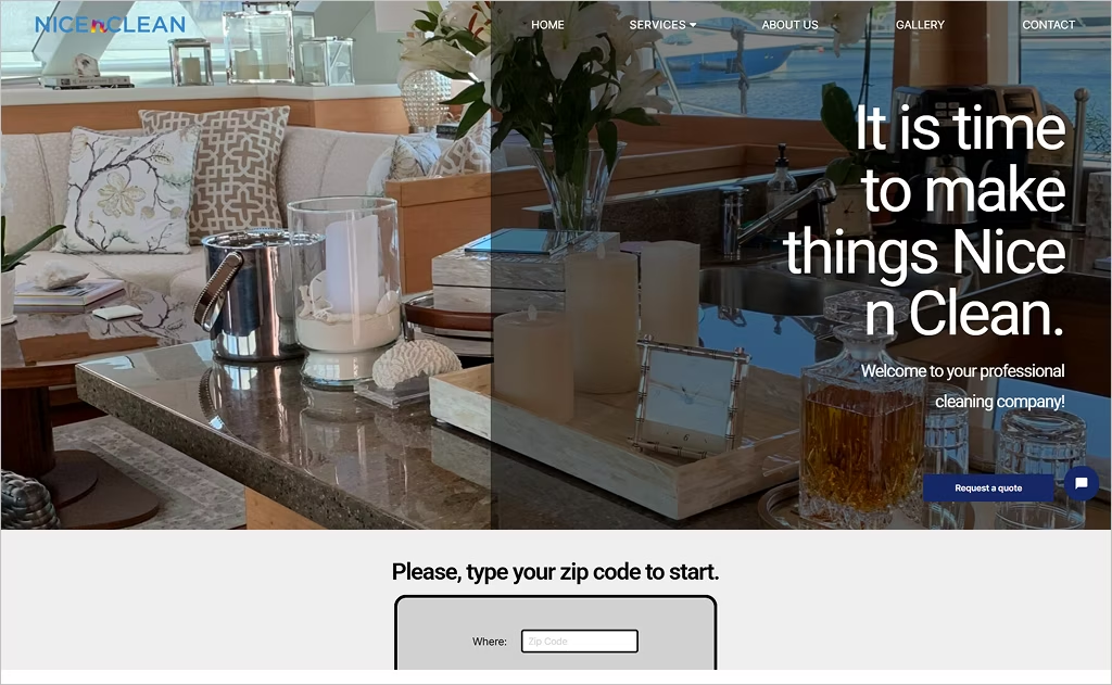
NicenClean catches attention with a zip-code prompt front and center, immediately guiding visitors into a location-based funnel. Their “Request a Quote” flow is integrated into multiple pages, reducing friction by not forcing page hops. The homepage also reinforces transparency by clearly listing service types — residential, commercial, boat — so potential clients instantly grasp their service breadth.
Beyond that, NicenClean leverages a gallery section to showcase before-and-after images, adding visual proof of their results. Their “Vision / Mission / Values” block is prominently presented, giving the brand a personality rooted in ethics. The site also highlights niche offerings like pressure washing and upholstery cleaning, diversifying its portfolio without overloading the user with excessive choices.
20. BerryClean
Industry: Residential & Commercial Cleaning
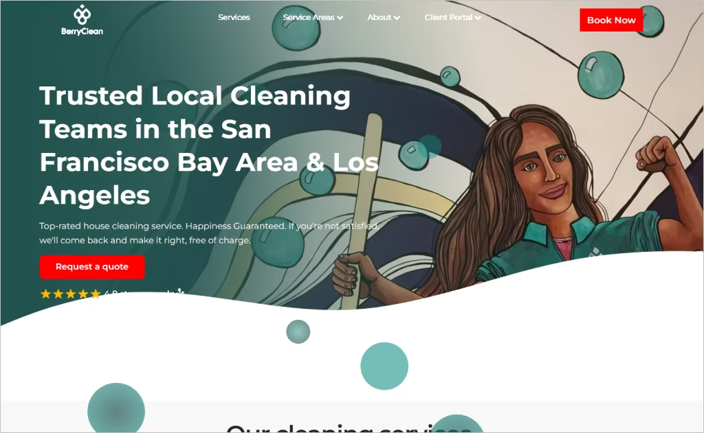
BerryClean opens strong with a clean, airy aesthetic that embraces minimalism — large white spaces, subtle overlays, and a restrained palette let the content breathe. A slick quote widget sits immediately alongside the zip-code search, making booking feel personal and local from the start. Their “Mission / Swag / Shop” trio in the top nav gives the brand life beyond pure service.
Their “Cleaning Professionals” section spotlights staff with brief bios and personality, making the people behind the service part of the visual narrative. Before-and-after photos scroll in a gallery near the bottom, offering proof without interrupting the flow. Their membership discounts and client portal are baked into the design, inviting repeat engagement rather than just one-time leads.
21. Maid Brigade
Industry: Residential & Commercial Cleaning
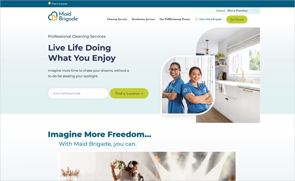
Maid Brigade’s site projects institutional strength with a polished, corporate style. Bold, saturated accent colors punctuate a calming white-and-blue color scheme that feels authoritative yet clean. Instead of generic service lists, they invite users into their “PUREcleaning®” system narrative, weaving technical detail and green credentials into a branded experience. They use “Find a Location” and ZIP code entry features early on to tailor the experience immediately.
The design stands out by layering trust throughout: framed, curated testimonial sections balance clean typography and real voices. A strategically placed footer includes franchise and ownership info, subtly reinforcing scale and legitimacy. The navigation’s inclusion of “Disinfection” and “Green Cleaning” alongside standard services signals both versatility and a commitment to health-conscious offerings.
22. Out of Sight Cleaning
Industry: Residential & Commercial Cleaning
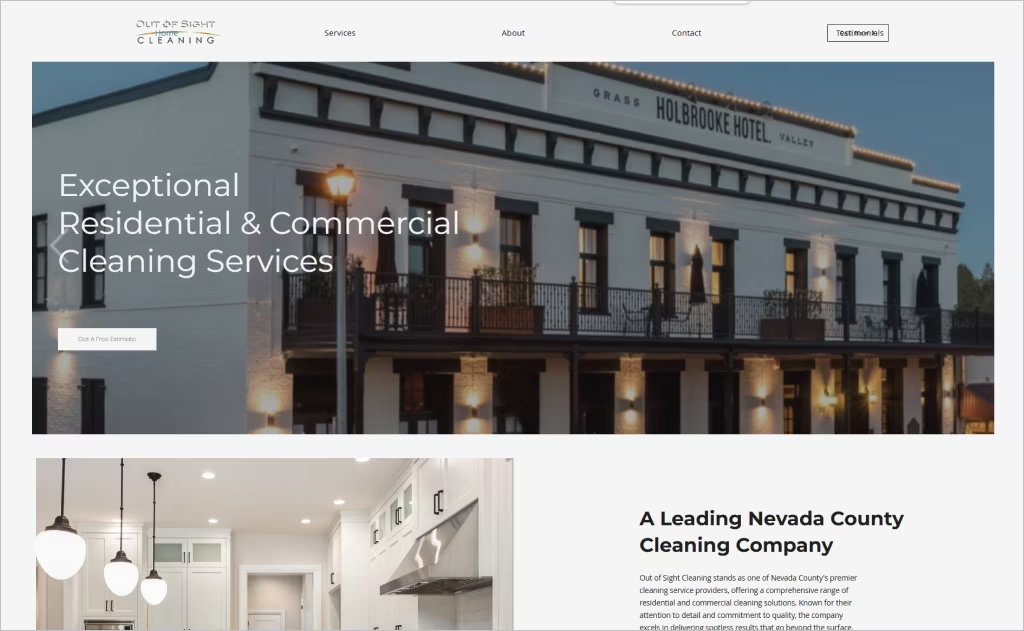
Out of Sight Cleaning’s site opens with a commanding “Get A Free Estimate” prompt and delivers a clear, structured navigation that includes distinct pages for Residential, Commercial, and Carpet services. Their use of eco-friendly messaging is woven into the “Why Choose Us” section, where non-toxic and biodegradable claims are paired with a quality guarantee to emphasize responsibility.
What really lifts the design is how they blend local identity with trust cues: the homepage states “Serving the Greater Nevada County since 2011,” rooting the brand in place. Testimonials are featured with real client voices and full names, and the site highlights BBB accreditation and licensing to reinforce professionalism.
23. The Cleaning Company
Industry: Residential & Office Cleaning
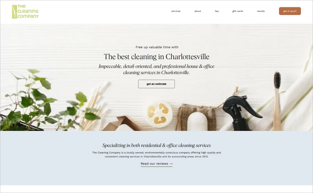
The Cleaning Company (Charlottesville, VA) greets users with polished professionalism. Their homepage combines a soft hero image with a bold “Get an Estimate” prompt, while their clean layout guides users through service types — residential, office, move-in/out — instantly clarifying their scope. The “About” section integrates the founder’s hospitality background, lending warmth and authority, and the site highlights environmentally conscious practices to appeal to modern consumers.
What truly makes the design stand out is the brand’s storytelling intersecting with credibility cues. Real client praise flows into the narrative of the site, and the guarantee to “fix it if we miss something” is placed in plain view. The “Contact” page offers multiple communication modes — text, call, email — making it flexible for different users.
24. Perfect Power Wash
Industry: Exterior Cleaning / Power Washing
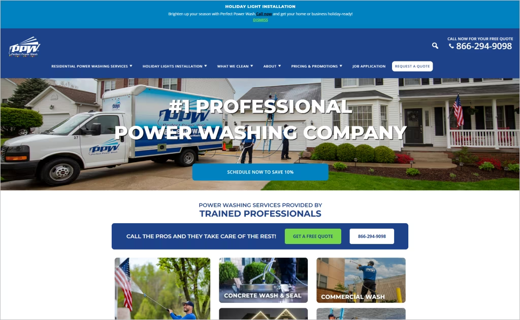
Perfect Power Wash greets visitors with bold service declarations — “Schedule Now To Save 10%” layered atop dramatic, high-resolution imagery of washing in action. Their “Get a Free Quote” form is repeated in multiple sections, making lead capture unavoidable yet seamless. They showcase a host of awards and accreditations (HomeAdvisor Elite, BBB, Inc. 5000) to reinforce trust.
What makes this design especially strong is its educational depth: pricing is explained transparently (based on square footage, with itemized charges). Their “About Us / Why PPW” pages articulate biodegradable cleaning products and a proprietary sealant process, blending technical detail with brand storytelling. Photo testimonials and regional location links tie together its national scale with its local presence.
25. Maid Marines
Industry: Residential & Apartment Cleaning
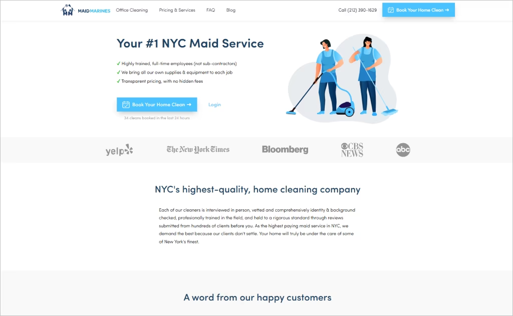
Maid Marines commands attention with a real-time social proof cue — “34 cleans booked in the last 24 hours” — popping up consistently to build urgency. Their homepage emphasizes that its cleaners are full-time employees (not contractors), reinforcing stability and accountability. Transparent pricing is front and center, with no hidden fees and a 55-point checklist detailed for users to inspect.
What makes this design exceptional is the combination of high standards and visual legitimacy. The site features mammoth trust signals — “background checked,” “bonded & insured,” and “eco-friendly” labels — alongside customer photos and a blog spotlight that humanizes the brand. Their “We Bring Supplies” promise removes uncertainty, and their FAQ is comprehensive, making the decision to book feel entirely informed.
Want to speak with an expert?
Call us at (872) 242-1074
How to Craft a Website That Promotes Your Cleaning Services
Your cleaning business website is more than just a digital storefront — it’s your 24/7 sales representative. To truly stand out in a competitive market, your site must instantly communicate professionalism, trust, and reliability. Here’s how to design a website that perfectly highlights your cleaning expertise in five essential steps:
1. Start with a Spotless Visual Design
Just like a freshly cleaned home, your website should feel neat, bright, and organized.
- Use clean, minimal layouts with plenty of white space — this creates a sense of freshness and order.
- Stick to a consistent color palette, often whites, blues, or greens, to symbolize cleanliness and calm.
- Use high-resolution images and videos of your team in action, sparkling rooms, and happy clients. Authentic visuals build trust faster than stock photos ever could.
Tip: Consider subtle animation effects (like a “wipe” transition) to make your site feel as dynamic as your cleaning services.
2. Highlight Your Expertise with Compelling Content
Your visitors want to know why they should choose you over competitors.
- Use short, persuasive copy that emphasizes experience, quality, and attention to detail.
- Showcase your specializations — whether it’s deep cleaning, post-construction cleanup, or eco-friendly solutions.
- Add case studies, testimonials, or certifications to prove your professionalism and reliability.
Pro Tip: A “Before & After” gallery can visually demonstrate your skills and results, instantly boosting credibility.
3. Make Navigation Effortless
A great cleaning website should be as easy to navigate as a well-organized kitchen.
- Use a simple and intuitive menu structure — think “Home,” “Services,” “About,” “Pricing,” “Contact.”
- Include quick links or call-to-action buttons like “Book Now” or “Get a Free Quote” in visible spots.
- Ensure your website is mobile-optimized, as many clients will find you through their phones.
Advice: Keep your contact information visible at all times — ideally in the header and footer.
4. Build Trust Through Social Proof and Transparency
Trust is key in the cleaning industry. Your website should make visitors feel completely comfortable inviting your team into their space.
- Showcase any insurance, licenses, or guarantees you offer.
- Add team photos or short bios to show there are real, friendly professionals behind the brand.
- Integrate your social media feeds (like Instagram or Facebook) to show real-time updates and interactions.
Tip: A short “Our Story” video can go a long way toward humanizing your brand and establishing emotional trust.
5. Optimize for Performance and Local SEO
Even the most beautiful website won’t matter if no one can find it.
- Focus on local SEO keywords like “residential cleaning services in [your city]” throughout your site.
- Use structured data and meta tags so Google understands what your business offers.
- Add a Google Maps embed and clear service area descriptions to attract local traffic.
Pro Tip: Encourage satisfied clients to leave online reviews — they boost both credibility and search visibility.
The Power of Professional Web Design
A well-designed cleaning website does more than just look professional — it builds trust, communicates reliability, and converts visitors into loyal clients. The best designs seamlessly balance clarity, usability, and a polished brand image that resonates with potential customers.
At Comrade Digital Marketing, we specialize in creating custom websites that highlight the unique strengths of your cleaning business while ensuring they are optimized for search engines and user experience. Our team understands how to combine strong visuals with proven digital strategies that drive measurable growth.
If you’re ready to elevate your online presence and attract more clients, partner with Comrade Digital Marketing. Contact us today to start building a cleaning website that truly sets your business apart.
