World-Class Web Design Agency
Boost your client acquisition efforts with our custom web design services for home improvement companies.
218+ Reviews • 4.8-Star Average
$100M+ Revenue Generated
Average 8.2x ROI

Experienced Web Design Company Trusted By


Beautiful and High-Performance Web Design Services
Is a website that’s just beautiful good enough? Not quite! At Comrade, our web design services are crafted to drive traffic, skyrocket your lead generation efforts, and (of course!) boost sales.
Did you know: 88% of online consumers don’t return after a poor website experience? That’s why our performance-oriented web designs focus on two things: lead generation and sales conversion.
From layout to functionality to speed, we fine-tune your website from every angle to perform like a beast. Our web design services include websites that are engaging, user-friendly, and 100% optimized for conversions.
Join forces with Comrade today! You’ll get a robust website that guarantees growth.
Expert Web Design Services for Home Businesses & Contractors
PRO Web Design & UI/UX
Homeowners judge your business in seconds. We design sleek, high-converting websites that instantly build trust, load fast, and give every visitor a smooth experience that drives more calls and form fills.
Landing Page Design
Your landing pages should sell, not just sit there. We design pages that grab attention, deliver the right message, and turn local traffic into real leads for your service business.
Custom Web Design
Want a pro website that ranks and converts? We build exclusively on Webflow for surgical optimization and maximum speed. We choose Webflow for its total design freedom, ensuring a frictionless experience that turns visitors into die-hard clients.
Mobile-Friendly Website
Over half your traffic is on mobile. We build responsive websites that look sharp and work flawlessly on phones – so customers can call, book, or request service without skipping a beat.
Conversion Rate Optimization
Clicks don’t pay the bills — booked jobs do. Our CRO strategies turn your site into a lead machine by fixing weak spots and dialing in what gets visitors to take action.
Website Maintenance
Your site needs ongoing support to stay fast, secure, and lead-ready. Whether it’s monthly care or emergency fixes, we keep your site running like a well-oiled machine — just like your crew.
Website Design Costs Start at $599
We design high-performing websites for home service businesses and other local providers.
Pricing depends on your goals, features, and complexity.


Why Businesses Choose Comrade for Their Web Design Projects
Your website is make-or-break. In just seconds, visitors decide if they like you. That split-second judgment could affect your revenue. Why leave your web design to chance? You need a team with the right track record.
17+ Years of Unstoppable Expertise
For nearly two decades, we’ve delivered high-impact web design campaigns for 330+ clients nationwide.
Pro-Level Designers
Our expert team brings 80+ years of combined experience across web design, UI/UX, copywriting, digital marketing, and technology.
Award-Winning Team
Comrade is hailed as one of the top web design agencies in the U.S. Our award-winning designers build websites that drive revenue.
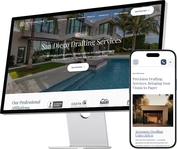
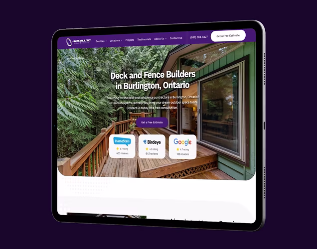
See Results For Our Web Design Clients


What Contractors Say About Us
Frequently Asked Questions About Our Web Design Services
How much does a new website cost?
The cost of a new website varies based on its complexity, functionality, and design requirements. For example, a basic one-page site’s cost will be lower than a larger, custom project. At Comrade, our custom web design and development services start from $599/mo, and we provide tailored quotes to ensure our solutions fit your specific needs and budget.
Why do we build our websites on Webflow?
We choose Webflow because it is a professional-grade platform that combines total design freedom with lightning-fast performance. Unlike other systems that rely on slow, clunky templates, Webflow allows us to create a “surgical optimization” for every page. It provides a frictionless experience for your audience and a secure, easy-to-manage environment for your business as it grows.
How long will it take to get a new website?
On average, a custom site can take anywhere from 6-8 weeks to build. However, the timeline at Comrade can vary based on client requirements, feedback speed, and the complexity of the site.
What does your website development process look like?
Our process at Comrade involves understanding your business goals, designing a layout, developing the site, testing, and finally launching a professional custom website with ongoing support and optimization.
Get a Website That Converts. Start With a Free Audit
We’ll review your website and show you exactly what’s holding it back, from design flaws to missed conversion opportunities. Clear, actionable insights to help you turn more visitors into booked jobs.