
Architects know that a well-designed website is more than a digital presence — it’s a reflection of creativity, innovation, and professionalism. Just like a building, a website must balance structure and aesthetics to leave a lasting impression.
The best architect websites don’t just showcase projects; they tell stories through visuals, layouts, and interactive elements. With sleek portfolios, bold typography, and immersive design, these sites capture the essence of architectural mastery.
This list of the top 25 architect website designs highlights the firms that have mastered the art of combining functionality with visual brilliance, offering inspiration for anyone looking to elevate their digital presence.
The Most Stunning Architect Websites Online
1. Gensler
Industry: Architecture
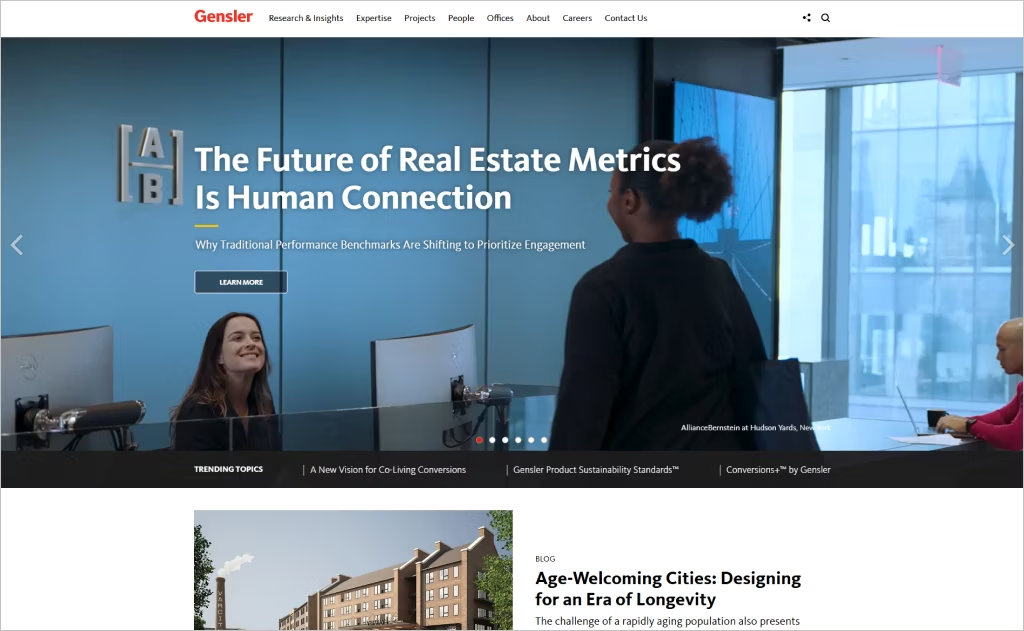
Gensler’s website exemplifies a seamless integration of architectural innovation and digital experience. The homepage features a dynamic full-width slider promoting the “Design Forecast 2025,” emphasizing the firm’s thought leadership and forward-thinking approach. This interactive element immediately captures visitors’ attention, setting the tone for an engaging user experience.
The site boasts a clean, content-rich layout with intuitive navigation, reflecting Gensler’s global influence and commitment to innovation. Detailed infographics, such as those illustrating carbon budgets, demonstrate transparency and environmental responsibility. This fusion of aesthetics and functionality creates a memorable experience that aligns perfectly with the firm’s philosophy.
2. Perkins&Will
Industry: Architecture
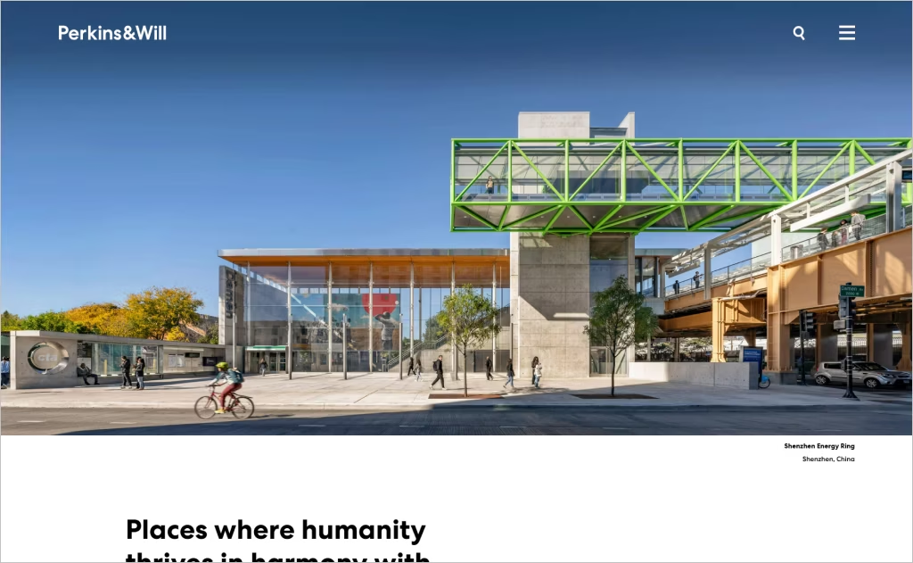
Perkins&Will’s website stands out with its minimalist design, emphasizing clarity and elegance. The homepage features a serene landscape photograph paired with the tagline “Places where humanity thrives in harmony with nature,” setting an inspirational tone that resonates with the firm’s focus on sustainable and people-centered design.
The site employs a consistent color palette and clean typography, enhancing readability and user experience. Project presentations adopt a case study approach, offering detailed insights into each endeavor. This structured layout, combined with intuitive navigation, reflects the firm’s commitment to innovation and impact, making their digital presence as thoughtful as their architectural designs.
3. HKS
Industry: Architecture
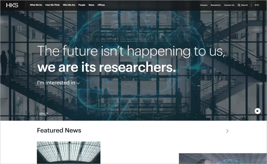
HKS’s website exemplifies a sophisticated blend of clarity and modernity. The homepage features a compelling tagline, “The future isn’t happening to us, we are its designers,” setting an inspiring tone. Large, impactful images accompany this message, showcasing the firm’s diverse projects and reinforcing their global reach and innovative approach.
The site’s design emphasizes user engagement through interactive elements and a well-structured layout. Visitors can easily navigate through various services and projects, each presented with concise information and high-quality visuals. This thoughtful design not only highlights HKS’s architectural expertise but also reflects their commitment to creating spaces that are both functional and inspiring.
4. Corgan
Industry: Architecture
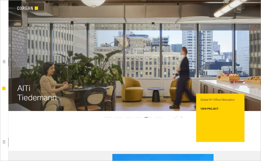
Corgan’s website stands out with its dynamic design, seamlessly blending form and function. The homepage features a captivating carousel of high-quality images showcasing their diverse projects, immediately drawing visitors into their world of architectural excellence. This visual storytelling is complemented by a clean, grid-based layout that ensures easy navigation and a cohesive user experience.
Interactive elements further enhance the site’s appeal, with smooth animations and transitions that reflect Corgan’s commitment to innovation. The thoughtful integration of these features not only showcases their design prowess but also creates an engaging platform for prospective customers and collaborators to explore their work and ethos.
5. Populous

Industry: Architecture
Populous’s website captivates visitors with its immersive design, reflecting the firm’s expertise in creating dynamic public spaces. The homepage features a compelling tagline, “We design the places where people love to be together,” setting an inspiring tone that resonates with the firm’s focus on community-centric architecture. Large, impactful images accompany this message, showcasing their diverse projects and reinforcing their global reach and innovative approach.
The site’s design emphasizes user engagement through interactive elements and a well-structured layout. Visitors can easily navigate through various services and projects, each presented with concise information and high-quality visuals. This thoughtful design not only highlights Populous’s architectural expertise but also creates an engaging platform for potential clients and collaborators to explore their work and ethos.
6. Altura Architects
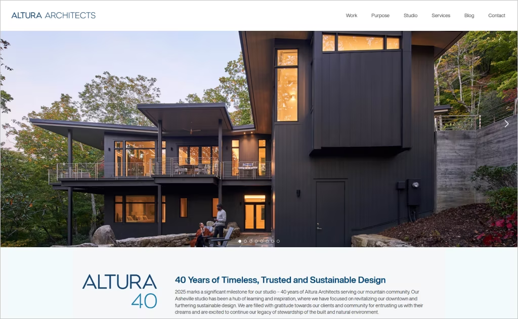
Industry: Architecture
Altura Architects’ website offers a compelling digital experience that mirrors their commitment to timeless and sustainable design. The homepage prominently features a full-width image of a project reflecting their architectural philosophy, immediately establishing a connection with visitors. The clean, grid-based layout ensures easy navigation, allowing users to explore their portfolio seamlessly.
Interactive elements, such as hover effects on project images, enhance user engagement, providing a dynamic browsing experience. The integration of recent blog posts highlights the firm’s thought leadership and ongoing industry engagement. This thoughtful combination of elements positions Altura Architects as a trusted and innovative leader in the architectural space.
7. HOK
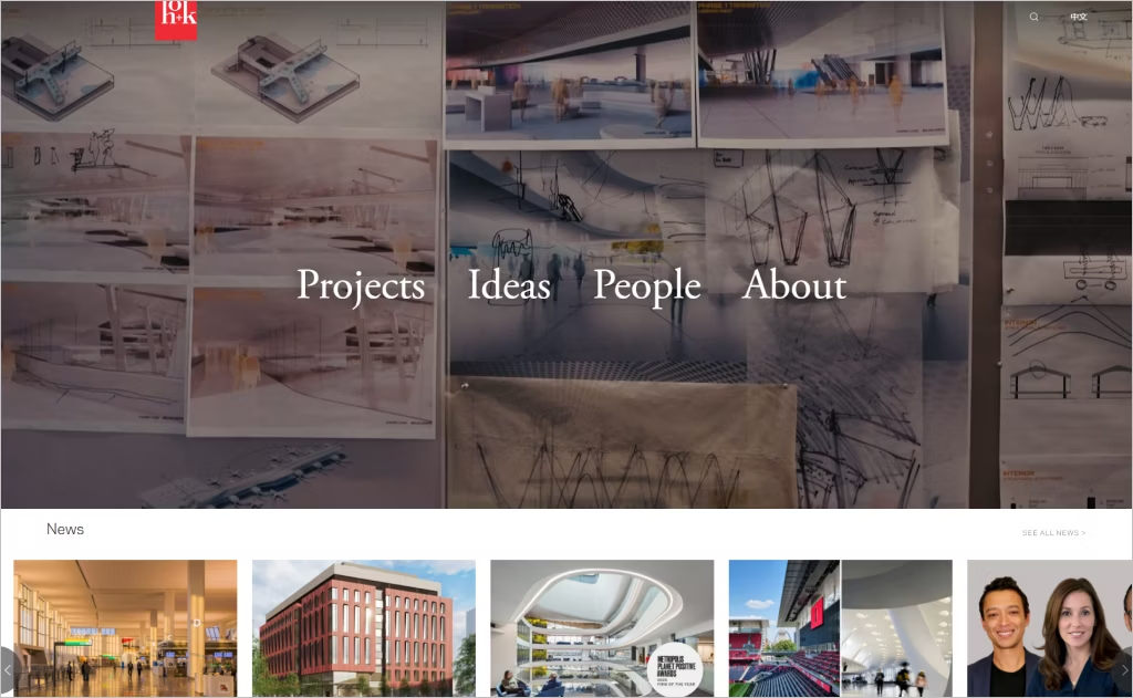
Industry: Architecture
HOK’s website masterfully balances innovation with user-centric design, reflecting its global architectural prowess. The homepage showcases a captivating video loop of dynamic projects, immersing visitors in the firm’s diverse portfolio. This visual approach not only highlights HOK’s design excellence but also sets an engaging tone for the user experience.
The site employs a modular grid layout, allowing for intuitive navigation across various disciplines and projects. Interactive elements, such as hover-triggered animations and smooth transitions, enhance user engagement without overwhelming the content. This thoughtful integration of design elements ensures that HOK’s digital presence is as impactful as its architectural creations.
8. Anacapa Architecture
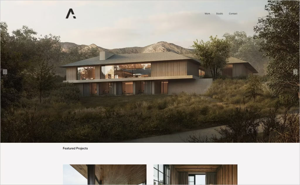
Industry: Architecture
Anacapa Architecture’s website is a masterclass in minimalist design, where each element serves a purpose. The homepage opens with a striking full-width image that immediately immerses visitors in the firm’s aesthetic. This visual approach sets the tone for a user experience that is both engaging and reflective of their architectural philosophy.
The site’s layout is thoughtfully structured, allowing for intuitive navigation through their diverse portfolio. High-quality images paired with concise project descriptions provide a clear understanding of their work. This seamless integration of design and functionality ensures that Anacapa’s digital presence is as impactful as their physical creations.
9. HDR
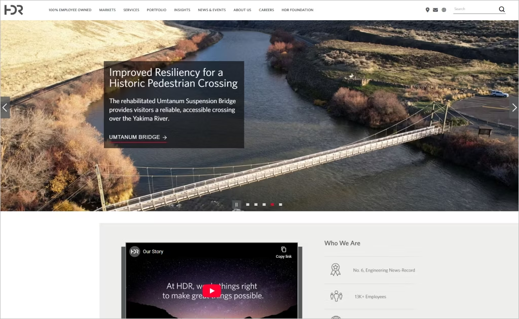
Industry: Architecture
HDR’s website stands out with its immersive storytelling and user-centric design, effectively showcasing its multidisciplinary expertise. The homepage features a dynamic carousel of high-quality project images, each accompanied by concise captions that highlight HDR’s global impact across various sectors. This visual approach not only captures the firm’s diverse portfolio but also engages visitors immediately upon arrival.
The site’s navigation is intuitive, with clear categories for services, markets, and insights, allowing users to easily explore HDR’s offerings. Interactive elements, such as hover effects and smooth transitions, enhance the user experience without overwhelming the content. This thoughtful integration of design elements ensures that HDR’s digital presence is as impactful as its architectural and engineering solutions.
10. AECOM
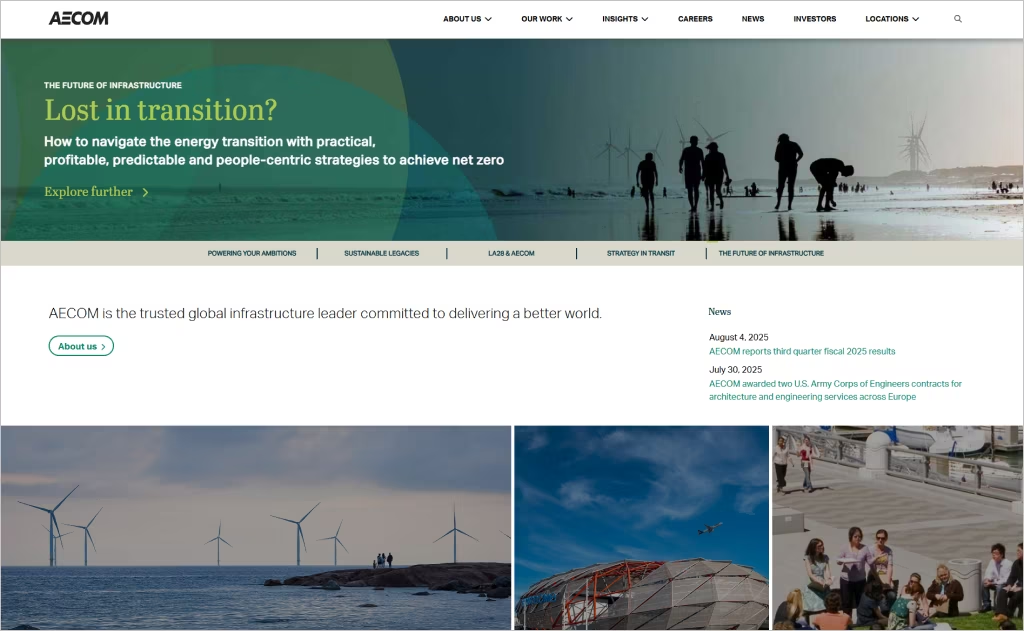
Industry: Architecture
AECOM’s website stands as a beacon of clarity and professionalism in the architecture and engineering sector. The homepage features a compelling tagline, “Delivering a better world,” immediately setting an inspiring tone that resonates with the firm’s commitment to impactful infrastructure. High-quality images of landmark projects, such as the One World Trade Center and Mercedes-Benz Stadium, are prominently displayed, showcasing AECOM’s global reach and design excellence.
The site’s design emphasizes user engagement through intuitive navigation and interactive elements. Smooth transitions and hover effects enhance the browsing experience, allowing visitors to seamlessly explore various services, markets, and projects. This thoughtful integration of design elements ensures that AECOM’s digital presence is as impactful as its architectural and engineering solutions.
11. Andersson / Wise
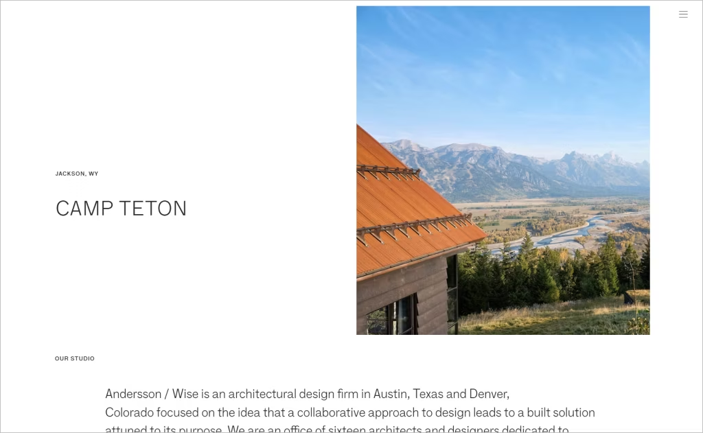
Industry: Architecture & Design
Andersson / Wise’s website immediately impresses with its striking visuals and understated elegance. Their full-screen project teasers, especially “Campsite at Shield Ranch,” showcase immersive, high-quality imagery that evokes the firm’s deep connection with natural landscapes. The choice of vast white space frames each image beautifully, letting textures, light, and materiality shine rather than compete with ornate graphics or heavy design elements.
The navigation is pared-back yet purposeful, with only four main menu items (“Studio,” “Projects,” “Press + Awards,” “Contact”) guiding the user. Interactive rollover effects and clean typography lend clarity, while project-type labels (public, residential, religious, etc.) provide instant context. Every element feels intentional, reflecting Andersson / Wise’s collaborative, purpose-driven architectural philosophy.
12. Page
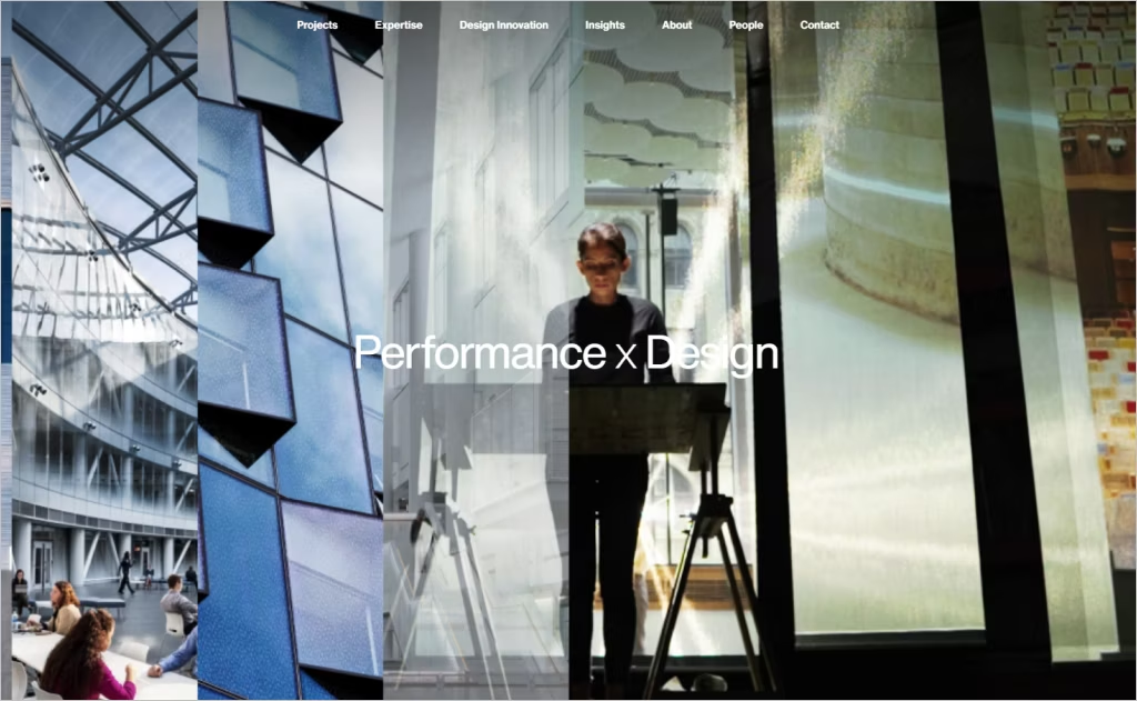
Industry: Architecture & Design / Engineering
Page’s website impresses by centering performance and impact right at the heart of its visual storytelling. The large hero image paired with the statement “Performance by design” immediately conveys their philosophy. Markets and services are meticulously categorized, letting users quickly explore specialties like academic innovation, healthcare, and mission-critical design without sifting through unrelated content.
The site balances imagery and insight expertly; each project boasts context-rich captions (LEED status, public plaza, site integration) that deepen the narrative beyond mere visuals. Smooth transitions and structured modules guide you through “Design Innovation,” “Impact,” and “Insights,” making the site feel more than a portfolio — it becomes a reflection of research, strategy, and collaboration in built form.
13. Leo A. Daly
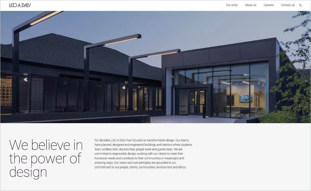
Industry: Architecture
Leo A. Daly’s architecture service page exemplifies a refined digital presence that mirrors the firm’s century-long legacy in design excellence. The page opens with a compelling statement: “We believe in the power of design,” immediately setting an aspirational tone that resonates with visitors. High-quality images of their diverse projects, ranging from public institutions to adaptive reuse ventures, are thoughtfully integrated, showcasing the firm’s versatility and commitment to impactful design.
The layout is clean and intuitive, allowing users to seamlessly navigate through various sections, including new construction, renovation, and interior architecture. Each category is accompanied by concise descriptions and relevant project highlights, providing a comprehensive overview of their capabilities. This structured approach not only enhances user experience but also reinforces Leo A. Daly’s dedication to delivering thoughtful, context-driven architectural solutions.
14. Burns & McDonnell
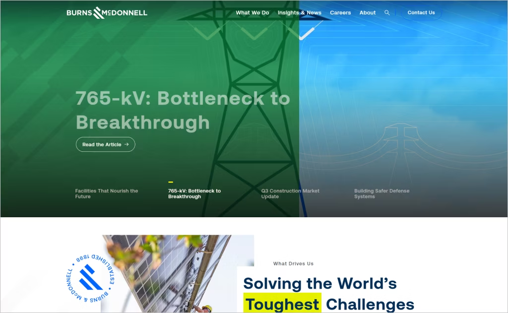
Industry: Architecture
Burns & McDonnell’s website stands out with its dynamic and user-centric design, reflecting the firm’s commitment to innovation and excellence. The homepage features a compelling tagline, “Solving the World’s Toughest Challenges,” immediately setting an aspirational tone that resonates with visitors. High-quality images of their diverse projects, ranging from power plants to clean water initiatives, are prominently displayed, showcasing the firm’s global reach and impact.
The site’s navigation is intuitive, with clear categories for services, industries, and projects, allowing users to easily explore Burns & McDonnell’s offerings. Interactive elements, such as hover effects and smooth transitions, enhance the user experience without overwhelming the content. This thoughtful integration of design elements ensures that Burns & McDonnell’s digital presence is as impactful as its engineering and architectural solutions.
15. MG2
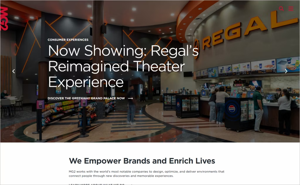
Industry: Architecture & Design
MG2’s website masterfully balances minimalism with impact through its bold typographic approach and dynamic project imagery. The clean white space allows their architectural photography to breathe while sophisticated hover effects and smooth transitions create an engaging browsing experience that mirrors their design philosophy.
What sets MG2 apart is their innovative use of split-screen layouts and fullscreen project showcases that immerse visitors in their work. The subtle animation of text overlays and the seamless integration of video content demonstrate technical sophistication while maintaining the elegant simplicity expected from a top-tier architecture firm.
16. PBK
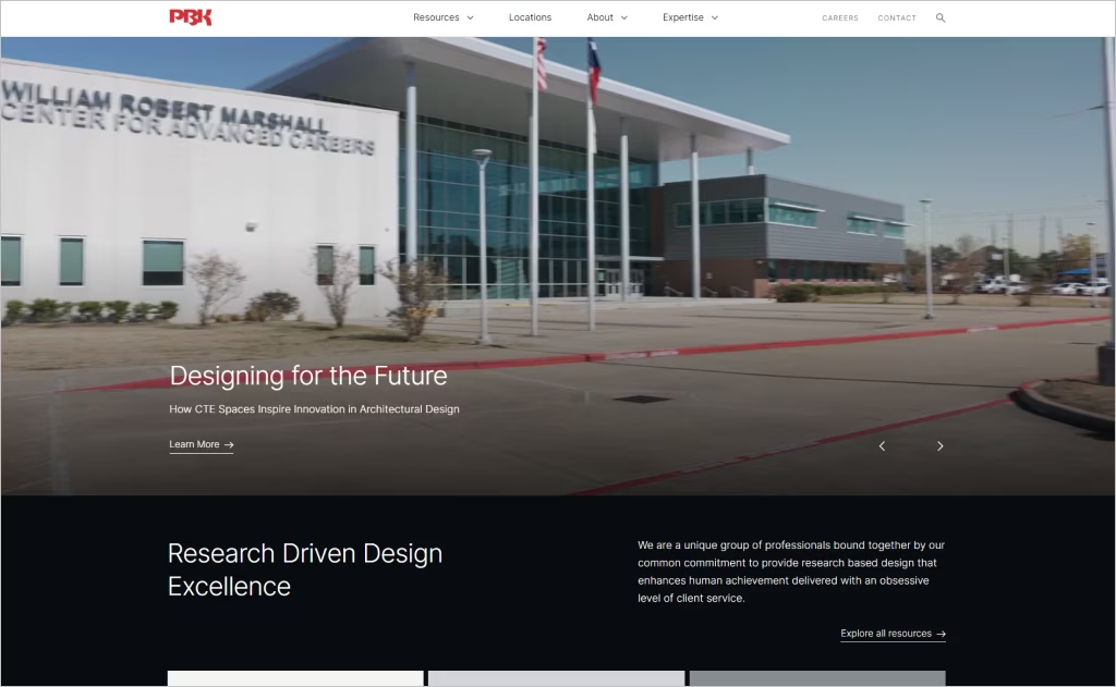
Industry: Architecture & Design
PBK’s website captivates with its strategic use of color-coded navigation that intuitively guides visitors through different sectors like education, healthcare, and civic projects. The site’s distinctive grid-based portfolio presentation creates a museum-like browsing experience, where each project thumbnail reveals compelling narratives through subtle parallax effects.
The standout feature is their innovative “People First” approach visualization, incorporating team member profiles directly into project case studies. This human-centric design philosophy extends to their responsive filtering system that adapts seamlessly across devices, while custom iconography and data visualizations transform complex architectural concepts into digestible visual stories.
17. Hoefer Welker
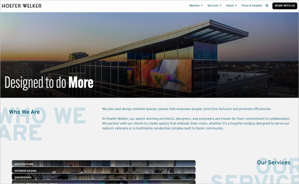
Industry: Healthcare & Commercial Architecture
Hoefer Welker’s website embraces bold simplicity with striking project photography that dominates the screen, immediately showcasing their healthcare and commercial expertise. The homepage features a dynamic project carousel with compelling headlines like “CHI Trinity Health System St. Clairsville Hospital” that draw visitors into their portfolio through visual storytelling rather than excessive text.
The design prioritizes user experience through intuitive navigation and clean typography that lets their architectural work speak for itself. Large-format imagery creates an immersive browsing experience while maintaining professional elegance, demonstrating how architectural firms can balance visual impact with functional design to convert visitors into potential clients.
18. Lawrence Group
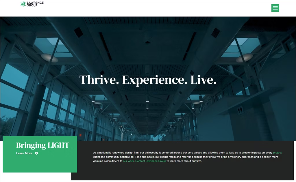
Industry: Multi-Disciplinary Architecture & Design
Lawrence Group’s services page utilizes a sophisticated scroll-triggered sectioning system where each discipline unfolds vertically with its own hero image and strategic messaging. The design cleverly positions “Collective Expertise” as the anchor concept, reinforcing their integrated approach through structured content blocks that emphasize collaboration over individual services.
The typography hierarchy shines through paired headings like “OUR APPROACH” and “OUR EXPERIENCE,” creating a rhythmic reading pattern that guides visitors through complex information effortlessly. Their color-neutral palette allows photography to anchor each section while maintaining professional cohesion, proving that restraint in visual design can amplify architectural credibility and multidisciplinary capabilities.
19. Wittehaus
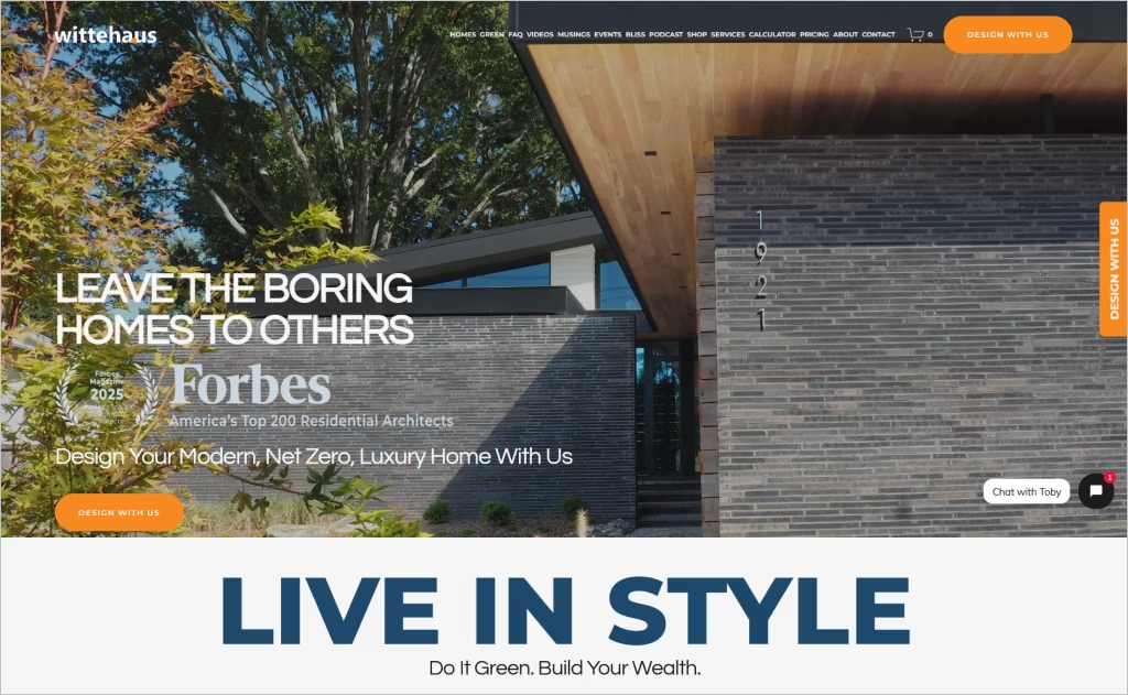
Industry: Sustainable Residential Architecture
Wittehaus breaks convention with personality-driven copy that speaks directly to homeowner aspirations rather than technical specifications. The animated ticker statement repeating “We guide you from A to Z, through the entire journey” creates kinetic energy while reinforcing their hands-on philosophy, transforming what could be static content into an engaging visual rhythm.
The design embraces emotional storytelling through conversational language and strategic white space that lets the sustainability message breathe. Principal Toby Witte’s prominent personal presence humanizes the firm, while accolades scattered throughout establish credibility without overwhelming the welcoming, accessible tone that positions custom architecture as an achievable dream rather than an intimidating luxury.
20. BBS Arch
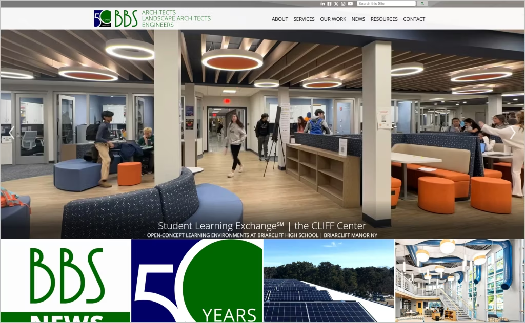
Industry: Multi-Disciplinary Architecture & Engineering
BBS Arch’s architecture page adopts a comprehensive, text-forward approach that functions like an encyclopedia of services. The content-rich structure systematically categorizes offerings from “Architectural Design” through “NYSED Reporting + Compliance,” creating a reference-style resource that prioritizes substance over visual flourishes for institutional clients seeking detailed service descriptions.
The minimalist presentation focuses purely on delivering exhaustive information without distraction. This deliberate absence of imagery or interactive elements positions BBS as serious technical experts, particularly evident in specialized sections covering forensic architecture and ADA compliance reviews, where depth of knowledge trumps aesthetic appeal to communicate reliability and regulatory mastery.
21. SmithGroup
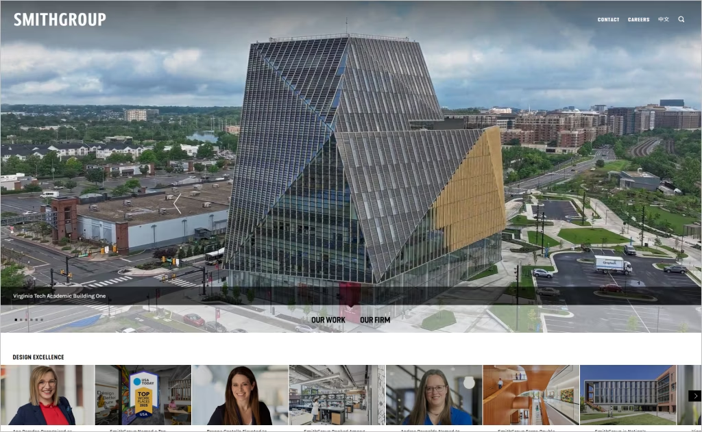
Industry: Integrated Architecture & Engineering
SmithGroup’s homepage operates as a dynamic content feed showcasing their thought leadership with constant updates in news, awards, and perspectives articles. The tagline “Design a Better Future” anchors the brand promise while the stream of accolades establishes their national rankings across healthcare, laboratory, and university architecture sectors without heavy-handed self-promotion.
The interface strategically intermixes recent achievements with insights-driven content, creating authority through volume and variety. Categorical tags like “Justice, Equity, Diversity and Inclusion” and “Research & Innovation” organize the abundance of content while maintaining scanability, demonstrating how major firms can leverage editorial-style web design to position themselves as industry voices rather than mere service providers.
22. Mithun
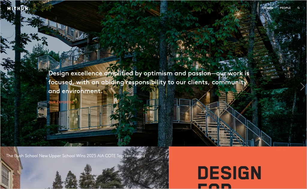
Industry: Sustainable Architecture & Planning
Mithun’s homepage employs a bold carousel-style navigation where each slide presents a philosophical statement paired with a call-to-action, creating an immersive brand journey. The poetic declarations like “We believe in design’s vital capacity to connect people to place and each other” establish their values-first approach before visitors even see project work, prioritizing mission over portfolio.
The minimalist slide transitions with sparse text against striking background imagery create breathing room between concepts, allowing each message to resonate individually. This deliberate pacing transforms the homepage into a meditation on their design philosophy rather than a traditional landing page, using restraint and rhythm to communicate depth of purpose and environmental commitment through experiential storytelling.
23. Rockwell Group
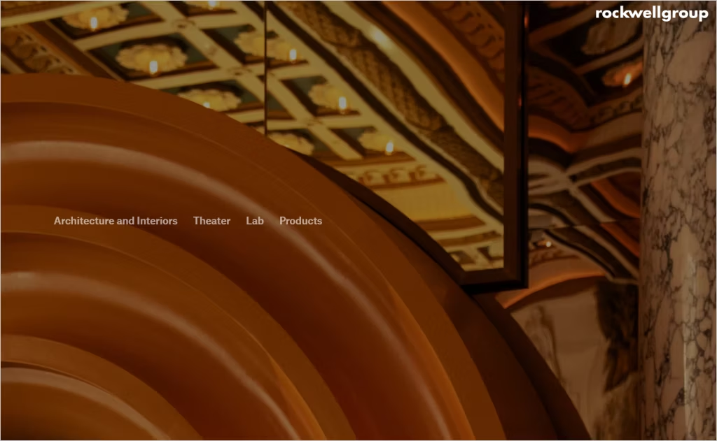
Industry: Architecture and Interiors
Rockwell Group’s architecture page strips away excess to deliver a single, powerful statement: “We create memorable spaces and experiences across a range of typologies that bring people together.” This radical simplicity demonstrates confidence in their reputation, allowing visitors to dive immediately into visual project exploration without navigational clutter or service descriptions competing for attention.
The ultra-minimal approach creates dramatic contrast against typical architecture sites heavy with information. By reducing the introduction to one sentence, the design shifts focus entirely to their portfolio imagery, trusting that their celebrated hospitality and entertainment projects speak louder than words. This editorial restraint reflects the theatrical elegance their firm brings to physical spaces.
24. Selldorf Architects
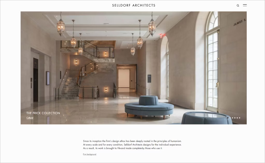
Industry: Cultural & Residential Architecture
Selldorf Architects opens with a refined philosophical statement emphasizing “humanism” and “the individual experience,” immediately positioning their design perspective before any visuals appear. The understated presentation mirrors the sophistication of their museum and gallery clientele, using restraint and elegant typography to communicate intellectual rigor without ostentation.
The homepage’s muted palette and generous negative space create a gallery-like digital environment that parallels their physical architecture work. This minimal aesthetic functions as both branding and filtering mechanism, attracting discerning clients who appreciate subtlety over spectacle. The quiet confidence in their presentation suggests a firm that relies on reputation and word-of-mouth rather than aggressive marketing tactics.
25. TenBerke Architects
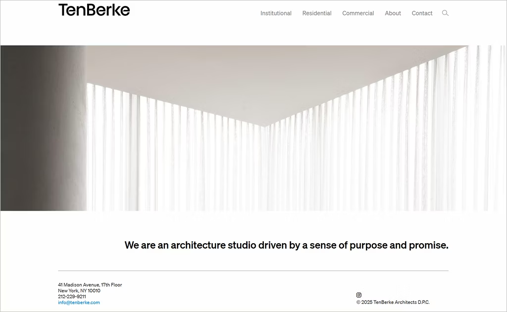
Industry: Contemporary Architecture & Urban Design
TenBerke’s website embraces an extreme minimalist philosophy with virtually no text on the homepage, letting architectural photography consume the entire viewport. The design relies completely on visual communication, presenting their projects through large-format imagery that dominates the screen without introductory copy, service descriptions, or mission statements to mediate the experience.
The navigation appears discreetly, allowing uninterrupted visual immersion that mirrors the clean lines of their modernist projects. This radical absence of textual content creates an art gallery atmosphere where the architecture itself becomes the sole storyteller. The approach assumes visitors already know the firm’s reputation, reflecting confidence that their built work requires no verbal explanation or contextual framing.
Want to speak with an expert?
Call us at (872) 242-1074
How to Build a Website That Reflects Your Architect Expertise
A powerful architect website should do more than display pretty images — it should capture your signature style, convey professionalism, and guide potential clients seamlessly from admiration to action. A thoughtful design strategy ensures your expertise stands out in a competitive industry. Here’s how to craft a site that truly showcases your architectural brilliance:
1. Define a Clear Visual Identity
Your website is often the first touchpoint clients have with your brand, so its look and feel must reflect your architectural philosophy. Establishing a strong visual language helps create consistency and emotional impact.
- Choose a minimal, modern layout that lets your projects shine
- Stick to a cohesive color palette that aligns with your brand
- Use high-quality imagery and clean typography for a refined feel
Pro tip: Keep your design uncluttered — negative space is just as powerful as your visuals.
2. Highlight Signature Projects Strategically
Instead of overwhelming visitors with every project, curate a selection that reflects your strengths. This creates a clear narrative around your expertise and design range.
- Feature 5–8 standout projects in a visually engaging portfolio
- Include case studies that explain design challenges and solutions
- Use before-and-after visuals or interactive sliders to show impact
Tip: Lead with your most impressive projects to make a strong first impression.
3. Create an Intuitive User Experience
Architecture celebrates structure and flow — your website should do the same. A logical layout makes navigation effortless, ensuring users stay engaged.
- Keep menus simple and logically organized
- Use sticky navigation for easy browsing
- Optimize internal links to guide visitors toward inquiries or project pages
Advice: Test your site’s navigation with someone unfamiliar with your brand — if they get lost, simplify.
4. Integrate Storytelling and Personality
Clients aren’t just buying designs — they’re choosing your vision. Adding storytelling elements humanizes your brand and builds trust.
- Include a compelling “About” page with your philosophy and approach
- Share behind-the-scenes glimpses or design processes
- Use authentic copywriting that reflects your voice
Pro tip: A short, engaging founder video can make your story unforgettable.
5. Optimize for Performance and Mobile
Even the most stunning website loses its impact if it’s slow or clunky. Ensuring smooth performance and mobile responsiveness is non-negotiable.
- Compress images without sacrificing quality
- Use a responsive framework for flawless display on all devices
- Minimize plugins and optimize loading speed
Tip: Run regular speed tests — every second of delay can lower conversions.
Shape the Future of Your Brand
Great architecture deserves a digital presence that’s just as inspiring. A well-crafted website can build trust, showcase creativity, and spark meaningful connections with potential clients. The best architect websites prove that exceptional design begins online.
At Comrade Digital Marketing, we blend strategy and artistry to create websites that highlight your strengths and captivate your audience. Our approach goes beyond good looks — we focus on building platforms that engage visitors and turn interest into real opportunities.
If you’re ready to take your online presence to the next level, let’s build something remarkable together. Contact us today and bring your vision to life.