Law firm logos are the visual representation of a legal brand, conveying its essence and personality in a single glance. Creating the perfect attorney logo requires understanding what makes professional law logos effective at capturing your firm’s unique identity. They are not simply a combination of colors, shapes, and fonts. They are symbols that encapsulate the values, expertise, and professionalism of a law firm. A logo serves as the visual ambassador of a firm’s identity, reinforcing its presence in the minds of clients, colleagues, and the legal community.
It might be tough to make a logo or even know what should go into your legal logo design to represent your law firm’s unique strengths and personality truly. That’s why we’ve put together 55 of the best law firm logos and designs to help you create a visual identity that truly reflects your firm.

What Makes an Effective Law Firm Logo Design
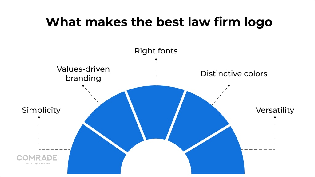
Your logo is usually the first thing people see when they interact with your firm on various platforms. Therefore, it has the power to make or break the first impression. Since there are so many logos out there, you may wonder whether yours should be bold and striking or sleek and modern. Should it feature a symbol or an image, or is a simple text-based logo the way to go? Let’s find out what makes the best law firm logo.

Simplicity
A simple design can make a stronger impact and help your firm stand out in a crowded legal industry. Avoid cluttering your logo with too many elements or intricate details, making it appear busy and confusing. Instead, opt for a clean and minimalist approach, effectively communicating your firm’s values and reputation. A clean design looks more professional and makes it easier for potential clients to remember and recognize your firm.
Values-Driven Branding
Values-driven branding is an approach to law firm marketing that focuses on communicating your firm’s unique values, strengths, and mission through your visual identity. Incorporating symbols such as scales, gavels, or blindfolded ladies can convey a sense of fairness, impartiality, and the rule of law. You can also opt for symbols that reflect the specific areas of law your firm practices, such as a shield for defense or a pillar for strength.
Right Fonts
The font you select should align with your firm’s personality, whether traditional, modern, or bold. For a traditional law firm, a serif font such as Times New Roman or Garamond can convey a sense of stability and reliability. If you’re looking to create a modern and innovative brand, a sans-serif font like Helvetica or Calibri may be a better fit.
It’s also important to select a web-safe font, which means that the font is widely available and can be easily viewed on different devices and platforms. Some examples of web-safe fonts include Arial, Verdana, and Georgia.
Distinctive Colors
Colors play a significant role in creating a memorable and effective law firm logo. Remember, the law firm logo colors you choose should be distinctive and memorable. Avoid using colors that are too similar to those of other law firms in your area, as this can lead to confusion and dilute your brand.
You can also use color psychology since it helps clients’ behavior towards your law firm. For example:
Blue is often associated with trust, reliability, and professionalism. It’s a popular choice for law firm logos as it conveys a sense of stability and confidence.
Green is linked to growth, harmony, and balance. It can represent a firm’s commitment to sustainability, innovation, and progress.
Red is a bold and passionate color that can symbolize energy, determination, and strength. It can be an excellent choice for firms specializing in high-stakes or criminal law disputes.
Purple is associated with creativity, luxury, and wisdom. It can represent a firm’s commitment to excellence, innovation, and exceptional client service.
Versatility
A good law firm logo should be versatile and flexible enough to work across various platforms and mediums, including the law firm’s letterhead, website, business cards, signage, and other marketing materials. Since your logo has to be strong and consistent with your brand identity, ensure that the logo can be adapted to different backgrounds, images, and layouts without losing its integrity or effectiveness.
Comrade Digital Marketing Agency can help you with the above if you’re unsure how to go about it. Schedule a free consultation.
Top 55 Law Firm Logo Designs
We’ll be highlighting the top 55 legal logos that you can use as inspiration for logo ideas and we will go into what makes 25 of them unique and effective.
1. Ben Crump Law Firm

The gold-colored logo exudes a sense of majesty. It features the abbreviation ‘BC’ representing Ben Crump, written in black alongside it. The powerful message of “TRIAL LAWYERS FOR JUSTICE” below highlights their dedication to fighting for justice.
2. Lawyers For The People

This law firm logo stands out with its minimalistic and simple design. The white text boldly reads “LAWYERS FOR THE PEOPLE,” conveying their commitment to serving the needs of the people effectively.
3. Ozarks Family Law

The green-colored logo incorporates a tree, symbolizing growth and stability. The law firm’s name positioned below the tree connects their practice with family law, evoking a sense of trust and harmony.
4. Law Office of Cohen & Jaffe

Just like Ben Crump’s design, this personal injury law firm logo employs green and black colors. The inclusion of the abbreviation “CJ” along with the firm’s name signifies a strong partnership, while the colors evoke a sense of trust and reliability.
Enhance your online presence with proven personal injury SEO strategies – dive into our blog post.
5. H&H IP Law

This logo also employs abbreviations similar to Ben Crump’s approach but they are in small letters ‘hh.’ The firm’s full name is positioned beside it, accompanied by the legal practice area of intellectual property below. This design effectively showcases their service.
6. Jackson & Wilson Trial Lawyers

The logo showcases a map of Orange County to acknowledge their local clients. The blue design exudes professionalism and trustworthiness, with the law firm’s name positioned on the right and the practice area of trial lawyers below.
Local SEO for law firms is the key to connecting with potential clients who are actively searching for legal services in your area.
7. Horton & Horton Law Firm

The blue and black logo incorporates an overlapping abbreviated HH in both colors. The full name of the law firm is positioned below, creating a visually appealing and balanced design that conveys a sense of reliability and professionalism.
8. Griffith, Young & Lass

This unique logo features the abbreviation GYL in navy blue, with the white Y positioned between the G and L, creating an eye-catching visual element. The full law firm name is placed below, while the phrase “Family and Divorce Law Firm” emphasizes their specialization.
9. Gilbert Law Group

With a minimalistic approach, this logo features a white letter G enclosed in a circle. The G is highlighted by green lines, adding a touch of sophistication and representing growth. The simplicity of the design conveys professionalism and a modern outlook.
10. Neilsons Lawyers

The logo embraces simplicity with a sophisticated design. The letter “n” is creatively crafted in small letters, adding an elegant touch. The law firm’s name is presented below the initial, creating a clean and professional logo that exudes a sense of professionalism and expertise.
11. Mancuso Carey

The blue and gold logo showcases the MC abbreviation incorporated into the body of a pineapple, symbolizing hospitality and warmth. The firm’s name is positioned below, accompanied by the descriptor “REAL ESTATE ATTORNEYS,” effectively communicating their area of expertise.
12. Christensen & Jensen

The logo uses wine and gray colors to feature the CJ abbreviation, with the ampersand (&) separating the initials. The law firm’s name is elegantly written on the right, creating a balanced, professional design that conveys a sense of sophistication.
13. Howard Kennedy

This straightforward logo presents the firm’s name in bold capital letters, exuding a sense of professionalism and confidence. The addition of a symbol alongside the name in navy blue adds a touch of visual interest and establishes a memorable brand identity.
14. Carbert Waite LLP

With a clean and minimalistic approach, this logo features the firm’s name written in white. The use of a double slash (//) to separate “Carbert” and “Waite LLP” adds a unique visual element, creating a distinct and memorable logo design.
15. Carden & Tracy

Enclosed within a rectangular box, this logo showcases the abbreviated CT at the top, separated by a vertical bar (|). The full name of the law firm is positioned below, accompanied by the descriptor “Trial Attorneys,” highlighting their specialization. The design presents a professional and authoritative image.
16. Hamil Little Healthcare Law

The logo utilizes various shades of blue, symbolizing trust and professionalism. It incorporates a distinct symbol complemented by the firm’s name written next to it. The lines “Business Regulatory Employment” below the name highlight their areas of expertise in healthcare law.
17. Donato Law

The logo features white text against a contrasting background. The letter D is enclosed within a rhombus shape, adding a unique visual element. The simplicity of the firm’s name positioned alongside the symbol conveys a sense of clarity and professionalism.
18. Levine Family Law Group

This logo combines white and mint green, creating a fresh and calming aesthetic. The firm’s name is presented simply, while the addition of birds flying away above it symbolizes freedom and resolution, reflecting the firm’s focus on family law.
19. Tate Law

The logo showcases a creative play with colors and shapes. The abbreviation TL is cleverly formed by stacking a square, triangle, and circle. The firm’s name is written simply in white, creating a clean, modern design that leaves a memorable impression.
20. Vanst Law

Incorporating white and green, this law firm logo features a distinct V symbol, representing the initial of the firm’s name. The law firm’s name is positioned on the side, creating a balanced composition. The use of colors and the simplicity of the design contribute to its effectiveness.
21. Baker McKenzie

This simple yet effective logo features the firm’s name accompanied by the number 75. The inclusion of the number signifies the law firm’s 75th anniversary, serving as a celebratory element that showcases its long-standing presence and experience in the industry.
22. Skadden, Arps, Slate, Meagher & Flom

This logo stands out with its simplicity and functionality. The law firm’s name is joined within a rectangle, with the menu positioned above and the search bar below. This law firm logo unique design eliminates clutter and showcases a streamlined approach to accessing important information.
23. Latham & Watkins

Embracing simplicity, this logo boldly spells out the law firm’s name in red. The use of a single color and strong typography creates a memorable and impactful design, conveying a sense of confidence and professionalism.
24. DLA Piper

The simple logo consists of the firm’s name spelled out on the left, while on the right side, a moon-like shape encapsulates the words “DLA PIPER.” The combination of typography and the encapsulating shape adds a touch of visual interest, creating a clean and distinctive logo design.
25. Kirkland & Ellis

With a focus on simplicity, this logo features the law firm’s name spelled out in white capital letters. The bold typography adds a sense of strength and authority, while the simplicity of the design ensures clarity and memorability.
26. Clifford Chance

27. Jones Day

28. Allen & Overy

29. Hogan Lovells

30. White & Case

31. Sidley Austin

32. Freshfields Bruckhaus Deringer

33. Gibson, Dunn & Crutcher

34. Sullivan & Cromwell

35. Weil, Gotshal & Manges

36. Morrison & Foerster

37. WilmerHale

38. Davis Polk & Wardwell

39. Cleary Gottlieb Steen & Hamilton

40. Covington & Burling

41. Paul, Weiss, Rifkind, Wharton & Garrison

42. Quinn Emanuel Urquhart & Sullivan

43. Simpson Thacher & Bartlett

44. Shearman & Sterling

45. Cravath, Swaine & Moore

46. Fried, Frank, Harris, Shriver & Jacobson

47. Debevoise & Plimpton

48. Reed Smith

49. King & Spalding

50. Orrick, Herrington & Sutcliffe

51. Greenberg Traurig

52. Mayer Brown

53. K&L Gates

54. Arnold & Porter Kaye Scholer

55. Dentons

Professional Legal Logo Styles for Law Firms
Your logo style determines how clients see your firm in the long run. Each style has its own charm, but all aim to leave a lasting impression that speaks to the firm’s character.
Wordmarks: Also known as logotypes, these logos rely on typography to create a strong visual impact. They use custom or unique fonts to showcase the lawyer logo distinctively and memorably, making a bold statement in legal logo design.

Combination marks: Blending typography and symbolic elements, combination marks offer a versatile approach. They combine the firm’s name with a relevant icon or symbol, creating a lasting impression that resonates with clients and rivals.

Emblems: Emblems exude tradition and authority. They consist of intricate designs with the firm’s name enclosed within a badge or shield. These logos often incorporate classic elements such as crests, laurels, or intricate patterns, reflecting a sense of heritage and professionalism.

Pictorial marks: Pictorial marks utilize visual imagery to convey the firm’s essence. They often feature a simplified, recognizable symbol or icon that represents the firm’s values, expertise, or industry. These logos captivate attention and leave a memorable impression through their visual storytelling.

Mistakes to Avoid in Law Firm Logo Design
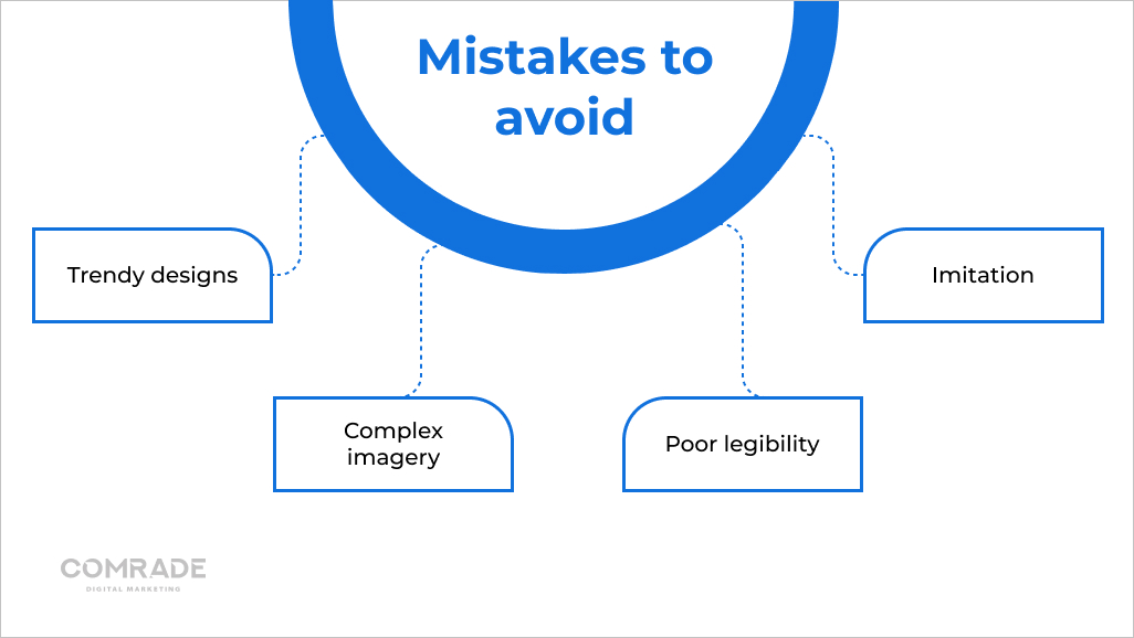
A well-designed logo can set your firm apart, while a poorly designed one can affect your law firm’s identity and even reputation. Since your reputation is at stake, you don’t want to make mistakes that will cost you. Some of those mistakes include:

Trendy designs: Don’t follow the crowd with trendy designs that will quickly become outdated. A timeless and classic aesthetic is a smart investment for longevity.
Complex imagery: Overcomplicating a logo with intricate details can hinder its impact and legibility. Keep the design clean and simple to allow for easy recognition and versatility across various mediums.
Poor legibility: A difficult-to-read or decipher logo can be detrimental to a law firm’s image. Choosing clear and legible typography ensures that the firm’s name is easily identifiable, even in small sizes.
Imitation: While drawing inspiration from successful logos is common, outright imitation can be damaging. Focus on what makes your firm special to establish individuality and set it apart from competitors.
Comrade Digital Marketing Agency can help you with the above if you’re unsure how to go about it. Schedule a free consultation.
Ethics for Law Firm Logos
The ethics for law firm logos encompass various principles guiding the design process and representing the firm’s identity. Law firm logos should provide truthful information and avoid misleading or false claims. This ensures that clients and the public can trust the firm’s representation and rely on the information conveyed through the logo.

Law firms must ensure that their logos do not disclose any confidential client information or violate attorney-client privilege. Additionally, logos should not create conflicts of interest, such as implying a relationship or endorsement with a specific client, organization, or cause that could compromise the firm’s impartiality and professional obligations.
Furthermore, law firms should not infringe upon copyrighted or trademarked materials in their logo designs, as this would be both unethical and potentially illegal.
Crafting the Perfect Law Firm Logo Design with Comrade Digital Agency
Crafting the perfect law firm logo requires carefully balancing professional legal logo design principles with your firm’s unique identity. Whether you’re creating a new attorney logo or refreshing your existing law firm logo design, following these best practices will help ensure your visual branding stands out while maintaining the professionalism expected in the legal industry.
You can also use the hand of a professional graphic designer agency like Comrade Digital Marketing Agency to craft a logo for your law firm while you focus on providing clients with service. Our team of experienced designers specializes in crafting custom logos and law firm website design elements that capture the essence of your firm and resonate with your target audience. Contact Comrade Digital Agency today and let us help you craft the perfect law firm logo design that reflects your firm’s unique strengths and values.

